
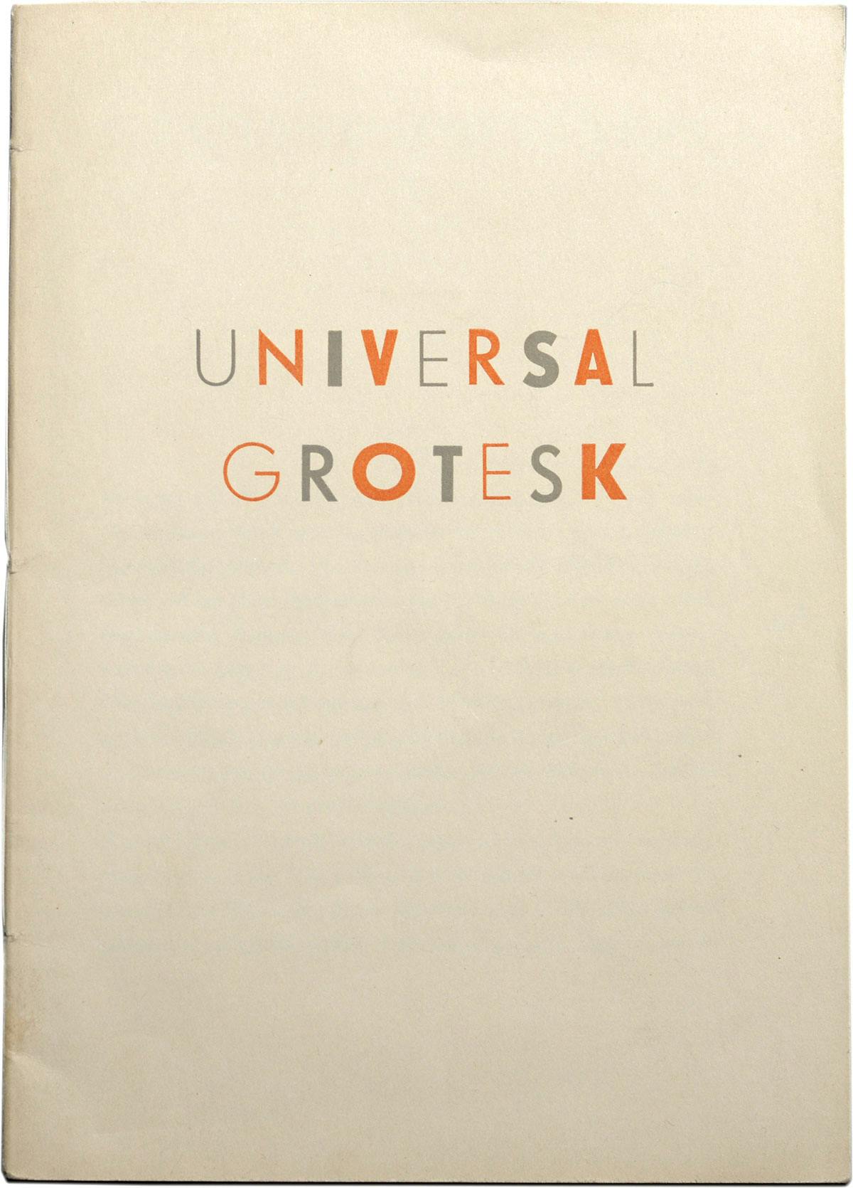
About Uni Grotesk, a Central European geometric Sans
Uni Grotesk is a modern adaptation of the ubiquitous but awkward Universal Grotesk, a typeface that dominated communist Czechoslovakia.
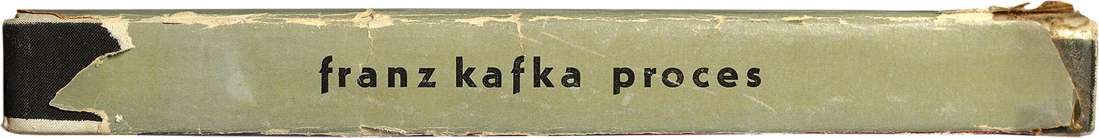
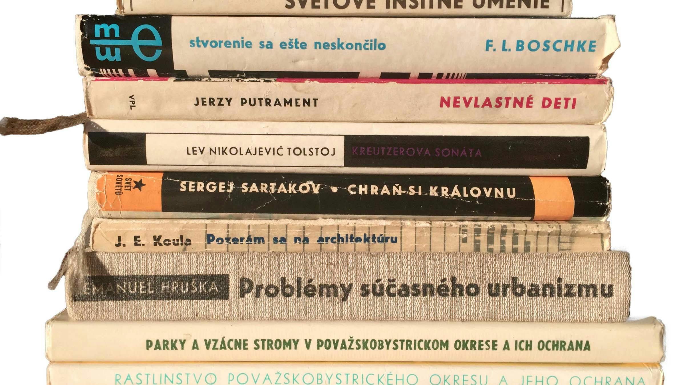
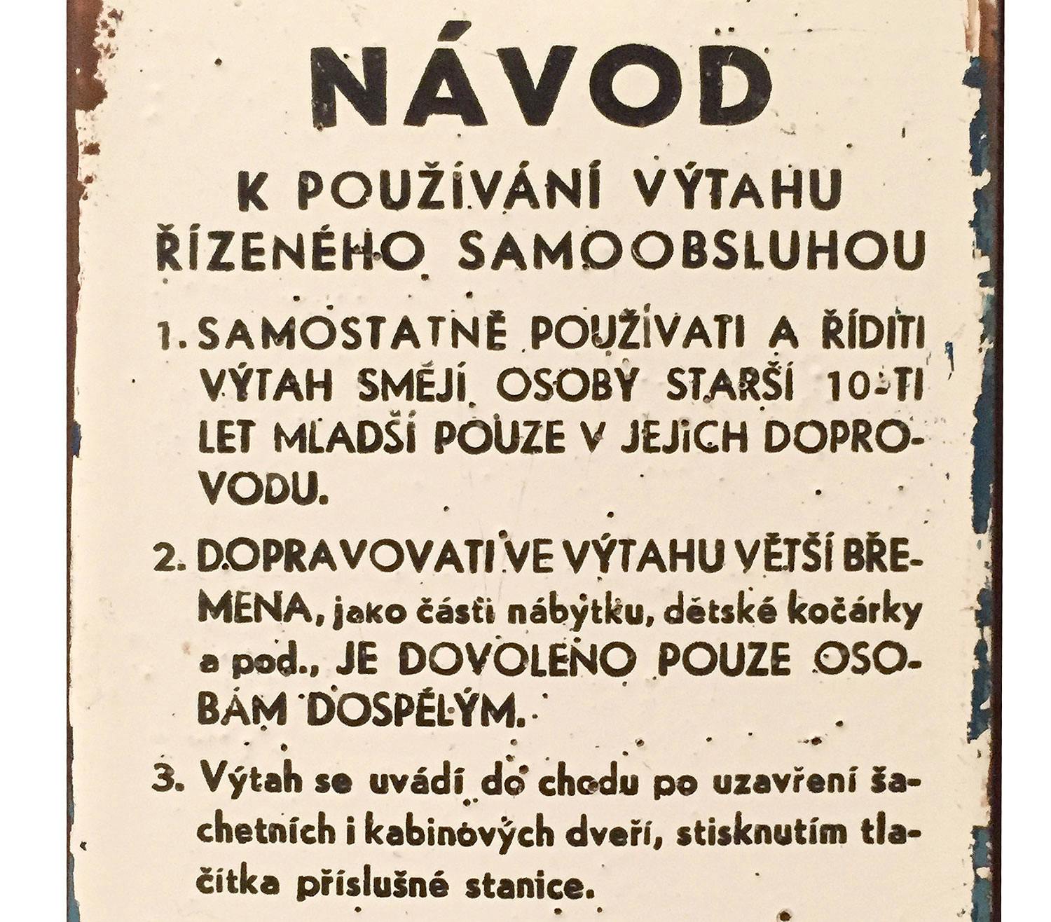
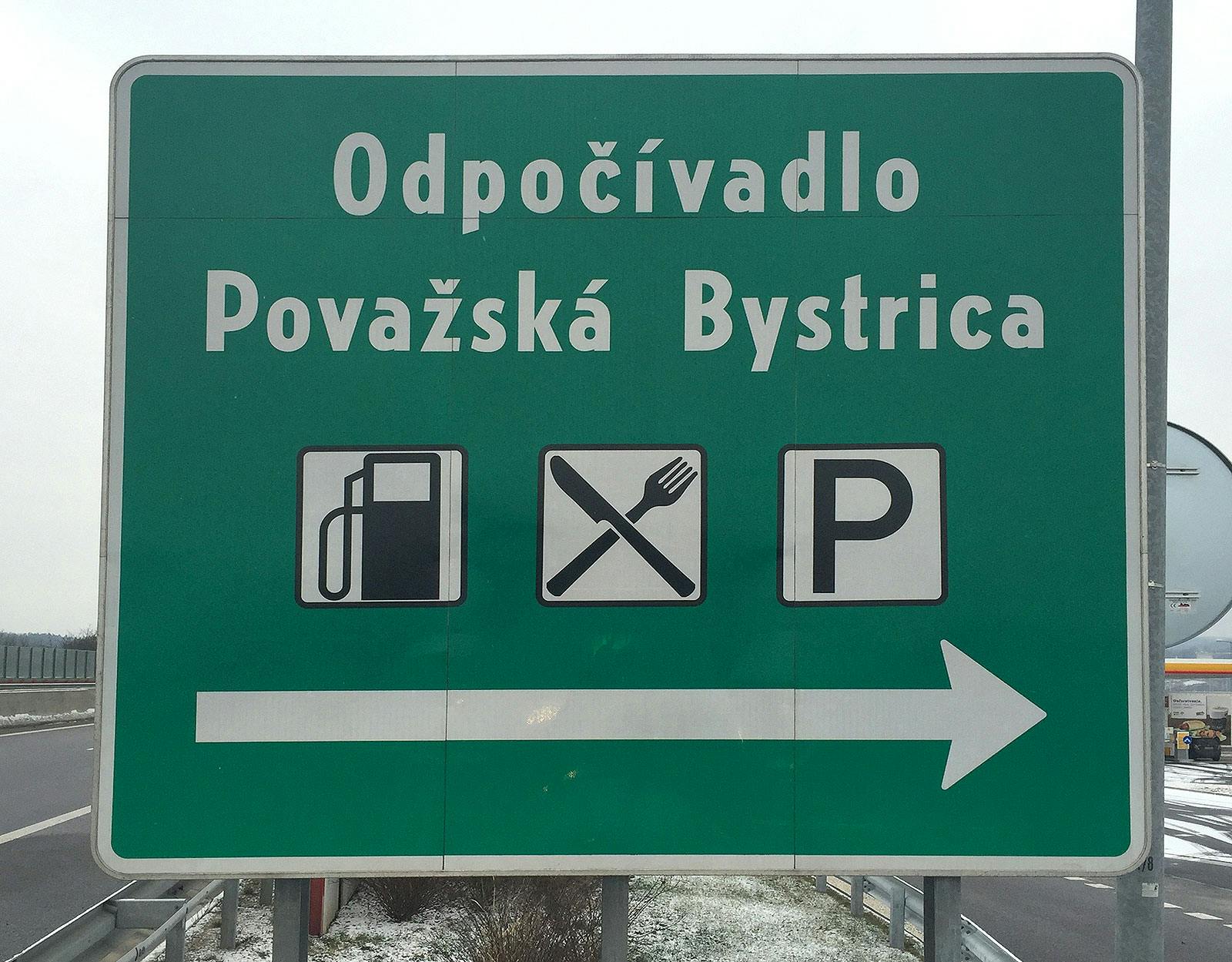
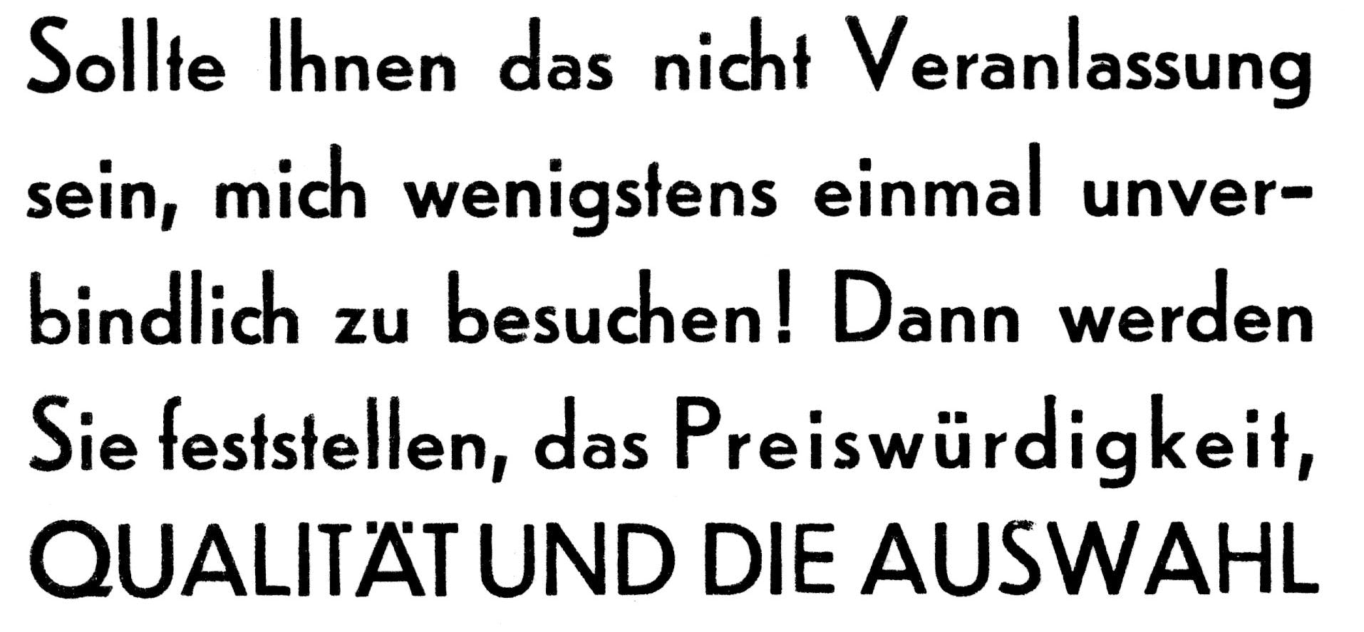
I remember looking at this book cover every evening before falling asleep. I was perhaps 9 or 10, and I didn’t really know who Franz Kafka was, but this book with the weird ‘f’ on the spine caught my attention. These kinds of details continued to catch my eye, and as I became more aware of lettershapes and of typography, I realised that this descending ‘f’ was rather common. In particular, this typeface, Universal Grotesk, was used everywhere throughout communist Czechoslovakia, appearing on everything from posters to road signs, from packaging to newspaper headlines, from our local version of transfer letters (Propisot) to instruction manuals of all kinds (perhaps its most fitting use).
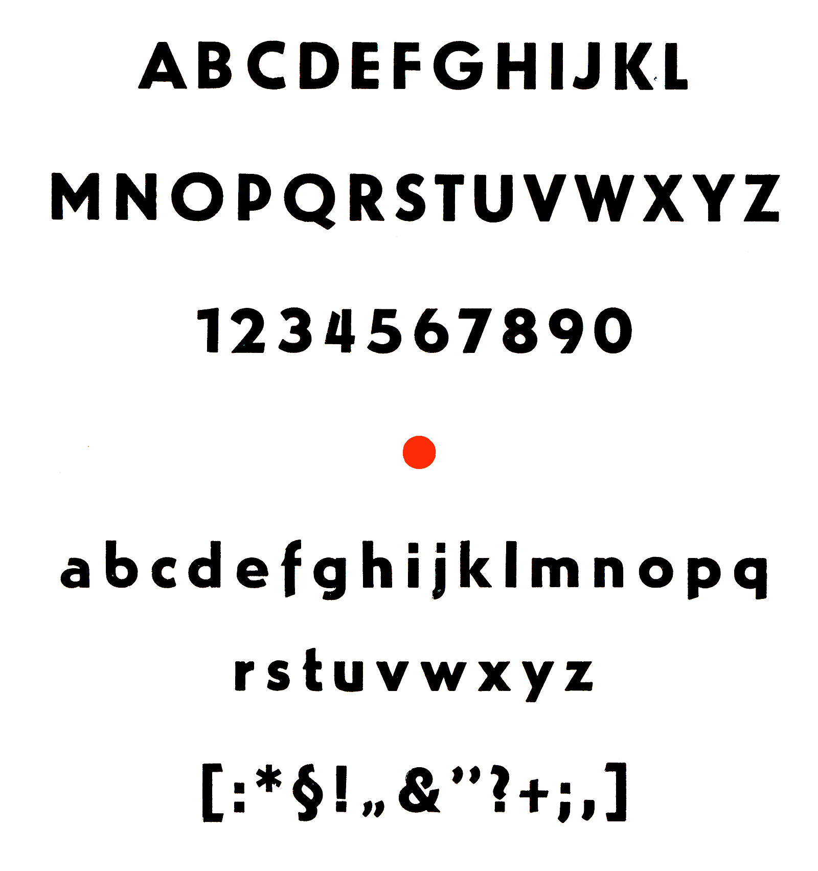
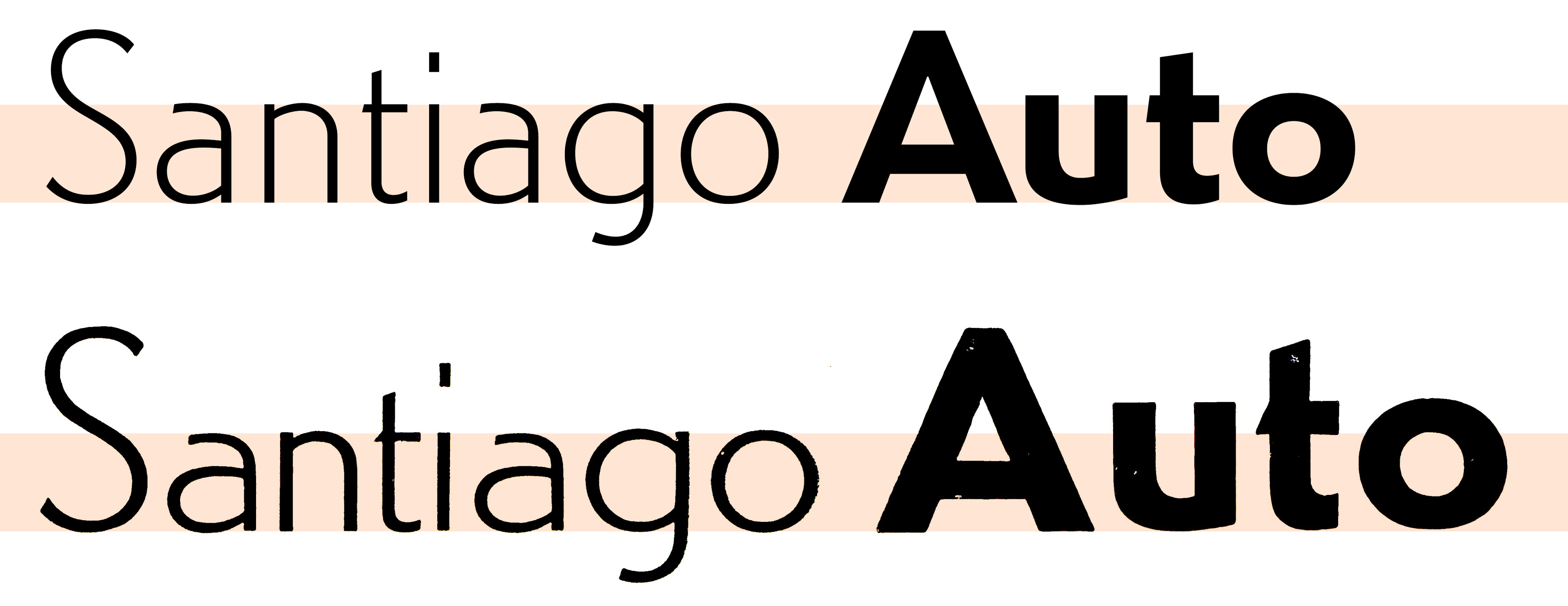
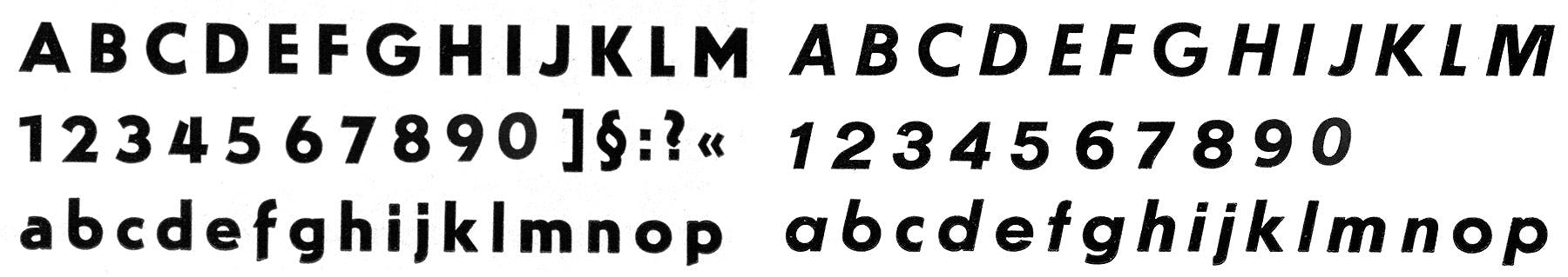
Despite its name, which was a slight nod to Bauhaus’ Universalschrift, its shapes were far from being universal. It was a quirky geometric sans, uneven and full of idiosyncratic details, such as the spurless ‘u’ and ‘b’; descending ‘f’, uneven text colour and odd proportions (for example, the very wide, circular ‘e’ and ‘b’). Still, it was such an omnipresent part of daily life that I began to consider the descending ‘f’ and spurless ‘u’ normal, and all other forms strange, and it is not surprising that Fedra Sans (2001) also sports a descending ‘f’, not a direct reference to Universal Grotesk, but a sign of unconscious influences from my childhood.
Awkward as it may be, it still holds a place in my heart, and I felt that a deft adaptation could be a useful addition to the modern repertoire, so I started to do some research, expecting that a font this ubiquitous must surely have been well documented. Surprisingly, however, very little is known about it. It was distributed by Grafotechna, a conglomerate Czechoslovak type foundry established in 1951, but the shapes of Universal point to much earlier origins. In Grafotechna’s catalogues there is no mention of the original designer’s name, nor the date of publication. The only information I could find about Universal Grotesk was in Jaspert, Berry & Johnson’s Encyclopaedia of Typefaces, which dates the design to 1922. That would make it the first geometric sans. Who designed it? When? Where? Why?
The Grafotechna type specimens in my library were of no help, so I asked the design historian Otakar Karlas, who is a walking encyclopaedia of Czech typography, but he had no definite information either. I checked with other older Czech type designers like František Štorm and Jan Solpera, all of whom obviously knew the typeface intimately, but had no idea about its origins. Karlas speculated that it might not have been a Czechoslovak design at all, but a German design that somehow ended up at Grafotechna, since it bears a marked similarity to Erbar-Grotesk, (Ludwig & Mayer type foundry, 1926), which also was used on street signs in Germany. An early printed specimen supports this claim, as the Czech diacritics are poorly constructed.
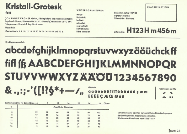
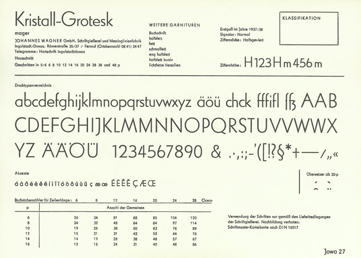
I decided to follow the German trail and emailed Indra Kupferschmid, who replied just minutes later. ‘This looks like Kristall-Grotesk by one of my favourite confusing foundries Wagner,’ she wrote, and in fact Universal Grotesk looks just like Kristall-Grotesk, with the exception of a few alternate glyphs.
According to Indra, ‘Universal Grotesk is based on matrices by Wagner & Schmidt, Leipzig, cast and sold by Norddeutsche Schriftgießerei, Berlin, and other type foundries such as J. John Söhne in Hamburg or C. E. Weber in Stuttgart.’ After 1945, the remains of Wagner & Schmidt, Leipzig, were merged into East Germany’s Typoart foundry. Czechoslovakia’s Grafotechna must have gotten the matrices from them at some point in the 1950s. After so many years, I finally had my answer!
In 2013, I asked Hrvoje Živčić to digitise scans of Universal Grotesk from the 1960s Gratotechna specimens. That, however, was only the beginning of the project. Typefaces of that era didn’t come in well planned families of fonts designed to work smoothly together, and Universal Grotesk was no exception. In Light, for example, the x-height is too small, increasing dramatically in darker weights, and the Italics seem to come from a different, uncredited design unrelated to the upright styles. The Condensed version is probably the most useful addition to the family, quite different from the Standard style of Universal Grotesk in the design of letters such as b, G and W, and with more refined details and optical corrections.
It was clear that Universal would require extensive adjustments, and after experimenting with the proportions, we decided to increase the x-height of the lighter cuts. And not only did I have to adjust the proportions of nearly all the individual letters, I also had to work to establish more systematic connections between all the styles.
As usual, I worked with Nikola Djurek in the final design stages, and together we also designed a Display version loosely based on the capitals-only version of Kristall-Grotesk (lichtfetter Versalien).

Neither Universal or Kristall-Grotesk had suitable Italic versions, so Uni Grotesk Italic is a completely new design based on the upright styles.
As ubiquitous as Universal Grotesk was, it disappeared, never making the transition from metal to digital type. Our new Uni Grotesk is a refinement of the typeface and well suited for contemporary use, with its particularly Central European flavour of early 20th century geometric sans. Uni Grotesk is a new typeface with a purpose and function, with geometric structure and elementary letterforms, and with flavourful details that lend this sans its unique character.

A note about the typeface name: Inspired by musical composition, where assigned Opus number indicates the chronological order of the composer's production, I also number my typefaces. Since 1995, I’ve been naming them alphabetically, so I have Eureka (1995), Fedra (2001), Greta (2007), History (2008), Irma (2009), Julien (2010), Karloff (2012), Lava (2013). The next one should logically start with a ‘M’. Just like some composers selectively number their pieces, leaving their early work, experiments, or unpublished compositions, I left out some experiment such as Bodytype (2011), and I am leaving out Uni Grotesk, which is not my original design.