Conceptual Type?
In November 2010 Peter Biľak was invited to give a talk at a one-day conference‘Conceptual Type – Type led by ideas’ in Copenhagen about the underlying ideas behind typefaces. This lecture questions the possibility of conceptual type and compares type to other disciplines.
To begin with, let’s be clear that conceptual type is an oxymoron. A typeface can’t really be conceptual, because it is dependent on its execution. Typeface design is a craft, so the process that transforms the pure idea into a functional font is a critical part of the discipline. Before the typeface is executed, it is not a typeface, it is simply an idea. A few years back I was part of the jury at an art school in Antwerp, where a student proposed a conceptual font. Instead of defining the shapes, he came with a set of written instructions, so the capital E was defined as ‘three evenly spaced horizontal lines crossing one vertical line’. It was fun and very clever, but technically it was merely a description (however witty) of the alphabet, not a font, which is based on the repetition of shapes.
Sol LeWitt’s famous quote ‘Banal ideas cannot be rescued by beautiful execution’ does not apply to type design. There are plenty of examples of nicely designed and successfully exploited typefaces based on banal models. Nowhere else is revivalism as popular as in type design, and recycled versions of proven models seem to form the core of most type libraries. For example, how many versions of Garamond or clones of Swiss neutral sans serif do we really need?
Let’s have a look what the term ‘conceptual’ means in other disciplines. We can skip music, architecture, illustration, ceramics or dance, which similarly to typography are also dependent on performance or execution. Obviously, there are some exceptions — John Cage's 4′33″, for example, or some projects of Rem Kolhaas or Peter Eisenman — but in essence all craft-based disciplines rely on the transformation of abstract ideas into material form. Should the idea remain in its semantic form, one has to rethink the whole frame of the discipline. Would you hire a ‘conceptual’ plumber to fix your sink?
Where the term ‘conceptual’ really prospers is in the domain of modern art. This term came into use in the late 1960s to describe a philosophy of art that rejected the traditional art object as a precious commodity. Instead, the typical work of conceptual art is generally semantic rather than illustrative, a self-referential, non-material meta-object, art of the mind rather than the senses. The work of Yves Klein, Robert Rauschenberg, Joseph Kosuth, Sol LeWitt or the group Art & Language challenged viewers’ expectations concerning the limits of what can be considered art. It even tried to be an anti-art.
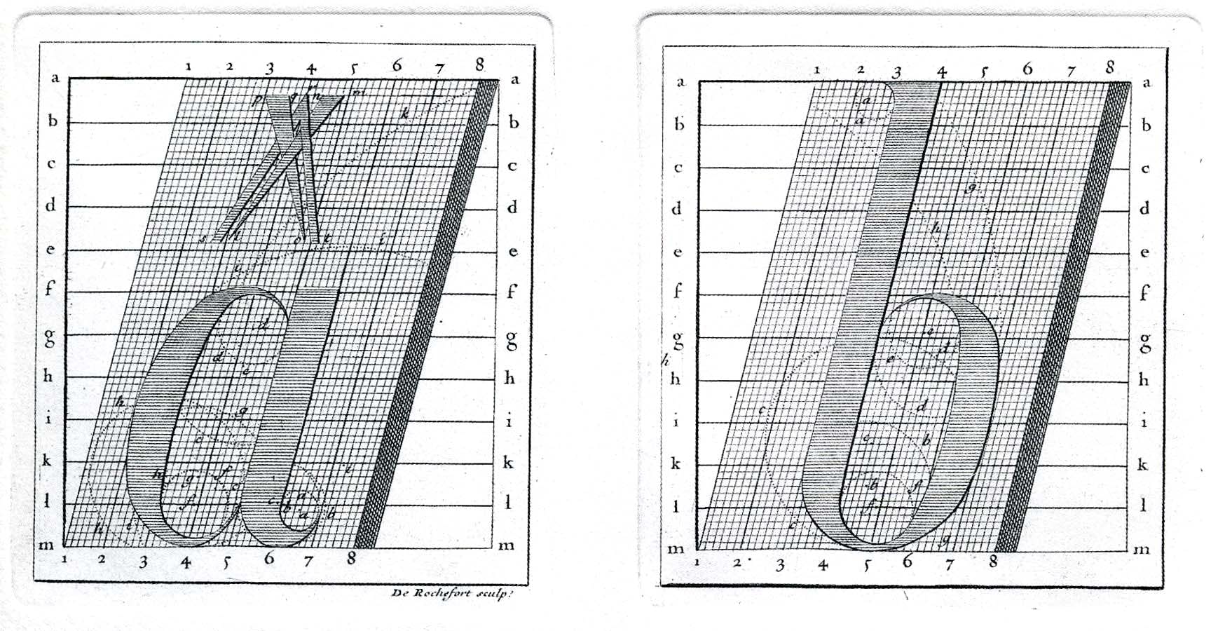
Type design, by contrast, was originally dependent on the expertise of the maker: the final typeface was only as good as the skill of the punch-cutter. The first examples of type design separate from the craft of manufacturing come from the Enlightenment period. Romain du Roi, an exclusive typeface commissioned by the French King Louis XIV, departed from the traditions of calligraphy and worked with analytical and mathematical principles of drawing type. This then, if you like, could be considered the first ‘conceptual’ typeface. The committee of the Academy of Sciences proposed a grid of 48×48 units, inventing the notion of vector outlines by defining characters in terms of geometry rather than physical mass. The committee also invented the notion of font metrics and suggested the idea of bitmap fonts. Some 50 years separated the conception of the typeface and the execution of a complete set of punches for it.
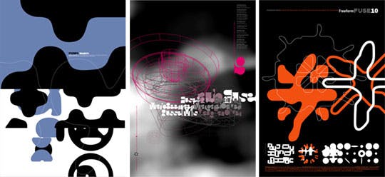
More recently, a type design project that approached the definition of conceptual art was FUSE, launched by Neville Brody and Jon Wozencroft in the early 1990’s. FUSE consisted of a set of four original typefaces with corresponding posters, and an accompanying essay. Each issue had a theme such as religion, exuberance, (dis)information, virtual reality, etc., but the designers had complete freedom as to how they interpreted that theme. In the first issue, Wozencroft described FUSE as ‘a new sensibility in visual expression, one grounded in ideas, not just image.’ Carrying forward the ideals of the avant-garde, Brody and Wozencroft wrote with an impassioned rhetoric as if they saw themselves as fighting the repressive typographic establishment by making fonts that rejected functionality as the reason to design type. The fonts ranged from purely formal exercises to completely abstract shapes independent from Latin construction, purported ‘new forms of writing’. FUSE typefaces were curiously diverse, making it hard to discern any criteria for selection.
And this is precisely the problem with the use of term ‘conceptual’: very often it is simply synonymous with ‘idea’ or ‘intention’. Since every act of creation arguably stems from intent, regardless of the function of the product, is every artwork, object or typeface therefore conceptual? Mel Bochner, American conceptual artist, disliked the label ‘conceptual’, because the word ‘concept’ is not always defined entirely clearly, and is therefore in danger of being confused with the author’s intention.
I believe that the topic of this conference is to look at the underlying ideas of typography, the intentions of authors, rather than to claim that type itself is conceptual. That makes the discussion less problematic, but still not easy, since there is probably no other discipline where the difference between the intention of the author and intention of the user can be so great. For example, the original intention behind Fedra Sans was for it to be the corporate type of the insurance company that commissioned it, and it was designed precisely according to the stipulations of the company’s brief. The original client, however, was acquired by a bigger fish, and development of the corporate font came to an abrupt halt. That was a disappointment at first, but a blessing in disguise in the longer term, as I could expand the family and offer it to the public myself. In the years that Fedra Sans has been available for licensing it has been used in all kinds of applications from building facades to children books, to Bible typesetting, to the identity of a terrorist organisation, but as far as I know, not a single insurance company.
Children books, Bibles, terrorists… it becomes quite obvious that the type designer has no actual say in how the typeface is actually used. While the concept of the typeface might be very clever and original, what happens when the typeface is never used the way it was intended? Does it make the typeface less inventive? How about a font which never gets to be used? Can it still be called a font, or is usage at the core of the definition of a font?
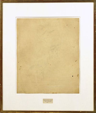
So what would be a truly conceptual typeface? In 1953, Robert Rauschenberg’s Erased de Kooning Drawing demonstrated that destruction could also be conceptual art. According to Rauschenberg’s example, I narrowly missed a chance to be the co-creator of a similarly creative opus in 2001 when a thief broke into our studio and stole my computer and all the backup disks for Fedra Sans, then in the final phases of completion. Had the thief claimed responsibility, he could have become the designer of a rare example of conceptual type — by destroying months of work in mere minutes.
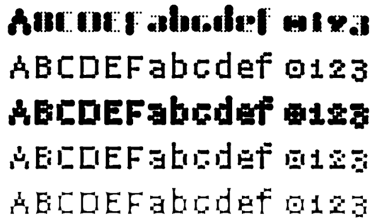
On the other hand, some principles of conceptual art transfer well to type design. Sol LeWitt’s statement ‘The idea becomes the machine that makes the art’ can be neatly illustrated by Erik van Blokland and Just van Rossum, collectively known also as Letterror. Instead of designing fonts, they write code that makes fonts. Letterror examined the process of creation, suggesting that the engineers who make the tools we use have a greater impact on aesthetic trends than most designers do. It makes sense then for designers themselves to reclaim this field by designing their own creative tools. One Letterror project is Bitfonts, computer code which takes the structure of a bitmap font and interprets it in multiple ways. By deciding to design the process rather than controlling the end result, Letterror embraced the possibilities of unexpected results. It is the machine that makes the type.
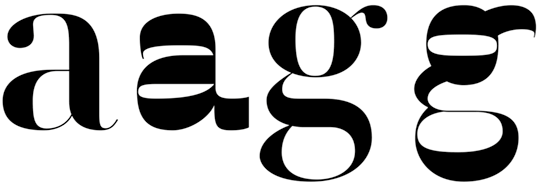
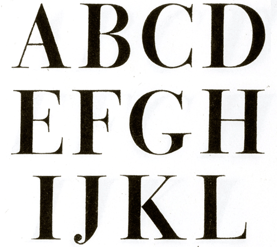
I’ll conclude with one of my current projects, for which the background idea is more interesting than the resulting forms. For centuries, art has been defined as something that gives rise to an aesthetic experience. Capturing beauty and avoiding ugliness were considered to be the prime responsibilities of the traditional artist. In this project (which since then had been published) I have tried to identify the most beautiful examples of typography known to mankind. I settled on a series of serif typefaces designed by Giambattista Bodoni in the late 18th century.
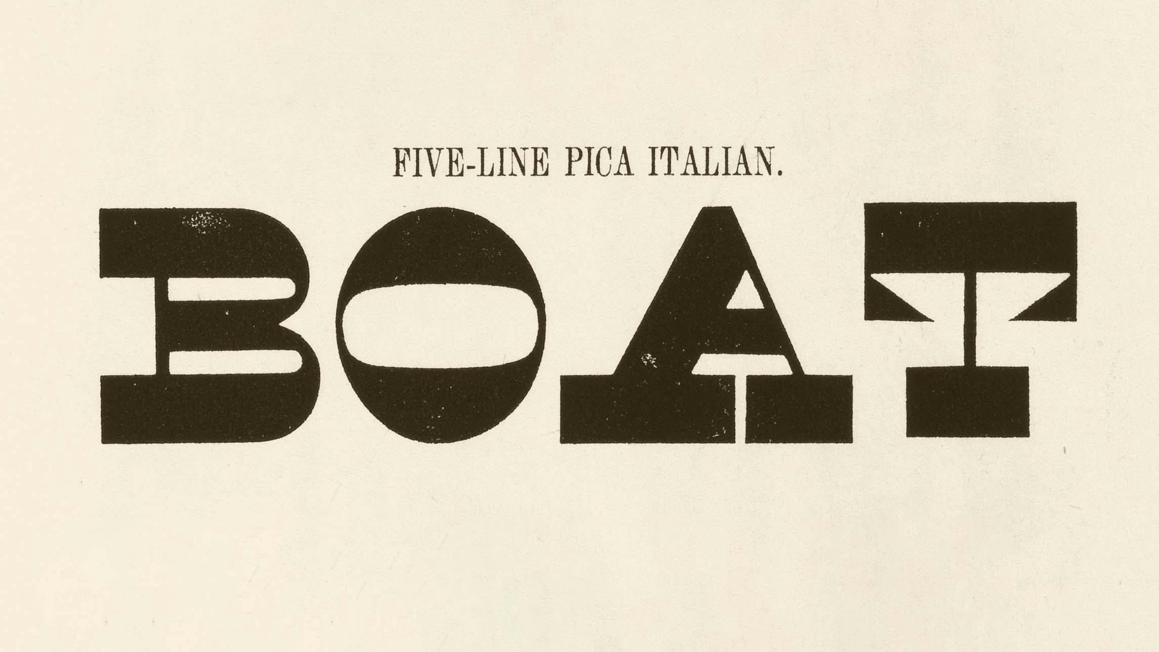
In the second step, I tried to identify the ugliest examples of type that we know. That was a bit more difficult, but finally the prize went to eccentric ‘Italian’ from the middle of the Industrial Revolution. This reversed-contrast typeface was designed to deliberately attract readers’ attention by defying their expectations. Strokes that were thick in classical models were thin, and strokes that were thin became thick — a dirty trick to make freakish letters that stand out in the increasingly saturated world of commercial messages.
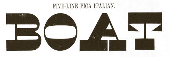
This project (later released under the name Karloff) is not interesting because of the forms, which have been explored before, but because it creates a tight link between the two extremes, between the beauty and the ugliness. Time will tell if this project finds some suitable application, or whether it remains purely an aesthetic exercise, a ‘conceptual’ type. I wrote a separate article about this relationship of beauty and ugliness.
