
Interview with René Knip
I would like to start this interview by asking you: What made you choose letterforms as a medium?
It has never been a real decision. The real answer could be that I am the youngest of three children. When my brothers were learning the alphabet, I was copying them, as the youngest. They learned to write simple words, and they knew the sounds of those words. I did not know all of that so well. I was making all these forms and I was always intrigued by the beauty or excitement of a letterform as a sign, as a drawing. Later on, I saw there were so many possibilities for how you could express a word by being vulnerable and beautiful through calligraphy, and I started to learn how you could express human emotion by lettering. All people who learn how to read and write are intrigued and have a special relationship with lettering — look at children. They adore letters when they are young and start to write. Later on they lose their handwriting and start e-mailing, and they have left this wonderful land. All humans are very sensitive to lettering, in a way. They can’t do it, but they can enjoy it, more than they think.
I saw so much in lettering that the whole idea for me is to create a world of images; I do a lot of lettering which is very illustrative. I got out of the world of book typography because it has so many rules for readability; the text needs to be more or less transparent. I use letters like a photographer does a camera: I use them to illustrate emotions.
You are inspired by Art Deco and 1920s–1960s type. What is it that interests you about this period?
It all began when I moved to Amsterdam after my studies at St. Joost. Amsterdam is full of the ‘Amsterdam School’, a stylistic period of letterforms and architecture. For Amsterdam, the period of wartime in the 1880s was the first period after the 17th century where there was some affluence. It was also the time when all architects were still taught ‘graphics’ and were doing their own lettering. You had the Wiener Werkstätte, Art Nouveau, Art Deco, Jugendstil... during this time people where very busy with the Gestalt of lettering. In designing letters they communicated the same way as they did with furniture or a whole building. That is what interests me. I am not interested in the old days themselves or due to a sentimental nostalgia; I don’t care much about Art Deco. However, I am interested in the past for two reasons: First, letters integrated with other disciplines like architecture. The other reason is that you do not always require a Frutiger or Helvetica to express the word ‘restaurant’ on a building: after a while, everybody agreed that there was a restaurant. Then you can play with the idea. In those earlier days of lettering, the idea of what an F or G could be was greatly expanded. That is not just something coming out of Art Deco. If you look at the 16th or 17th centuries, you’ll also find many examples. When you walk around the streets of Copenhagen or Amsterdam, most of the still-present stone lettering is from a previous period: it was executed better, it was integrated with the architecture — it is in the building itself — and as a result, it doesn’t go away so easily. That’s why you see so many old examples of façade lettering. Art Deco is not a specifically important period for me; I just started walking around the streets of Amsterdam and was inspired by it.
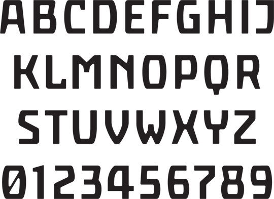
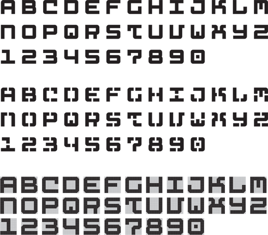
IJburg typeface, designed for the street signage of Amsterdam (unrealised)
What do you believe to be a ‘modern’ style?
I had many discussions when I was a student at art college: about modern times and concepts, form and content, how you had to behave. At the end I thought, as the stubborn guy I am, that I wanted to become an artist. I was not so interested in learning how to do conceptual, fashionable work. I was walking and cycling, then I started to photograph and draw, and I started to use what I saw on the streets of Amsterdam. I noticed that if you make an E in a specific way, people will say ‘oh, this is quite normal’. If I make it differently, they will say ‘oh, this is quite modern’. If I make it in a third way, you may say ‘oh, it’s old-fashioned’. There are a lot of prejudices which state: this is normal, this is modern, and this is old-fashioned. But why should you decide something is old-fashioned? Only because at certain periods they started to play with it and made these kinds of adjustments, but for us a capital E must be expressed by using three horizontal stripes and one vertical. Why shouldn’t we give ourselves the freedom as designers to design what we want? I started to consider the whole idea with a new freedom.
Can you tell me about your education and the role of your teacher Chris Brand?
I was 18 and didn’t know what to do. I went to France for a year, returned and began law studies at university. After one year of law I dropped out. I always wanted to become an actor or a singer. I also knew that I always enjoyed drawing and lettering, but these were normal activities in my family. I never considered myself as being specifically ‘creative’. When I was studying law it went well enough, but I missed having a real purpose, a real goal in my life. I decided to become an artist. I wanted to become a painter, so I applied to the Rietveld Academy, but they didn’t take me because of lack of talent. Then I went to the St. Joost academy in Breda, where I had the opportunity of working on the entrance tests for a few days — they accepted me. In school I wanted to become a graphic artist and learn to make good prints, paintings: become the traditional artist.
I met Chris Brand who was a type designer and calligrapher. I am not totally fond of his work, but I liked the man very much as a teacher and as a human being. He had a very tough sense of humour and was a straightforward but elegant man. Most students had difficulties with him — a lot of younger students did not want to be confronted by this strong man. In the first year calligraphy was a compulsory course. Chris Brand was 65 then, so it was his last year. That was a problem for him as he liked to teach, and after 40 years he didn’t feel like an old man. He would walk through the classroom and lightly touch the shoulders of students at work. He told me later on that he was feeling their muscles: he wanted to see how they were writing. You have to write from your neck and shoulder when you write a small letter. When he could not feel movement in these parts he knew that you weren’t writing with the whole body. He was checking for talent, feeling the muscles.
One day he asked me ‘Can you please just draw the capitals without looking in books?’. He wanted to see what my hand could do if I had to draw a classical form. He was kind of surprised. I went to his home and began to study. He said, ‘well, its better for you to study graphic design and forget about fine arts, because there is a designer, a calligrapher in you. It won’t be so good if you become a painter and then return to your passion for calligraphy and lettering, without ever having learned them properly’. And he was right!
[signup]He taught me discipline. He said ‘you are lazy, you are too late, you didn’t work; I am not going to watch this’. He once said, ‘is this all you did last week? Then I am not going to spend time on you’. He said at the end of a period, ‘René, you have a certain talent, you have a certain energy; you cannot become lazy. You have to start a new life, forget about school, you have to train yourself, and learn discipline. Otherwise you will lose yourself. With your talent you need to become a monk’. So he taught me how to work really hard. He gave me the discipline which I never had myself, because I was a good student in school: I could catch up easily, and that was also a problem.
Your type designs are clearly not calligraphic or inspired by writing. What kind of rules and principles do you set up for your designs?
Most of my type designs are very much architectural, and there is a simple reason for this. I started to enjoy lettering because I began working with Evelyne Merkx, the architect. She likes graphics, and she invited me to design the lettering for many of her projects. If you start to work with text in an architectural environment, most of the time you have to deal with angled surfaces, the specific size of a window, and so on. Most of the lettering work which originates in handwriting has a foundation in printed matter, from manuscripts, books and their readability. The logic of the letterform being derived from the pen as Gerrit Noordzij says, that’s fine, but not for what I wanted to do. I started to become interested in monospaced lettering. I decided early on, that for a lot of type designs I was not looking at the pen at all.
Can you tell me about your sketching process? Do you mostly sketch by hand or directly on the computer?
By hand: I start with the pencil. Then I select a few directions and start doing various exercises. For example: do I want to have it brighter, thicker, and smaller? I choose a simple word and hang it on the wall, and possibly try to have it a dance bit more, or make it slightly more elegant, or more opened up. Some of my types are done in one morning, others take weeks — but I’ll never spend five months on a design. I think my longest project has been about one month. Often I’m asked on Monday, and Friday is the launch. The process ideally takes me one day, one morning, not more. So you make quick decisions, and the clients say, ‘OK, that’s it’. I do some drawings then I start playing — this is my real profession. For me this is graphic design, and for that reason I need to make fonts.
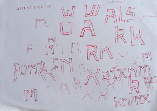
Sketch for Arktype typefaces
Are you influenced by client suggestions, or do you make all the design decisions?
I listen quite carefully to what clients have to say, then I throw everything away and start to think for myself. Usually I come up with an approach which is utterly different from what they asked me, and I try to convince them. They sometimes see me as completely arrogant and not worth telling anything to. However, I must say that most of the clients realize that I also react to them. I try to respond to their direction, solve the problem, take them seriously, but not by trying to give them wine or please them — instead I am interested in what they could do with their organization or approach. I don’t mind at all if I have to argue with them. I act like I’m an independent artist in that sense. I work alone, and only collaborate with freelancers. If I lose a job because the client thinks ‘I cannot work with that guy, because I want the letter green and he wants it orange’, then we are just not the right match. I say, ‘listen, this is not going to work’. This doesn’t happen regularly. In 17 years I have never had an assignment which completely broke down.
You like to illustrate a functionality in work, such as in Laundry Sans. What do you think this adds to the design?
What I like is that part of the letters bear traces of their function of being hung — I use the idea ‘I hang!’. It is like the statement of the sign itself. So I make it a hanging sign. If you want to have normal, readable text, you try to design the most normal letters. It’s the Tschichold skeleton: you can easily hang them on a wire. But what happens if the whole idea of hanging, like clothing on a line, starts to become more important than the letter itself?
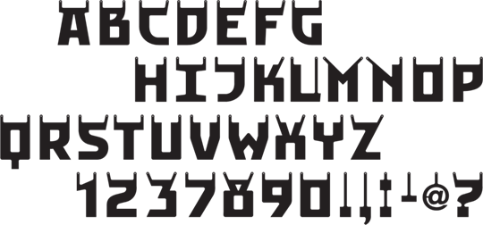
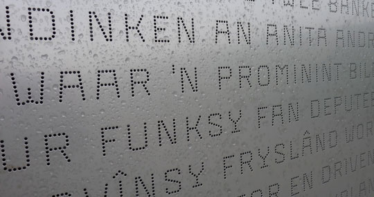
Hanging alphabet for the Stedelijk Museum, Laundry Sans
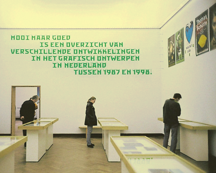
Laundry Sans used in the exhibition Mooi Maar Goed, 1999
Can you say a bit about the Arktype project?
I am working on this project with Janno Hahn. Arktype will be launched next year, hopefully in September. It’s a book, an online store, together with 25 smaller projects like a wooden alphabet, a perforated alphabet, and so on.
[social]In all, it is a large concept which will be sold internationally, primarily for environmental projects. For example, architects and graphic designers have to build a big school somewhere. If I was in such a venture, it might be suggested that project number 16 would be perfect for me, and I should design big numbers. In a design sense, I would be free to do it how I wanted, so I’d buy the project. I’d pay some 500 Euros, and the Arktype book would explain how I could use it, and how its creators used it. We expand the idea, the client buys it, downloads it and gets the whole manual. This is the first type collection not about printed matter, but for environmental and architectural use. I don’t think anything in this sense has ever been published before.
Selection of the Arktype alphabet collection
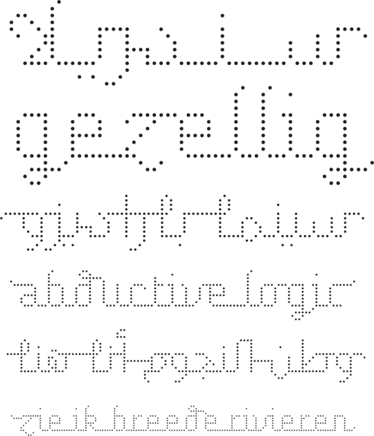
Perfoline, a dot matrix typeface, where distances between the dots are always different to optically balance the pattern of dots
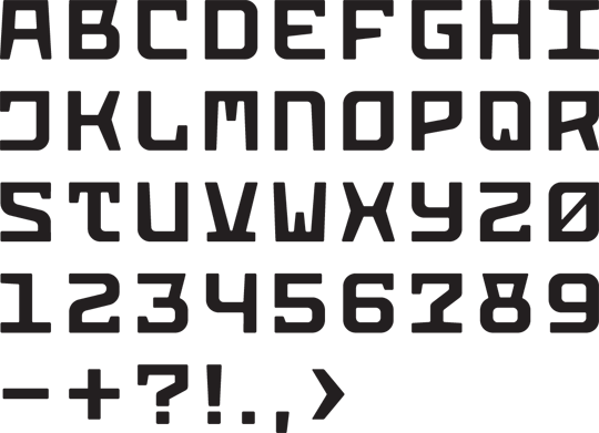
Typeface 'Concrete', designed for the steel and concrete lighthouse
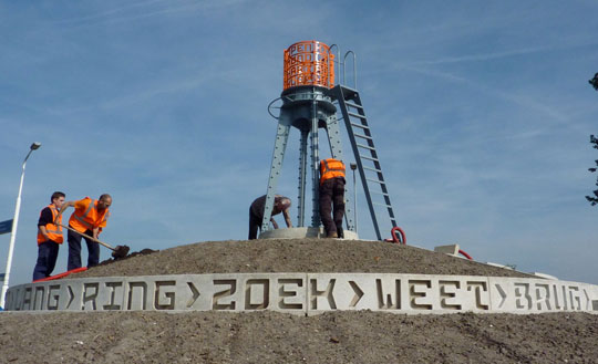
Lighthouse structure at the Weteringbrug roundabout, 2011
You are involved with Arabic typography. What interests you about Arabic characters?
The most interesting thing about Arabic characters is that I cannot read them, so I am free in my way of seeing. Another very interesting thing about Arabic is the way everything is connected. I like this idea of connecting things. Also interesting is that Arabic arrives from a completely special three-dimensional way of writing. The real old Arabic sometimes goes in all directions. Later on they started to get back to linear writing, because of our western scripts, but in the beginning they could draw freely. The letters flowed like a bird in the sky, not like an airplane, (as they are now). They went everywhere. That is very interesting to me.
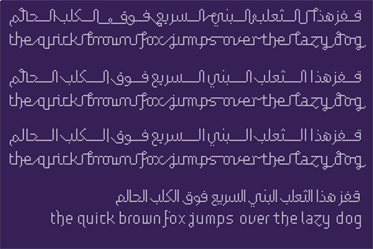
Connected Latin and Arabic script, designed for the Typographic Matchmaking project, 2010
How do you translate your style into Arabic? Will you combine Art Deco with Arabic?
I won’t be combining Arabic and Art Deco; we are on another track. Khajag Apelian and I have a simple matrix, which we created together. He solves the Arabic and I solve the Latin. We start with a typical sentence like ‘The quick brown fox jumps over the lake’. He says exactly the same thing, but with Arabic letters. The idea of this is interesting. The reason for our Dubai project is matchmaking — to unite two languages together in certain applications. For instance, an art fair or a museum showing the work of Arabic-speaking artists in a Dutch speaking venue. You need both languages. I have a skeleton of these dots and I can easily say ‘I want to give it a skin’. Or I can say, ‘no, I want the dots to be slightly random, but the same letter’.
Nuqat, a dot matrix typeface for Latin and Arabic script, 2010
We give the letters a structure of connected, written or more architectural lines. In both languages we give them the same length, and then we start to dress them up differently. So the whole project ultimately allows the users to choose what kind of letters they want: thick, thin, or skinny... It’s like coming up with a meal off a menu. I want a bit of Chinese, I want no dessert, I want this and that... and then your type comes out. This is a project which comes from the idea of providing a modular system of Arabic and western type.