
Seria’s motives: How Martin Majoor developed his literary typeface Seria
In a 1992 survey of Dutch type design, Robin Kinross observed that Martin Majoor’s first published typeface was ‘beginning to be used quite widely.’ Scala had at that time only been available for a year, and though Kinross saw the type’s popularity increasing, he could hardly have predicted how prevalent it would soon become. The way Scala captivated some designers during that period was recently illustrated when an American designer made reference in a magazine interview to his ‘Scala Years.’ Toward the end of the last decade, writing of Scala’s ‘increasing ubiquity,’ Emily King noticed that the type’s ‘correspondence with the cultural mood of the mid-1990s has been remarkable.’ It now looks as if Scala’s popularity was not relegated to the 1990s, as Majoor’s large family of types is still ever-present.
The versatility Scala showed as it became pervasive may have obscured its origins as a type devised for a specific purpose. Majoor began the typeface while working as a designer at Utrecht’s Vredenburg concert hall in the late 1980s.
Faced with a poor selection of early PostScript typefaces, out of necessity he began work on a font that would have the features he required – like non-lining figures and small capitals – while also having forms suited to the low resolution laser printers of the time. When FontShop published Majoor’s new design as Scala in 1991 (the sans followed in 1993), a typeface meant to solve a specific problem quickly proved itself effective in a much wider range of applications. Though it is hard to know all of the factors that contributed to Scala’s success, several writers have offered theories. King, for one, has speculated that its quotation of classical forms, along with ‘its ability to speak broadly of typographic tradition while shying away from commitment to any single historic model,’ may explain its popularity.
[signup]In light of the reaction Scala received, it is significant that Majoor waited nearly a decade to publish another typeface – apparently sticking to his belief that new type designs should be undertaken with a clear motivation. (In the intervening years, Majoor did work on a few commissioned types, most notably for the Dutch telephone company.) The impetus for Seria, Majoor’s second and most recent family of retail typefaces, grew out of his ‘dissatisfaction with the use of Scala in a more literary way,’ as he describes it. Though nearly every sort of printed matter has been composed in Scala – from newspapers and ticket stubs to exhibition catalogues and letterpress editions – Majoor became convinced that the type's proportions made it wrong for certain kinds of typography. After rejecting a superficial solution of lengthening Scala’s ascenders and descenders, Majoor decided it would make sense to create a new face that would address the typographic modes for which he believed Scala was inadequate. In 1996 he began the first rough sketches for the type that would develop into Seria.


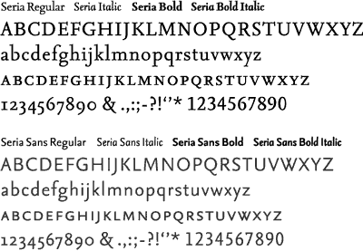
Majoor’s initial instinct to make a face with long ascenders and descenders was preserved in Seria, whose generous vertical proportions are one of its dominant features. Writing about Seria, Majoor has compared the type’s proportions to two 20th century designs in the classical book typeface tradition: Bruce Rogers’s Centaur and Bram de Does’s Trinité no. 3. Many of Jan van Krimpen’s types, most of which are similarly well proportioned, might also be added to this list of Seria’s predecessors. Majoor has in fact had a long-standing interest in the austere Dutch typographer’s work, and it stands to reason that Van Krimpen’s influence could be pertinent to the design of Seria. This connection can most directly be made in Seria’s italic, which echoes Van Krimpen’s Romanée Italic of 1949; designed 20 years after its roman counterpart, Van Krimpen’s italic was remarkable for its reduced angle of inclination that resulted in a slope of only four degrees.
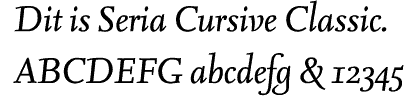
In Seria Italic Majoor has taken this same unusual approach, though his upright italic stemmed from a functional need, and was not meant as an homage to Van Krimpen. As Majoor explains it, in the mid-1990s a French designer had planned to set a book in Scala, but because of the complexity of the text, had the rare need for two distinct but related italics. The designer asked Majoor if a second Scala Italic could be drawn with a more extreme slope. Seeing that it would not be feasible to redraw the existing face, Majoor chose to implement the concept of two related italics – one nearly upright and one more normally inclined – in the fledgling Seria family. Seria Italic was then drawn upright in the Romanée fashion while Seria Cursive, which has not yet been published, is a more traditionally sloped letter. One of the most inventive aspects of Majoor’s upright italic are its capitals. Where Van Krimpen had intended roman capitals to be used with Romanée Italic, Majoor has drawn hybrid capitals that stand-up straight while still suggesting a cursive rhythm in their details. By equipping Seria with dual italics, Majoor has provided a potentially powerful tool for typographic articulation, though using the faces in tandem will be a test of ingenuity.
Majoor’s interest in making related typefaces that can be combined intelligently can also be seen in the design of his sans serifs. Gratified by designers’ effective use of Scala together with its Sans, Majoor decided that an unserifed counterpart would also make sense for Seria. In Scala Majoor had approached the design of the related sans serif by deriving its underlying structure from that of the serif typeface. Though this was not unprecedented, Majoor’s execution had a deliberate rationality that differed from previous attempts at relating sans to serif. In Seria he has followed the same successful approach, drawing the sans serif version of the type in accordance with the seriffed original’s proportions and structural characteristics. The result could be described as Scala Sans’s more bookish cousin.
Whether Majoor’s second family of retail typefaces will be as widely used as his first, or whether Seria will find more specialized applications, remains to be seen. Just as it would have been difficult to foresee the variety of ways that Scala has been used, it is hard to predict what will happen with Seria. Majoor readily accepts that he cannot anticipate where his types appear, and though his work may be disposed to the needs of the specialist, he is hardly prescriptive about his types. He encourages people to use them ‘however they want.’ With this same sort of pragmatism, Majoor is currently preparing a second iteration of Seria that will have more economical vertical proportions to increase the type’s versatility.