
Custom Typography Services for Brands
Besides retail fonts, Typotheque provides tailor-made custom font solutions for clients of all sizes, enhancing brands, supporting visual identities, providing language localisations to create distictive brand assets.
Typotheque has created many entirely new exclusive bespoke fonts to provide full control over the typography. Sometimes we also modify our existing retail fonts to create a highly efficient and cost-effective type solution to capture the unique voice of a brand, refine logos, or offer custom licensing arrangements. See case studies below, or contact us to request our portfolio of the latest corporate type projects.
- Custom Fonts

Bespoke type solutions to enhance the identity of your organisation.
- Font Modification

An economic solution to custom type — your changes to our retail fonts.
- Character Set Extension

Support for additional languages, new characters, symbols and logos.
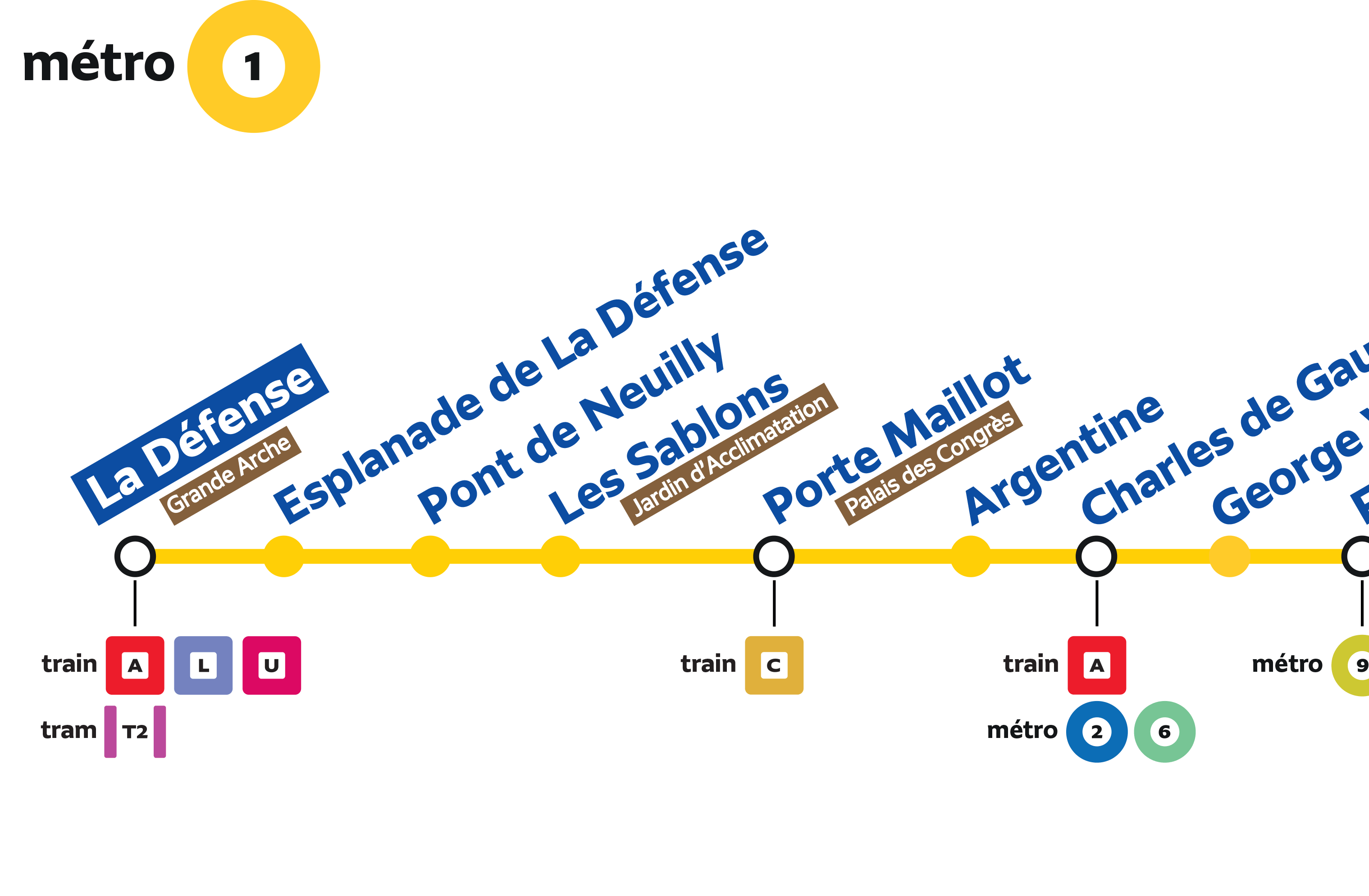
New Paris transportation system
Commissioned by Intégral Ruedi Baur in Paris, Typotheque has been working on the new information system of the Paris public transport network, designing a new typeface system named Grand Paris Express to create a coherent visual language for the 56 new stations. A particular challenge has been the fact that the stations are still being built, and the implementation won’t be completed until the 2030s. This is a work in progress in collaboration with Société du Grand Paris, Attoma, and Intégral Ruedi Baur.
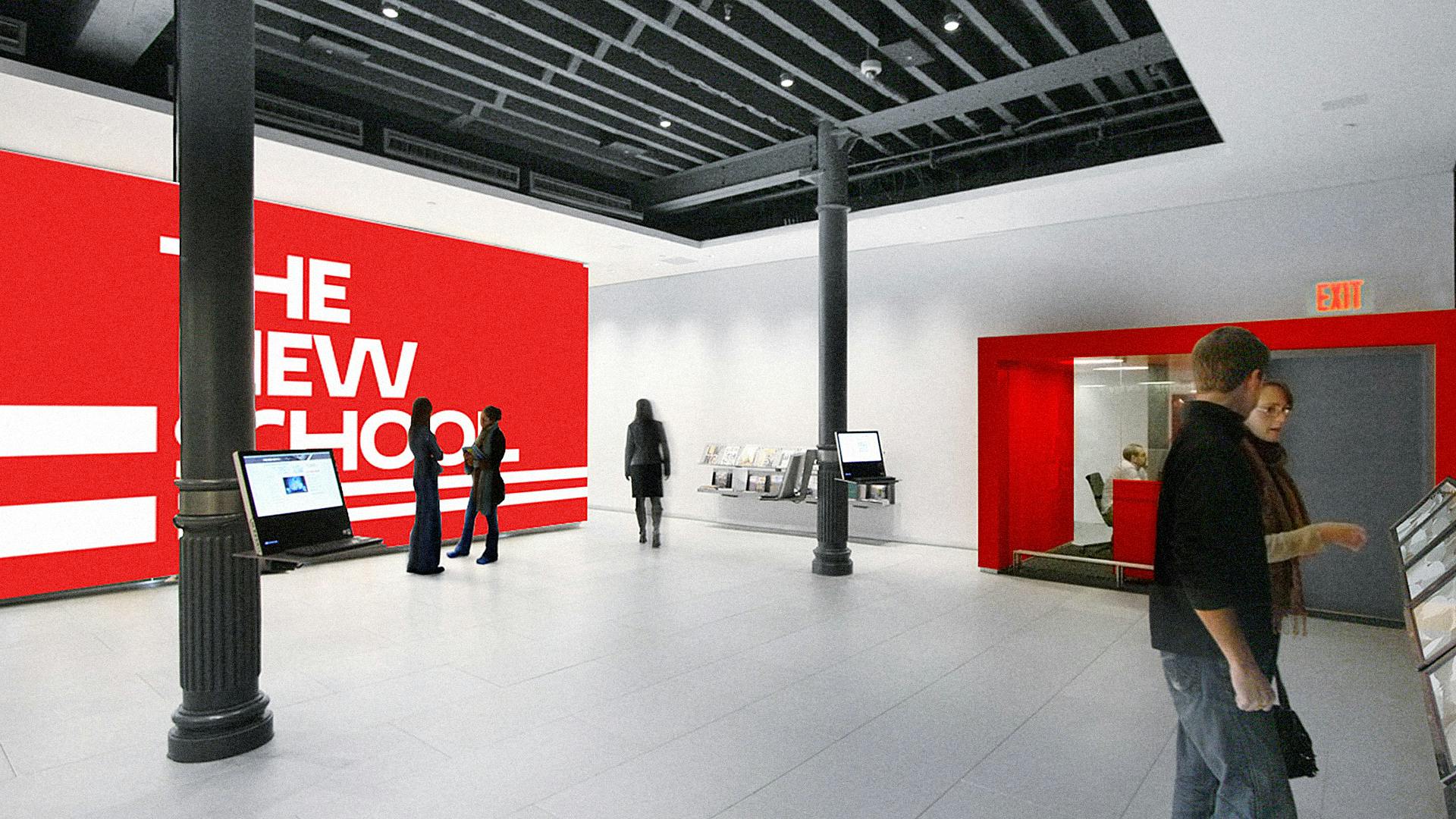
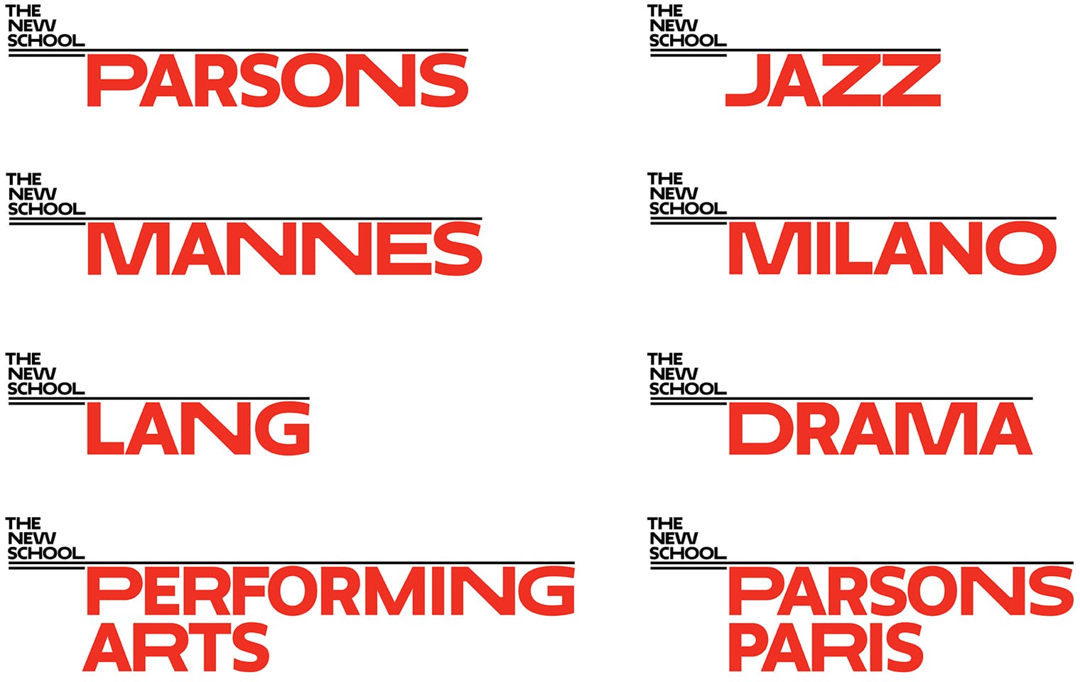
Neue
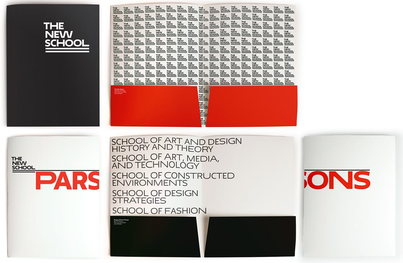
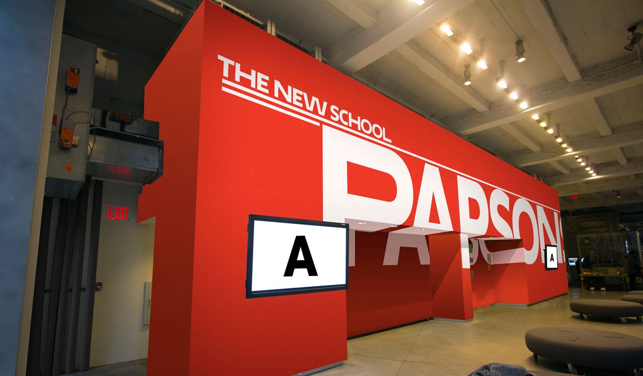
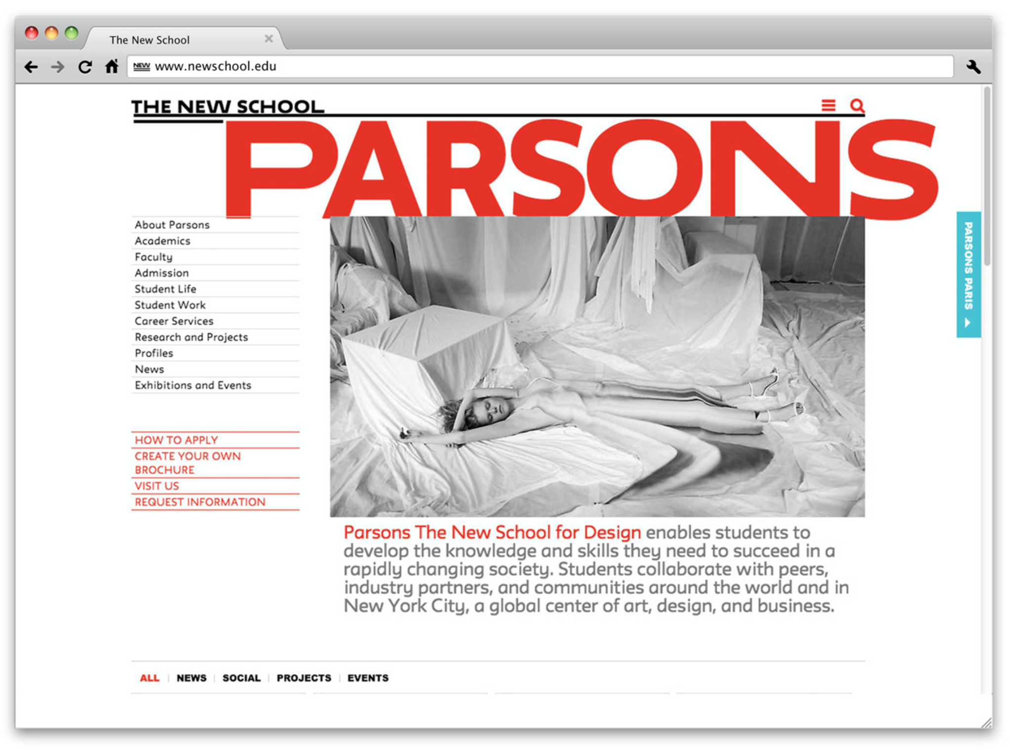
Pentagram’s Paula Scher has designed a new identity for The New School, progressive university in New York, commissioning Typotheque to create bespoke typeface called Neue. The typeface is based on Irma and combined regular, extended and very extended widths of the same font controlled by a pseudo-random algorithm written by Karsten Luecke.
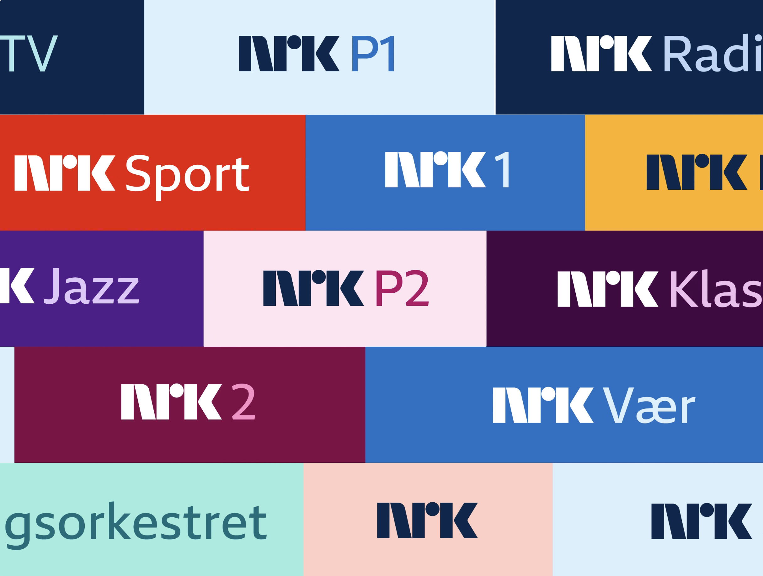
Custom fonts for largest media organisation in Norway
Typotheque has designed a set of new fonts for the largest public broadcaster in Norway, as part of its brand refresh. The fonts respond to the client’s needs, creating a tool to strengthen its identity. The variable fonts that we created explore motion, dynamic displacement of elements, and stretching of the visual elements. Read more about the design process.
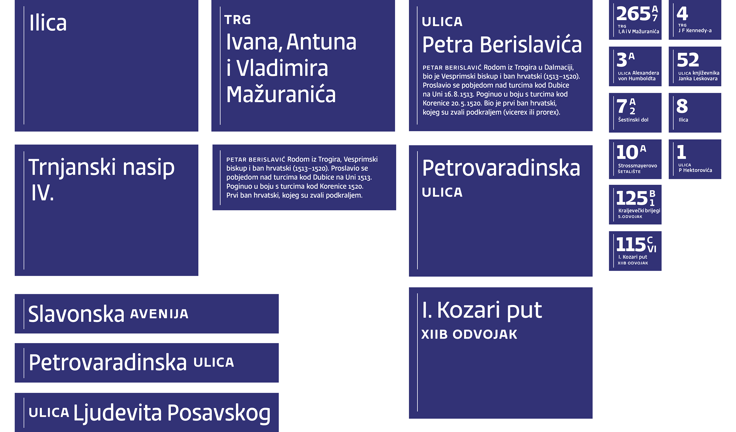
Zagreb street signs
Typotheque partner Nikola Djurek designed an exclusive typeface and a special set of numerals for the street signs of Zagreb, the capital of Croatia. The typeface retains subtle references to Croatian art nouveau architecture, and was tested for legibility at a distance. Djurek collaborated with Damir Bralić on the street sign design, which abandons the central axis in favour of left alignment and reduces the traditional border to a simple line on the side.
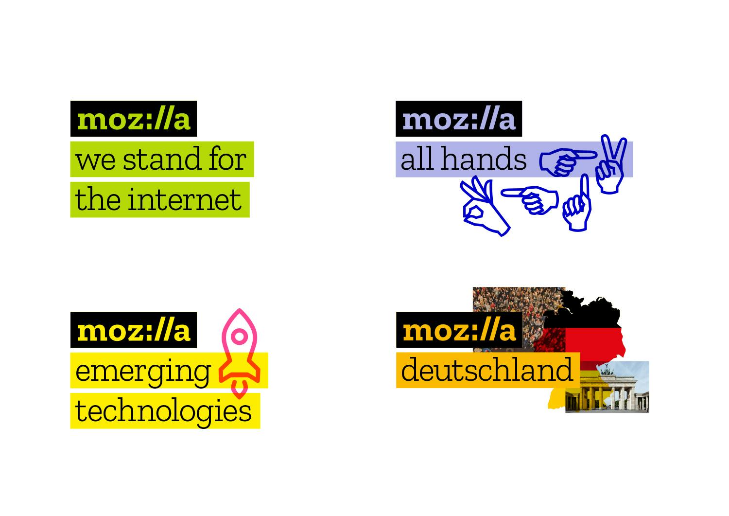
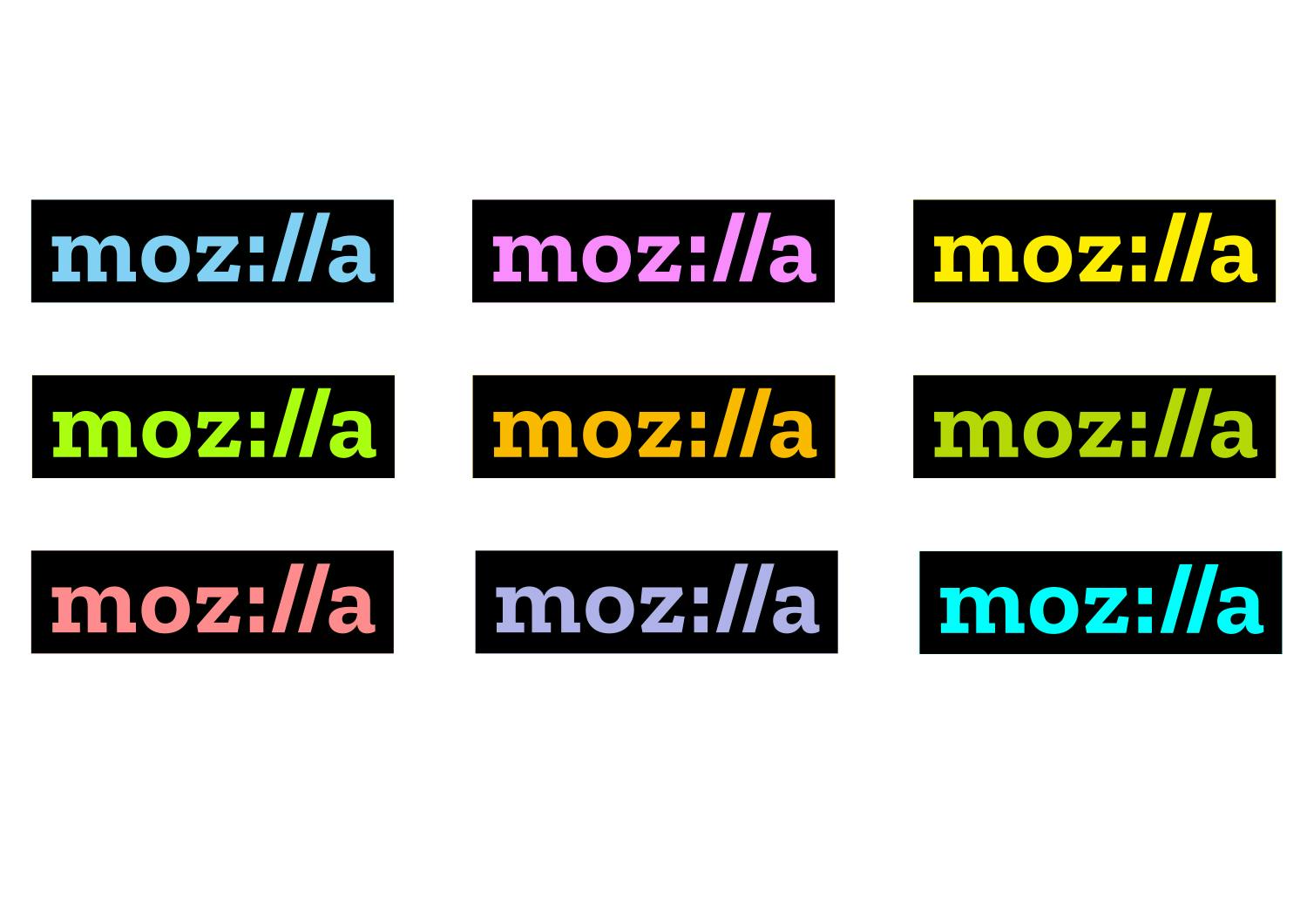
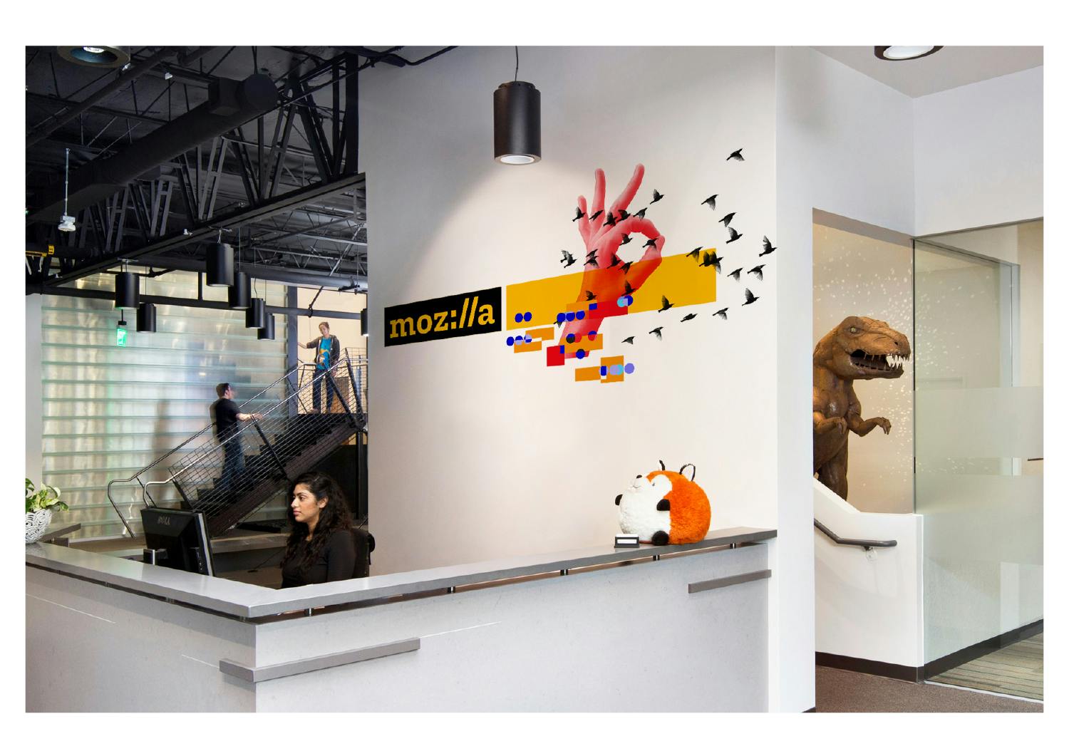
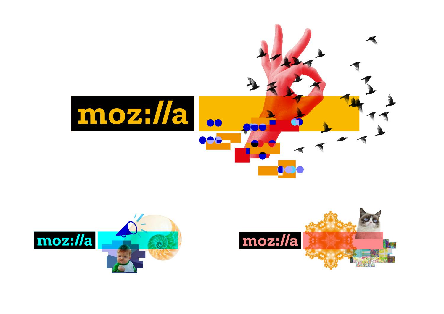
Mozilla
Typotheque was approached by Mozilla to define the typography of the new wordmark. We were thrilled to work on this project, as Firefox pioneered typography on the web, by being the first browser to support WOFF webfont format, which allowed the boom of webfonts. A few months later, in October 2009, Typotheque became the first foundry to launch a webfont service, and license its entire collection for both print and web. The project was art-directed by Johnson Banks, the London-based brand identity agency. Besides designing the new word mark, we designed also a complementary typeface Zilla that matches the personality of the new logo.
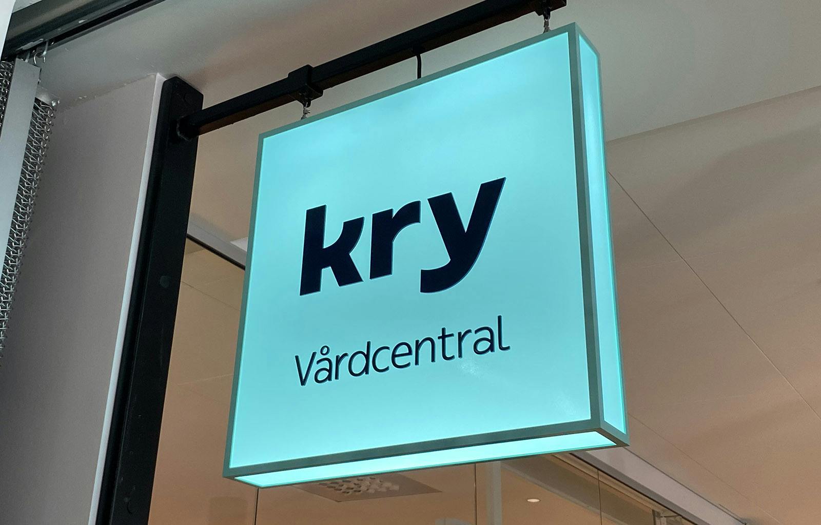
Bespoke typeface for healthcare
In collaboration with the Swedish design agency Identity Works, we designed a bespoke typeface for Kry, a fastest growing European healthcare provider. Named You Sans, the typeface is aiming to be human and inclusive and works across many languages and writing scripts.
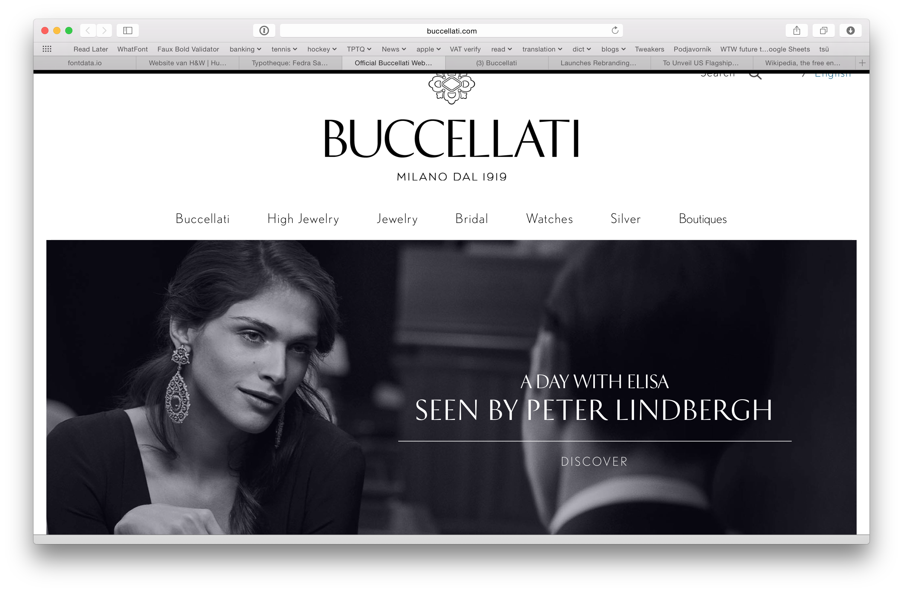
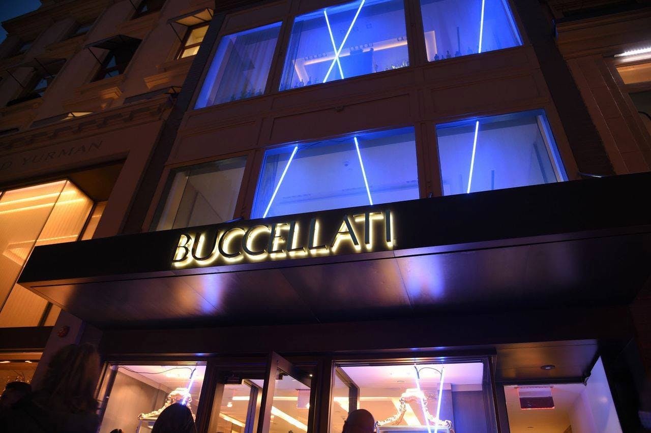
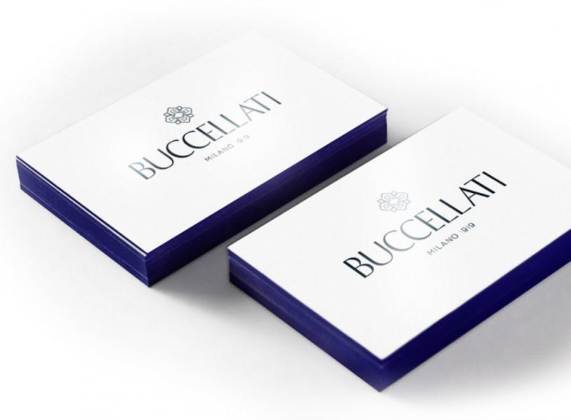
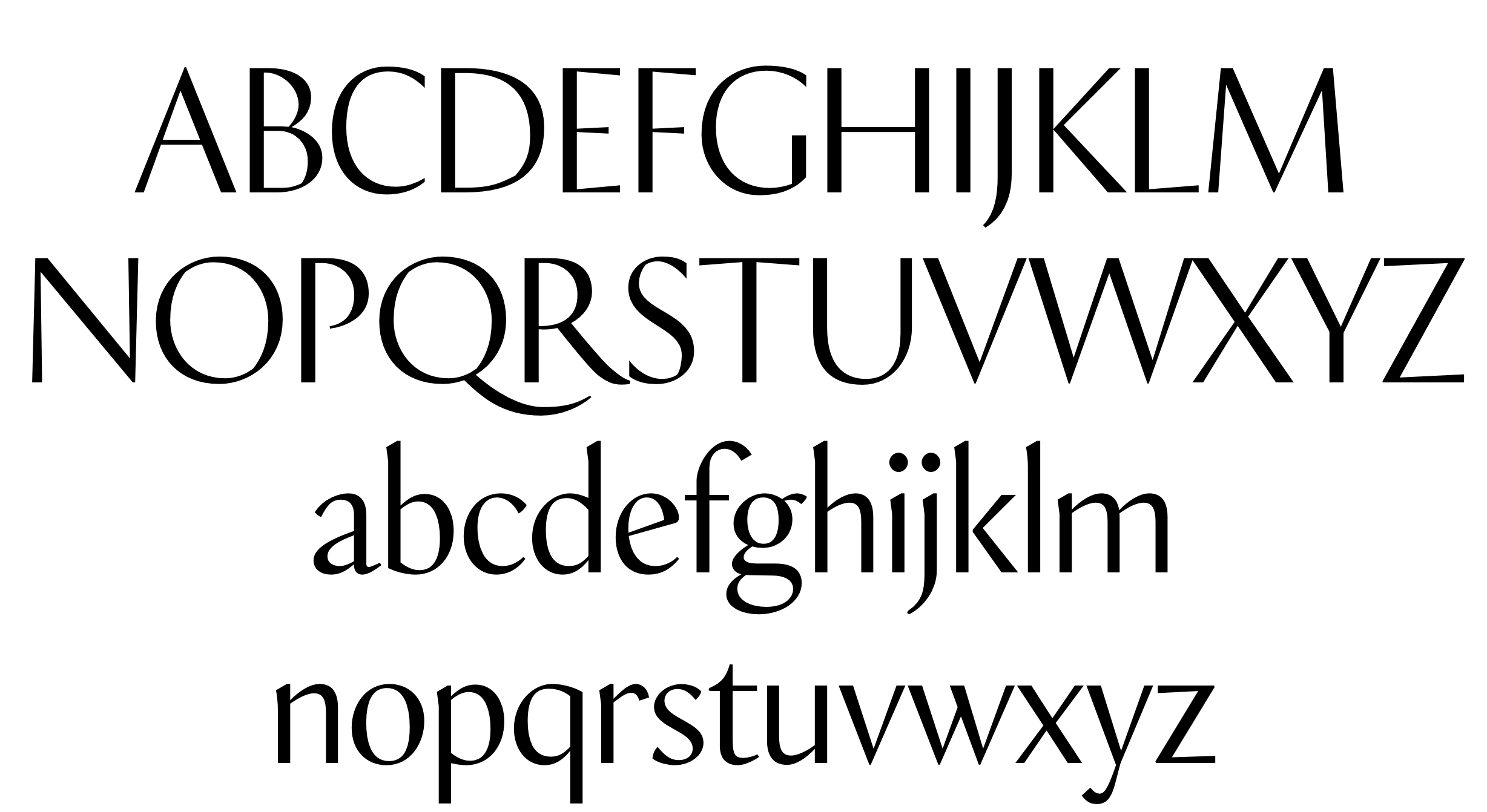
Buccellati
Buccellati, an Italian jewellery and watches company, looked to reinvigorate and modernize its image, while still respecting its rich and prestigious heritage. The elegant Milanese brand also sought to attract a younger luxury customer. Commissioned and art-directed by Out There, Typotheque created a bespoke typeface for Buccellati. It is based on History 2, creating lower case set, and more sophisticated set of capitals.
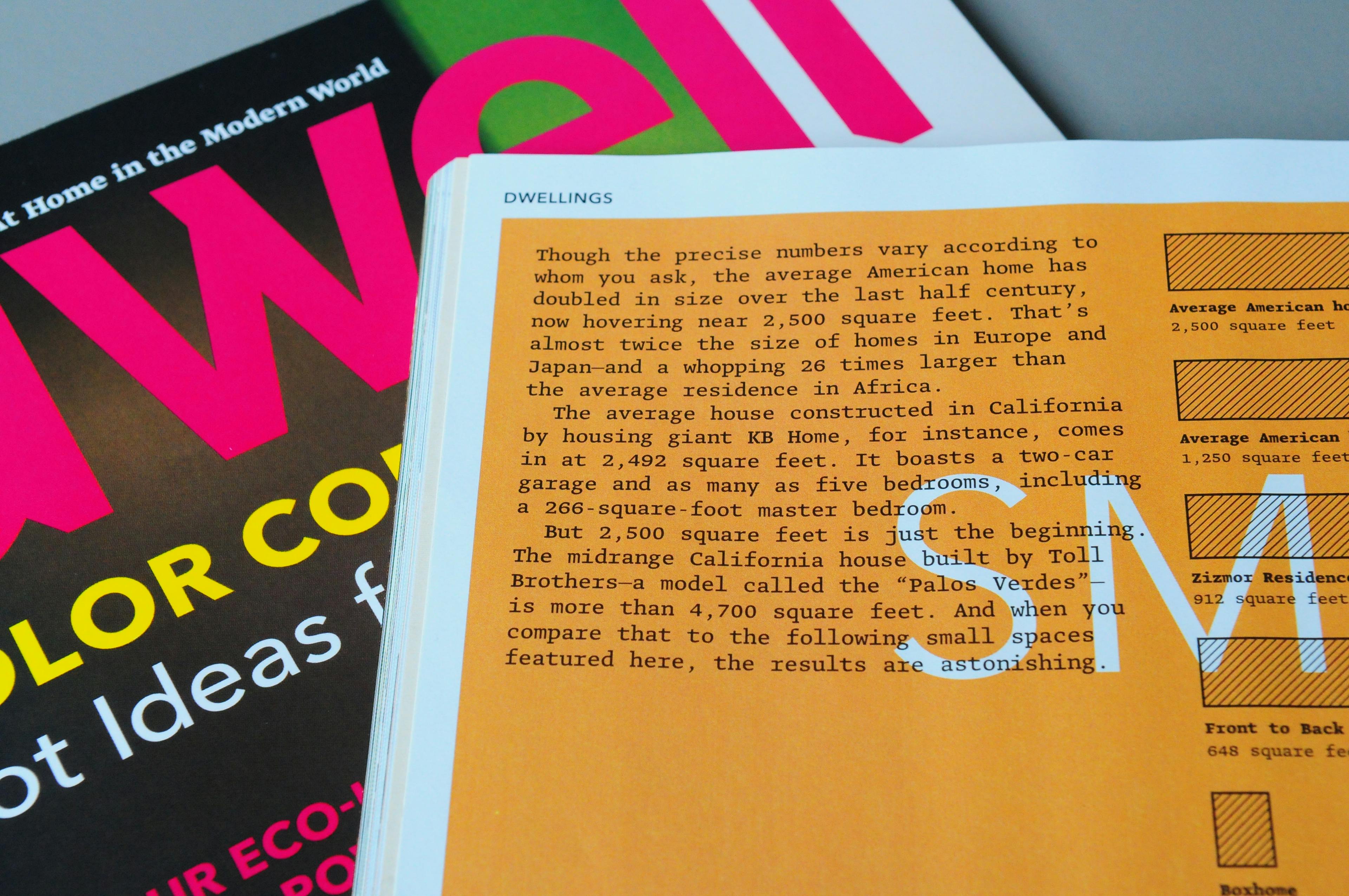
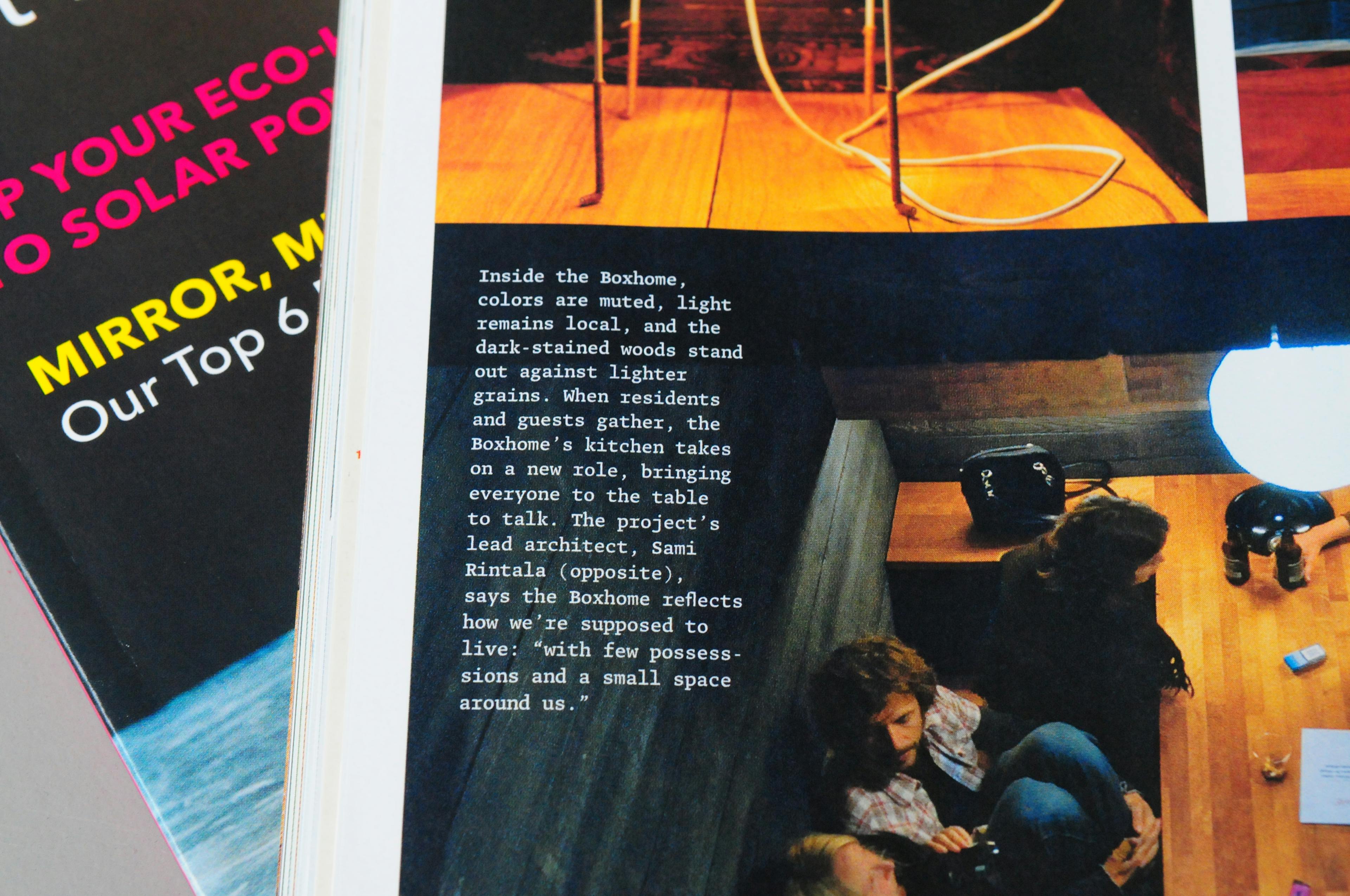
Dwell Magazine
For the complete redesign of Dwell, an American magazine devoted to modern architecture and design, Typotheque was commissioned to create a special monospaced version of Greta Text for photo captions in very small sizes.
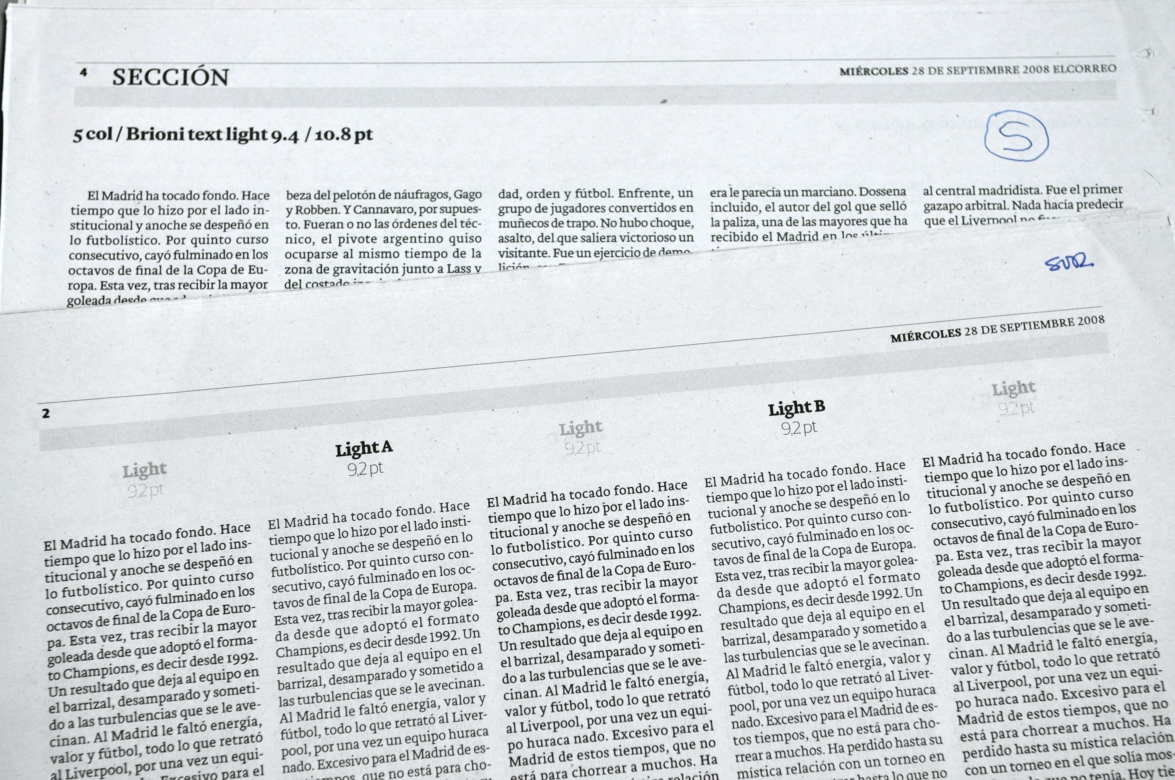
El Correo
El Correo, the leading daily newspaper in northern Spain, commissioned Typotheque to create a new lighter weight of Brioni for their redesign in 2009. After a series of press tests involving five potential variants, Brioni Extra Light was created and implemented as the main body typeface.
Bibliothèque nationale de France
Bibliothèque nationale de France adopted the Fedra typeface family because of its versatility, advanced typographic features, and extensive language support. For its specialised editions BnF commissioned Typotheque to extend all Fedra fonts to support Sanskrit transliteration.
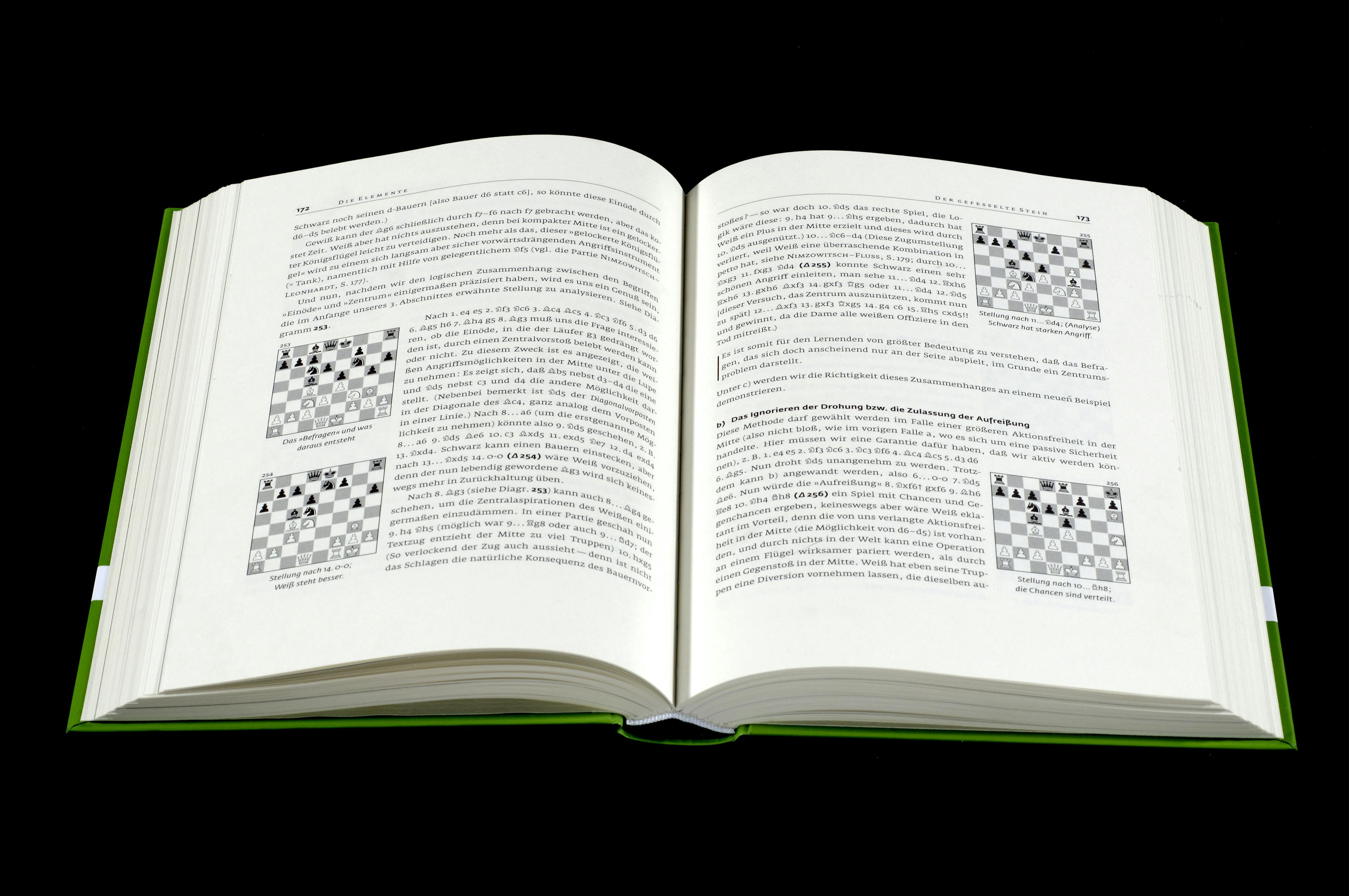
Chess Symbols
German Chess publisher Schachzentrale Rattmann commissioned Typotheque to develop a set of chess symbols which match the proportions of Fedra typefaces. Both Fedra Sans and Serif A were used.
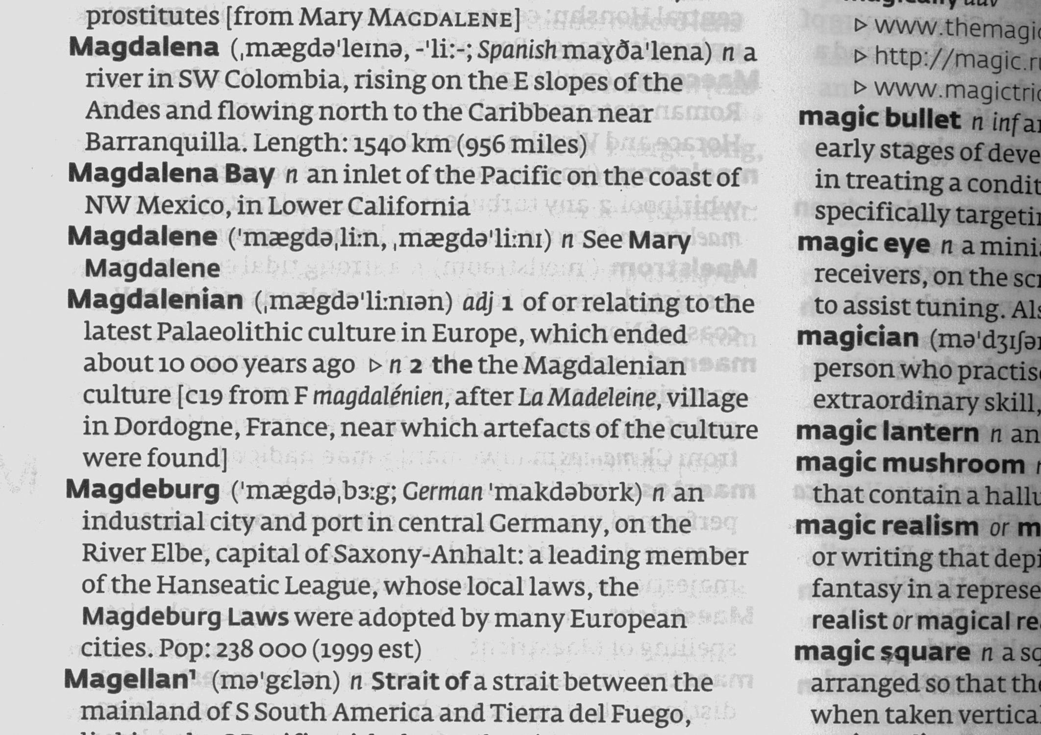
Phonetic type
HarperCollins commissioned Typotheque to create a special version of Fedra Serif and Sans for their line of over 200 dictionaries. Besides the modification of the Latin set, a special Phonetic version was designed for the dictionary use.
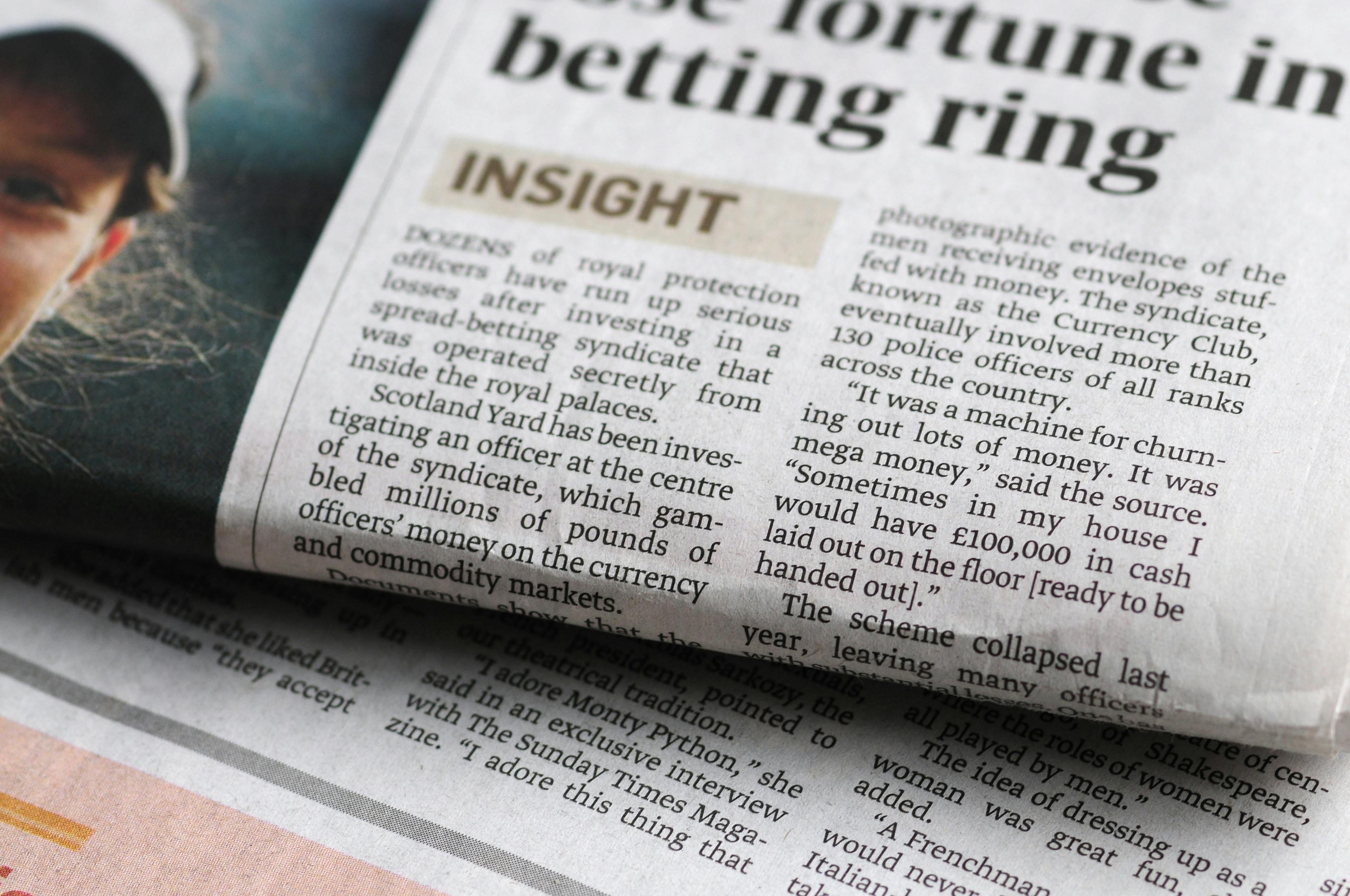
The Sunday Times
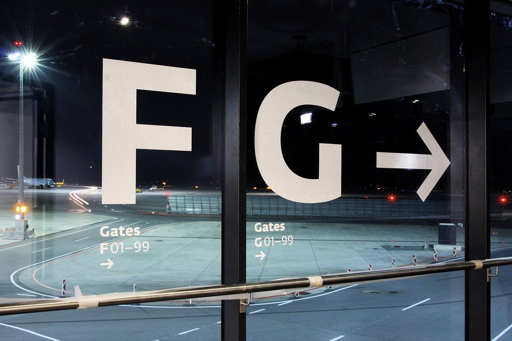
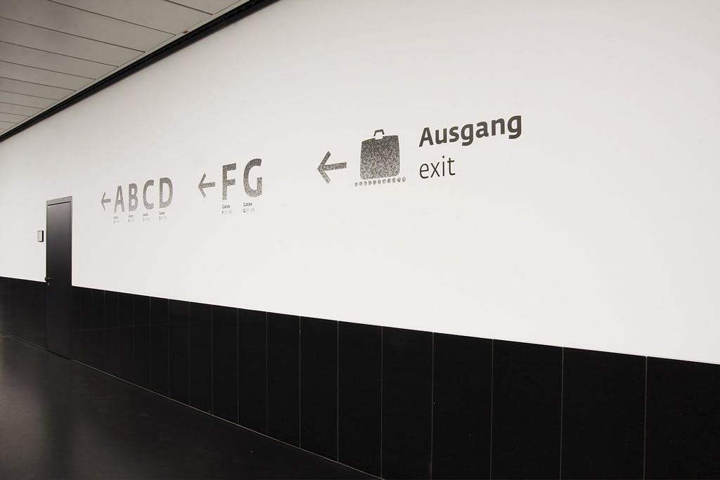
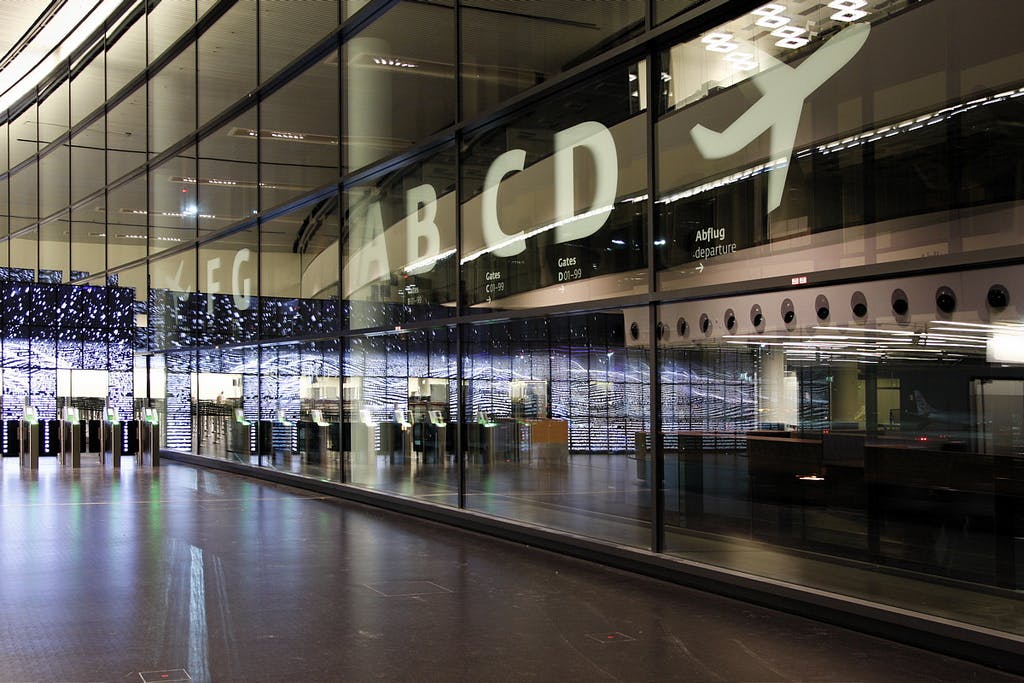
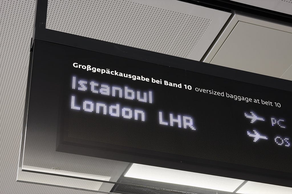
Vienna Airport
In June 2012 Vienna International Airport opened a new terminal which more than doubled the size of the airport. The new terminal was designed by architectural venture Itten-Brechbühl/Baumschlager-Eberle, with signage by Intégral Ruedi Baur. Typotheque developed a custom version of Fedra Sans for the Airport.

Inuktitut
Avataq Cultural Institute, the Inuit cultural organisation of Nunavik (Northern Québec, Canada), commissioned Typotheque to create an Inuktitut version of Fedra Sans for the organisation’s purposes. Fedra Sans Inuktitut is now available for standard font licensing.
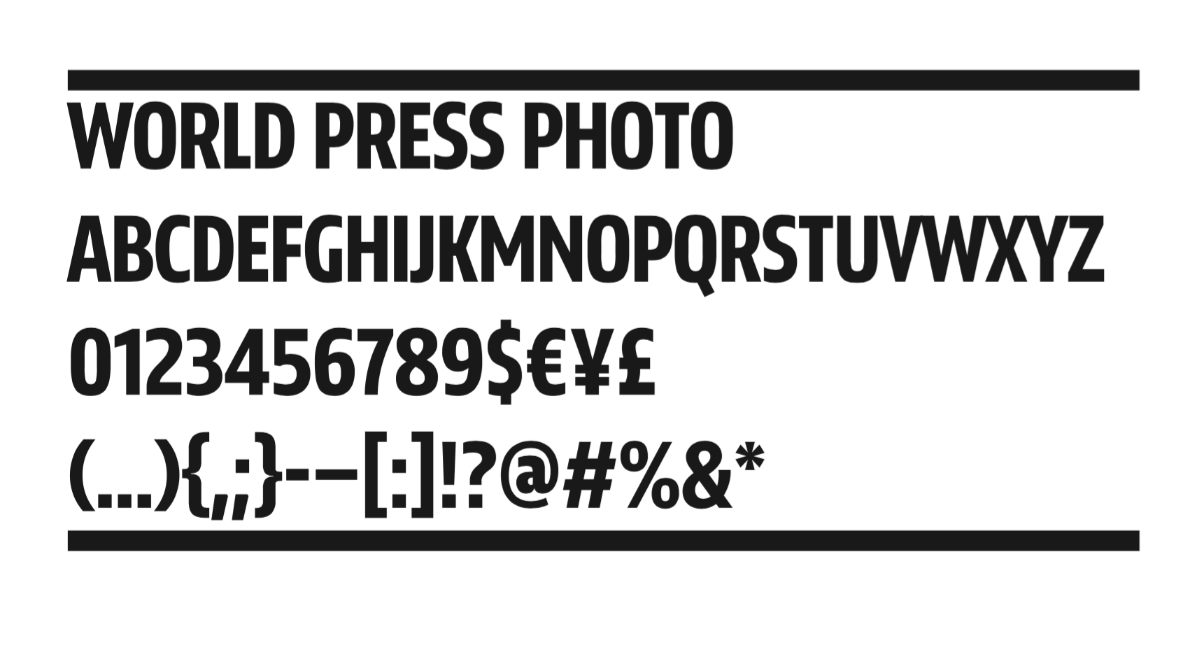
World Press Photo
Because of using highly generic name, World Press Photo, can’t register trademark for its name. Typotheque was commissioned to develop a unique typeface that is recognisable, yet using same proportions as the old logo set in Futura.