About Nothing, really
At the centre of everything is nothing. It is the conclusion of mystics as well as a scientific fact. The concept of ‘nothing’ has been studied by philosophers and theologians whose understanding varies widely depending on the cultural background of the observer. In the West, examples can be found in the work of Thomas Aquinas, Goethe or Hegel. Aquinas thought that the world was creatio ex nihilo. The entire universe is largely a vacuum – nothingness. When Goethe’s Faust sets out on his mystical way to the void he says: “In Nothingness I hope to find my All”. Hegel writes that the absolute Being and absolute Nothing are identical. In the Far East, the description of the nature of Buddha is closest to nothingness.
In the world of quantum physics, nothing is real. No matter what form they take, all energy, objects, beings are made from the same raw material. Physician, endocrinologist and author Deepak Chopra writes: “How would you see your arm through a high-powered microscope? You would see a collection of individual cells, loosely bound together by connective tissue. If you used an even more powerful microscope, you would see separate atoms of carbon, hydrogen, and so on. Go even closer and you would arrive at the boundaries between matter and energy: you wouldn’t see ‘things’, but whirling electrons dancing around a nuclear core. At this level there is nothing substantial to be touched or seen. Matter is 99.9 percent empty space. The void between two electrons is proportionately that of the space between galaxies.” If you look closely enough, you see nothing.
These assertions may sound all but helpful for graphic designers. Design, after all, is concerned with creations of form, rather than philosophical discussions about holism and acceptance of non-form. Although the blank (sheet of paper, electronic document, roll of film) is at the beginning of all design, the ultimate goal is to fill it partly or wholly, to document the potential of design by the act of creation. A completely blank document will most likely be understood as a work not yet started, let alone completed. Yet although nothing and everything are binary opposites of each other, still they are inseparably connected. In the design context, ‘nothing’ (the absence of content) can only exist in relation to ‘everything’ (content overload). Thus ‘nothing’ gains value progressively as it balances out the saturation of our environment. Nevertheless, it is difficult to find many examples of ‘nothing’ as a conscious act of design, if i exclude gestures of ultimate extravagance and excess. There are countless examples in advertising documenting purchase power of the advertiser and their design to modify an internal structure of existing publications by creating their private space. It is probably the commercial background of design that restricts similar experiments, and it is easier to find intelligent examples outside of the field of design.
In the early 1950s Robert Rauschenberg created a series of monochrome paintings entitled ‘White Painting.’ White Paintings were purged of all remnants of image, shape, line, colour, tone and texture, the traditional elements that painting relies on to produce sensations of volume, space and light on a two-dimensional surface. Through the work of Malevitch, Rodchenko, Duchamp or Rauschenberg, art has abandoned its representative obligation. Rauschenberg’s pure white canvasses occupy a terminal point in this modernist development, adding to the crisis of representation and the iconoclastic tradition of modern art. For Rauschenberg these painting became vehicles for perception beyond the limitations of intellect, and to describe them he used words such as ‘silence,’ ‘absence,’ and ‘nothing.’
Silence
According to the New York Times, Apple’s iTunes music store refused to sell a track by Sonic Youth called Silence after a customer complained about paying for nothing. Silence is a 63-second stretch of silence – a tribute to the composer John Cage. At the request of the band, Apple put the copy-protected ‘song’ back up for individual download, making it clear that the silence is intentional. Silence is available for $0.99.
Cage was reluctant to intentionally create silence, when he was first thinking of composing his silent piece in 1947, consisting of performers playing nothing for four minutes and thirty three seconds (hence the title of the piece, 4’33’’). The length is based on the standard length of commercial music of its time. He was aware that it might be easily dismissed as a joke or provocation. It took him five years of deliberation to become comfortable with the idea of not producing any sounds himself. Cage employed an elaborate random system to compose the piece, using charts and tables of duration, building the composition silence by silence. The composition was first performed in 1952, a year after Robert Rauschenberg made his series of white monochrome paintings, which Cage credited as inspiration for 4'33".

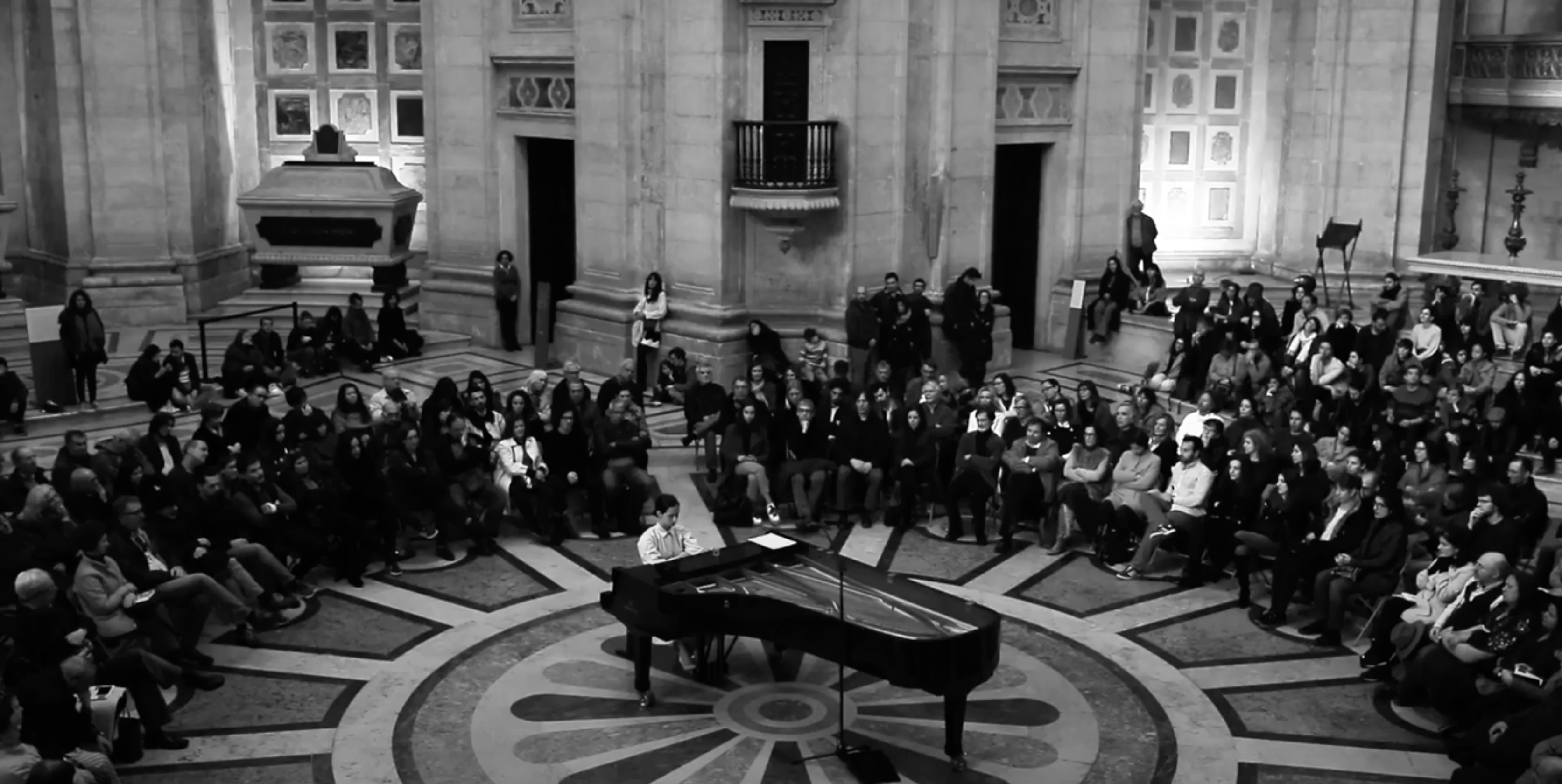
4'33'' by John Cage performed by Joana Gama on a piano at the National Pantheon in Lisbon on February 18th 2018. Watch on YouTube
Cage observed that ‘the essential meaning of silence is giving up of intention’, which consequently erases the dichotomy between sound and silence, leaving the listener alone to focus his attention on sounds and silences. The awareness of the listener becomes a prime instrument in decoding the intention of the composition. In this sense, music is continuously present, stopping only when the listener stops paying attention. Cage turned to Eastern philosophies, concluding that all kinds of sounds (even ‘mere’ noises) are potentially musical, and he encouraged audiences tot take note of all sonic phenomena, rather than only sounds produced by conventional musical instruments. 4’33’’ has recently been performed on radio. BBC Radio 3 broadcast the entire piece; this required switching off its emergency back-up system, which is designed to cut in when there is silence on the air.
Negative Space
Most people are aware that the shape of an object is determined as much by its positive shape as by its negative shape. Negative spaces are not just by-products of the creation of shapes; they are essential for the definition of any shape. Negative space requires you to concentrate on the space around the object rather than the object itself. An obvious example would be typography, the art of black and white. The letters are not defined only by the inked surface, but primarily by the surrounding space. Most of the information on a typical page of text resides in the blank, rather than the printed area, and it is their interaction that creates the rhythmic structure of the text. In type design, negative space is called counter-shape. Counter-shapes are essential for the legibility of text, as they are more unique than the letter-shapes themselves. We recognise 26 letter-shapes (52, if we count both upper-and lowercase letters), while combinations of letters create hundreds of possible unique in-between-shapes. By studying the word-images rather than just the isolated shapes, we can improve the readability of text. Type designer and design teacher Gerrit Noordzij suggest that dyslexia is a product of western education’s focus on sequences of black elements rather than on structures of black and white shapes. This claim is supported by the lower incidence of dyslexia in eastern cultures which uses syllabic rather than phonetic writing systems.

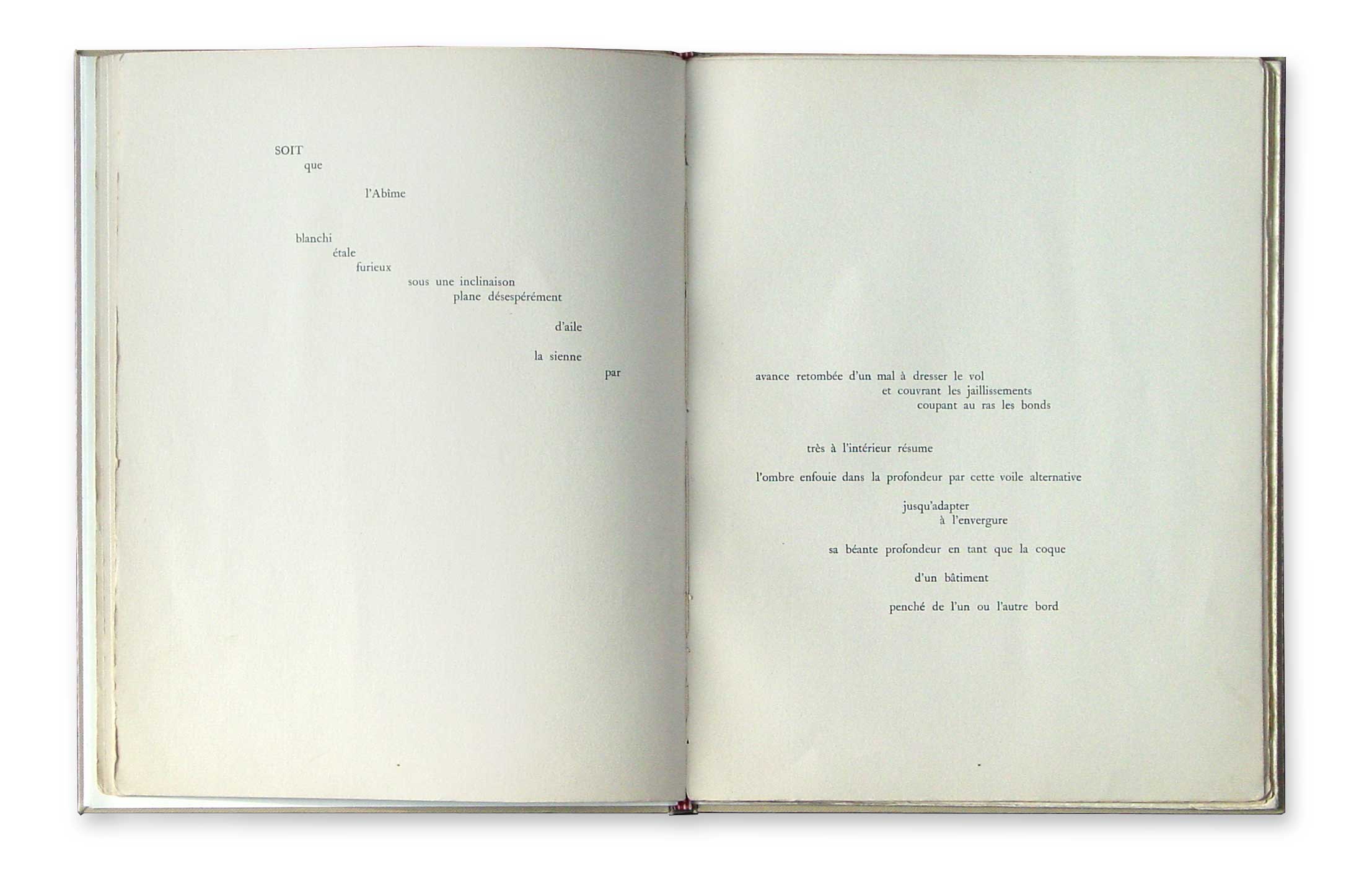
Negative space can be observed and studied in other fields of visual expression such as painting, drawing, sculpture, or even urban planning, where the city is defined not only by its buildings and structures, but also by the space between the buildings, the space where the city ‘happens’. It was perhaps the French poet Stéphane Mallarmé who paved the way to understanding the possibilities inherent in typography and experimented with shifting the attention from words to the entirety of expression. By 1868 Mallarmé had come to the conclusion that, although nothing lies beyond reality, within this nothingness lie the essences of perfect forms. Un Coup de dés jamais n'abolira le hasard, poème ('A Throw of Dice Will Never Abolish Chance, Poem') was one of the first poems arranged spatially and to give the blank as much importance as the printed area.

A poem written by Mallarmé in 1897, published in book form in 1914, 16 years after the author's death, spread over 20 pages. Photo: Peter Biľak
Blanks
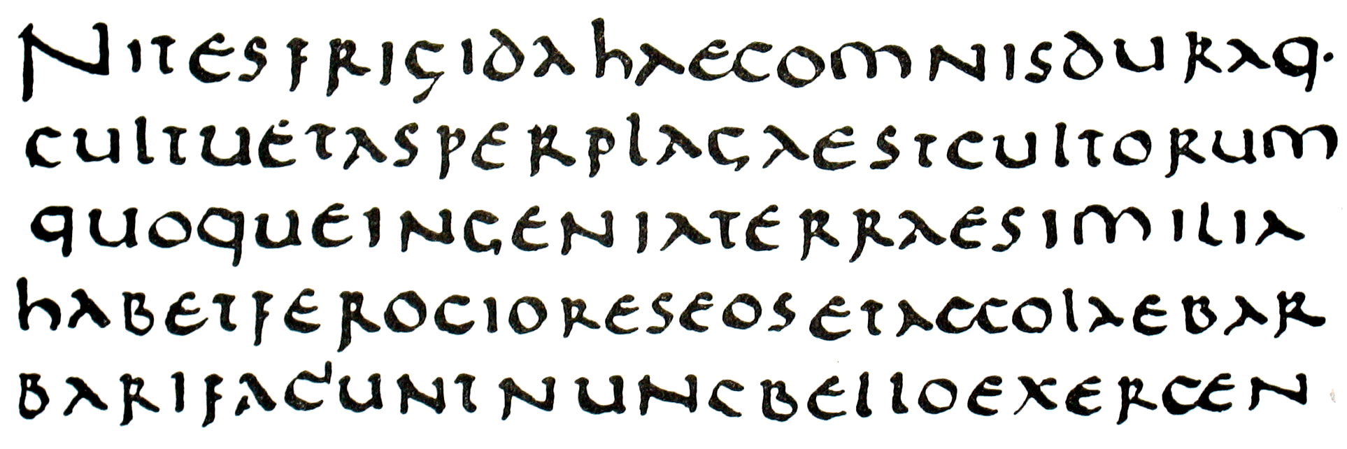
Blank spaces between the words seem so obviously crucial for intelligible reading that it can be difficult for us to comprehend that they were once considered redundant. Before the introduction of vowels to the Phoenician alphabet, all ancient languages of the Mediterranean world (Semitic and Indo-European) were written with word separators (spaces, dots, or decorative elements). When the Greeks invented vowels as codes for sound interpretation, they eliminated the spaces in written documents. They considered word separation superfluous and adopted an uninterrupted flow of characters. The Romans followed their example and used scriptura continua for nearly six centuries. This might seem a curiously retrograde development in western civilization, and is only possible to understand in the social context of reading: the ancients were not much interested in the spreading of literacy, making reading swifter and easier. They preferred collective oral reading rather than the autonomy of the reader.
 Furthermore, as Paul Saenger observes in his book Space Between Words: “Interpuncts [word separators] were a sign of the Latin reader’s slower cadence, rather than an aid to augment the speed of decoding”. Space, the graphic element which is most unambiguous and clearly understood in all sizes as a word separator, made its dramatic comeback in the late 7th century. Reintroduction of word space by the Irish scribes enabled the spread of a new phenomenon: silent reading. Using vowels and word spaces allowed for greater peripheral vision for the perception of words and their decoding. According to Saenger, the introduction of space changed the activity of reading from oral and collective to silent and solitary. Silent reading also supported the long-term memory of the reader and allowed him to concentrate on understanding the text.
Zero
Nothing and zero are closely related but not identical concepts. The term ‘nothing’ is rarely used in mathematics, instead ‘zero’ has become the representation of a starting point. In programming, arrays always start with zero rather than one. All calendars, on the other hand, start with one rather than zero. The Romans didn’t know zero because their counting system developed around trading, where it was sufficient to have a system that refers to a collection of objects.

Interestingly, zero is the only character of the alphabet and numeral set that is drawn not following the logical principles of type design.

End
Withdrawing our attention from the objects and becoming aware of the ‘space’ itself liberates us to focus on the essence rather than forms. The closer you look the less you see. Focus and look closely. You stop seeing the sentences on the lines. Look closer and words dissolve. The surroundings fade out, and letters start disappearing. Closer. Look beyond the ink and texture of the paper, look directly through. Nothing is accomplished by reading, by breathing, by being. If you ignore it it is distrurbing, if you observe it is fascinating. Focus. Everything loses shape; it becomes quiet. Now you see nothing, it is eternal, without beginning or end, boundless in time. Silence. The closer you look the less you see. The less you see the closer you are to truth.