
Erik Nitsche: The Reluctant Modernist
The life and work of the quietly pivotal Swiss modern design Erik Nitsche, who's clients ranged from the MOMA to RCA in a career that spanned the 20th century.
Eric Nitsche may not be as well known today as his contemporaries, Lester Beall, Paul Rand, or Saul Bass, but he is their equal. Almost 90 years old, this Swiss born graphic designer is arguably one of the last surviving Modern design pioneers. Although he never claimed to be either a progenitor or follower of any dogma, philosophy, or style other than his own intuition, the work that earned him induction last year into the New York Art Director’s Club Hall of Fame, including the total identity for General Dynamics Corporation from 1955 to 1965 and the series of scientific, music, and world history illustrated books, which he designed and packaged during the 1960s and 1970s, fits squarely into the Modernist tradition.
Yet Nitsche’s approach was not a cookie-cutter Modern formula that so many designers blindly followed at that time. It was a personal fusion of early influences (classical and otherwise) and contemporary aesthetics based on fast pacing and dramatic juxtapositions. Rather than adherence to Modernist orthodoxy, Nitsche insists that the methodology that most closely resembles a Modern manner, clean, systematic, and ordered, developed because of his restlessness at doing mostly illustrative work during the early part of his career.
Although he might not own up to the fact that he had played a formidable role in the Modernist legacy, Nitsche does not deny that he was as good — certainly as prolific, if not more so — than any other designer of his age. He also speculates that had it not been for his asocial tendencies ("I preferred to do the work, not talk about it") and a few poor business decisions along the way (he says he turned down a job at IBM that later went to Paul Rand), he might be as well known today as any of the other acknowledged pioneers. In fact, he worked for many of the same clients, including Orbachs, Bloomingdale’s, Decca Records, RCA Records, Filene’s, 20th Century Fox, The Museum of Modern Art, Container Corporation of America, the New York Transit Authority, Revlon, and more. Judging from the sheer volume of work bearing his signature or type credit, there are few others who can make this claim.
Both his General Dynamics work and book packages had a profound influence on younger designers during the 1960s and 70s. Seymour Chwast, co-founder of Push Pin Studios, compares his tattered, well-thumbed copy of Dynamic America, the ambitious corporate history that Nitsche edited and designed between 1957 and 1960, to Herbert Bayer’s landmark Geo-Graphic Atlas for its innovation in the area of information graphics. And Walter Bernard, principal of WBMG, routinely shows slides of Dynamic America in lectures describing his early influences. Bernard also credits the book’s exceptional cinematic pacing as having radically changed the way that he achieved kinetic flow in his own books when he was a designer for American Heritage in the early 1960s.
Nitsche’s books, annual reports, and other sequential printed material rely on meticulous attention to the details of page composition, the elegance of simple type presentation, and the expressive juxtaposition of historical and contemporary artifacts on a page. His method exerted an impact on a portion of the field that had become too reliant on rigid Modern formulas, which in turn limited variety and fluidity. Yet this reluctant Modernist was so absorbed with creating and producing his own wares that he had little time to reflect on what he was actually doing to change the attitudes of other designers. Even today he is surprised to hear that his work made an impression.
In fact, during his long career Nitsche neither sought the limelight nor participated in design organizations (other than an invitational membership into the Alliance Graphique Internationale — AGI). Although his work started appearing in European graphic design annuals and magazines back in the early 1930s, Nitsche did not engage in the social politicking that might insure his place in the design pantheon. His induction into the Art Director’s Club Hall of Fame came as a pleasant surprise. But nevertheless, he says that it came too late to ‘do me any good,’ implying that had he been inducted earlier he might have benefited by attracting new clients, which is not the usual outcome anyway. Nevertheless, his induction validates the major contribution that has gone largely unheralded except for those aficionados who know (and collect) his posters and books.1
Nitsche’s career began virtually at birth. He was born into a family of commercial photographers on July 7, 1908 in Lausanne, Switzerland. His grandfather had worked in China during late nineteenth century and his father and uncles were noted portrait photographers. The artist Paul Klee was a family friend and exerted a profound influence on young Nitsche, who wanted to be an artist rather than enter the family business. Although Nitsche initially thought he might study with Klee at the Bauhaus, after a short stint at the College Classique in Lausanne when he was 18 years old, he attended the Kunstgewerbeschule in Munich. There he studied with the famous German typographer F.H. Ehmcke and eventually won a prestigious award for a poster competition for an annual Munich ball.
In 1930 Nitsche began his peripatetic professional life. He went Cologne, Germany, with Professor Ehmcke where together they designed The International Press Exhibit (Pressa). A year later Paris beckoned. But it was hard to sell what he calls ‘enlightened design’ in the City of Light at that time, recalling that ‘French advertising was unbelievably corny.’ Nevertheless, it was the period when A.M. Cassandre and other French poster artists were beginning to make a profound impact with stylish work that opened up creative possibilities. Moreover, French advertising agencies were smitten by Swiss graphic design, which was largely illustrative. The Draeger Freres agency, for whom Nitsche first worked, welcomed Swiss designers as though they were conquering heroes.
Nitsche was next hired by Maximilien Vox, an enterprising typographer, advertising designer, and writer for the influential applied arts magazine Arts & Metiérs Graphiques. He headed his own agency which did typographic work running the gamut from packages to labels to letterheads. At the time, the moderne (or Art Deco) style dominated the French scene, and Nitsche explains that ‘stylistically speaking, I did too many different things.’ However, he learned one essential French design principle: ‘Try to give everything you design a feeling of elegance,’ he says. But Nitsche was also attracted to the Bauhaus and its rationalist discipline which went counter to the French intuitive nature. It was not the look of the avant garde that impressed him: ‘I was not interested in what the Bauhaus produced as much as how they did it,’ he recalls. ‘Having grown up in Switzerland, I think I always had a sense of order.’ Thus that convergence of French and Bauhaus sensibilities defined his early efforts.
As a testament to Nitsche’s prolificacy he still has the original accounts ledger in which he chronicled every freelance job (and the payments he received). From around 1930 to 1935 he recorded literally hundreds of illustrations and political cartoons for weekly publications such as the French Vu, and the German Simplicissmus and Querschnitt, as well as scores of advertisements for magazines and newspapers. Working for both French and German clients gave him considerable creative latitude and a fairly decent income during this dangerously inflationary period in Europe.
But sensing the larger troubles to come, like many of his contemporaries (including Alexey Brodovitch whom he first met in Paris), Nitsche decided to leave Europe for the United States in 1934. While Brodovitch landed in Philadelphia, Nitsche ventured on to Hollywood where he joined his friend Frederick Hollander, the song-writer for Marlene Dietrich, who got him a job designing sets and curtains for a musical called All Aboard. But since Hollywood was so obsessed with attitude and class, and Nitsche was such a devout social recluse, he remembers that it was an unbearable place to live and work. So after a year he packed his bags.
New York was still feeling the effects of the Great Depression. Apartments were cheap, and Nitsche fortuitously rented what he called a ‘marvelous studio’ penthouse adjacent to the Museum of Modern Art. He also found that it was surprisingly easy to get work. ‘I was a Swiss in the graphic arts,’ he explains. ‘I had no problem. I walked into places like Harper’s Bazzar [where Brodovitch had settled in as Art Director] and Town & Country [where an old friend from Paris, Louis-Marie Eaud, was art director] and got work immediately.’ His assignments included witty editorial and fashion illustration, studio photography, and a modicum of layout. Working on fashion became his bread and butter for quite a while (although he was not terribly fond of the women editors with whom he worked and describes them as prone to ‘crying fits when they couldn’t handle a situation’). He also painted covers for Fortune, Vanity Fair, Stage, Arts & Decoration, and House Beautiful that were either comical or decorative. At another leading shelter magazine, House & Garden, he did product and still-life photography under the auspices of art director Leslie Gill. After a few years of collaboration Gill generously gave Nitsche the lease to his fully equipped design and photo studio on 56th street.
In no time at all Nitsche was a very busy general practitioner. What he lacked in an identifiable or consistent style, he certainly made up for in volume. Around 1938 he landed the job of art director at Saks Fifth Avenue (where Brodovitch had also worked). Furthermore, he was sought after by the leading drug companies, Hoffman-Laroche, Ciba, and Squbb as a designer and photographer. And another major freelance assignment was designing a book for Standard Oil of New Jersey as well as covers of their promotional magazine, The Lamp. The freelance flowed like water and Nitsche drank up as much as he could.
But with all these jobs, the first real evidence that Nitsche had a distinct design methodology, finally emerged in the early 1940s. After a chance meeting with Philip and Helen Andrews, publishers of specialized magazines, including Air Tech and Air News, he was hired as art director with total control of the format and illustrations. What for many designers would have been a hellish assignment — to design charts and graphs about aerodynamics — for Nitsche was pure heaven. He was tired of the fashion industry and savored designing ‘meaningful’ technical data for such things as hydraulic systems and cross-sections of airplanes. ‘I loved the beauty of it,’ he opines, ‘There is so much logic in all that stuff. Its so very Swiss.’
During World War II Nitsche also designed graphics for one of the Andrews’ magazine about tanks which almost got him drafted into the U.S. army. ‘I got so good at doing all the aerial views that they wanted my services.’ His Swiss citizenship prevented conscription, though. At time the greatest compliment to him came from former Bauhaus master Lazlo Moholy Nagy, who had seen the Andrews’ magazines, and asked a mutual acquaintance ‘who was that doing the Bauhaus in America?’
The Air News experience changed Nitsche’s approach even towards fashion work. What might be called an experimental phase began with a short stint in 1948-49 as art director of Mademoiselle magazine (before Bradbury Thompson took the job). Nitsche recalls that in addition to doing much of the photography and going to Mexico and South America on fashion shoots, he pioneered the use of the split fountain. This odd printing technique was designed to achieve a rainbow-like effect by using only two colors, one at the top and the other at the bottom of the ink pan, which as the cylinders rotated blended the colors together in the middle resulting in velvety, mixed gradations. ‘I was always interested in printing,’ he attests. ‘The more difficult the process, the better I liked it.’ And while this trick was comparatively simple in the 1960s when Underground newspapers used it to achieve a psychedelic aura, when Nitsche introduced it to magazines in the 1940s it could really damage the machinery. ‘I don’t know how many cylinders you could wreck,’ laughs Nitsche, ‘but the result was certainly beautiful.’
Nitsche admits that he is ‘a restless type,’ who could never remain at one job for too long. This accounts for his prolific output, but it made a distinctive signature somewhat more elusive. Also in the late 1940s in addition to art directing Mademoiselle, RCA Victor Record Review, and Ohrbach’s, he was appointed art director and vice president of Dorland International (Germany’s largest advertising agency) where he worked on campaigns for Scandinavian Airlines, Douglas Aircraft, Chanel, and Rolls Royce (most of this work has been lost today), each required an anonymous solution. During the early 1950s he was contracted by 20th Century Fox and did advertising campaigns for ‘No Way Out’ (the same film for which Paul Rand did a billboard), ‘All About Eve’, and ‘Fourteen Hours.’ Around the same time he designed campaigns for Universal Pictures for ‘The Egg and I’ and the ‘Imposter.’ To manage and produce these diverse accounts he hired studio assistants to refine the basic concepts and layouts. While he ceded some technical responsibility to them, he reportedly attended to the details of each job and was something of a Spartan manager.
Nitsche solved each of his design problems individually. Yet at that time he was also developing two approaches that would eventually blend into a seamless Nitsche style. The first involved minimal and abstract drawing, including random and geometric scribblings apparently influenced by Paul Klee. These where used for record albums and some advertising work. The second was rooted in minimal and elegant typography which combined a line or two of gothic type, like Akidenz Grotesque (and later Helvetica), with a classic serif face, like Garamond or Didot. Nitsche, however, rejected the Neue Grafik, or Swiss International Style, that drew nourishment from the Bauhaus legacy, referring to it as ‘a little too cold for our uses,’ and stayed ‘pretty much with the classical typefaces.’ He insists that ‘I really never went outside of my love for Didot.’
In 1950 Nitsche left the hustle of New York City for the sylvan hills of Ridgefield, Connecticut, where he designed a home — an example of where his taste and the Modern ethos intersected — and established his main studio there. To pay for it, he began to take on even more freelance clients as well as some sub-contracting, including work for The Gotham Agency, a medium sized advertising shop which handled the General Dynamics account. If destiny does intercede in people’s lives, this is definitely when it took over Nitsche’s. The advertisements that he created for this expanding multinational corporation transformed Nitsche from a boutique designer into one of the world’s most effective — and Modern — corporate designers.
General Dynamics was incorporated in 1953 as the parent for ten different manufacturing firms (among them, Electric Boat, Canadair Limited, Electro Dynamic, General Atomic, Convair, and Stromberg-Carlson) which at that time were administering to the defense needs of the United States. Its products ranged from atomic powered submarines to electric motors for destroyers, to the B-58 supersonic jet bomber and the commercial 880 jet transport. The company was also working in the areas of electronics, astronautics, aero- and hydrodynamics, and nuclear physics.
In the early fifties, the spin on nuclear power was that it heralded peace and progress. General Dynamics’ president, John Jay Hopkins strongly held that his corporation should be positioned in the public’s mind as a purveyor of peace. He argued that General Dynamics was in a position to benefit mankind through scientific research. But Hopkins understood that presenting a good public face was endemic to this goal. Gotham’s overall campaign strategy was merely conventional but Nitsche’s ads stood out like gems amidst coal. ‘I was so disgusted with the copywriting and general bad taste of the ads,’ Nitsche recalls, ‘that I created a visual persona that overcame the shortcomings.’ Among other things, he introduced his abstract drawing style to give a futuristic aura that at once suggested General Dynamic’s products as well as its progressive aspirations.
In the Spring of 1955 Hopkins stole Nitsche away from the ad agency and gave him complete freedom to design a critical exhibit at the International Conference on the Peaceful Uses of Atomic Energy to take place in Geneva, Switzerland, that August. Hopkins wanted an attraction that would elevate the stature of General Dynamics among other huge American technology firms in attendance, including General Electric, Union Carbide, and Westinghouse.
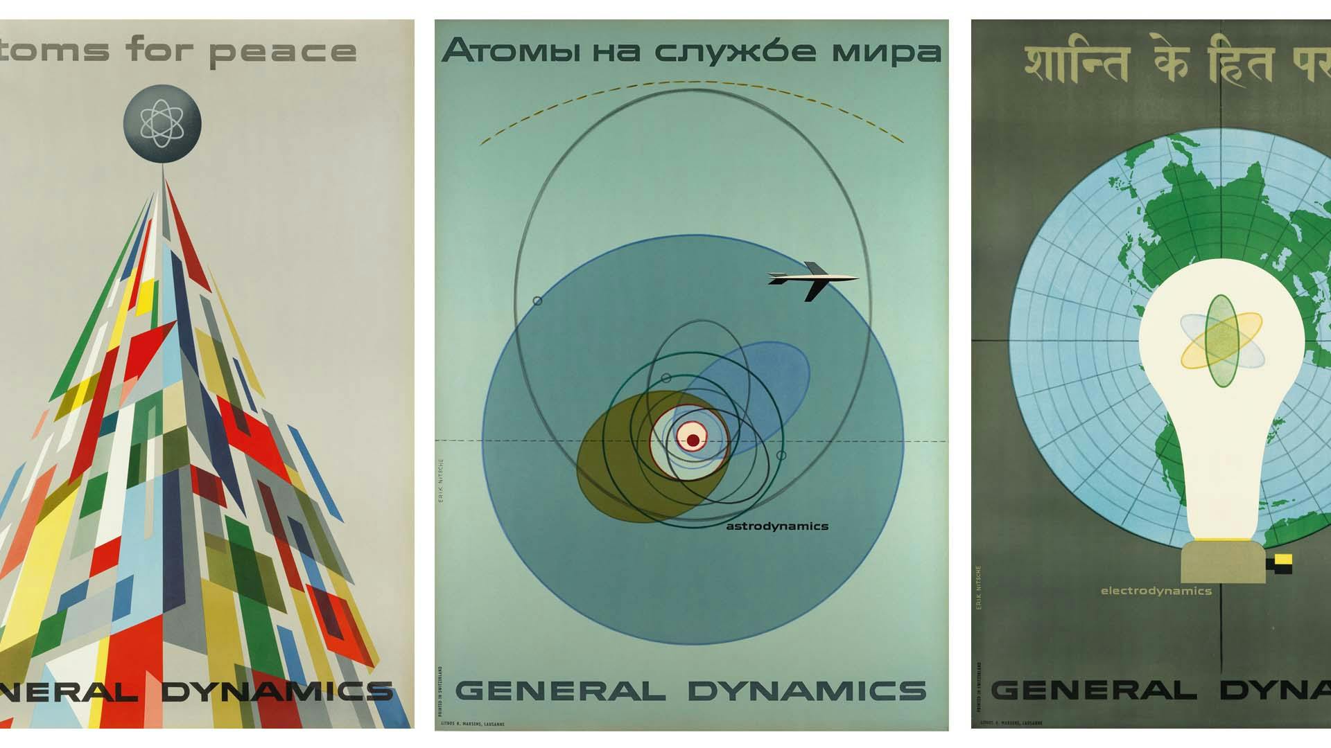
As builders of the first atomic submarine, The Nautalis (with contracts for three more), and with commitments to produce the first atomic powered airplane, General Dynamics presumably had exceptional show pieces. Yet they had nothing to show. The company was prevented from displaying anything that would compromise the security of their top secret commissions. Only within limits could General Dynamics even discuss its various research projects at all. So in the absence of their so-called atomic products, symbolic expression of the corporate mission was the only real option. Nitsche’s first job was to develop a graphic means to present peaceful uses for the atom. The first task he set himself as the centerpiece of the exhibit environment was the design of six (35 x 50 inch) posters — he intuited that in Switzerland (what he calls ‘the nation of posters’) these would appeal to the largely European audience.
With tremendous speed Nitsche developed a graphic premise united by the headline ‘Atoms for Peace.’ The corporate clarion was a series of six multilingual posters — in English, Russian, German, French, Hindi, and Japanese — featuring both abstract or symbolic imagery, and including the biblical text from Isaiah: ‘They shall beat swords into plowshares, and their spears into pruning hooks: nation shall not lift up sword against nation, neither shall they learn war anymore.’ Isaiah’s testament stood dramatically, albeit ironically, as a backdrop to a model of the hull of the Nautilus submarine. So to explain away the irony of juxtaposing a message of peace with the world’s most powerful warship, Nitsche added a quotation from an Easter message given by Pope Pius XII to the effect that the Nautilus is at last putting nuclear force to the service and not the destruction of men.
Each poster identified a particular aspect of General Dynamics’ research. The most well-known of the series, representing ‘hydrodynamics,’ was a painting of a nautilus shell with the artist’s conception of the Nautilus submarine shooting out of its chamber. It was an indelible logo in its day. Set against a gradated gray background, the shell was a virtual cornucopia of progress. The submarine was not seen as a killing machine, but rather the offspring of progress poised to help the world. Other posters were much less controversial by today’s standards, but no less exquisite. One particularly Klee-inspired poster with a somewhat enigmatic subtitle, ‘basic forces,’ was a abstract design of the sea (wavy dotted lines), space (dots and dotted lines representing constellations in the sky) and the sun (a white circle with a red center, like an eye) set against a gradated background (much like one of Nitsche’s earlier split fountains). In addition to his artistic inspirations, Nitsche derived much of his imagery from science itself, such as the abstracted symbols for isotopes used in his poster for ‘nucleodynamics.’
Nitsche avoided the temptation to use science fiction, which might have had an immediate positive effect, but he presumed correctly that the novelty would have worn off. ‘What I am concerned to do is establish [the posters] with a certain classicism,’ he wrote at the time. ‘I would hate to have to apologize for a design, to have people puzzle and ask, ‘What is it?’’ The first series of six posters established a tone for all future General Dynamics graphics, as well as a paradigm, of sorts, for how the marriage of science and engineering would be visualized by kindred companies. Indeed Nitsche’s brand of artful futurism was copied by many others at the time and might be seen today as representative of the so-called ‘Atomic Style’ that emerged in the mid- to late-1950s. Hopkins was so pleased with the initial result that he ordered more posters to promote the company with, as he put it, ‘the spirit of discovery that motivates the corporation’s diverse developments.’ There were a total of four series in all, including another six posters for Atoms for Peace, six for Exploring the Universe, and eleven divisional posters related to the different subcompanies. All incidentally were printed under Nitsche’s watchful supervision in Switzerland.
Like a battlefield general, Nitsche built a total corporate advertising and identity campaign equal to the most celebrated — IBM, Olivetti, etc. Bringing his photographic expertise to the fore, he developed an editing, layout, and cropping method for the GD annual reports that emphasized cinematic pacing and were more like books than brochures. Although each year’s report is different, they follow the principle of dynamic flow based on scale, repetition, and juxtaposition. In one report Nitsche presents a panoramic view of General Dynamics’ accomplishments by using photographic images of all its divisions so meticulously paced as to evolve from sea to sky through the turning of pages. Text bars explaining the different divisions are intermittently inserted as short sheets of paper interrupting every other spread. The typography is set in such a way as to at once evoke Modernity and classicism. And even today, the total design (even if the subjects of the photos are somewhat dated) retains the integrity of a timeless document.
Throughout the ten years he devoted to General Dynamics, Nitsche did every design task, including the interior and exterior design of Hopkins’ private airplane. Nitsche’s crowning achievement, however, came when he edited and designed the company’s history, Dynamic America. Making use of tip-ins and foldouts (a precursor to today’s interactive media), Dynamic America’s remarkable pictorial narrative told a story of the nation’s military and industrial development seen through the lens of General Dynamics as it traced itself back to when it began in 1880 as Electro Dynamic. The book took almost four years until it was completed. Nitsche originally designed each spread in miniature at a 35mm size in order to approximate the movement of film itself. The book is, therefore, akin to a storyboard. In fact, the story told by the first color proofs without any text, which Nitsche has saved in pristine condition, are just as readable as if they had a verbal narrative. The pictures are laid out in such a way as to be the equivalent of complete sentences, phrases, and paragraphs.
Hopkins was stricken with cancer and died in 1964. And despite the success of Nitsche’s tireless efforts, no provisions were made to continue Hopkins’ patronage of design. So after a short time and much bureaucratic wrangling, Nitsche was completely phased out without so much as a gold watch. Although embittered by this experience, he had no time for recrimination and moved on to the next phase of his career — book packaging.
Nitsche was among the pioneer design auteurs. Moving back to Geneva in the early 1960s he Founded ENI, S.A. (Erik Nitsche International) and began an enterprise that would produce some of the finest pictorial history books ever designed. The first series was a twelve volume history of science and technology, printed in numerous languages with a total print run of over two million copies. They included histories of communication, transport, photography, astronomy, etc., and followed the model established by Dynamic America — pictures drove the text. Nitsche relished the research process (‘the meat of the project’) during which he unearthed thousands of rare and never-before-seen archival images which he then composed into specific narratives. The second series on the History of Music was even more ambitious — twenty volumes — and covered an expansive range of musical experience from composition to instrumentation, from classical to jazz. His book design had a simple beauty and didactic economy. Superfluous images were rejected in favor of dynamic silhouettes and vignettes of important artifacts. He could make historical engravings and paintings look contemporary. His typography was clean and crisp. At the end of each book Nitsche’s signature timeline gave the reader additional textual and visual information.
As Nitsche confesses, business has not been his forte, and ENI ultimately met with hard times when a former partner established a competing packaging company doing the same kind of books. ‘He even stole my design,’ Nitsche adds. Legal hassles left him in debt, so when he was offered the opportunity to edit and design L’Epopee Mondiale D’Un Siecle, a five volume history of the Twentieth Century, he jumped at the opportunity and moved to Paris where the publisher, Hachette/Paris Match, was headquartered. Meanwhile, he alternated his time between Paris and Hamburg, Germany, where he redesigned the format for Stern magazine.
For many turning Seventy is well past the time to wind down a career. But not Nitsche. In the late 1970s he returned to Ridgefield to design children’s books (The Upside Down Book, Oompah-oom-Parade, and Mr. Peewinkle’s Mailbox, among them), worked on special effects for a film called ‘The Color of Man’ and produced proposals for something called Info-Card and Info-Map systems, a series of easy access flash cards that gave data and vital statistics on a wide range of natural and man-made themes. In 1980 he moved to Sherman, Connecticut, and feigning retirement he took up painting. But this lasted only a year before moving again to Munich, Germany, where he began to design the first of 17 postage stamps for the West German Ministry of Communications, including one commemorating the Bauhaus. There he also contracted with Unicover Corporation (based in Cheyenne, Wyoming) to design over 200 philatelic first day covers which he did between 1985 and 1987.
In a way, this last commission brought him full circle back to the beginning of his career. His first day cover images are highly rendered — including various series of animals, insects, scenery, etc. Leaving abstraction behind, if only for the moment, he developed into an exquisite realist — and a master of this arcane postal art.
Nitsche’s story may be in its final chapter now, but it is not yet over. When I met him in September 1996 he had returned to Connecticut from Germany for medical reasons. He was sitting in a wheelchair behind a white desk covered with neat rows of freshly sharpened colored pencils and a stack of clean white paper, waiting patiently for his energy to return. This had been a tough year for him. Only 12 months earlier he had been diagnosed with a possibly fatal illness which sapped his strength, reduced his great physical frame, and forced him to return to the United States for treatment. He could still work, but only intermittently and for short spurts. On the warm Indian summer day that I interviewed him he resisted fatigue induced through strong medication by talking about his plans to produce illustrated books, a series of educational flash cards, and a collection of toys that he had been designing for the past few years. Even in his weakened state, I was amazed by his tenacity and drive. When I left, I thought that this might very well be his last of his many hurrahs. It wasn’t.
As of this writing the 89 year old artist is building eight foot models of those sculptural toys that he calls, Polichinelles (a term derived from the Neapolitan Polecenalla and has roots in the Commedia dell’Arte), which are at once futuristic, Bauhausian, and curiously post-modern in terms of their wit and humor. During a recent conversation, I was about to pursue my probe into his past, when he said in a strong Swiss-German accent, ‘I don’t want to talk about that anymore, let’s talk about the future.’