
Hans Eduard Meier, a life dedicated to letter design
H. E. Meier; lowercase letters a and g in Lapidar Display Regular typeface (left) and in Syntax Regular (right).
Hans Eduard Meier has devoted his entire life to letter design – creating new fonts, working in typography and calligraphy, whilst also teaching and writing. His activity, as well as his philosophy of life, can be readily understood through the perspective of history, both classical and modern. His passion for calligraphy and for the evolution of writing forms ever since antiquity led to the writing of his compendium Die Schriftenwicklung / The Development of Writing / Le Développement de l’Ecriture, published in 1959. Today, it is still available in a re-edition, with a slightly modified title.[1] Fruit of a vast working knowledge, this concise book, written in three languages, bears the touch of the calligrapher’s hand. As such, it has remained a reference on the subject for more than fifty years.
It was also in the 1950s that Hans Eduard Meier started to work on the design of what would become his Syntax font – combining the modernity of sanserif letters with certain characteristics of Renaissance alphabets. It evolved slowly, taking shape over several decades, and underwent several changes, following the profound technical mutations that occurred in the second half of the 20th century. Apart from designing typefaces, Hans Eduard Meier also worked as a graphic designer, and taught in parallel at the Zurich School of Applied Arts (then known as Kunstgewerbeschule, and now called Zürcher Hochschule der Künste [ZHdK]). His work and his contribution to the field can be perceived today as a serene period – unaffected by the vagaries of time, shunning the demands of productivity and visual impact.
If we distance ourselves from the impressive pace of technological breakthroughs and the current dynamism of the sector, we can appreciate the more discreet aspects of contemporary history. Meier’s creative output no doubt needs to be seen in this light. He has forged his career far from the turbulence of incessant imagery and texts. In devoting himself to letter design and typography, he has revealed a life-long preoccupation – a personal commitment driven by a need for an inner pursuit that would give form to his convictions. Fired by the same passion for letter design as Albert Boton, and still active today, Hans Eduard Meier can boast more than 60 years of professional activity. Amazingly, his generation will have been witness to two revolutions in printing techniques. Around 1950, while the process attributed to Gutenberg had been in use for more than five centuries and given rise to semi-automatic compositing systems (still based on smelting metal), photocomposition was about to replace lead. Several decades later, in the mid 1980s, the dawning of the digital era paved the way for replacing the older processes. As was the case in many other domains, this brought about a revolution in the art of drawing typefaces. Letters, which had been traditionally hand-drawn, then fabricated manually one by one, could now be created directly on a screen. Meier was quick to adopt the new digital tool, which proved to be a great time-saver for him. For those unfamiliar with the period before the digital technologies, it may not be easy to grasp how much adaptation and reorganization these mutations demanded.
Hans Eduard Meier was born in 1922, in the lake-side town of Horgen in Switzerland. As a student at the School of Applied Arts in Zurich[2] from 1943 to 1946, he received a state-of-the-art training. At the time, the school was run by Johannes Itten[3], a prominent figure in the first Bauhaus. At the beginning of the 1940s, classes in letter design were relatively new. The Zurich school was a pioneer in the domain – calligraphy and letter design classes had been set up there as early as 1916. At the Bauhaus, it was around 1923 that typography and graphic art really took off – an integral part of the avant-garde dynamic that had revolutionized (typo)graphic art-making around the 1920s. The concept of a new typography started to emerge, reflecting the spirit of the times and the latest forms of artistic expression. This trail-blazing approach took root in professional activities as much as those practised in the art schools.
In the 1940s, the Zurich School had a roster of students including Adrian Frutiger, Josef Müller-Brockmann, Emil Ruder, Jean Widmer, and also the kinetic painter Yaacov Agam. Meier was a student of both Ernst Keller and Alfred Willimann (fig. 1), two of the foremost personalities in graphics in Switzerland at the time.[4] There was a burgeoning of new activities which developed in the wake of the avant-gardes – which were destined to be pivotal. Meier’s training was effectively nurtured in a highly rich artistic environment.[5]
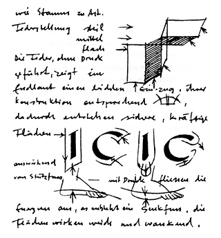
figure 1. A page of Alfred Willimann’s notes for a lesson, Zurich School of Applied Arts.
In the North, in Germany, the avant-gardes had suffered a severe setback in the mid-30s with the rise of National Socialism. Neighbouring countries – Italy, the Netherlands, France, Switzerland – asserted themselves as active graphic art centres. Numerous pioneers born around the turn of the century came to the fore in Switzerland – graphics and typography constituting often only a part of their activities. Apart from Alfred Willimann (fig. 2) and Ernst Keller (figs. 3, 4), a whole spate of creative artists emerged on the scene (some only temporarily): Jan Tschichold, Max Bill (fig. 5), Theo Ballmer, Herbert Matter, Otto Baumberger (fig. 6), Anton Stankowski and Max Huber. Their work evolved in parallel to the Concrete Art movement in Zurich around the 1940s – basically, a geometric abstraction movement which grew around Max Bill, Camille Graeser, Richard Paul Lohse and Verena Loewensberg.


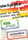

figure 2. Alfred Willimann, poster for the exhibition Light in the house, at the office, in the studio, Zurich Kunstgewerbemuseum, 1932. Lithography.
figure 3. Ernst Keller, election poster “Vote for the 4th list”, Switzerland, 1933–5. 129 × 92 cm.
figure 4. Ernst Keller, poster for the Rietberg Museum in Zurich (art collections from Asia, Africa and America), 1953–5. Linocut, 129 × 92 cm.
figure 5. Max Bill, poster/programme for a matinée at the Municipal Theatre, Basel Wulff Dance Studio, 1931–2. 127 × 90 cm.
figure 6. Otto Baumberger, poster for “Brak Bitter”, alcoholic drink, 1937. 128 × 90.5 cm.
It was in this environment that Meier trained, first as a compositor from 1939 to 1943, then as a graphic designer at the Zurich school up till 1946. Even though drawing and painting had been his favourite activities since childhood and other passions had made him fantasize about becoming a “builder of planes”, the circumstances of his life nevertheless led him to taking up typography (fig. 7). It was through family connections that he landed a job as apprentice compositor. The Zurich school allowed him to perfect his drawing, painting, graphic design, and most of all, calligraphy and letter drawing skills – activities in which he took an intense interest. He had great admiration for his professor, Alfred Willimann, a highly reputed calligrapher to whom, he later declared, he owed his whole career. Graduating from the school in 1946, Meier first worked at the Zurich cultural magazine Du. In 1948, he ventured off to Paris, with the aim of setting himself up as a self-employed graphic designer. But work was hard to come by and besides, his visuals were considered “too Germanic”. He decided to put his stay in Paris to good use by signing up for engraving classes at the École Estienne, where he perfected his drawing skills. Then, through an unexpected turn of events, he was offered a post by his ex-professor Alfred Willimann – to teach letter design at the school in Zurich. Delighted at this prospect, he returned to Switzerland.
figure 7. Illustration made by H. E. Meier for a poem at about age 14. Engraving.
Meier started teaching at the Zurich School of Applied Arts in 1950. He taught letter design and calligraphy there for 36 years, and he also conducted classes in painting, drawing and perspective (figs. 8 and 9). This is how he describes his experience of teaching letter design: “Teaching students letter design is a specific task in a school of visual arts. What’s more, it is not particularly popular since it requires undivided attention, precision, and perseverance […] So, the actual drawing of a typeface is a really difficult exercise […] Often, the students have not been properly prepared to study these subjects […] They therefore become easily disillusioned when they see the level of precision and rigour required of them. But without these qualities of conscientiousness and perseverance, it is impossible for them to progress beyond a beginner’s level – not only in the domain of writing and letter design, but also in the exact representation of perspective in drawing […] During the first few weeks of studying typefaces in particular, their creative forces are really quite limited […] But then, other exercises – chosen with the same objective in mind – can rapidly allow students to gain a certain independence and to express themselves in a more personal vein”.[6]

figure 8. Student exercise conceived for one of Meier’s classes: creating a composition with two initials inscribed in a square (linocut printed in two colours, four colours in all). Linocut.
figure 9. Student exercise conceived for one of Meier’s classes: cutting out the letters of a first name from a sheet of white A4 paper and reassembling them with the offcuts on a sheet of black A3 paper.
[signup]Right from the beginning of his teaching career, Meier prepared models of historical writing for his students, giving them specimens he had drawn himself (fig. 10). Subsequently, these samples were to form the matrix of his book The Development of Writing. The work was published in Zurich in 1959, in three languages – German, French and English (in the same edition, as is the practice in Switzerland, a multilingual country[7]). This first publication was reissued about a dozen times, each printed in an edition of 2,500, amounting to some 25,000 copies in all. At this point, it had yet to be translated into a fourth language. In 2011, Campgràfic’s publication of a Spanish translation of the book proved that there was still interest in the work more than 50 years after its very first publication. La Evolución de la Letra is a welcome step in the book’s trajectory, making it henceforth available to a wide Spanish readership.
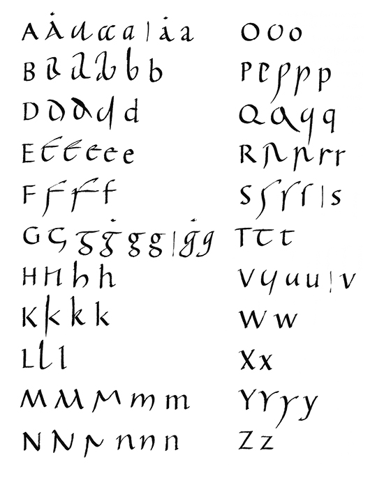
figure 10. Study of letterforms drawn by H. E. Meier: evolution of minuscule letter forms, preceded by a majuscule, made for his students.
The Development of Writing chronicles the history of the principle forms of manuscript writing in the Latin alphabet, complete with about ten important typefaces, providing around 70 specimens in all. This slow evolution spans 2,500 years of history – starting with the Greek lapidary inscriptions from the 5th century BC and coming up to today’s sanserif fonts, detailing along the way Roman square capitals, Rustic capitals, cursive writing of the first centuries AD, Uncial and Half-Uncial, the Merovingian and Visigothic scripts of the Early Middle Ages, Carolingian minuscule, Blackletter (like Textura, which was also the very first typeface used in printing), Humanistic scripts, Roman type, Cancellaresca, modern typefaces, 18th century scripts written with a pointed pen, and the Egyptian (figs. 11 to 19).
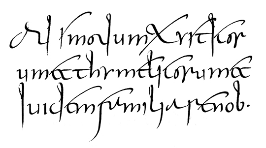
figure 11. Minuscule-cursive from the 3rd century. “While the square capitals developed into the Rustica and Uncials, they also underwent development into a current style, written for daily use quickly and with little care […] a minuscule-cursive was formed from the majuscule. These minuscules were to become decisive in the further development of western lettering.”
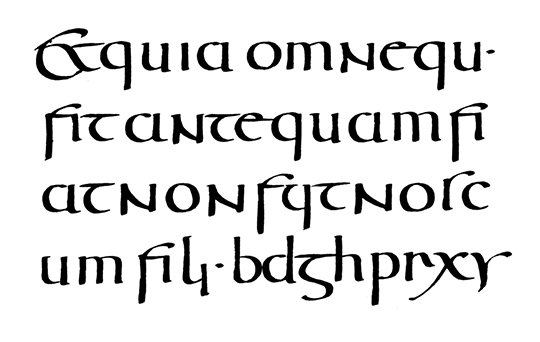
figure 12. Roman Half-Uncial from the 5th century. “They were written, as were the Uncials, with a reed or quill pen with the nib parallel to the base line.”
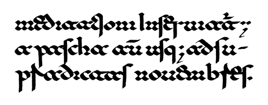
figure 13. Lombardic-Beneventan script from the 11th century – one of the writing forms in use in Italy at the time.
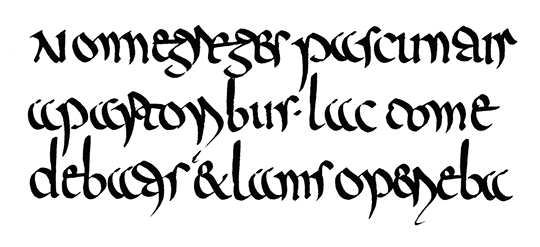
figure 14. Merovingian Book Script from the 7th century. “In France the Roman Cursive developed into the Merovingian script of the 7th century and into the East-Frankish script of the 8th century. In the latter, the beginnings of the Carolingian letters can be seen”.
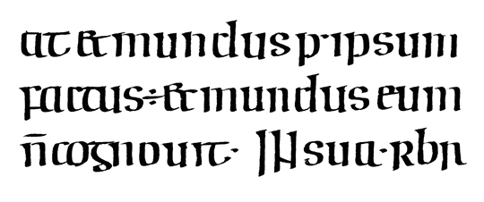
figure 15. Irish Half-Uncial from the 8th century.
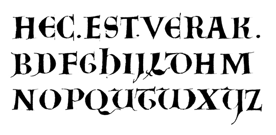
figure 16. Uncial from the late Carolingian period (outline traced with a fine nib).
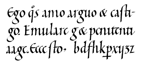
figure 17. Carolingian minuscule from the 11th and 12th centuries.
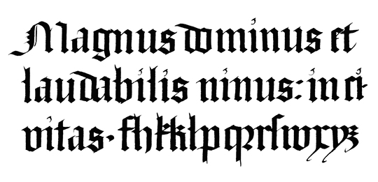
figure 18. Textura from the 15th century.
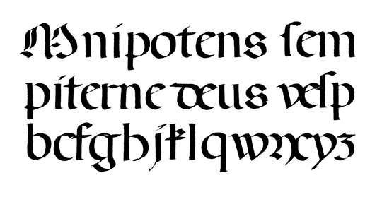
figure 19. Rotunda from the 15th century.
All the specimens of handwritten scripts reproduced in this work were hand-drawn by Hans Eduard Meier. His main aim was pedagogical – not to present exact replicas of the originals that history furnishes us with. Rather, he sought “to highlight the essence of the models and what they typify in order to illustrate more clearly the development of writing forms”[8]. The characters appear most often in fragments of texts, and sometimes in an alphabetic form. Schematic and didactic, the work sets out to retrace the major steps of writing forms with the help of drawings that are as precise as possible, leaving aside certain aspects of calligraphy. In this respect, it can be seen as a useful document – as much for the historian or the amateur as for those wishing to learn the basics of calligraphy or to perfect their skills in this domain. Max Caflisch, in his short preface to a new edition of this work[9], explains that Meier’s “own calligraphic specimens provide excellent models for all who practise this art. The emphasis throughout is on good letterforms and not on the emotional or expressive style in calligraphy”.[10]
“Hans Eduard Meier’s concern with good type-forms is deeply rooted,” Caflisch goes on to explain. “Starting with calligraphy, of which he is a masterly practitioner and scholar, his lifelong experience of script and type has been extremely fruitful”.[11] This return to sources has not prevented Meier from seeking out a decidedly contemporary idiom in his own work on letterforms. Possibly, it is his very interest in the evolution of a 2000-year old art form that has enabled him to envisage inscribing an original form in its repertoire. This could have been his ambition behind Syntax (figs. 20 and 21), his major contribution to fonts – and also his first – blending the old and the new. At the outset, in the mid-1950s, he drew a sanserif typeface based on the proportions of the Renaissance Humanistic scripts and Roman types (such as Bembo, Jenson or Garamond).
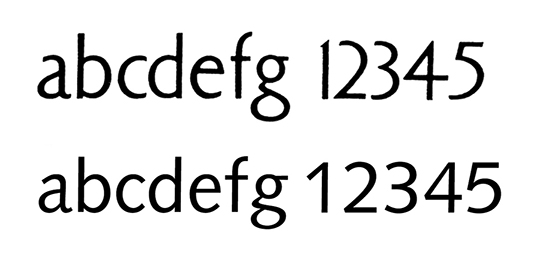
figure 20. Above: H. E. Meier, first version of Syntax, preliminary sketch, 1955. Below: digital version of Syntax.
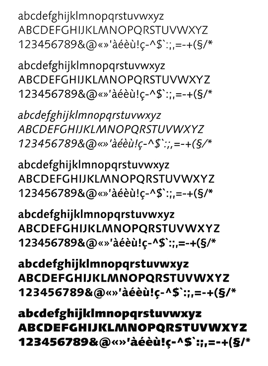
figure 21. Syntax styles (produced by Linotype): light, regular, italic, medium, bold, heavy, black.
Seeking a secular form, he deliberately avoided any type of purely geometric design or “normed” construction of letters. It is in this frame of mind that he conceived a specific font, which, as far as he knew, did not exist. His idea was to adorn block letters with features characteristic of scripts which appeared in Italy at the beginning of the Quattrocento and which gave rise to Roman type around 1470 (figs. 22, 23 and 24). In so doing, he questioned how a typeface which had proved remarkably readable throughout the centuries could evolve. Roman types had effectively remained dominant in the press and publishing ever since their invention, except in countries of Germanic culture.[12]
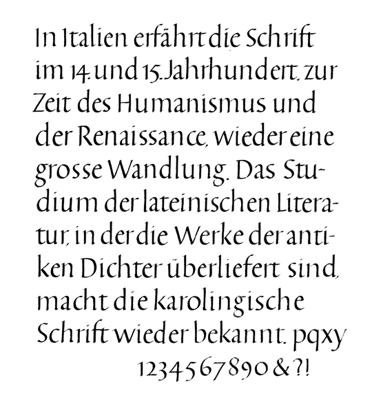
figure 22. Humanistic writing from the 15th century.
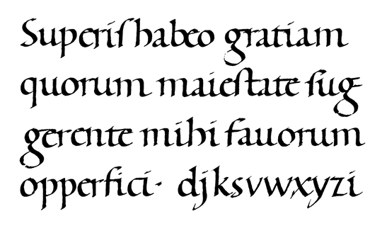
figure 23. Example of Humanistic writing – on which Syntax was based – where the letters correspond closely to the printed Roman type. Characteristic traits include: the rather flat start of the arch in the n (normally more rounded), the counters of the e and the a, and the contours of the g.
figure 24. Nicolas Jenson’s Roman type, Venice, 1475. Jenson’s fonts were among the first specimens of Roman type that still appear harmonious and very legible to us today.
Meier’s objective was not just to add his own letterforms to the repertoire of sanserif typefaces that already existed – of which there were hundreds of variants, possibly many more. Besides, he has not bequeathed to posterity any font bearing his own name. Rather, he chose to work on and adjust the silhouette of block typefaces, whilst keeping in mind the historical forms that have become our points of reference and to which we have become highly sensitized. Such were his convictions in this matter that he readily declared his “aversion for the standard sanserif typefaces – mechanically constructed and overly technical – like Helvetica and similar fonts. Neither am I in favour of Futura or Gill...for they, too, look as though they have been purpose-built […] At the time, the beginning of the 20th century...in an age when all things obeyed the laws of technology, it was thought that for a typeface to look modern, it had to have a structured look – as if made of building blocks” (fig. 25).[13] Numerous alphabets from the 1920s and the 1930s effectively show a tendency towards geometrical forms. But this was in keeping with the spirit of the times when the avant-gardes strove to forge a synergy between the arts, elaborating on elementary forms, exploiting geometrical contours and rendering the structure visible. As far as typefaces are concerned, the debate over drawing relative to construction has been brewing for a long time now. In fact, whether rhythms created manually take precedence over “normed” structure or not has been an on-going debate for several centuries (like the polemic over colour versus drawing in painting). Thus it was that in the 18th century the eminent typographer Pierre-Simon Fournier came to object to the first designs of the typeface known as “romain du roi” (King’s Roman). This typeface had first been sketched in the 1690s for the Imprimerie Royale at the behest of Louis XIV (fig. 26). Fournier fulminated: “How is it possible to have narrowed our minds and debased our taste to the extent of obstructing genius with such arbitrary and confusing rules? Does one really need so many squares to form an O – which is round – and so many circles to form other letters which are square? […] Real genius knows no rules, needs no compass – save for geometric forms”.[14] In the original project of the “romain du roi”, the letters had been formed effectively on a square grid divided into 2,304 units.
figure 25. Comparison between Futura (1927), Gill (1928), Helvetica (1957) and Syntax.
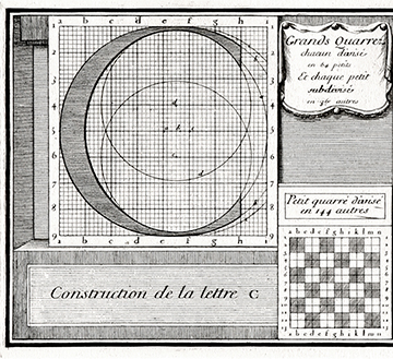
figure 26. Construction grid for “romain du roi” (King’s Roman) capitals, c. 1692. Typeface designed for the Imprimerie Royale under the reign of Louis XIV (Jaugeon method).
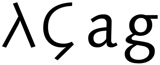
[social]Diametrically opposed to this logic of construction, Hans Eduard Meier was more involved in drawing, seeking natural forms – not calibrated ones – more intent on the trace left by a hand movement. His project consisted in imparting a historical aspect to a typeface that was resolutely modern. His aim was to infuse contemporary fonts with something of the simplest form of Latin scripts – with no serifs – which were revived in the 19th century. Given this rationale, the importance of Syntax can be better perceived through the lens of history. Product of an acute eye and an exacting practice, the typeface needs to be examined close up. Its most characteristic forms are in the letters a, b, g, k, n and x (fig. 27). Meier borrowed the specific contours of the Renaissance letters – for example, the proportions of the lower ascenders or the design of the n which has a fairly flat start to its curve.[15] Combining in the same design a synthetic structure with a model of legibility and elegance, Syntax reflects the harmony of a canon-inspired script while being very easy on the eye – questioning a long and widely held opinion (which is still around): namely, that sanserif letters are less readable in lengthy texts.[16]
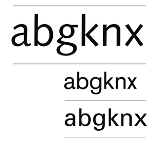
figure 27. Above: characteristic Syntax letters. In the middle: Akzidenz Grotesk (c. 1898). Below: Univers (1957).
The first sketches of Syntax go back to around 1954–5 (fig. 28). They reveal a typeface that was in progress, not yet settled nor with the fluidity that it attained in its final form (the start of the curves for example was still very flat). This is probably a sign of the complexity of the project and also proof of the importance of the most minute details. The first drawings were done free hand – without a ruler or a set square. Meier gave a very light, involuntary incline to the verticals. Though not intended, this characteristic – hardly perceptible – was finally retained, imparting a slight buoyancy to the typeface. After many years of research, the first version of Syntax finally came out in 1968 with three styles for lead composition (roman, italic, semi-bold, as Meier recalls).[17] Several years later, these first fonts were joined by two new variants (bold and extra-bold).
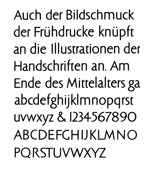
figure 28. Preliminary sketch for Syntax, 1955.
At first, Syntax did not sell very well. Meier believes that his typeface came out too soon, having to compete with two major fonts – Helvetica and Univers – which had already been on the market for ten years. Syntax, being available in lead, could not really appeal to printers, who had already started to move on to photocomposition. Today, having been adapted to photocomposition, Syntax exists in a digital form, with several dozen styles, including a version with serifs (Syntax Serif, created directly on a computer screen, based on the original typeface without serifs [fig. 29]).[18] For the version produced by Linotype in 2000, Meier remodeled the letters, believing that the original forms of Syntax were no longer totally satisfactory. He undertook minute corrections and made a number of changes to perfect his design – and this, nearly 50 years after he launched his initial project. That he spent half a century honing this typeface was basically due to personal motivations which led him to declare: “One cannot make a living by drawing letterforms; rather, one can only practise this craft as a pastime”.[19] Syntax, whose 2000 version now represents the ultimate form for Meier, may be seen as his major contribution to the repertoire of letterforms. A quintessential aspect of this typeface consists in the complex and audacious project that bore it, one that took several decades of maturation to accomplish. Only time will determine the mark it will make in the future.
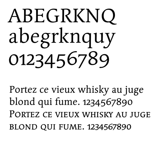
figure 29. Regular Syntax Serif (with small capitals), 1999–2000.
Amongst the other letterforms Meier created, we need to mention: Barbedor[20], Letter, Lapidar and Syndor. Syntax and Barbedor were the only ones he first sketched out on paper. Lapidar (fig. 30), like Syntax, is based on a historical model (fig. 31). True to its name, it is derived from an antique Roman lapidary script, in its sanserif version. Despite this, the font is quite versatile, certain letters having been redesigned or interpreted, based on older models.[21] As type and graphic designer, Meier also worked for industry as well as on cultural projects (figs. 32, 33 and 34). He created corporate identities and specific fonts for several companies. In 1995, he was commissioned to work on a typeface for Swiss banknotes, remodeling the condensed version of Helvetica for the purpose.[22] Since then, he has been busy working on new projects, in particular on Schulschrift (or Basisschrift [figs. 35 and 36]) between 2001 and 2003. This alphabet was designed specifically for those learning to read and write, and is used today in several Swiss cantons.[23] Amongst his typefaces from the turn of the century, there are also Elysa (designed roughly between 2002 and 2004) as well as a sanserif font – an ongoing project – inspired by both Syntax and Helvetica, provisionally called Konstructa or Glaris. (He started working on it around 2006 and took it up again in 2010). This, Meier believes, will be his last letterform.
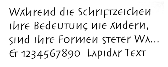
figure 30. H. E. Meier, Lapidar, sanserif version, 1995.
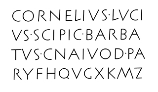
figure 31. Roman lapidary script from the 2nd century BC, on which Meier based his Lapidar font.
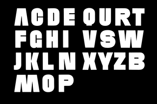
figure 32. H. E. Meier, typeface designed specifically to be embossed on the metallic parts of a belt, c. 1960 (not made to be printed).


figure 33. H. E. Meier, project for “Viktor Meyer” logotype, c.1960.
figure 34. H. E. Meier, logotype for Hobel, store specialized in hand-made objects and furniture, c. 1955.
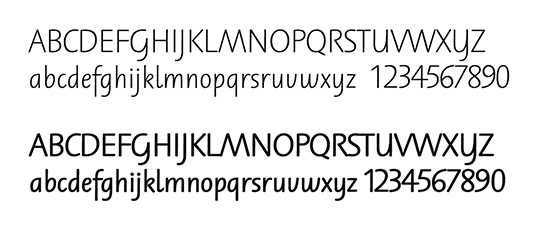
figure 35. H. E. Meier, Schulschrift typeface, regular and bold, designed between 2001 and 2003.
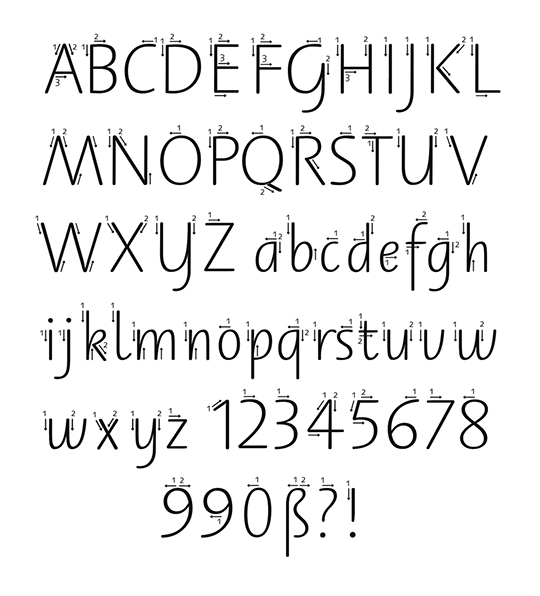
figure 36. Schulschrift typeface with ductus instructions (indicating the order and direction of each stroke).
Meier was also active designing posters for various cultural events in Zurich (exhibitions [fig. 37], concerts etc.) and, in a completely different vein, drawing letterforms for headstones (fig. 38). In his leisure time, he enjoyed creating numerous calligraphic designs inspired by poems – including those of Christian Morgenstern. His professional activity also led him to give lectures and run calligraphy workshops, both in Europe and in the United States.
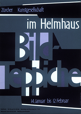
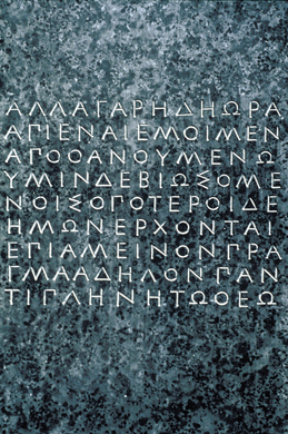
figure 37. H. E. Meier, poster for tapestry exhibition at the Helmaus Museum in Zurich, c. 1955.
figure 38. H. E. Meier, Greek lettering for a headstone (commissioned work), c. 1965.
To keep abreast of the latest technologies, Hans Eduard Meier learnt how to use digital tools in the mid 1980s. These became in a short spate of time his only method of creating new typefaces. Since then, he has ceased to sketch his fonts on paper – besides, he does not even own a scanner. His love of nature and natural forms has remained intact. Perched high up in his little village in the hills, he commands a breath-taking view – over and above his computer screen – of the mountain chain that overlooks Lake Walen.
Far from the hectic race of contemporary society and its concomitant competitiveness in visual stimuli, Meier’s work can be seen as a form of typography motivated by legibility and nuance, as opposed to that designed for impact and high visibility. With no lucrative finality, his work was conceived as a voluntary contribution to typography and writing – Syntax having taken almost half a century for its designer to find the ultimate form to encase it and make it a versatile typeface. Eventually, it became a superfamily.
Maybe this is a characteristic of our time that know-how in crafts imbued with a spirit of moderation exists side by side with a field of creative activity in continual effervescence – bent on innovating, and equally important. Meier’s opinion has always been unequivocal: he has the greatest reservations as to the opening attributed to recent and current practices, considering “an absurdity any typography whose raison d’être is to exploit all the possibilities of digital production”.[24]
His whole career and output resonates with Milan Kundera’s praises of slowness: “Speed is the form of ecstasy which the technological revolution has given to man […] Why has the pleasure of slowness disappeared?”[25] The attraction of adopting a slower pace gives us an insight into the artist’s mindset: the typographer seen more as an interpreter and passeur, firmly grounded in experience and the belief in what time can accomplish. Seen in this light, Hans Eduard Meier can be seen to have engaged in typography that was to endure, pursuing an aspect of letter-drawing where forms develop very slowly over time – sometimes evolving over centuries – impervious to mainstream movements while still being integral to their time - and all this, way beyond the span of a man’s lifetime.
NB : figures 11–19 and their captions taken from H.E. Meier’s book Die Schriftenwicklung / The Development of Script and Type / Le Développement des Caractères. The handwritten specimens in this book were drawn by H.E. Meier (Latin texts).
Original quotations in English appear as such in the text, notes and captions. Other quotations have been translated from the French version into English.
This text, entitled “Hans Eduard Meier, una vida dedicada a los caracteres” in its Spanish version, is the preface to the Spanish edition of Meier’s book La Evolución de la Letra, published by Campgràfic in 2011 (original edition: Die Schriftentwicklung / The Development of Writing / Le Développement de l’Ecriture, 1959). It is a modified version of the original article “Hans Eduard Meier, en toutes lettres” by Roxane Jubert which featured in the review Etapes Graphiques in 2000 (no.67, November 2000, pp.58–70). The illustrations in the text are, for the most part, those that figured in the original article.
Notes
1. First edition: Hs. Ed. Meyer [sic] Die Schriftenwicklung / The Development of Writing / Le Développement de l’Ecriture, Zurich: Amstutz & Herdeg, Graphis Press, 1959, German / English / French. Hans Eduard Meier’s book has been reissued about a dozen times, with the title modified to Die Schriftenwicklung / The Development of Script and Type / Le Développement des Caractères.
2. Kunstgewerbeschule (literally School of Arts and Crafts), now called Zürcher Hochschule der Künste (ZHdK).
3. Johannes Itten was the director of the Zurich School of Applied Arts and the Arts and Crafts Museum in Zurich from 1938 to 1954. When the avant-garde movement was in full swing, he played an important role at the Bauhaus, where he had been active right from the foundation of the school in 1919. He ran the famous “preliminary course” there. Painter and colorist, he is also the author of The Art of Color.
4. Professors at the Zurich School of Applied Arts, Alfred Willimann and Ernst Keller were among the most prominent graphic artists working in Switzerland between the interwar years and the 1950s. Both were instrumental in the development of graphic design and typography, in particular through their teaching. Ernst Keller (1891–1968) studied lithography and typography in the early 1910s. Graphic designer, typographer, poster artist, heraldist and sculptor, he started teaching graphic design at the Zurich school in 1918. Many people consider him as the pioneer of “Swiss graphic design”. Alfred Willimann (1900–57), having studied at the Zurich school himself, went on to teach drawing, letter design and typography there, starting in 1930. His professional activities covered a wide spectrum – graphic design, typography, sculpture, photography, writing, calligraphy and drawing.
5. Testifying to the buoyancy of the environment in the 1910s, numerous exchanges took place between the artists in Switzerland and the avant-garde protagonists. It was in Zurich that Dada was founded in 1916, around the poets and artists in exile who had fled there from their homes in the first world war. It was also in Zurich that Jean Arp and Sophie Tauber met for the first time, in 1915. El Lissitizky traveled regularly to Switzerland in the 1920s (Die Kunstismen, co-written with Arp, was published in 1925). It was from Switzerland that numerous contacts were established with the protagonists of the European avant-garde, such as Kurt Schwitters, Le Corbusier and Walter Gropius. Max Bill settled down in Zurich when he went back from the Bauhaus in 1929. Paul Klee and Johannes Itten also went back to Switzerland, to escape from the Nazi regime. Jan Tschichold, spokesman for the New Typography, made his home in Basel in 1933, having been forced to give up his teaching post in Munich. All these cross-border comings and goings evidently contributed to the development of graphic design and typography in Switzerland – right from the beginning of the 1910s and all through the following decades.
6. Hans Eduard Meier, “Mein Schriftunterricht im Vorkurs der Schule für Gestaltung in Zürich”, Typografische Monatsblätter / Revue Suisse de l’Imprimerie, Switzerland, no.4, 1991, pp.1–2.
7. The main languages spoken there: German Swiss, German, Italian, French and Romansch.
8. Die Schriftenwicklung / The Development of Writing / Le Développement de l’Ecriture, Zurich: Amstutz & Herdeg, Graphis Press, 1959, p.4.
9. In the original edition, the book was prefaced by Hans Fischli, who was the head of the Zurich School of Applied Arts at the time.
10. Max Caflisch, preface to Die Schriftentwicklung / The Development of Script and Type / Le Développement des Caractères, Cham (Switzerland): Syntax Press, 1994, p.3.
11. Ibid.
12. In Germanic countries, Blackletter had been widely used in printing up till the 20th century.
13. Extract from a lecture given by Hans Eduard Meier at the “Typo[media] 2000” conference held in Mainz (Germany) on June 22, 2000 (the transcript of this lecture conveyed in a personal letter).
14. Quoted by Francis Thibaudeau, in La Lettre d’Imprimerie, vol.1, Paris: Bureau de l’édition, 1921, p.264.
15. See the in-depth study (in German) by Max Caflisch “Die Druckschriften von Hans Eduard Meier”, in Typografische Monatsblätter / Revue suisse de l’imprimerie, Switzerland, no.6, 1996.
16. This opinion, held by some professionals of letter design, concerns text types. While there may be several reasons for this, the main one possibly has to do with secular writing habits – most long texts having been printed in Roman typefaces for centuries. The case of the fonts designed by John Baskerville (18th century) shows that our perception in this field is relative, and very much influenced by habit. It was received with considerable hostility, one detractor of the Baskerville type going as far as to claim it would be “the means of blinding all the readers in the Nation [the United States] owing to the thin and narrow strokes of the letters” (quoted by Allan Haley in “John Baskerville of Birmingham, Letter-founder & printer”, U&lc (Upper and lower case), New York, vol.11, no.4, February 1985, p.15). Today, Baskerville is considered one of the great classic models of Roman typefaces that are particularly appreciated for their legibility.
17. For example, each version took about two months’ work. Syntax was the last lead font manufactured by the Stempel Foundry in Frankfurt.
18. Meier toyed with the idea of creating a particularly ornate version of Syntax with digital tools.
20. Named after Louis Barbedor, exceptionally talented French calligrapher, “Secrétaire ordinaire de la Chambre du Roy”, in the 17th century.
21. See the letters e, a and g.
22. To this end, he redrew certain letters whose forms he did not find fully satisfying, adjusting the weight, and slightly reducing the width of the characters in order to space them out better – judging those in previous banknotes inadequately spaced.
23. With this project, Hans Eduard Meier aimed to create a repertoire of simple forms that children would find easy to read and copy. See the website www.schulschrift.ch (in German). See also: Hans Eduard Meier, “ABCSchrift: Eine zeitgemässe Handschrift”, Typografische Monatsblätter, Switzerland, no.2, 2004.
24. Personal correspondence (transcript e-mailed July 5, 2000).
25. Milan Kundera, La Lenteur, Paris: Gallimard, 1999, pp.10–12.