
Nara – the typeface that never existed
I was very lucky to receive my earliest training in typography from my father. Besides teaching me calligraphy, he taught me to respect the historical development of typography, as well as to disdain uninformed experimentation for experimentation’s sake. For me, during those early years, the essence of all knowledge of type was his enormous two-volume edition of František Muzika’s Beautiful Typefaces (Krásné písmo ve vývoji latinky), a complete history of the Latin alphabet with many full-page illustrations. Years later my training continued under professor Jan Solpera in the very atelier founded by Muzika at the Academy of Arts, Architecture and Design in Prague. Solpera, apart from his many typeface designs, also created the systematic Classification of Print Type, which became an official, state-mandated norm in Czechoslovakia in 1979. As surreal as it may seem to impose a norm on typeface forms, this shows how highly this system was regarded by professionals in our country. And Solpera was a great teacher who led us through the systematic development of our first original typeface designs based on an understanding of history.

Muzika’s monumental 2-volume book Krásne písmo ve vývoji latinky I, II (Beautiful Typefaces I, II) 1958, 1963. This valuable and richly illustrated book was also published in German in 1965 (Die schöne Schrift in der Entwicklung des lateinischen Alphabets, Hanau am Main: Verlag Werner Dausien).
But even as a young boy studying Muzika’s books, I had been fascinated by the idea of ‘non-existent’ typefaces, designs that had never been conceived or realised. From the days of Gutenberg to the beginning of the 19th century, typographers built on the designs of their predecessors or colleagues, developing their own letterforms in the quest for more beautiful and useful type. Partly because of the great difficulty of producing type and partly because of the limited number of really influential type foundries, the development of type during this period seems nearly linear: small but important steps lead from one great design to the next. Tracing this historical progression, one gets the impression that type design necessarily developed along the only possible, logical line available, given the technological limitations of the era.
The power of these ingenious designs was such that they led the whole industry, establishing the direction for generations to come. But surely there must also have been other typefaces which, for whatever reason, were not selected for survival. So could the development of type have taken a different direction? Why is it that most historical periods are associated so strongly with certain characteristic combinations of formal elements?
In school we were taught to recognise which combinations of elements were typical for given periods and not to tamper with them. Only later when I was studying Solpera’s Classification did I realise that there could be alternative ways to combine formal elements in typefaces. More importantly, I realised that perhaps whole categories of type were missing from history!
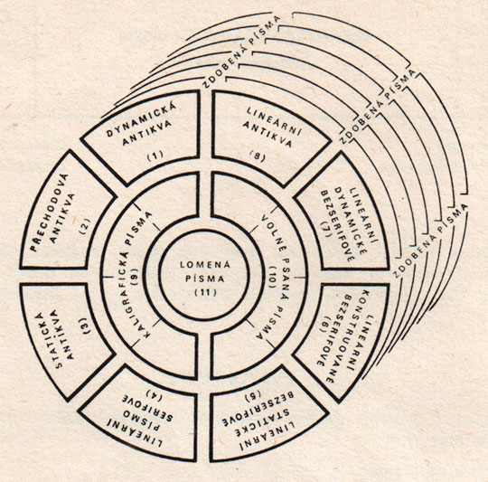
Professor’s Jan Solpera Classification.
1 Dynamic Roman, 2 Transitional Roman, 3 Static Roman, 4 Linear serif type, 5 Static linear sans-serif type, 6 Constructed linear sans-serif type, 7 Dynamic linear sans-serif type, 8 Linear Roman, 9 Calligraphic type, 10 Handwritten type, 11 Broken type (blackletter). In concentric rings, Ornamented type (Zdobená pisma)
Solpera’s system takes a different approach from other type classification schemes: instead of dividing historical typefaces into classes by historical similarities, he analyses them primarily from the standpoint of dynamic and static structures. Dynamic structures are characterised by an oblique axis of contrast, moderate contrast between line widths, rounded serif junctions and a greater variation in letter widths, whereas static structures are characterised by a strictly vertical axis of contrast, strong contrasts between line widths, sharp serif junctions and more uniform letter widths. There is a transitional variant between those main classes which marks the historical steps that led from one principle to the other.
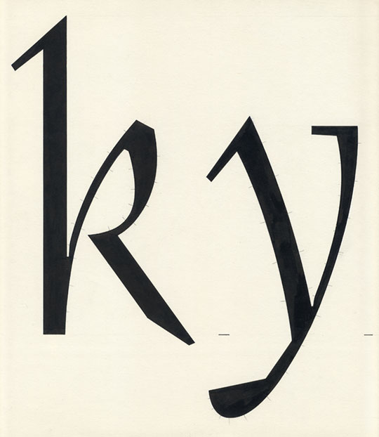
As I soon discovered, however, the classification does not fully cover the possibility of a truly dynamic typeface which also incorporates a very strong contrast between thin and thick strokes, precise linear serifs with sharp junctions and other ‘modern’ formal details. Intrigued, I began to search all the available specimens for such a typeface, but I could not find any that really fit the description. It seemed, in fact, that at least in the case of ‘text’ or ‘book’ typefaces, all had been created as direct descendants of their historical sources.
And it was exactly the body text applications of such an imaginary typeface that interested me most. My idea was that the dynamic principle would lend the typeface better readability in text sizes, while the more decorative, contrasting elements would give it a very fresh, contemporary character.
Another important idea for me was the possibility of creating an upright cursive style based on the dynamic principle of humanist calligraphy. Early printed humanist cursives were at most only slightly tilted to the right and were used in combination with upright antique capitals because the cursive is not a function of angle, but of a fast-flowing, handwritten form with connected letters. Such an upright cursive could possibly be combined with a true, slanted Italic version, creating a family of three base designs.
[signup]I started designing such a type family with the working name Adriq as a school project in 1988, starting with a base roman typeface and upright cursive.
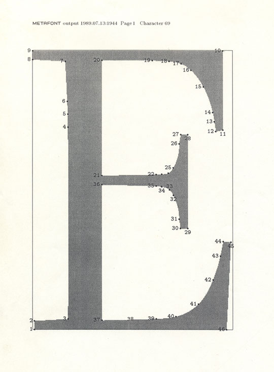
Original drawings marked up for digitisation with Metafont.
The first stage of drawing was relatively quick, and I drew the ‘analogue’ masters by hand in ink at a large scale to prepare them as perfectly as possible for photo reproduction. I could then set headlines and short texts by literally cutting and pasting letters together one by one. But soon I realised that I needed to find a way to digitise my type, not only to test it in real usage conditions, but also to facilitate generation of the slanted Italic from the cursive forms. Photocomposition was already a dead technology at the time, but digital type creation was far beyond the reach of a student from Eastern Europe since URW’s Ikarus font digitising system required an unimaginable investment in technologies, and Macintosh was still only a distant legend (and possibly still under US trade embargo). But soon a friend introduced me to the free Metafont programming language by Donald Knuth, which could run on a basic PC and was, together with the TeX typesetting program, capable of generating digital fonts.
The problem with Metafont was that there was no graphical interface, nor even a way to ‘scan’ an existing drawing into the software. Instead, each letter needed to be entered via the command line as a complex mathematical description before it could be printed or displayed. This was an extremely time-consuming process which involved overlaying the original drawings with millimetre graph paper to establish the coordinates of the key points for each character. These, however, needed to be entered with 0.1 mm accuracy, so it was a process of continual trial and error.
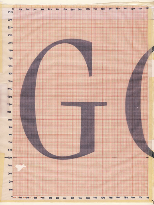
Millimetre graph paper over a drawing.

Lowercase ‘i’ in Metafont language with notes.
Metafont sample output.
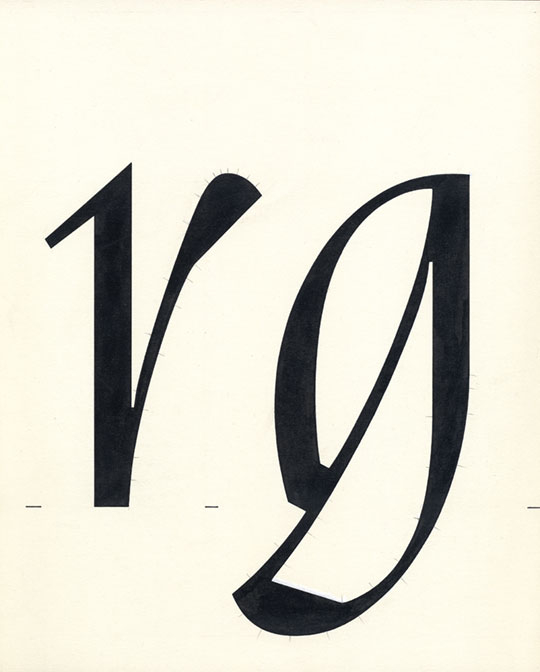
[social]Metafont finally gave me the opportunity to experiment with the slanted (true italic) version of cursive. I found that the calligraphy-based design worked in italic with just a few changes, namely the right bottom serif of letters such as lowercase m, n and u. Surprisingly, the slanted uppercase worked as well.
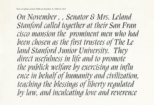
First sample of Italic text.
Another important feature of Metafont was its ability to create intermediate weights from two extreme base weights. I experimented with different weights, albeit only on a limited set of characters. The high contrast of thin and thick strokes gave the heavy version a surprisingly distinct and decorative character compared to the base design.
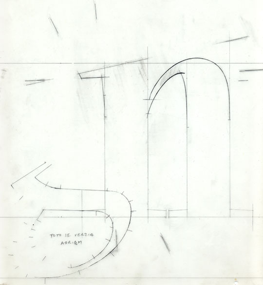
Sketches on tracing paper.
After this initial success with Metafont I realised that font technology was moving fast and that PostScript format was the next step forward. I designed my next typeface (FF Bradlo) directly in Fontographer, but I was not brave enough to start all the work on Adriq from scratch. It took several years before I was able to find a method to convert the digitised Metafont files into PostScript. But then came Unicode with its extended character sets, and the sheer complexity of completing the project to my satisfaction kept me from finishing the work.
Fortunately, several years later, Johanna Biľak asked if I would contribute Adriq to the e-a-t (experiment and typography) project and exhibition. She and Peter and I have been friends since their student days in Bratislava, so when Peter proposed that we finish the typeface for Typotheque I was really happy that we could do this together. Peter brought Nikola Djurek into the team, whose input was decisive in creating the many missing characters, especially in the heavy weight. I was really surprised at how deeply Nikola understood my design intentions when creating completely new glyphs. Peter’s input was invaluable in leading the work and proposing some important changes which made the design more contemporary and much more useful. My work was mostly to comment and correct the detailed drawings, but I must admit, that the full OpenType character sets and my perfectionist nature made even that a large task.
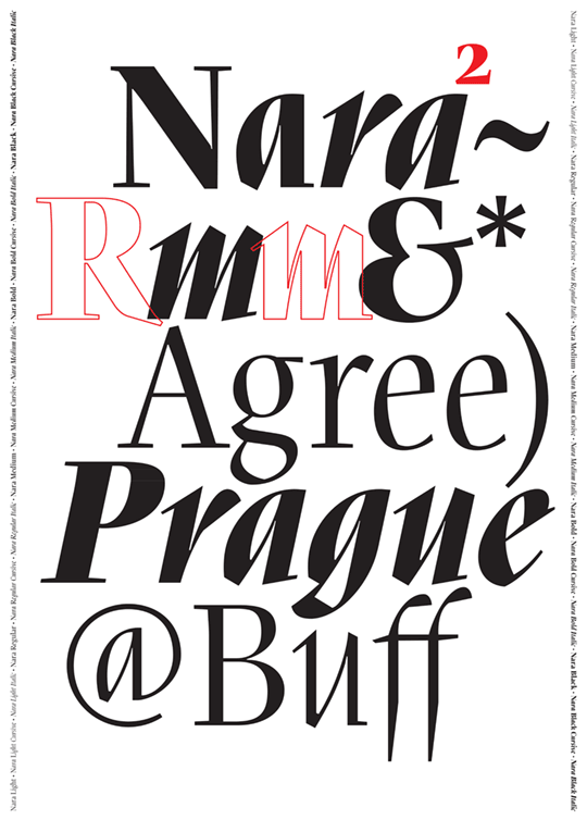
Finally it was time to decide on a name for the new typeface family. In connection with my recent visits to Japan I decided to rename the font after the tranquil, historic city of Nara, with its extraordinary Buddhist temples, the largest Buddha statue in Japan, and a large park full of freely roaming deer.
The Nara typeface family was completed and released by Typotheque in June 2009, 20 years after the initial design. In 2011 it received honourable mention at the National Prize for Design, the highest award in the field of design in Slovakia.
I would like to thank my father, Ľubomír Krátky, Prof. Jan Solpera, Johanna Biľak, Peter Biľak and Nikola Djurek for their inspiration and help with Nara.
See the high resolution images on Flickr.