Process of development of Charlie & Echo
There’s no definitive point when a typeface is ‘done’. When I attended the Type & Media masters course in the Hague, my instructors assured me of this, though it’s taken a good six years to fully grasp the concept. The typeface Charlie was first ‘finished’ in the fall of 2008 at the completion of my thesis project at Type & Media. Three years later, Charlie was finished for the second time when it was published by Typotheque, and I wrote these notes about developing Charlie. Now for the third time, Charlie is finished yet again with the extension and complete overhaul for the release of Charlie LCG. I suspect a trend is developing...
A typeface is done when the designer says it’s done, or at least until they decide to work on it a little bit more. There are always more weights to be added, unicode support to be expanded, new companion styles for display or text, or the constant tinkering that’s possible with software that examines the tiniest of bezier segments at 1000% scale.
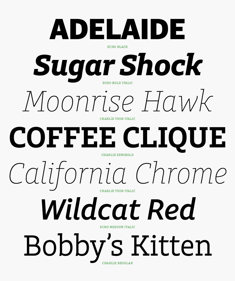
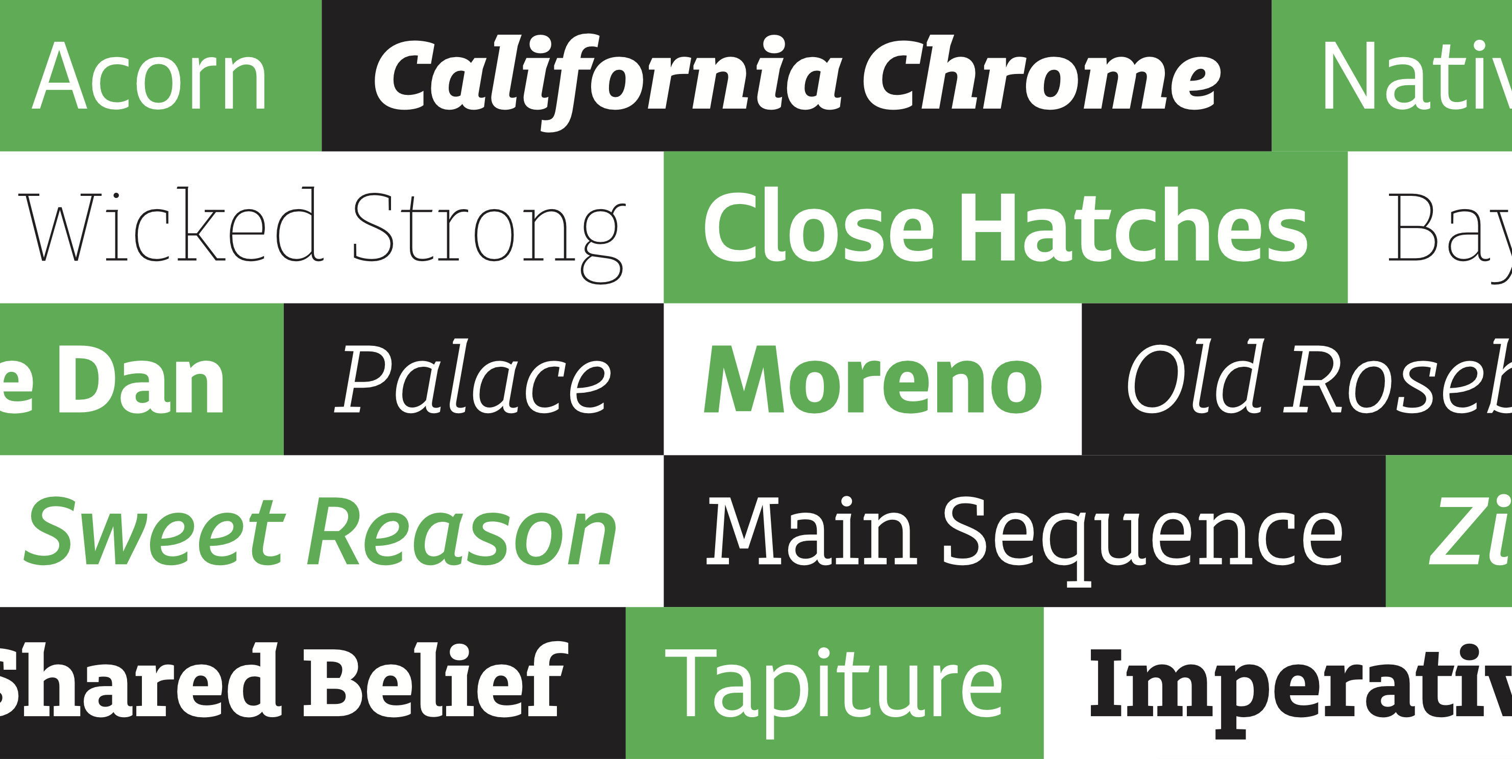
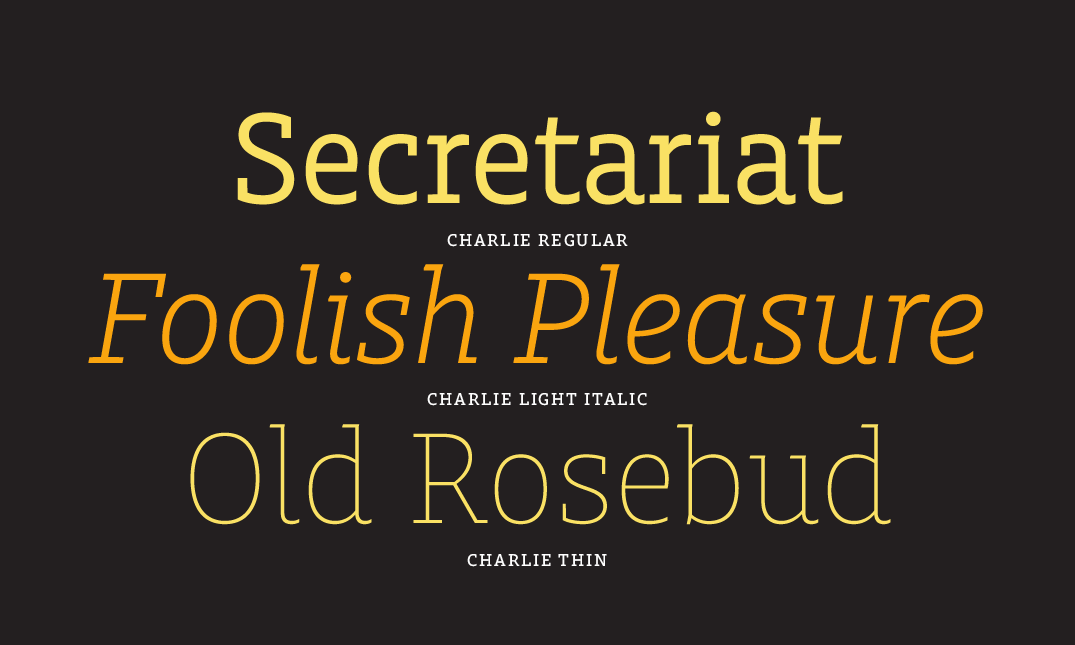
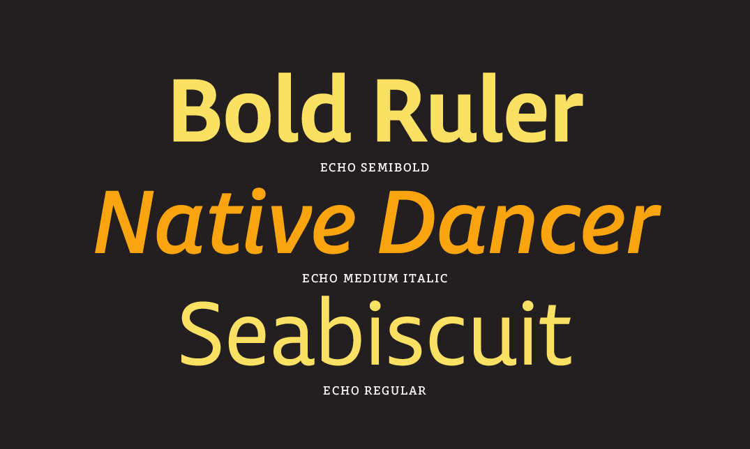
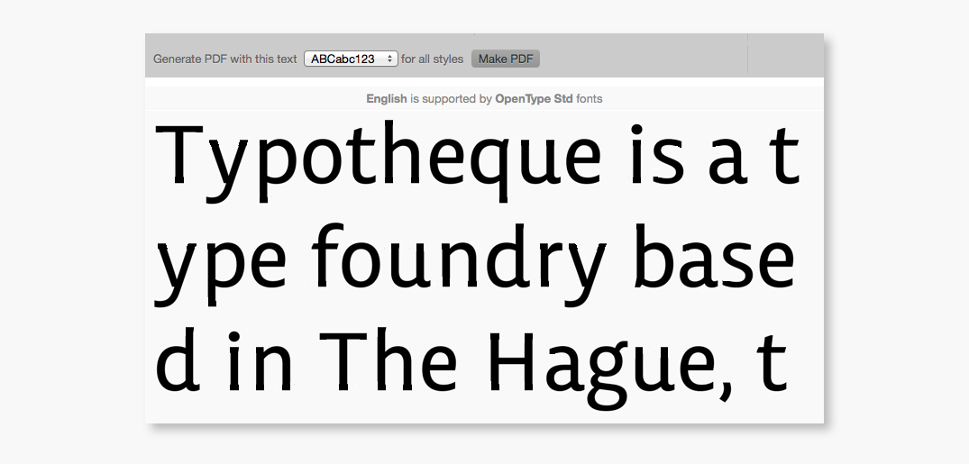
For now, Charlie is done. With support for over 140 languages across Latin, Cyrillic and Greek scripts, eleven weights with corresponding italics, numerous figure styles, expanded icons, arrows and too many currency symbols to count, it’s fair to say that Charlie has grown bigger than ever envisioned.
Getting reacquainted with an old friend
To call the latest LCG release of Charlie an expansion does not go far enough. Since the release of Charlie Std, we’ve been able to observe Charlie in use and have applied these observations during the development of Charlie LCG. Charlie has been fundamentally overhauled and retooled, with much care taken to ensure that Charlie LCG is still ‘Charlie’. Our intent is that the specific changes are subtle, possibly unnoticeable to most users, but that the type as a whole functions better as a result.
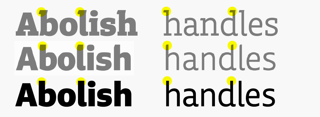
For the most part, these details are… details. The middle joints of the W and M in uppercase, and w in lowercase were heightened to correct the relationship between positive and negative space, particularly in the heaviest weights. Mild contrast was added to the joints in lowercase letters to alleviate density when text is used at small sizes. The proportions of small caps and small cap figures were widened for better integration with text settings. Many round curves, such as the capital O were inflated to maintain the square, upright qualities found elsewhere. Ordinals and superior figures were redrawn entirely and punctuation in the black weights was lightened somewhat. Mostly, however, the overhaul of Charlie presented an opportunity to simplify ideas back to the core of the typeface, saying goodbye to extraneous details in favour of strict adherence to the type’s logic.
Making changes and releasing a new version of a typeface can be dangerous, but care has been taken to ensure the types still function the same. Previous users should be able to replace old versions of Charlie with the newly updated sets.
First this, then that
If a typeface is never ‘finished’, another truth is that type design is seldom a linear process of idea and execution. Type design is like solving a puzzle where each individual piece fits in place only as the full picture comes into view. Every new idea informs previous decisions and new ideas are far too plentiful when dealing with projects that span numerous years.
Nearly halfway through the latest development, a respected friend in the type design world sent an image of Charlie Regular, slabs erased, and the message ‘just cut the serifs off’. With this, Echo was born and Charlie went back to the drawing board. Again.
The decision to name the sans serif Echo, and not ‘Charlie Sans’ came from a desire to give each typeface the freedom to deviate when needed. Like Charlie, the name Echo comes from the Radiotelephony alphabet. While it started as a convenient name for a divergent type family, the name informed how Echo developed. An echo is never an exact replica of a sound. Instead, the copy changes slightly, shaped by the environment that creates the echo.
The initial sketches for Echo attempted to retain as much of Charlie as possible, envisioning a sans serif counterpart acutely aware of its predecessor.
Charlie has subtle influence from the broad nib pen, creating small notches in the lowercase serifs that lend the typeface its angular quality.
Early attempts to translate these attributes directly from Charlie created a letter that felt uncertain of itself. Other attempts to leave these details behind entirely felt too disconnected from the series.
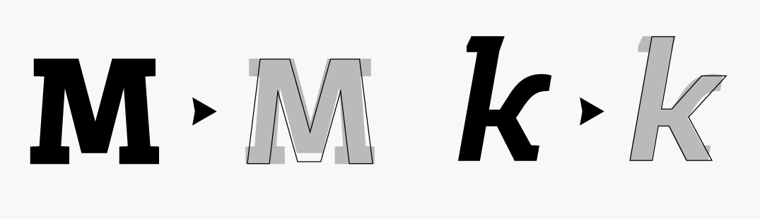
At times, forms were exaggerated or proportions adjusted to fit the identity of the specific type. In Echo, the capital M form becomes wider and with deeper diagonals than the forms found in Charlie. It takes its proportion from the width of the capital W, which Charlie’s M deliberately contrasts. In other cases, Charlie was revised to contrast better with Echo and slab serif forms were added to the two and four numerals in relevant styles
From the earliest stages, the two typefaces developed more-or-less simultaneously. In retrospect, it was never the most efficient way to work, though it created an outcome where both typefaces had the benefit of learning from the other. Seeing similar forms without serifs lent a new perspective to certain shapes, causing issues with contrast or stress to become instantly obvious.
Cyrillic and Greek Sets
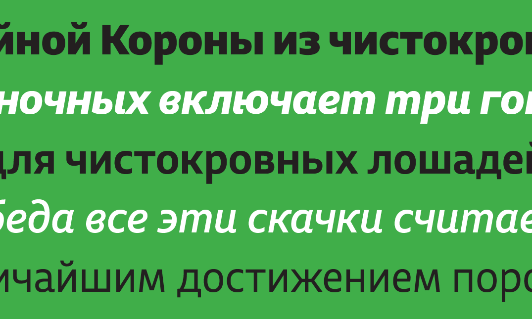
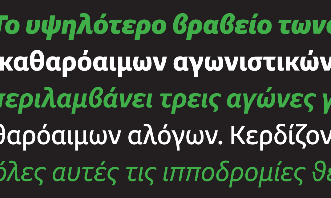
At the same time Charlie Std was being published in 2011, work had already begun on an expanded LCG set including support for Greek and Cyrillic scripts, each of which presented its own set of challenges. Initial lowercase Cyrillic forms broke from Charlie’s broad-nib influenced serifs and retained the symmetrical slabs found in the uppercase set. However, unlike Latin forms, upper and lowercase forms share very similar DNA in Cyrillic. With a large x-height such as Charlie and Echo, the two sets run the risk of blending together, making it essential to ensure the differences are perceptible. The issue is only compounded with the addition of small caps. The decision was made to let the serif structure follow the lowercase Latin forms directly. In the italic, the lowercase Cyrillic forms were given asymmetrical serifs further distinguishing the upper and lowercase sets.
Figure Styles
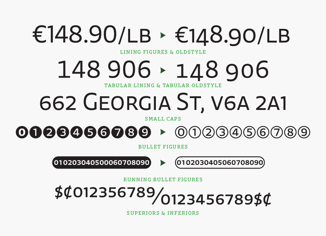
Along with the extended language support, additional figure sets were added to build on the standard proportional, tabular, lining, non-lining and small cap sets. Full sets of bullet figures were create, plus smaller bullets that can be used to create a variety of number strings.
Icon Sets
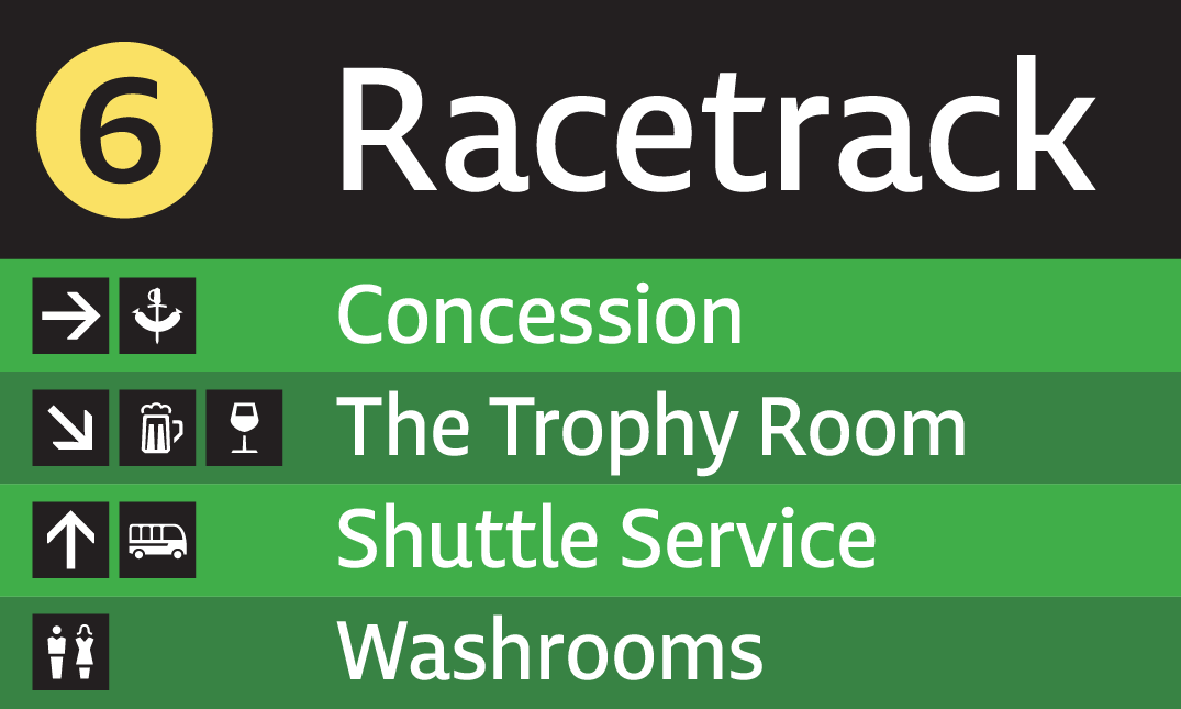
When Charlie Std was published, a narrow set of symbols were created to fit with the intended signage and gallery settings. For the release of Charlie and Echo LCG, extensive icons have been added by Vancouver-based designer Josh Nychuk.
Unfinished Business
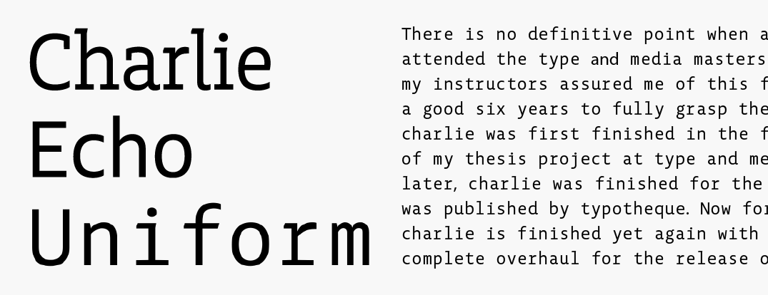
Coming full circle on a project that started six years ago, it feels strange to consider Charlie and Echo ‘done’. Against my better judgement, I’m slowly becoming comfortable with a project in constant on-again-off-again development. One of the latest evolutions is the addition of a monospaced variation, originally codenamed Uniform (Alpha, Bravo, Charlie, Delta, Echo… Unicode; how convenient!) From early sketches, the narrow forms of Charlie and Echo are well-suited to a monospaced variation.
With projects that last as long as a typical typeface development, new avenues are boundless. Sometimes these provide fruitful new directions worth exploring. At present, a monospaced companion is still in its infancy, without a clear timeline for development. Patience in type design is essential; Everything in it’s own time.
Special thanks to Natasha Raissaki, Gayaneh Bagdasaryan, Berton Hasebe, Kris Sowersby, and of course, Peter Bilak for their help in the production Charlie and Echo LCG.