Secondary Style in Hebrew Typography
Most of the Hebrew text typefaces consist of two styles at the most: Regular for running text, and Bold for emphasis. Occasionally there are also in-between weights, but those usually fail to create a clear hierarchy of text.
Complex text requires working with a range of styles in order to differentiate types of content. In Hebrew typography, a sense of improvisation is necessary to solve complex text situations: using a different typeface, a d r a m a t i c change in letter spacing, and underlining words are common solutions that evolved to become acceptable conventions.
Operating systems and word processors do suggest an ‘Italic’ style in every language (slanting letters in a fixed angle). But the notion of Italic is rooted in the Latin typography and is unrelated to Hebrew. As a result, Hebrew readers confuse Italic with oblique and consider Italic simply as a slanted form. They are not aware that a ‘true’ Italic is an entirely different construction principle of letterforms.
While the Latin typography has developed tools for differentiating text hierarchies that enabled the expression of distinctly different types of content (uppercase, lowercase and small caps, formal (upright) and informal (italic) styles)—and which became integral to the development of modern typography, Hebrew has not made such advancements. Hebrew is one of the oldest writing scripts. Its alphabet was considered a holy script and was used historically for religious needs.
The first revival of Hebrew as a modern printed text happened in Germany at the beginning of the 20th century, when a few new Hebrew typefaces were designed—Frank-Rühl is the most significant one of that time (Raphael Frank and Otto Rühl, Leipzig, 1910), followed by other examples of modern Hebrew type, in the 1950s. In less than a decade, five of the most canonical and influential Hebrew typefaces were designed. (David: Ismar David, Hatzvi: Zvi Hausman, Narkis Block: Zvi Narkiss, Hadassah: Henri Friedlander, Koren: Eliyahu Koren). Those essential typefaces, created out of line with normal historical processes, were designed with an affinity to the ancient hand-scripts known in Hebrew, from 530 BC (Second Temple Period). It was a time lapse, an accelerating and pioneering process of designing the face of modern Hebrew.
Cursive Hebrew
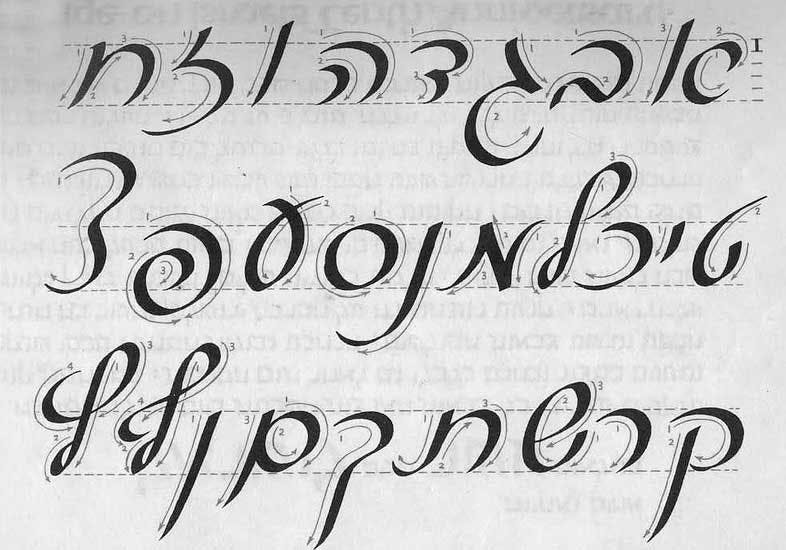
Cursive Hebrew developed from the 7th to the 19th century, as a faster method of writing. Those cursive forms were adapted from the formal Hebrew letterforms, although seemingly the two systems look rather unrelated.
While both constructed and cursive Hebrew systems are taught at schools simultaneously from when children start to read, the informal style hasn’t integrated into printed typography.
As a comparison, the Latin Italic, used together with the formal upright style as one unified system, has been is use from around the 1500s. Cursive Hebrew became popular in lettering for posters during the 1950s. It is almost always used for headlines and very short text and was never meant as a secondary text style for continuous reading.
The first attempt to design a cursive Hebrew as a secondary text style took place in the 1950s, when Ismar David, a German-born Hebrew calligrapher, created David Cursive, a typeface designed to slant to the left, towards the Hebrew reading direction.
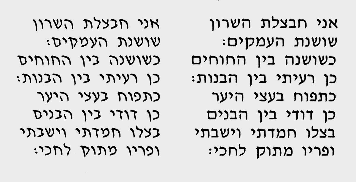
David Cursive is slanting to the left, towards the Hebrew reading direction
Although there were many literature and poetry books typeset in David typeface, the cursive style never won the appreciation it deserved. Today it is hard to find it in print at all.
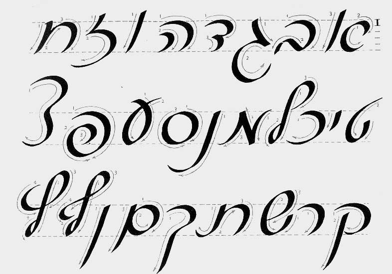
Hebrew cursive, from the The Art of Hebrew Lettering, L.F. Toby, Schuster, 1987
In trying to design a cursive style for Fedra Hebrew, I started very cautiously. The fact that the use of cursive styles was never adopted, and has no other historical reference, made it even more difficult. I was, however, determined to give it a try, to develop a complete system that gives Hebrew typographers the same possibilities as Western typographers have. Unlike David Cursive, I decided to slant the forms to the right, not just to follow the rhythm of the Latin writing, but to follow the logic of Hebrew handwriting. A right-handed person naturally slants letters to the right; it is simply an effect of holding the pen, and is more practical than slanting to the left.
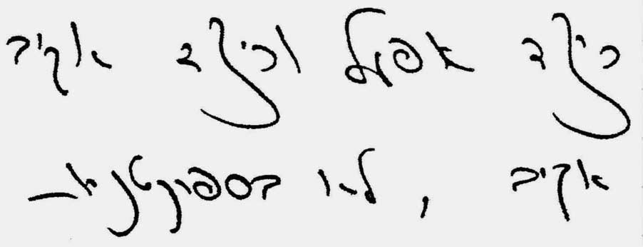
Typical handwriting of a left-handed person
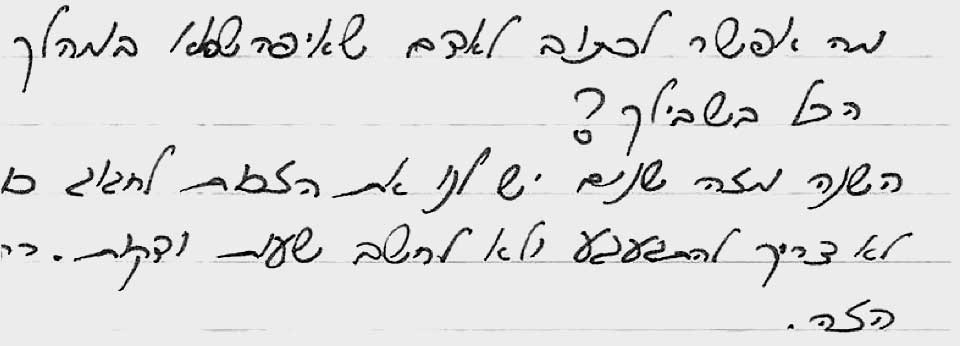
Typical handwriting of a right-handed person
Fedra Latin has a very subtle Italic angle (6°), and its proportions are rather narrow compared to the upright style, in order to differentiate between primary and secondary styles. This low degree of slanting works well for Hebrew too, but here there is a need to compress the letterforms to differentiate the formal and cursive styles more clearly.
Fedra Hebrew Cursive was designed as a completely separate set of letterforms, derived from the upright style and inspired by traditional Hebrew calligraphy. The design of it doesn’t follow any of the historical cursive Hebrew style, and all design decisions considered mainly the possibilities of creating adequate text hierarchies.
After Fedra Serif and Fedra Sans in Hebrew were ready, I took those lessons further and applied them also to Greta Text, a newspaper and book typeface, which also benefits from having a secondary style. I believe strongly that having the cursive styles allows new possibilities for local designers, and I will look forward to seeing how they may be used.

Greta Text Hebrew (above), Fedra Sans Hebrew (middle), Fedra Serif Hebrew (below), all designed by Michal Sahar