
Spot the difference
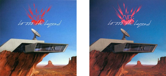
On the left is the cover of the Air album 10 000 hz legend with logo design and layout by the graphic design group Abäke. On the right is the US version of the same cover, still with logo design and layout by Abäke, but with the intrusion of an uninvited comma.
It’s only a little thing, barely visible really, but since when were logos subject to editing? No one ever tried to full stops between the I, B and M of Paul Rand’s famous logo, equally no one capitalised the a of abc, another of Rand’s designs. It might have been correct punctuation, but it would have had nothing to do with the workings of a large-scale corporate identity. In Rand’s grand schemes letters are wrenched from their normal place and, through design, taken to an alternative location where the rules of grammar and punctuation mean little and corporate value is all. The ambitions of Air and Abäke are not equivalent to those of Rand and IBM, but you get the general idea.
[signup]The reason that commas are inserted into numbers is to make them easier to read. In the UK this style is optional (this magazine does) in the US it is obligatory. But obligatory or not, to apply the style to the Air cover is mysterious. Designing the logo, Abäke have not chosen a font suited for skim reading. It takes at least a couple of moments to figure out that the last word says ‘legend’ and the ‘hz’ is decipherable only if you know it in advance. Why then make it possible to take in 10,000 at a glance – to stop you confusing it with that other work ‘1,000 hz legend’?
Abäke themselves are very relaxed about the freeloading comma. Not wishing to create a rigid, all-encompassing Air identity scheme and with the belief that meaning slips and slides between cultures anyway, they have taken the view that legislating against this pause would be pointless. But this chilled attitude isn’t entirely reflective of the relationship between designers and editors. There is many a struggle between those who want to make meaning clear with full stops, commas and colons and those who believe that other graphic and typographic devices do the trick. Eventually it boils down to a difference between reading and looking. Editors may well find it appalling, but not all type is there to be read.