
The Familiarity Effect in the Perception of Handwriting
Do we prefer our own handwriting? We conducted a large scale empirical study on how familiarity affects the perception of handwritten text, measuring implicit biases that show people favour text resembling their own style.
The effects of familiarity
While people often claim to welcome progress, accepting change can be difficult, especially when it comes to things we use every day. From the clothes we wear to the apps we use on our phones, familiarity is a powerful force that influences both our level of comfort and how user-friendly something seems.
In 2021, as part of a larger effort to consolidate their brand, Twitter announced a new bespoke typeface, Chirp, designed to replace the multitude of system fonts the app had been using until then. In late July, and together with other UI changes, the new font began to roll out, and backlash quickly followed.
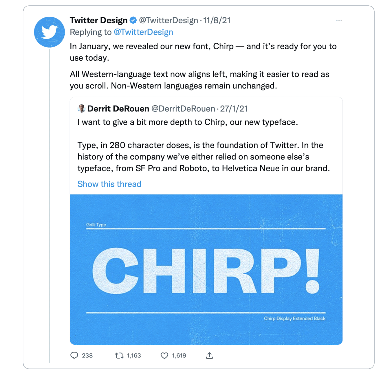
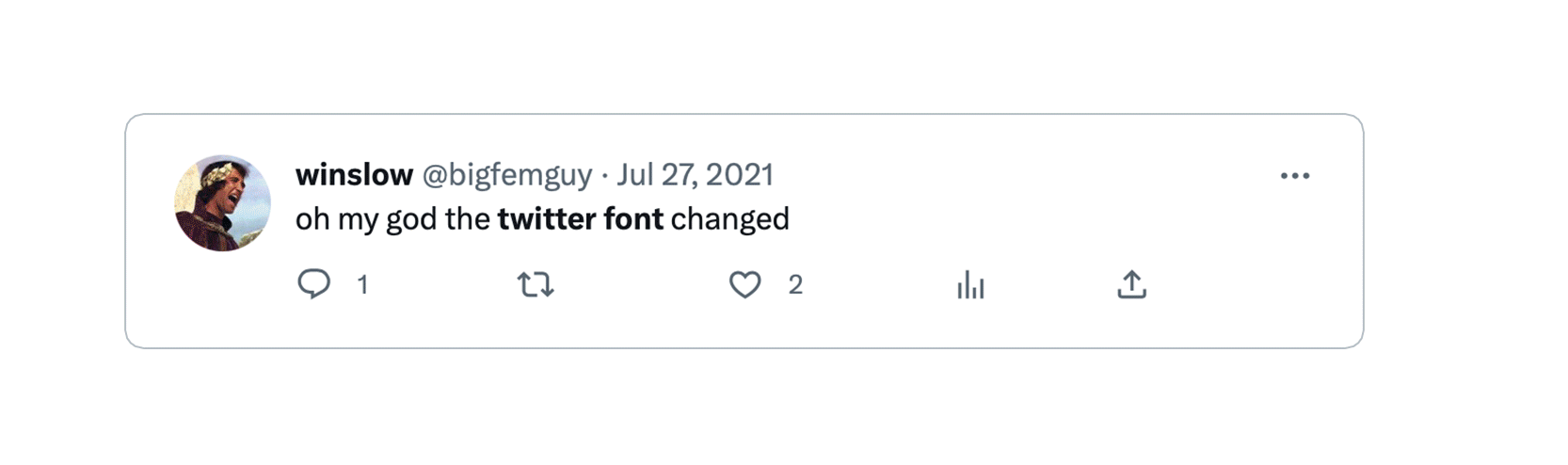
A storm of users complained that the font was ugly and illegible, and that it even caused headaches. Twitter’s response was that the font had been designed to be more legible and consistent than the previous options they had been using.
From a technical point of view, Chirp was a completely valid choice. Although initially rolled out with no support for Cyrillic and Greek and with some hinting problems (which were slowly fixed in the subsequent years), the typeface had a solid design from the day it was launched. Why then did its introduction encounter such a poor reception from the public?
A possible answer can be drawn from a well-researched psychological effect: the mere-exposure effect.
This phenomenon describes the tendency for people to develop a preference for things simply because they are familiar with them. It proposes that the more we are exposed to something, the more we oppose changes in relation to it. This effect has been observed in a wide range of contexts, from our preferences for music and art to our attitudes towards people and social groups. Some theories suggest that the mere-exposure effect is related to the brain’s processing of familiar stimuli, which may be interpreted as safer and less threatening. As a result, we may come to associate these stimuli with positive emotions and develop a preference for them.
Although design changes can help keep social media platforms fresh and engaging for users, too much novelty can be overwhelming and off-putting, causing confusion and even anger for no other apparent reason. In Twitter’s case, there might have been no other option than to roll out their new typeface, counting on there being a backlash. However, when designers neglect the importance of familiarity, we are potentially risking the acceptance and even usability of our work.
Do we prefer our own handwriting?
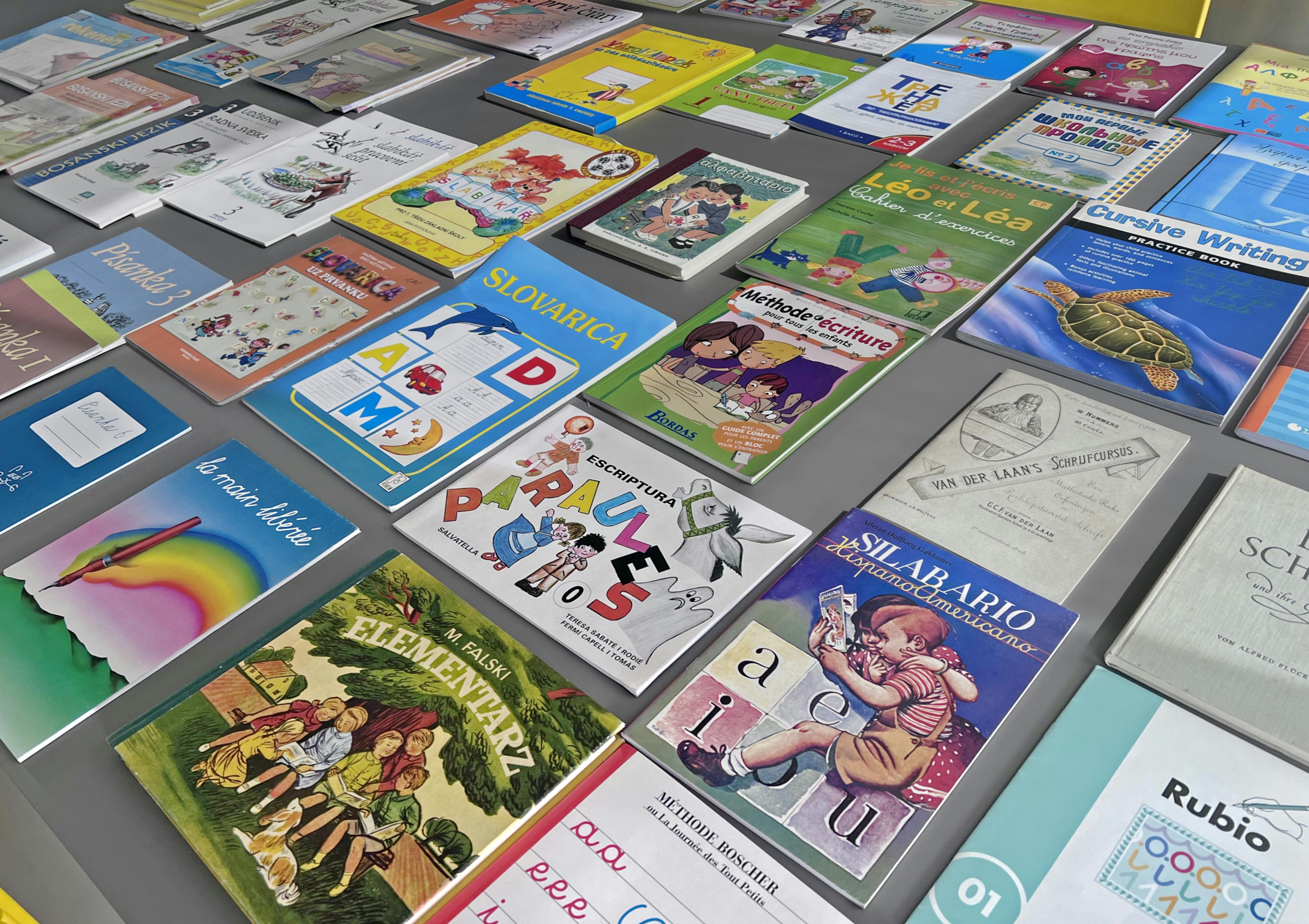
At the beginning of 2022, we began an inquiry into what became a large research project to learn more about handwriting. To inform our design process and better develop type solutions, we wanted to gain as much information as possible about the different styles and traditions of handwriting across the world. To begin with, we focused on populations who speak languages that use the Latin script, and collected hundreds of school books used to teach handwriting.
Historian and typographer Sébastien Morlighem delved into the history of handwriting, producing an extensive essay titled Modern handwriting: a historical survey. This essay covers the history of handwriting from the introduction of mandatory education, around the beginning of the 20th century, up to the present. Sébastien noted consistent differences between countries, and these differences often followed traditions that correlate with national borders or language variations.
But these models fail to provide an understanding of how the people of today use and perceive handwriting. It was of interest to have a contemporary snapshot of how users of today perceive handwritten text, specially on how perception is mediated by familiarity. We decided to design a survey to learn more about this. What you're about to read is a summary of these results.
Research question and hypotheses
Further to Twitter's anecdotal reference, previous research (e.g. Beier's work on legibility and familiarity) has empirically shown that familiarity is a solid predictor for font preference and other perceptual factors. For this reason, we expected familiarity to also exert an effect in perception when it comes to handwritten text, especially given the humane and personal elements inherent in script typefaces.
To explore the extent to which this supposition was true, we established the following research question:
Is there a familiarity effect when it comes to perception of handwriting? How does this affect certain dimensions of perception of text?
Using previous literature, we then took this question and broke it down into a series of measurable constructs, which were then tested using with the following hypotheses:
● Individuals will consistently rate handwriting that looks familiar as more trustworthy than one that is not familiar.
● Individuals will consistently rate handwriting that looks familiar as friendlier than one that is not familiar.
● Individuals will show a projection effect, consistently rating handwriting that looks familiar as one written by someone closer in age and similar in gender than handwriting that is not familiar.
These hypotheses look at the perceptual effects of familiarity. But what is familiar to one person might not be to another. Although taught writing models show there are clear stylistic variations between regions, during a pilot ran before the large collection of samples, we found individual differences also appear between writers of the same region. We therefore had to account for these and use each person’s handwriting as a system of reference. Each participant’s style had to be measured before identifying familiar and unfamiliar shapes, and each survey had to be individually tailored after each respondent's style. That’s why the study was divided into two parts: One to capture each individual’s writing style and one to measure perception of handwriting.
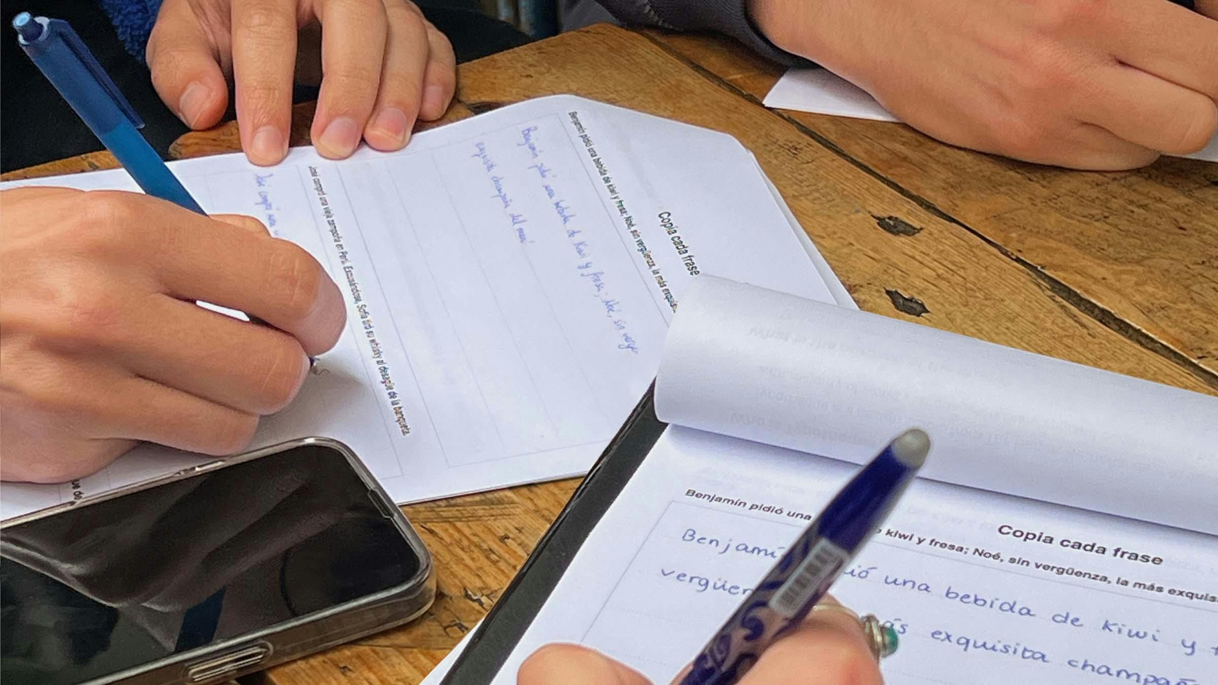
Part 1. Collecting handwriting specimens
The first part of the experiment used a copy-book form that prompted the participant to write down a series of sentences. Four types of handwriting were measured: minuscule handwriting, majuscule handwriting, initial majuscules and numerals. Pangrams were used for minus- and majuscule handwriting, which produce a natural way of writing all letters of the alphabet (the pangrams were mainly obtained from Rutter, 2014). For majuscules, a list of names (places and people) was drawn up and incorporated into naturally sounding sentences.
This form was adapted to 20 languages. The forms were made available on Typotheque’s website. Designed to be printed and scanned, they had spaces left for handwriting. Scanning and submission instructions were supplied online. Thanks to the great response to this call, a total of 596 samples were collected, with data coming from 46 countries and speakers of 29 languages. We’d like to thank all participants that selflessly contributed to this research.
All complete samples have now been made available as part of the Handwriting Database, a public repository that allows anyone to browse and filter through contemporary specimens of handwriting.
Sampling was obtained organically, via Typotheque’s communication outlets – mainly Twitter – and by using the scientific recruiting platform Prolific. Given that the majority of Typotheque’s audience has an interest in type and even work with it, Prolific was used to balance the results and obtain samples from people of diverse backgrounds. The expected background quota was pre-registred before collection of data started.
Part 2. Measuring perception of handwriting
The second phase of the experiment was designed to measure how participants perceive familiar versus unfamiliar handwritten letterforms. The same participants were asked to take an online survey that would measure how they perceived familiar versus unfamiliar shapes.
In order to select the significant letterforms under consideration, seven experienced practitioners from Typotheque’s team were asked to rank pairs of letterforms in three levels: low difference, medium difference and high difference. As a guide, each practitioner used Sébastien Morlighem’s research on taught handwriting models. The lists produced by each practitioner were compared, to find agreement. The six most agreed-upon pairs of letterforms from each level were selected and used for the study. You can see them below.
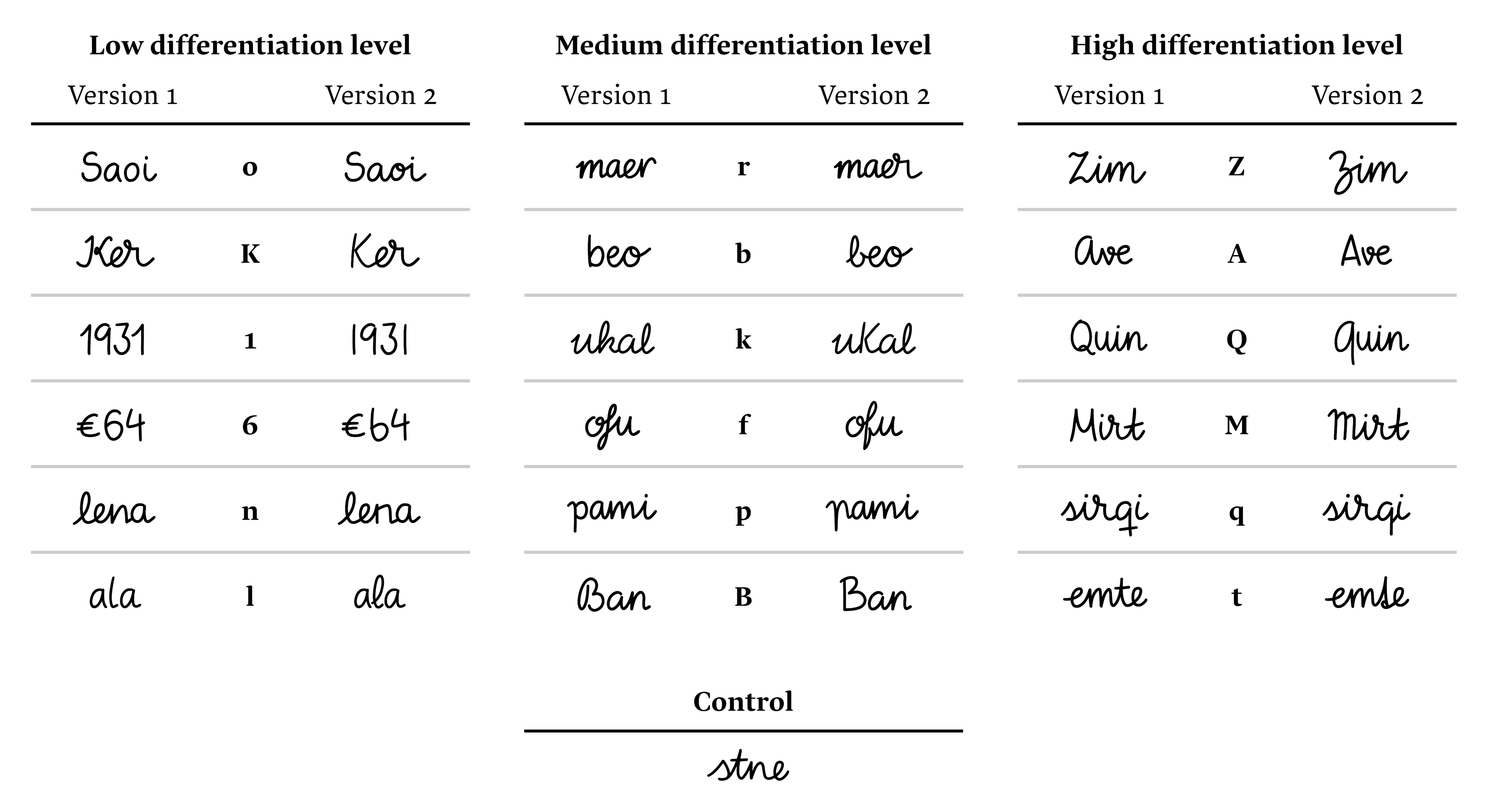
During a testing pilot, it was observed that participants became more insecure about their answers as the survey went on. This meant ratings risked being affected by practice bias. For this reason, a control stimuli was introduced to measure it. By recording reactions to the same stimuli twice throughout the experiment, this bias could be counteracted. The non-sense word ‘stne’ was shown at the very beginning of the survey and halfway through, drawn identically both times.
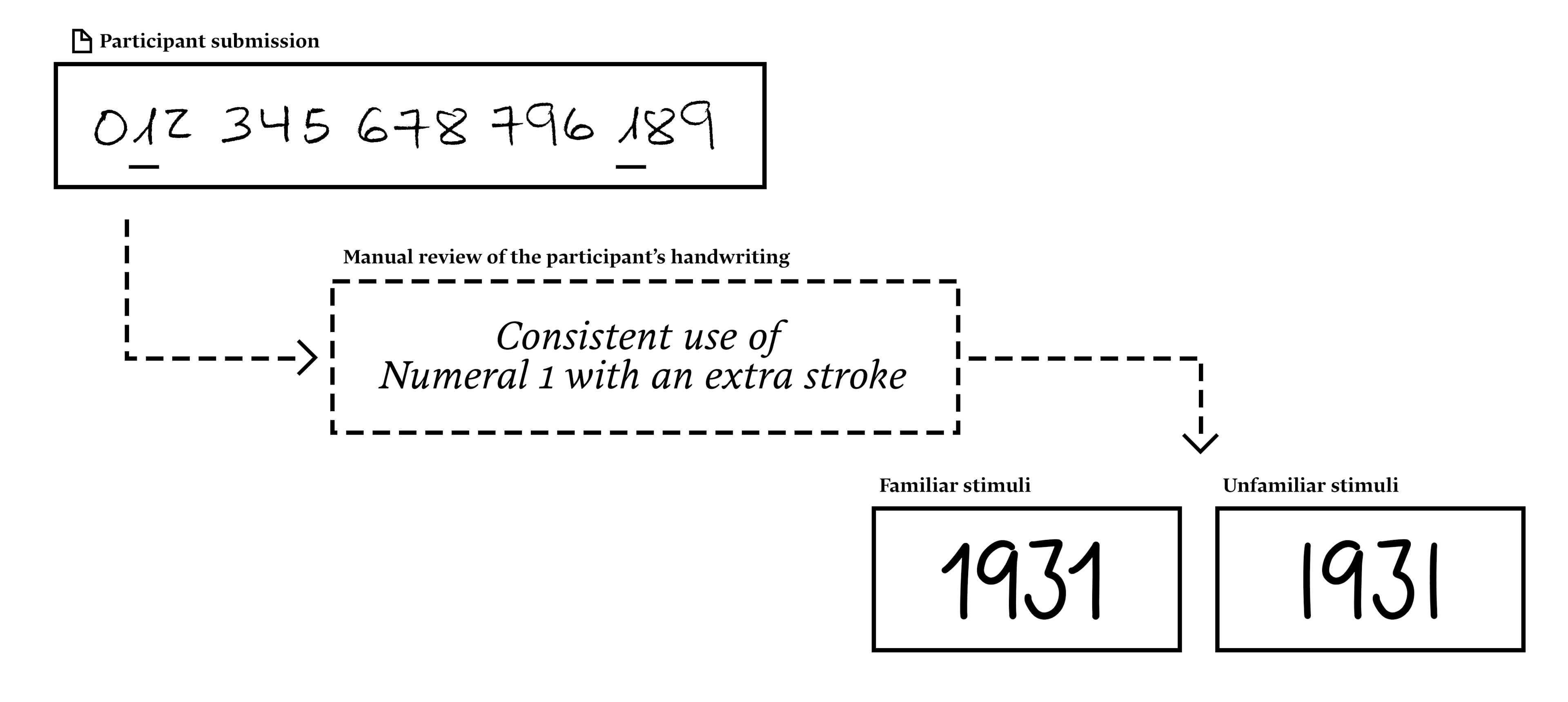
The scanned submissions were manually analysed. For each participant, three letterforms that consistently repeated in their handwriting were selected, one from each differentiation level. This way, each participant was prompted to react to a pair of letters (familiar and unfamiliar) that had low, medium and high differentiation between them.
Participants were asked to subjectively rate with variable scales (1–100) using the following items:
● What is the age of the person who wrote this statement?
● What is the gender of the person who wrote this statement?
● How trustworthy is the person who wrote this statement?
● How friendly is the person who wrote this statement?
● How readable is this statement?
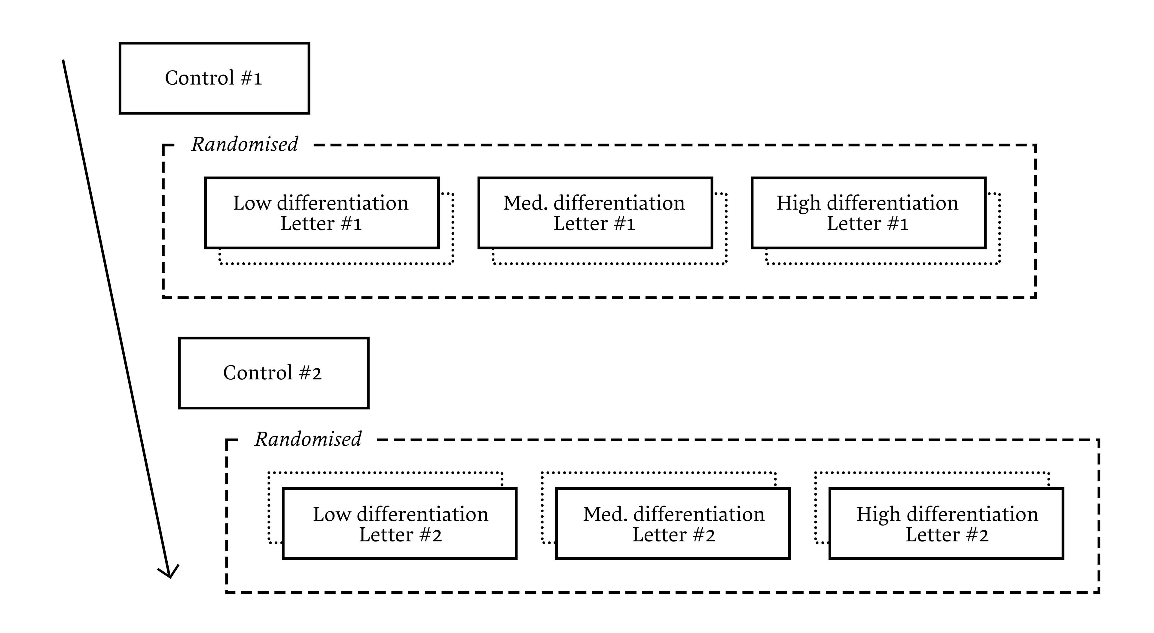
Participants were also asked to rate how sure they were about their answer to each of the ratings, from ‘Very unsure’ to ‘Very sure’, also using a variable scale. The display of questions was randomised using the logic below, with no two letters from a pair being shown consecutively.
In total, 596 people provided data in the first phase of the experiment. Out of these, 479 responses were collected for the second part of the experiment. After removing incomplete and very brief responses (less than 120 seconds), a total of 422 data points were used in the analysis. Participants had an average age of 27.4 years and were almost balanced in gender. For the aforementioned pilot, 30 participants were recruited from Spain and the Netherlands, also balanced in gender and with a similar average age.
Analysis
Pre-processing included removing incomplete data points (survey responses that didn’t include answers to all questions [53]; and answers that took a suspiciously short amount of time – less than two minutes [4]) and adjusting ratings with the two control stimuli.
This adjustment was made by subtracting ratings relating to the control in the middle of the experiment from those of the initial control and adding these to all ratings measured after the midpoint of the experiment (Ratings after midpoint + [Control 2 − Control 1]). Repeated-measures ANOVAs were performed on the data to compare ratings, as pre-established in the hypotheses: there would be significant differences between averages of trustworthiness, friendliness, perceived age, gender and readability.
Results
Significant effects of familiarity were only observed in the dimensions of perceived trustworthiness and friendliness. The ratings between familiar and unfamiliar letters also increased as the pairs became more differentiated in shape (small, medium and high differentiation). No effect by familiarity was found on the other three dependent variables of perceived age, gender and readability.
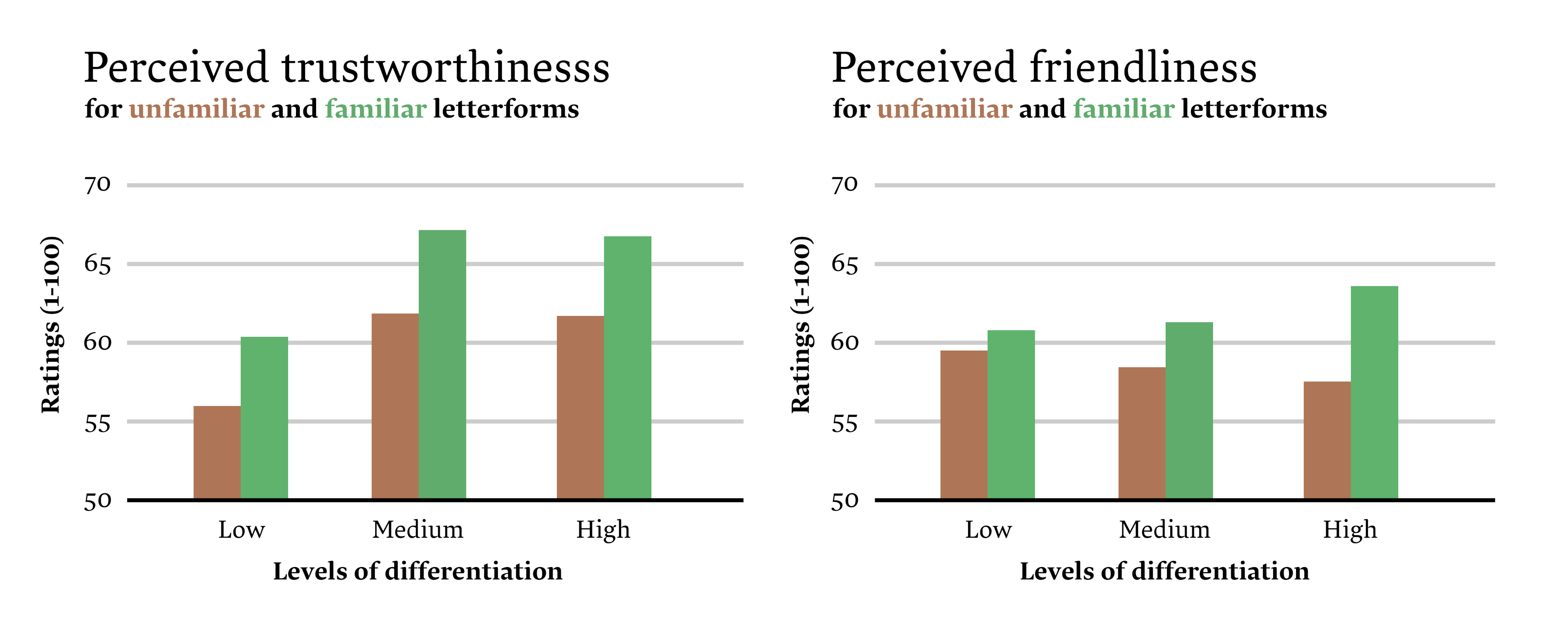
For trustworthiness, results from the 3x2 (low, medium and high level of differentiation by familiar and unfamiliar shapes) repeated measures ANOVA showed low differentiation pairs were rated significantly different, with a mean difference of 4.68 points over 100, p<.001. For medium differentiation pairs, the results showed a significant difference (p<.001) of 4.44 over 100 points. For high differentiation levels, a mean difference of 3.73 over 100 was observed, with p<.001. With these results, it can be stated that Familiarity had an effect in all differentiation levels except for Low when it comes to Trustworthiness ratings.
For friendliness, results from a second ANOVA showed that between the two averages of the Low level of differentiation, a non-significant (p=0.86) difference of 1.11 over 100 was observed. For Medium and High levels of differentiation, though, the results were found to be significant. For Medium, an average difference of 2.75 over 100 was observed (p=0.055) and for Large level of differentiation this difference was of 5.83 points over 100 (p<.001).
Conclusions
The results demonstrate that familiarity produces an effect in judgment regarding the perceived friendliness and trustworthiness of familiar versus unfamiliar handwritten letter shapes, specially when the letterforms are very distant from one's own handwriting. This answers our initial question about whether familiarity affects perception of handwriting and supports the first two of the three hypotheses posed.
Participants rated shapes that shared greater similarity with the shapes in their own handwriting as both friendlier and more trustworthy. Previous research has shown friendliness and trustworthiness are both solid indicators of preference (Schmitz, 2008; Seegers, 2009), and these results align with previous literature on trustworthiness of familiar stimuli (Sheldon, 1969; Schmitz, 2008).
When it comes to perceived age and gender, no results were found. The effects of familiarity did not extend to these two variables, as participants did not seem to perceive familiar letters as more likely to be written by someone closer in age and gender to them than those letters alien to them. We had expected to see such an effect as a result of the well-researched familiarity effect (Liao et al., 2011; Schwikert & Curran, 2014), which states that individuals will tend to see personal attributes even in inanimate objects (Epley et al., 2007). Readability was also expected to increase with familiarity, but no effect was found. This might relate to the subject matter of this study: letterforms created by hand. Previous research has shown that legibility is overall lower for handwritten letters than for set type (Bernard, 2000).
For the selection of the letterform pairs, and their division into three groups based on their level of differentiation, we used criteria compiled by a team of experienced type designers. The selection correctly reflected the bias increase, which can be interpreted as a sign of intuitional expertise, common among practitioners of this field. Most of the knowledge we have today about type is cemented on years of practical tuning and the intuition of several generations of practitioners. In a more recent time, formal research has empirically shown that the intuition workers of type have carried is most of times accurate, and this can be considered further proof of that.
Implications
We wanted to construct an accurate idea of how readers of today perceive text in order to inform our design process and produce better font solutions. This new knowledge has in fact already fuelled the design of Typotheque’s latest typeface: Dash, a new script typeface by Petra Dočekalová.
Given the importance of using familiar letter shapes in handwriting, we decided to conduct an additional study to select preferred localised letter forms for Dash. Based on collected writing models, we implemented various localised forms of letters from each respective country. These were then tested with real users from each population, providing accurate preference validation. The localised forms are triggered automatically when the user tags text with a specific language. Read more about localised forms in the Dash's type specimen.
We believe in open science, so should further research in this topic be undertaken in future, all raw data analysed for this study is available upon request under the Creative Commons BY-SA 4.0 licence. What you've read in this article is a summary of the experiment that was conducted. The full manuscript, containing a more extensive description of methods, procedure and analysis, is available upon request. Feel free to reach out at hector@typotheque.com.
We hope the findings of this research, together with the Handwriting Database, will be of use to the community, to researchers interested in handwriting, and to type designers who want to develop script and handwritten fonts in the future.
Acknowledgements
Copy-book form adaptations were made possible by Ioana Stănescu and Ada Ardeleanu (Romanian), Marc Simón and Abril Tibau "Xoxo" (Catalan), Marlis Zimmermann (Dutch), Magdalena Jaglińska (Polish), Trung Nguyen (Vietnamese), Inan Bostanci and Aybüke Uytun Yılmaz (Turkish), Sara Sofia Pitkänen (Finnish), Roberto Arista (Italian), Nikola Djurek (Croatian) and Peter Biľak (Czech and Slovak).