Stories
65 results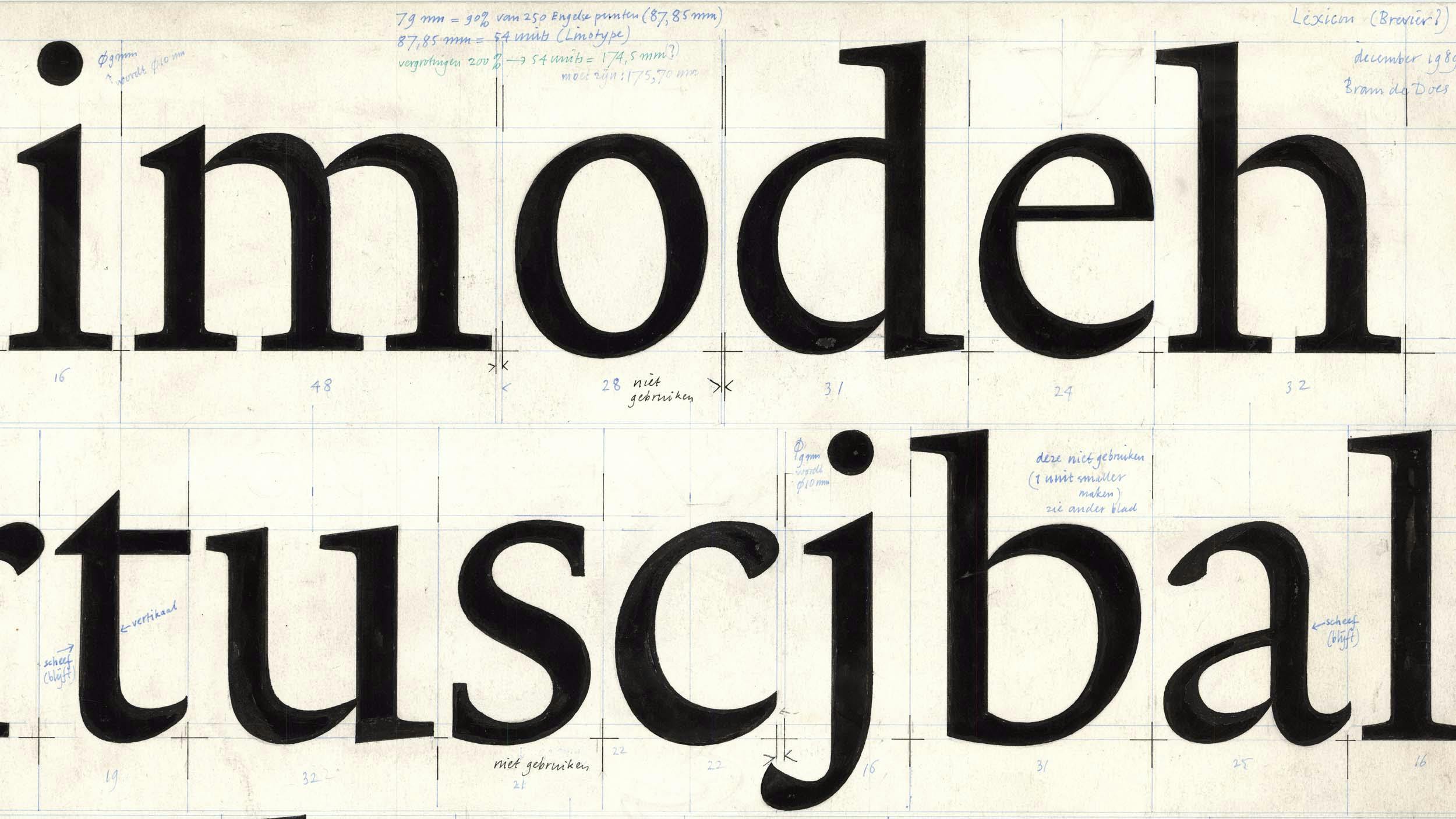
Originality in Type Design
by Peter BiľakThe article was triggered by the discussions with the late Gerard Unger about the nature of originality in the type design industry, highlighting the importance of historical continuity in creating new works while examining the notions of originality and the boundaries between interpretation and plagiarism.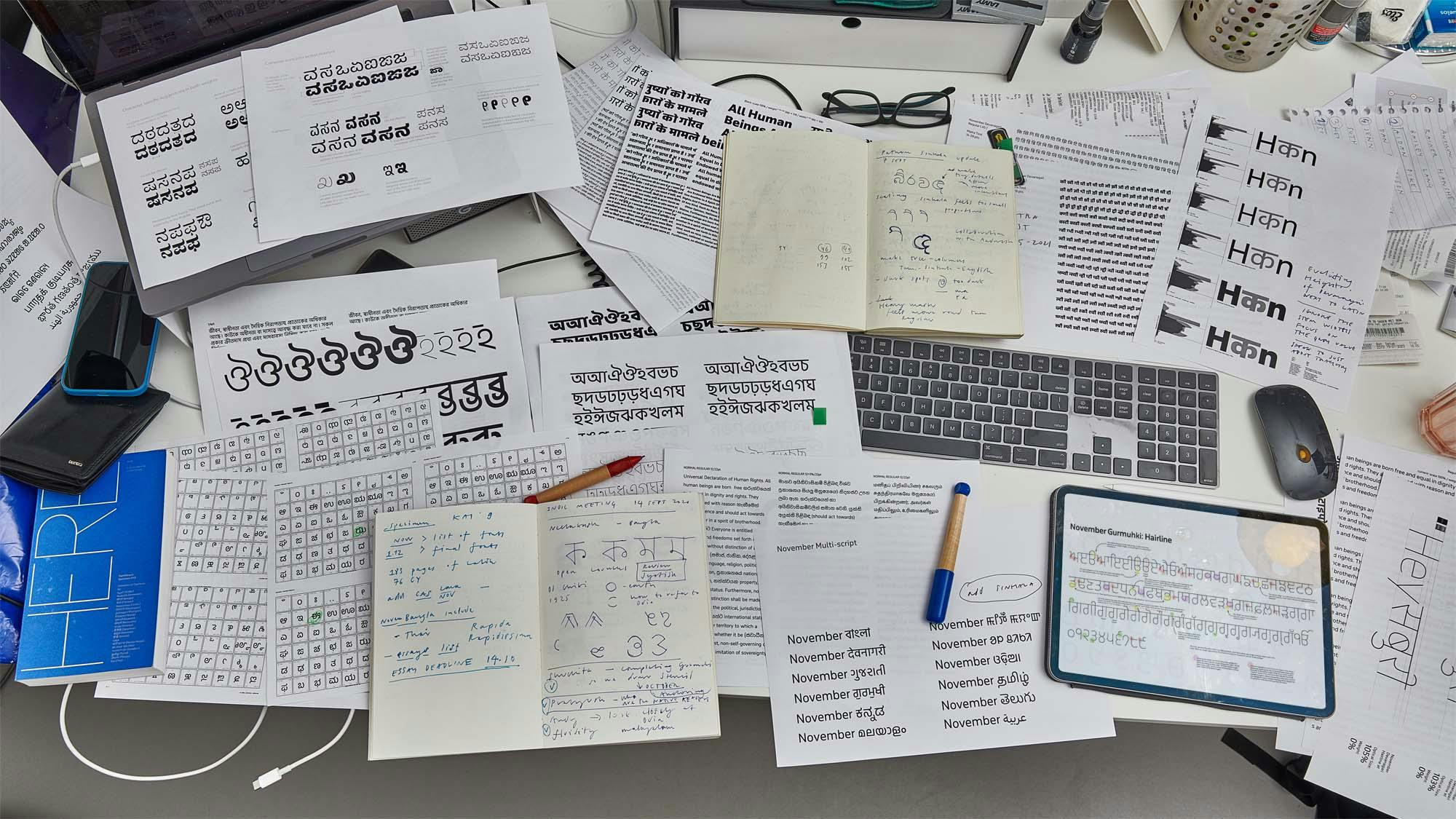
Designing Fonts for Two Billion people
by Peter BiľakTypotheque tackled the unprecedented task of designing a comprehensive set of fonts for South Asia.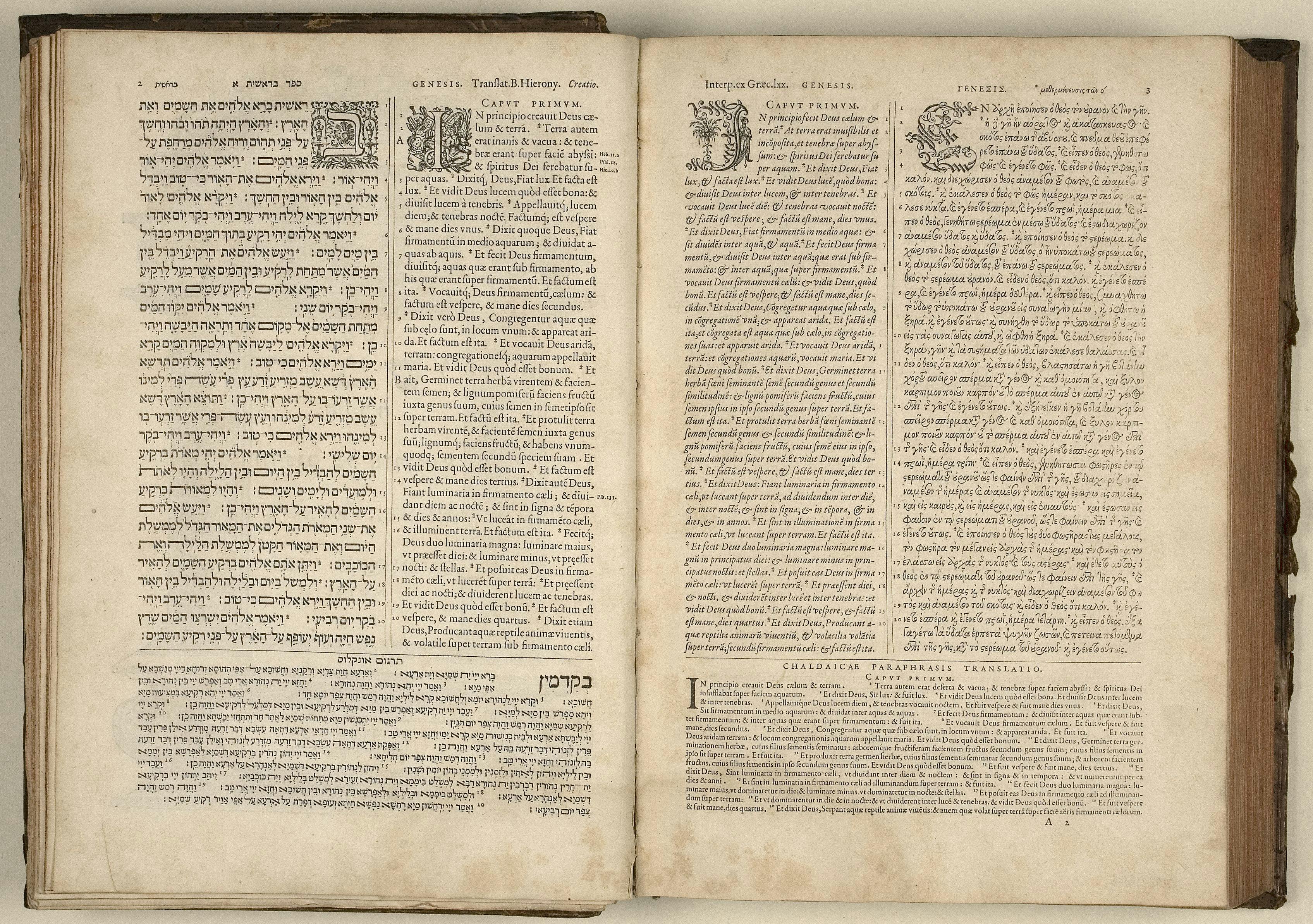
Typeface design beyond a single script
Essays by Peter BiľakCreating a new language version of a typeface is akin to a translation, whereby purpose, intention and respect are as important as proportion and design.
Theory of Type Design, a book review
Reviews by Peter BiľakA book review of Theory of Type Design by internationally renowned type designer Gerard Unger, where he is delving into cultural, historical and social roots of type design and typography.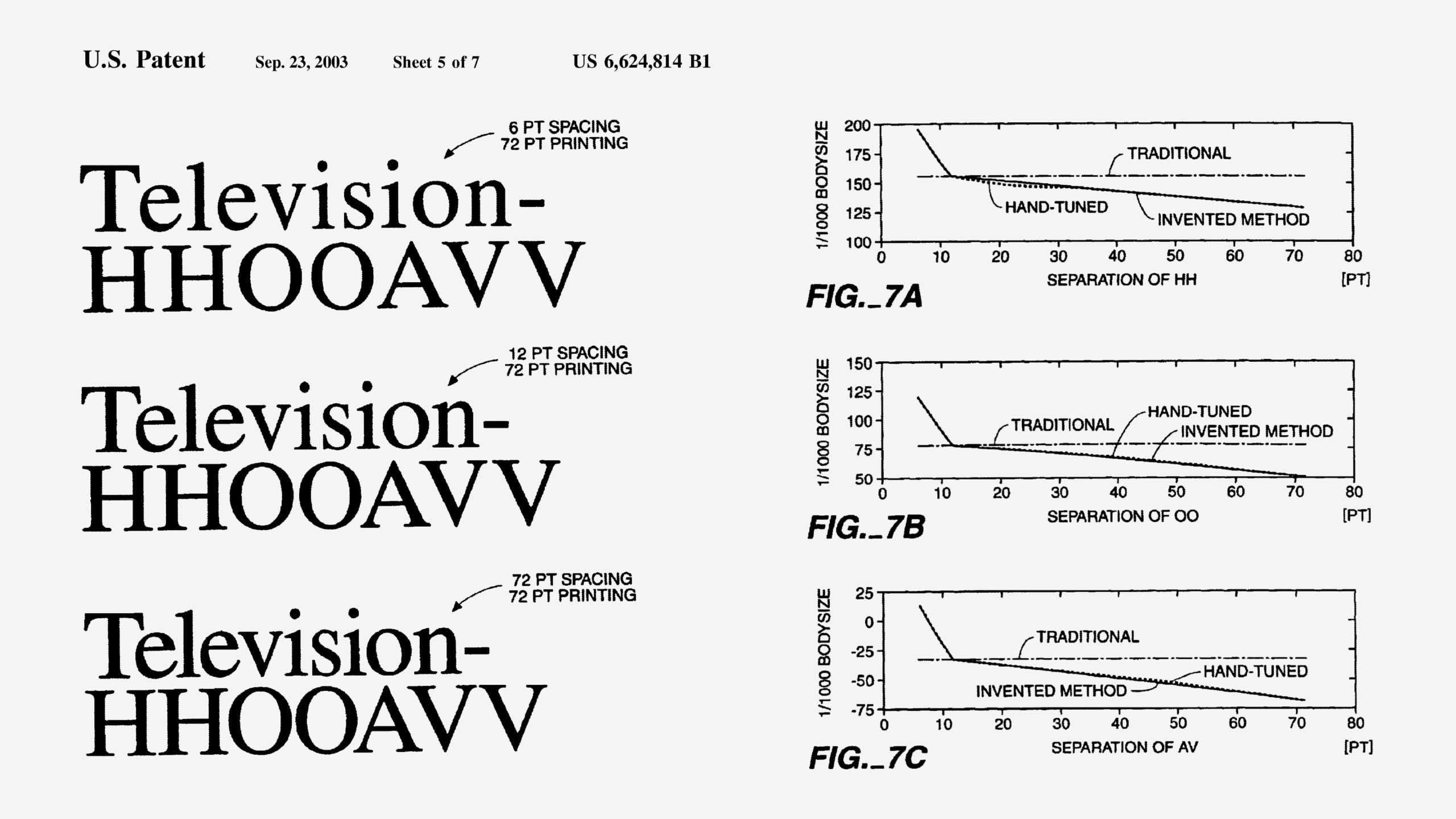
Size-Specific Spacing of Fonts
Essays by Peter BiľakType design must consider not only the shape of the letters, but also the white space around them, which is essential for the ease of reading.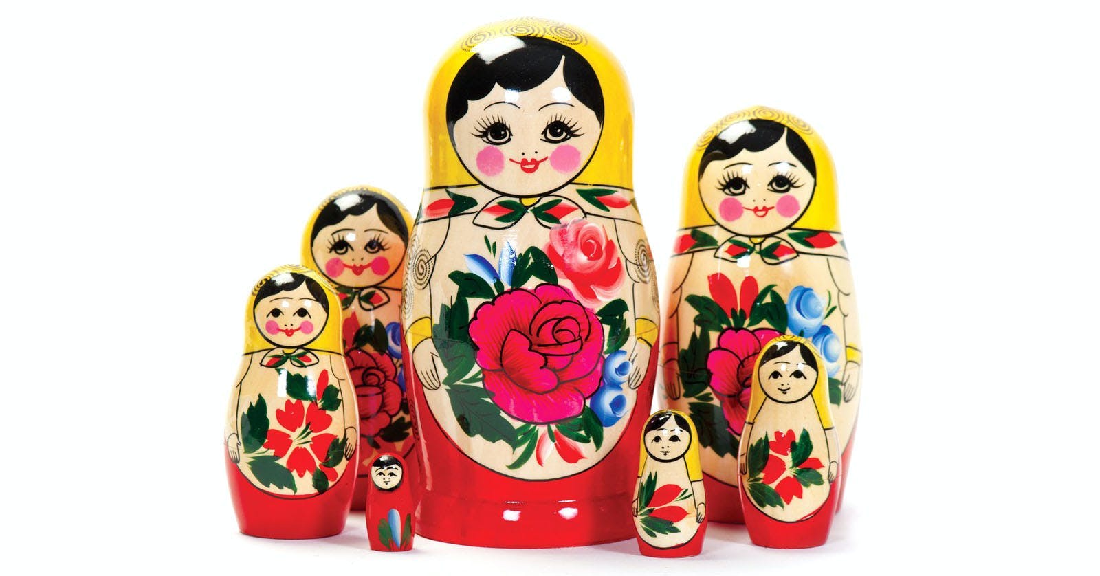
Planejamento familiar, ou como as famílias tipográficas funcionam
Essays by Peter BiľakUm ensaio sobre a história e definição de famílias tipográficas, parâmetros para o design de tipos, e as possibilidades para criação de sistemas tipográficos ainda maiores hoje.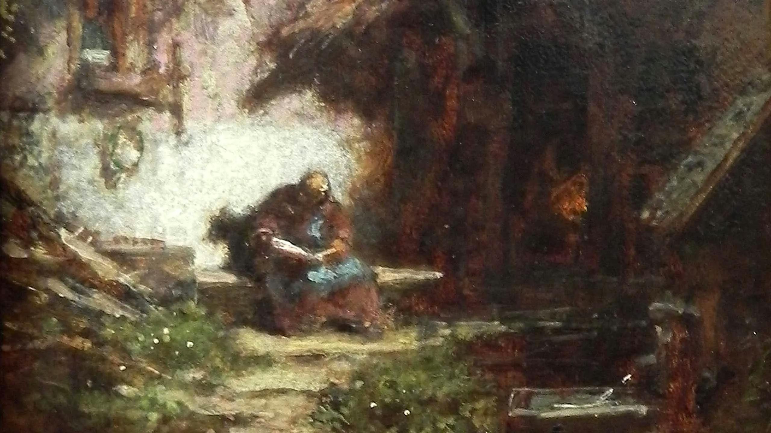
Designers Reclusos – Redefinindo o Sucesso na Era da Internet
Essays by Peter BiľakA distração das mídias sociais pode levar a gritos de “deixe-me continuar com meu trabalho”. Para designers, não há fim na demanda para se estar fisicamente e digitalmente ‘na vitrine’. Porém, e se esse não for o seu modo de ser, ou se não foi esse o motivo que o levou a projetar? Para além de curtidas, seguidores, networking e conexões, para muitos a questão fundamental é: até que ponto o reconhecimento público é uma medida de sucesso?
Reclusive Designers — Redefining Success in the Internet Era
Essays by Peter BiľakThe distraction of social media can lead to screams of ‘let me just get on with my work.’ For designers, the demand to be physically and digitally ‘out there’ is endless. But what if that is not how you are, or why you even wanted to design? Beyond the likes, followers, networking and connecting, for many people the fundamental issue is: to what extent is public recognition a measure of success?
The Importance of Play
Typeface stories by Peter BiľakIn the world driven by utility and performance, is there a room for open-ended typographic play system, that allows to discover something that was not entirely planned, something that the system hoped to allow, but could not guarantee?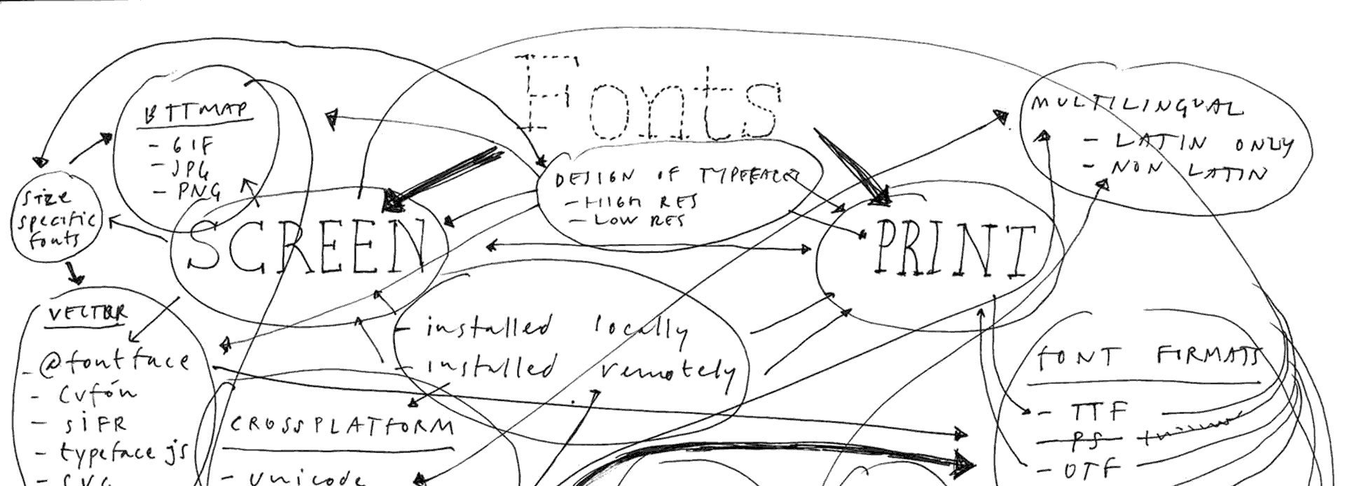
Brief History of Webfonts
Essays by Peter BiľakIn less than three decades, web typography has caught up to and even surpassed print typography. A brief look into how we got to where we are today.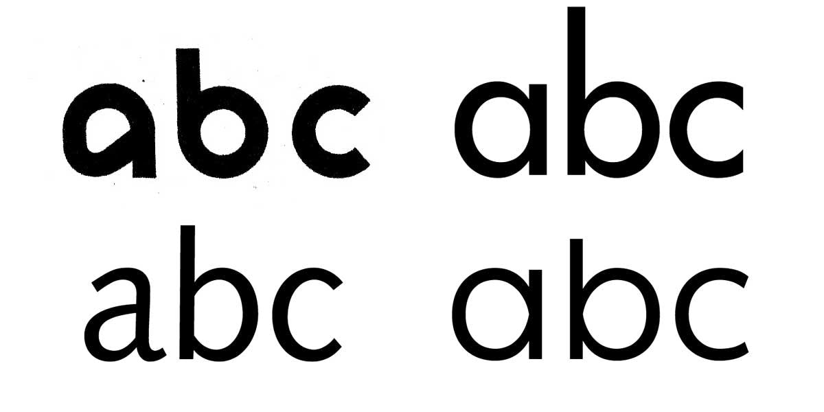
A Brief History of Sans Serif typefaces
Essays by Peter BiľakThe five centuries that followed Gutenberg and his moveable typefaces defined the possibilities of Roman serif type. The current possibilities of sans typefaces were defined over the course of the 20th century. Notes about types that inspired the Ping typeface.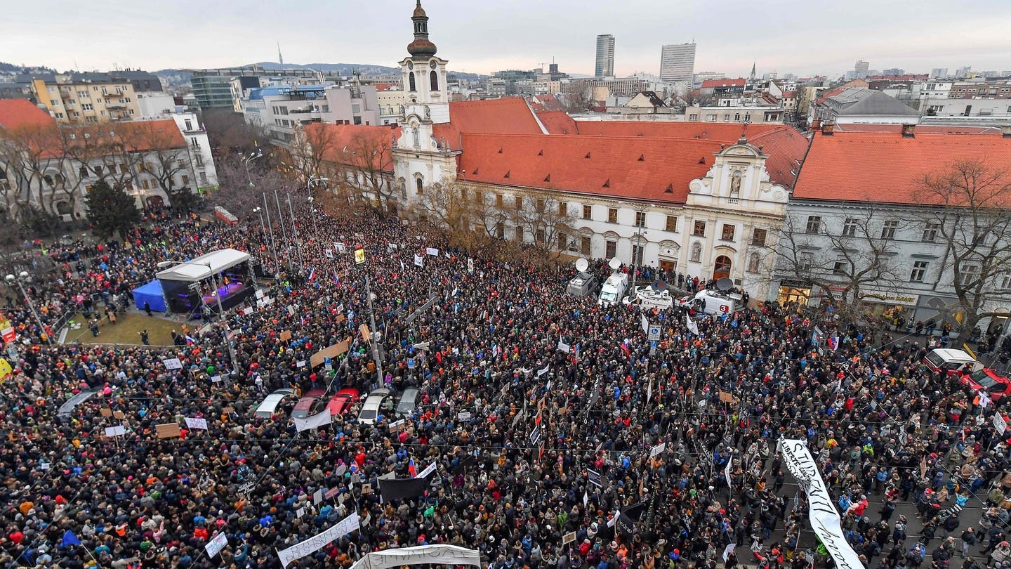
Typotheque Fonts in Mass Protests in Slovakia
AnnouncementsSimple graphics unite Slovaks seeking justice and decency in the largest protests in the country’s history.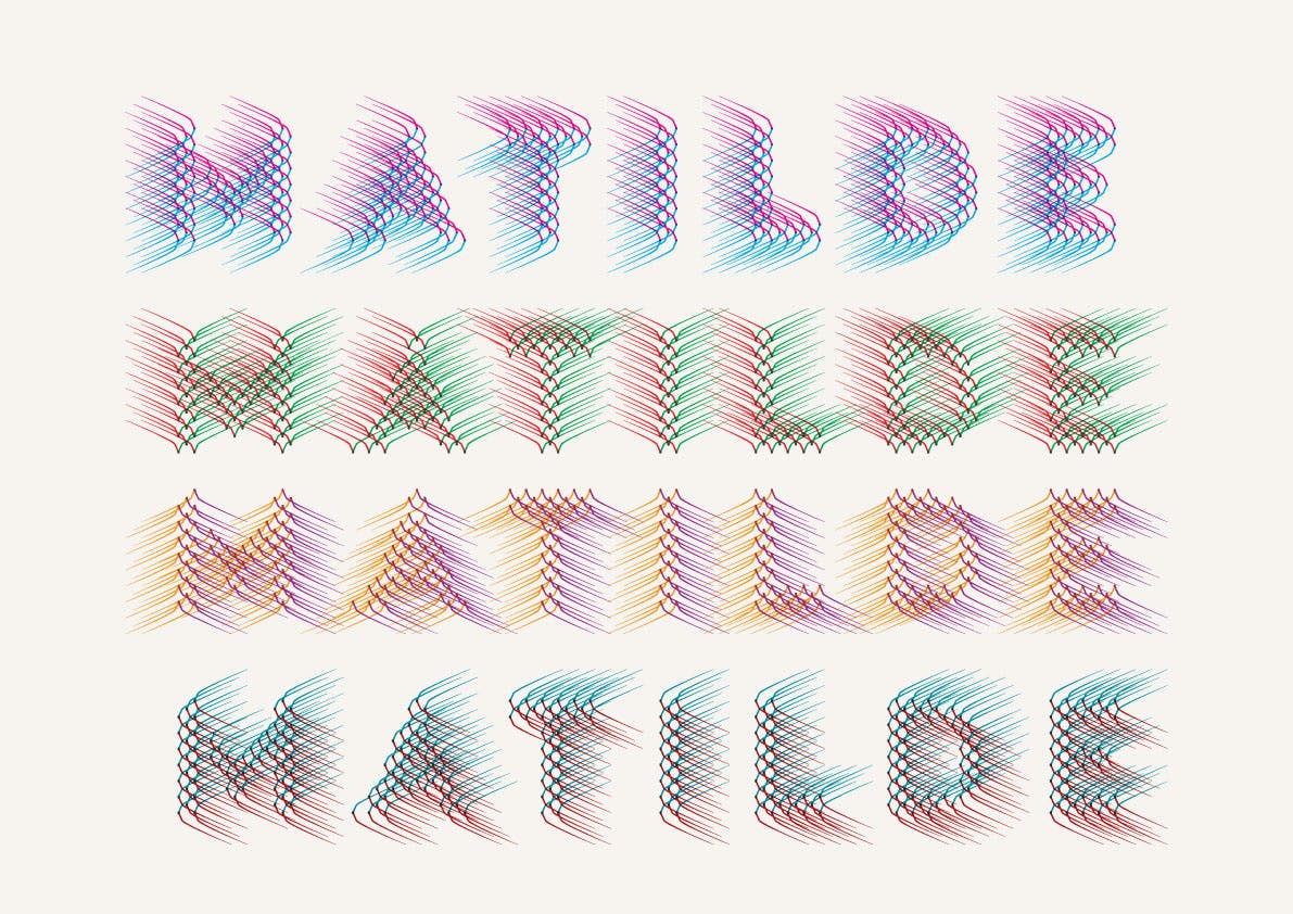
Notes on Designing and Producing the Typeface Wind
Typeface stories by Peter BiľakIt is not very often that I come across type that is so unusual, so strikingly different that I can’t place it. Hansje van Halem’s Wind is one of those rare examples, so I asked her if we could publish it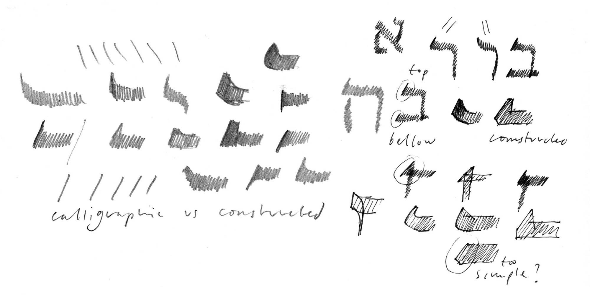
Designing Hebrew Type
Essays by Peter BiľakAn article on the process of designing typefaces for the language other than your own — challenges of looking at unfamiliar patterns, letters, and their cultural significances.Verwandte Schriftfamilien
Essays by Peter BiľakVon den einsprachigen single-style-Fonts der Bleisatzära zu den komplexen, umfangreichen Multi-Script-Familien der digitalen Gegenwart haben sich Typografie und Schriftgestaltung weiterentwickelt, nicht nur um sich den Veränderungen in Druck- und Kommunikationstechnik anzupassen, sondern auch um eine Welt zu fördern, in der Gemeinsamkeiten und Unterschiede zusammen finden müssen.Related Type Families
Essays by Peter BiľakFrom the single-style, monolingual fonts of the metal-type era to the complex, sprawling, multi-script families of the digital present, typography and type design have evolved, not only to embrace developments in print and communication technology, but also to support a world where unity and diversity must meet if we are to survive.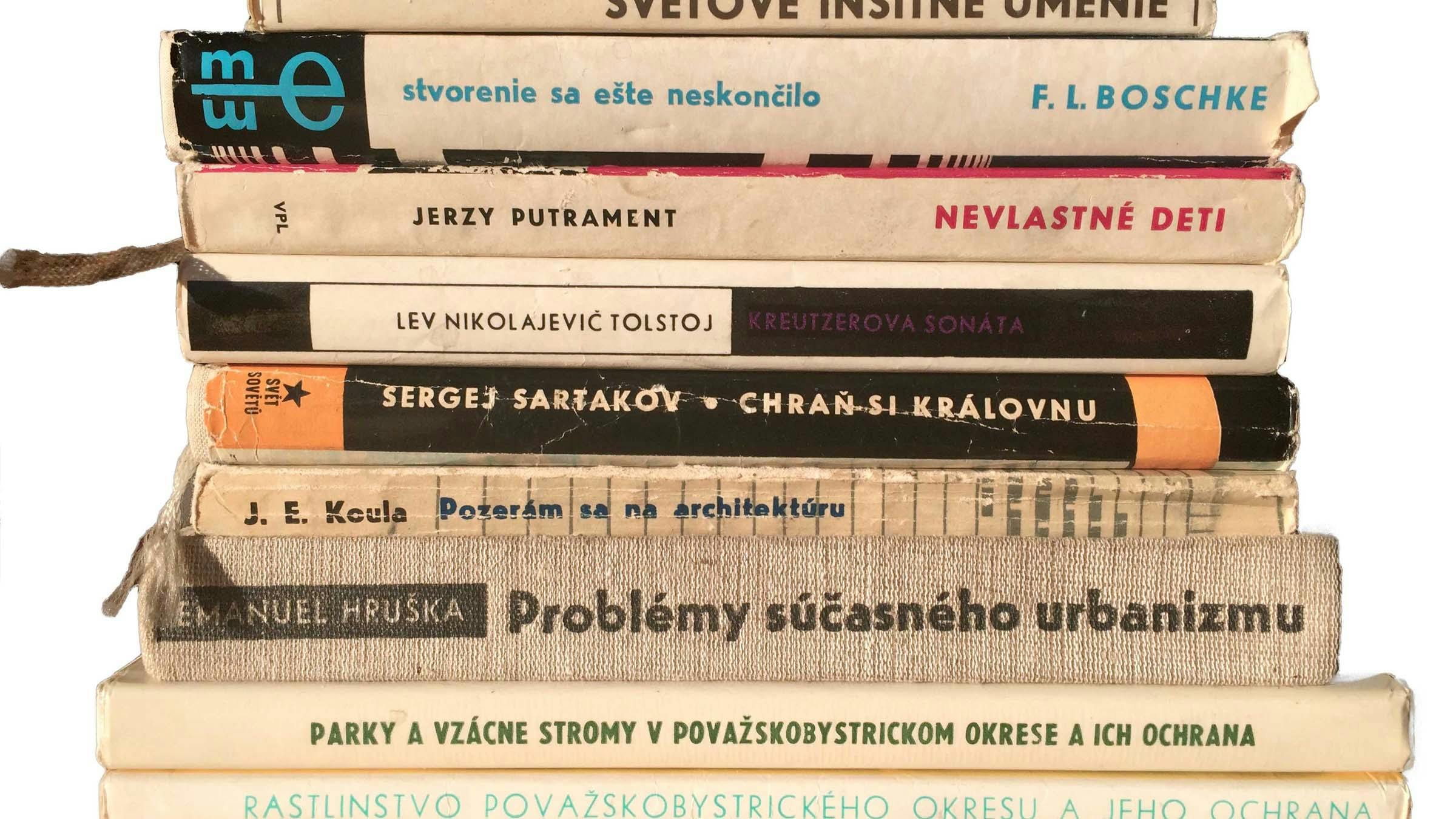
About Uni Grotesk, a Central European geometric Sans
Typeface stories by Peter BiľakUni Grotesk is a modern adaptation of the ubiquitous but awkward Universal Grotesk, a typeface that dominated communist Czechoslovakia.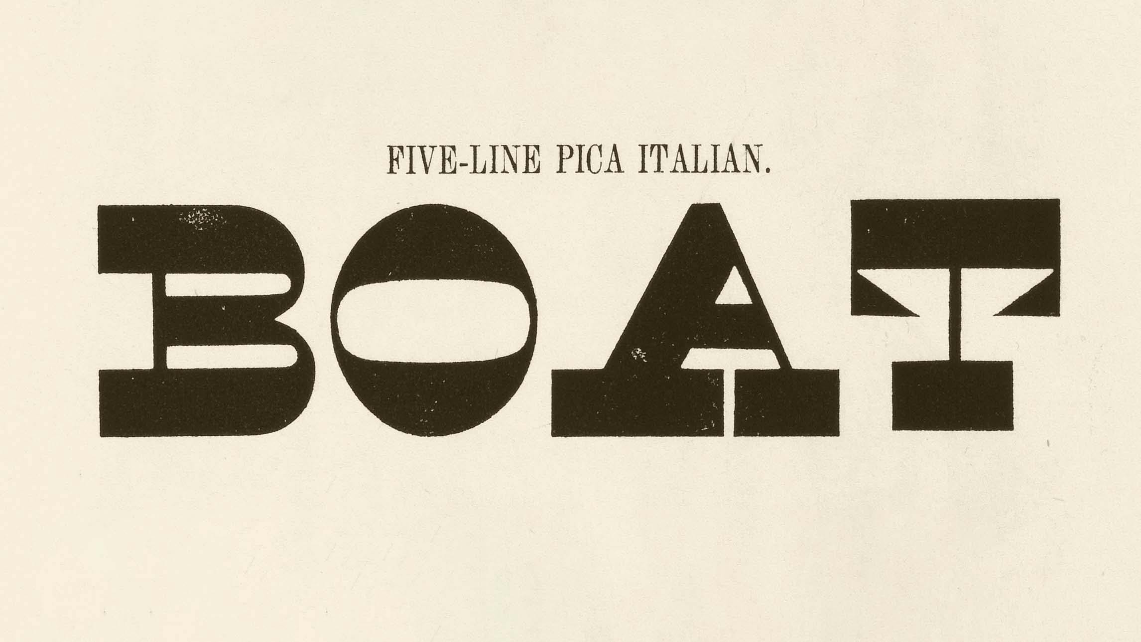
Caratteri concettuali?
Essays by Peter BiľakNel novembre del 2010 Peter Biľak è stato invitato a intervenire alla conferenza di un giorno tenutasi a Copenaghen ‘Conceptual Type - Type led by ideas’; tema del convegno, le idee che stanno alla base della progettazione dei caratteri. Questo intervento si interroga sulle possibilità dei caratteri concettuali e compara il type design ad altre discipline.Lava — Voice of a Magazine
Typeface stories by Peter BiľakLava was designed to bridge the digital and print editions of a newly designed magazine.
Beauty and Ugliness in Type design
Typeface stories by Peter BiľakArticle on the process of designing Karloff typeface, showing just how closely related beauty and ugliness are.