
17 years of this website
The first Typotheque website was designed by founder Peter Biľak in 1999. Unable to afford external help, he wrote all the texts and coded all the pages himself. The design was very plain and well suited to the internet speeds of the day. The blazing fast static homepage had no images and was a whole 4kb in size! The font pages were designed to take advantage of the latest technology of the era, animated GIFs.

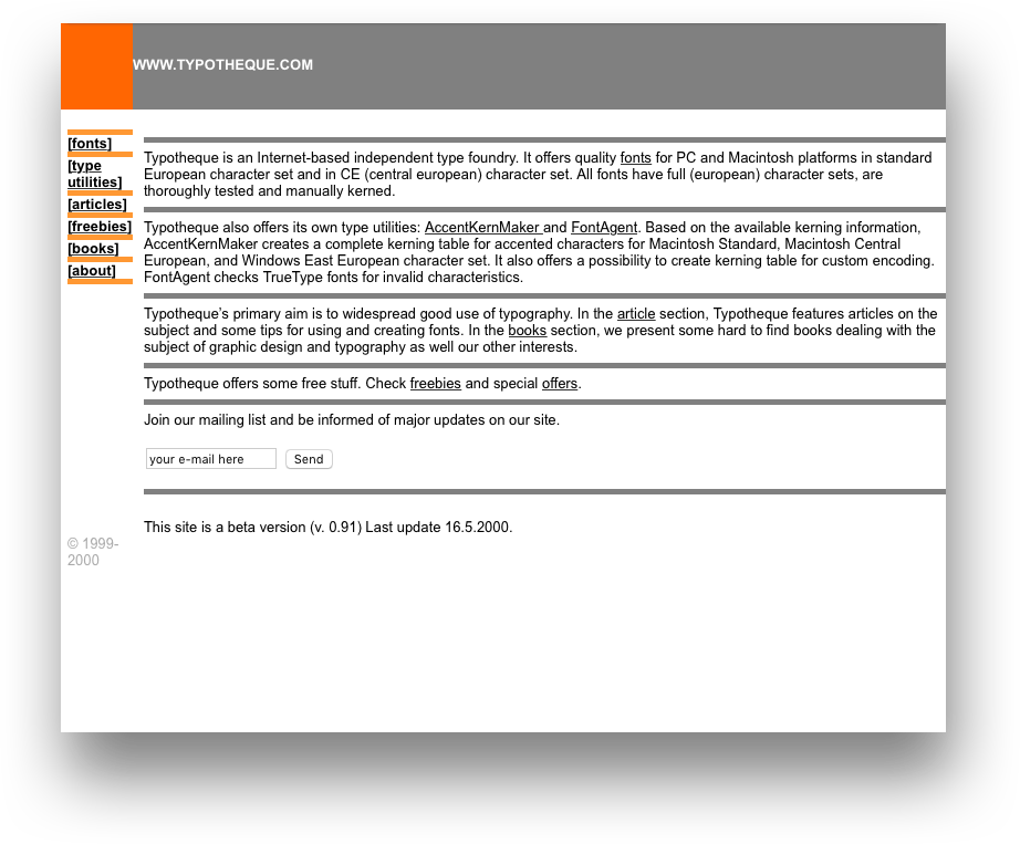
Typotheque.com launched in September 1999. For the first two years, we didn’t have a logo, and the site included very few images.
The first significant changes came in 2001, with the creation of dynamic PHP pages and the addition of the online store. It was hugely expensive, and revenues barely covered the monthly credit card processing fees, but it was also an indication that the foundry was serious about business and willing to take risks. This version of the website also included a reasonably popular discussion forum which was closed two years later when moderating became too time-consuming.

In 2001, we included an online credit card system, a very expensive one, where monthly costs often exceeded our income.
In 2004, the site changed to a three-column layout, and the online offering of books and t-shirts expanded. The site was still designed by Peter, but this time he hired external developers to code it. 2004 saw the addition of a detailed Fonts in Use section, tagging images by language, place, technology and font style used.

The site got more complex in 2004 with a range of products, fonts in use section, and regularly published articles
As the font collection continued to grow, the website became more and more visually oriented. In 2006, rotating slideshows debuted on the homepage as well as on each of the font presentation pages, (but these were later replaced by static images). 2006 was also the year that Typotheque started developing its own text engine to process fonts on the server and generate images on the fly. This system was used for the font presentation texts which were translated into the 150+ languages supported by the fonts, generating them in five different point sizes for each of the font styles. (For Fedra Sans alone, a family consisting of 10 styles and small caps, that meant 15,000 images available to be viewed.) Creating a custom text engine was a huge investment of both time and resources. It took two years to write a library in C++ which rendered fonts and OpenType substitutions on the website for nearly a decade. The same library is the foundation of the Type-Applications.com website where Typotheque offers its internal tools for licensing, and there are a dozen foundries that still use the OpenType font tester today.

Typotheque focused in developing own technology from 2005, investing heavily into proprietary text engine to generate font previews on the fly.
In 2009, Typotheque was at the forefront of webfont evolution, the first foundry to offer webfonts to a general audience via a proprietary webfont service. Shortly afterwards, the website underwent a complete overhaul, and Ondrej Jób, a student at the Type & Media course in The Hague who had been collaborating closely with Typotheque since completing his studies, became Typotheque’s first external webdesigner, reinterpreting the site, simplifying its structure and fine-tuning all the details. Every section was retooled, offering new, more interactive ways to view and work with fonts. The new design introduced the popular Font Combinator, full glyph set previews and visual demonstrations of OpenType Features. The old text-engine, adapted for the new server infrastructure, was still doing the heavy lifting behind the scenes.
In 2009, we asked Ondrej Jób to design a new site, a bit step, as previously, the site was designed by the founder.
Five years later Ondrej’s redesign was still more or less unchanged, although small modifications were made to the homepage, for example, listing fonts by category instead of name.
Last year, the site looked like this. It is not a radical change, but a functional improvement, that will allow improving the site for the future.
Around 2013 it became clear that the old custom text engine had been pushed as far as it could go. Incompatible with modern server infrastructure, it made upgrading to more robust and reliable systems impossible. Rewriting the libraries in C++ would have been a Sisyphean task, so in 2014, another redesign began, and Ondrej once again accepted the challenge of taking the website another step forward. The site is more intuitive, more image-oriented and optimised for high-resolution screens. The mobile version is coming next. The decade-old text renderer has been retired, and font samples are now rendered as webfonts, a setup that will be easier maintain going forward. The new design also introduces many new features (which are described in a separate blog post). It’s a natural next step in this 17-year project, and a good opportunity to reminisce about Typotheque’s history and progress.