
Brenner, an unusual typeface family with distinct voices

Despite its diversity, all styles of the Brenner family share the x-height and other vertical metrics, and can be easily combined in a line of text.
Editorial designers, whether they produce newspapers, magazines, websites or apps, often look for a combination of contrasting typefaces that can provide a variety of character and typographical colour, yet give the final product a unified, distinct voice. The last few decades have seen the rise of related sans and serif families that help to create smooth, harmonious layouts, but there is a limit to the amount of contrast they can create. Nikola Djurek’s Brenner takes quite the opposite approach.
Brenner combines seemingly unrelated styles into one large superfamily. Its unobtrusive Sans, confident Serif, expressive Display, utilitarian Mono, sharply chiselled Slab, and extravagant Script, along with space-saving Condensed Sans styles, all share vertical metrics, and can be easily combined. The styles differ from each other because each is built around a different model, yet as distinctive as they are, they support each other surprisingly well in complex layouts.
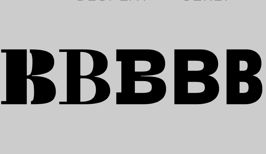
Brenner celebrates differences, and just like the Alpine mountain pass after which it is named, it is strategically positioned between the north and south, the east and west. Brenner (Serif) is a contemporary interpretation of the Southern European high-contrast typefaces produced by Bodoni and Didot (with a nod to Aldo Novarese). Brenner Sans recalls the Northern European grotesques of the 20th century. Brenner Script has an unorthodox disconnected style reminiscent of the café signage of the Mediterranean coast.
As individualistic as its members are, however, this is a remarkably harmonious family that works well together.

