
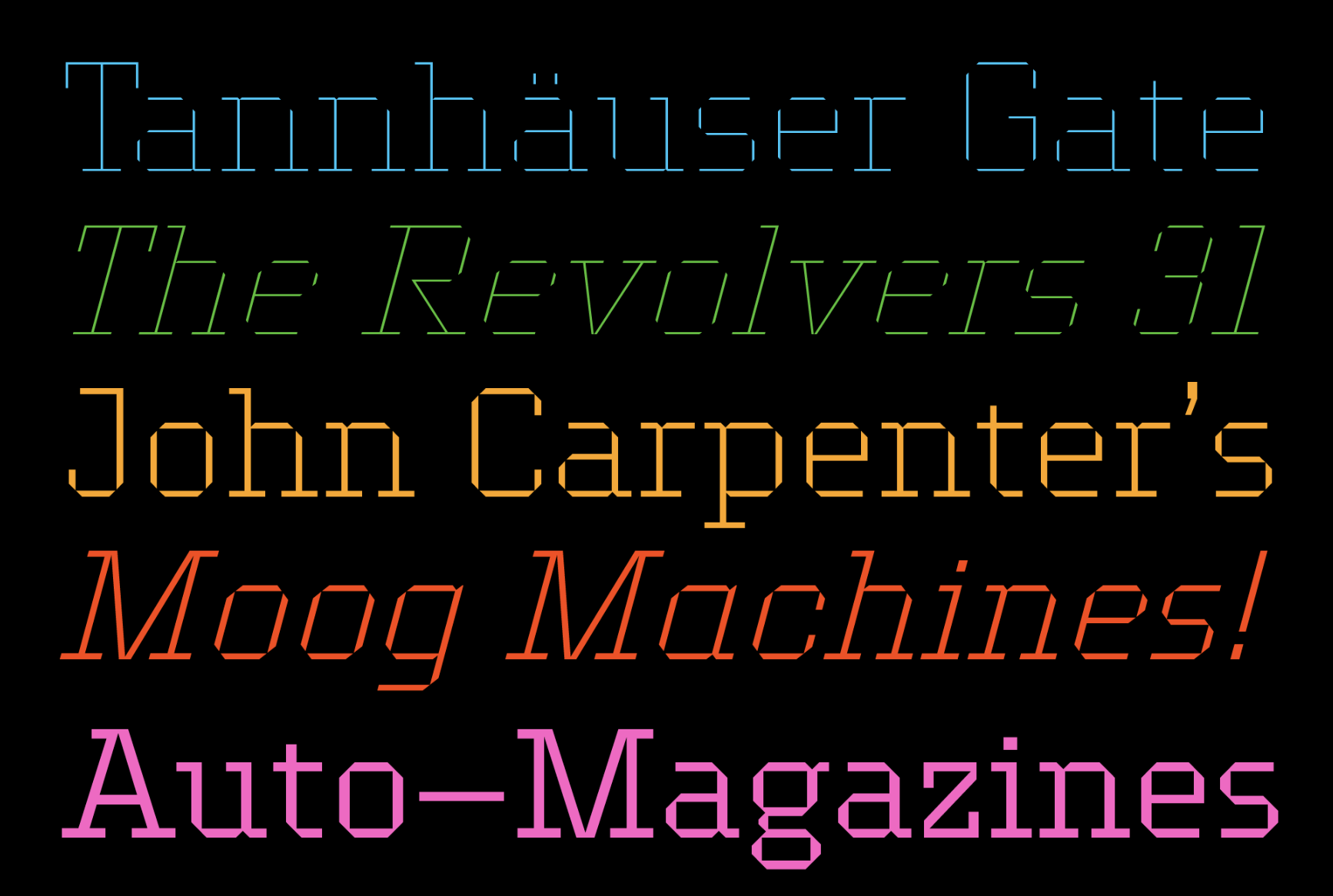
Edge, a geometric slab serif typeface
When we celebrated our 20th birthday, we looked back at our early days and revived one of the designs from the 1990s, publishing it under the name Edge Sans. Now, the designer Ermin Međedović expands the idea of a sturdy geometric typeface even further, in a slab serif version of Edge.
The underlying grid system behind the Edge's simple, rigorous shapes remains the same, while the typeface uses the rational grid in a different way. The typeface is the logical extension of that grid. Edge is playful despite its strict, formal constraints, building on the heritage of pioneers in graphic design, yet it is equally relevant for designers today.
Because of the universal ideas behind this typeface, Edge easily absorbs ideas from the context in which it is placed. It can be both timeless and retro; it can be static and machine-like and also vibrant and evocative of sports and movement.


