Exclusive fonts for NRK, Norway’s national broadcaster
In autumn 2019, Typotheque was invited to work on the new brand fonts for NRK, Norway’s state-owned public service radio, television and web channel. The client had observed a fragmentation of the broadcasting market and in response, chose to update their visual identity to increase the distinction of their brand.

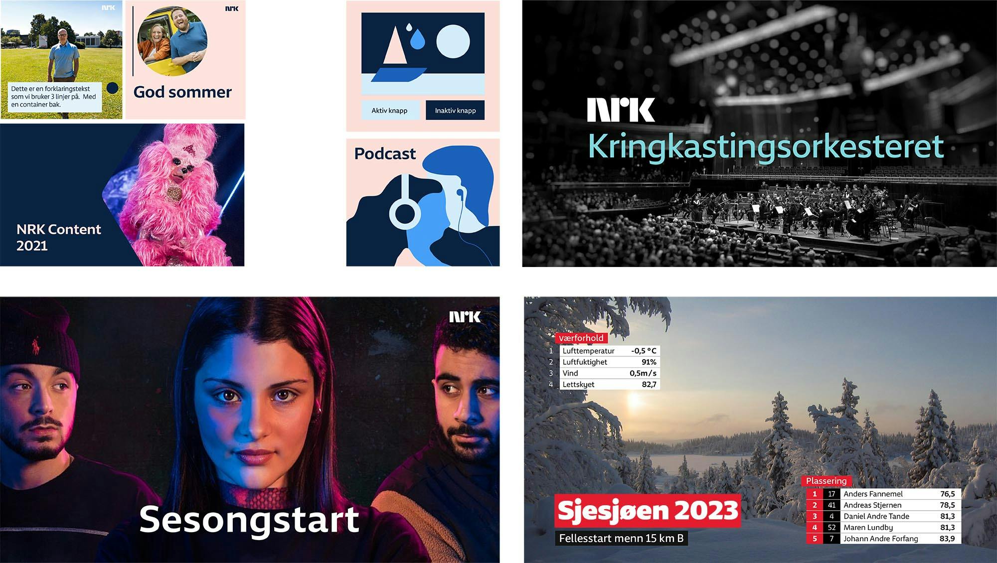
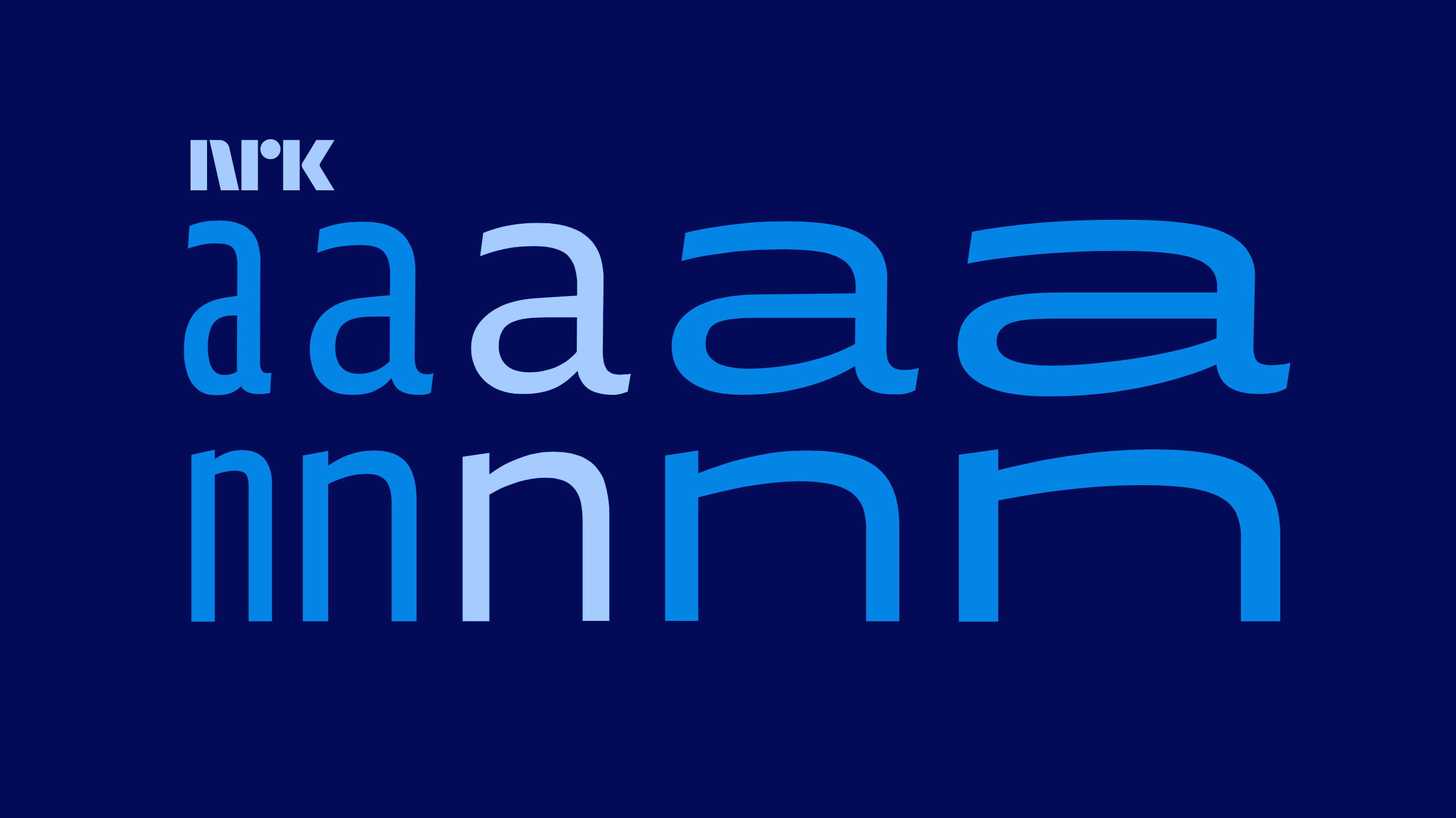
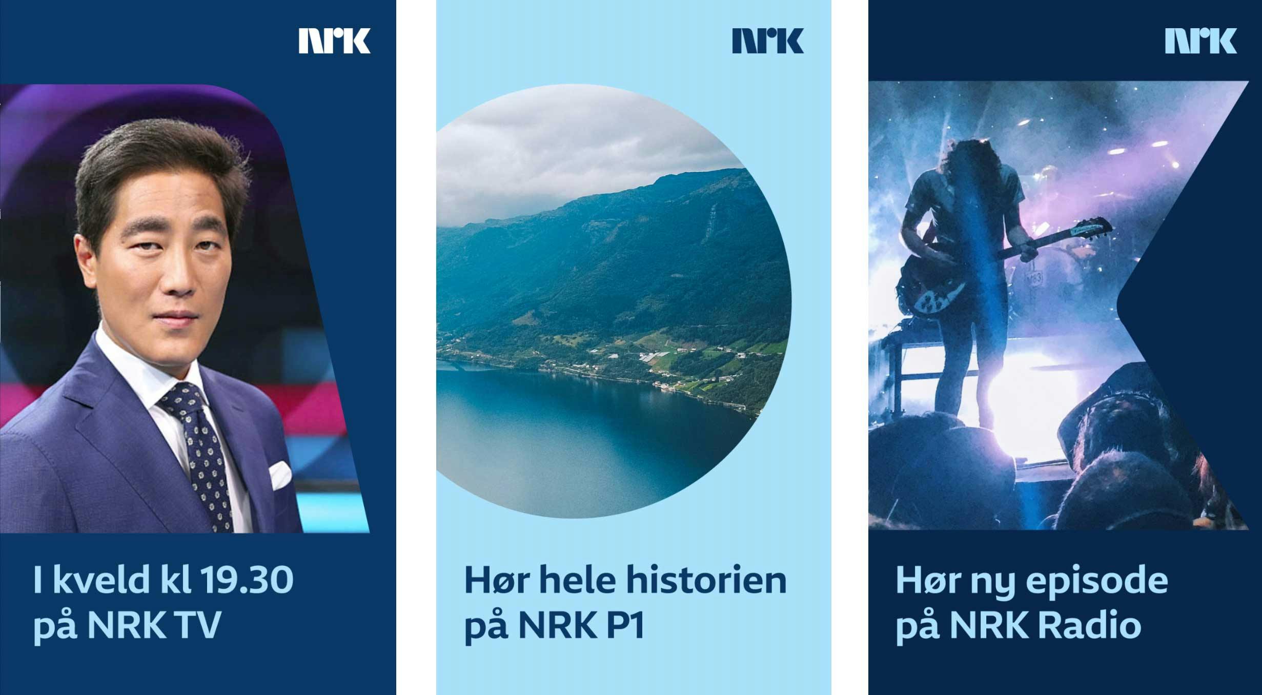
While the process has been disrupted by the pandemic, it also benefited from deep involvement of all involved parties, including our team at Typotheque, NRK’s design team and ANTI – a multi-disciplinary agency from Oslo working on the new identity of NRK. What made this project unique was the willingness to explore and rethink the original brief and the role of typography in the new identity of NRK. At the outset of the project, there was an intention to have a sans typeface and a complementary serif one, with four styles of each. Through the process of analysis of NRK’s content output, we decided that it would be more beneficial to create a single typeface family with more extreme proportions, ranging from the thinnest to the heaviest styles, with extreme widths too – from very compressed to super extended. These styles would be integral to the new identity of NRK, which explores motion, dynamic displacement of elements, and stretching of the visual elements. Once we defined the purpose of the fonts, we could create and evaluate various proposals and develop prototypes for testing.

The benefits of custom typefaces is that they are specifically created to align with the client’s content and communication strategy. We evaluated the prototypes in the real-world context and environment, enabling us to make informed choices about the stylistic and functional suitability of the proposals. After much in-depth discussion with all parties involved, we went on to refine the results.
NRK is the largest media organisation in Norway, reaching 90% of the country’s population daily, and particular attention was paid to accessibility – not just making the fonts easy to read in various text sizes, but also supporting all languages used in Norway, including a focus on the indigenous group of languages spoken by the Sámi people in the north of the country.
Stylistically, the new typeface NRK Sans is a humanist sans. It is reliable and highly legible in small sizes in the middle of its design space, and at the same time distinct, recognisable in its extremes, when used for high-impact titles and animations. We are proud of the results, a set of typefaces that address the needs and values of NRK.
We look forward to seeing how the fonts will be integrated into the new identity that will be rolling out during 2022. The fonts will remain exclusive to NRK.
Update: NRK Visual identity received the Yellow Pencil in 2023 D&AD Awards.