
Francis, a highly modulated Sans-serif
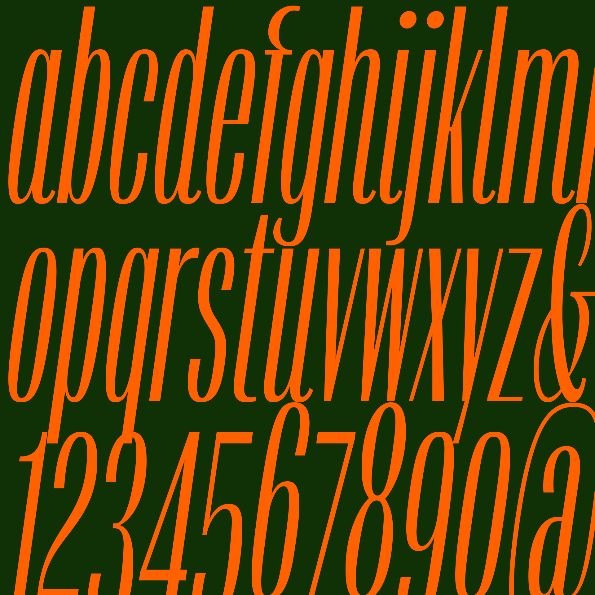

Francis draws its inspiration from an early 20th century lettering style often seen in European advertising, but also from the rational geometry that lends a rhythm to the typeface in text. Unlike most typefaces, the light styles of Francis are intended for the largest text sizes, and as the typeface gains weight, it also gains legibility at smaller sizes. From light to black, Francis goes from extremely compressed to a more airy design, keeping the highly modulated contrast of its thick and thin strokes. The true italics offer unexpected flair to the typeface. The letters nearly touch each other, creating a cursiveness that produces flowing headlines.
Francis’ real tour de force, however is its collection of four Gradient styles, capital-only display versions that produce dynamically increasing or decreasing character widths. These remarkable text patterns are possible because each Gradient style contains 2,690 glyphs that are selected automatically using OpenType’s Contextual Alternates feature. These gradient patterns can be applied to individual words, or to whole lines of text.
Frances is suited for many large-text uses spanning editorial design, posters, corporate design and advertising. One word of warning: Francis is seriously playful and addictive, so don’t work with it unless you have plenty of time for your project!


Illustrations by Shiva Nallaperumal. GIFs created by Henry Becker & Andrew Paul Keiper.