
Greta Mono
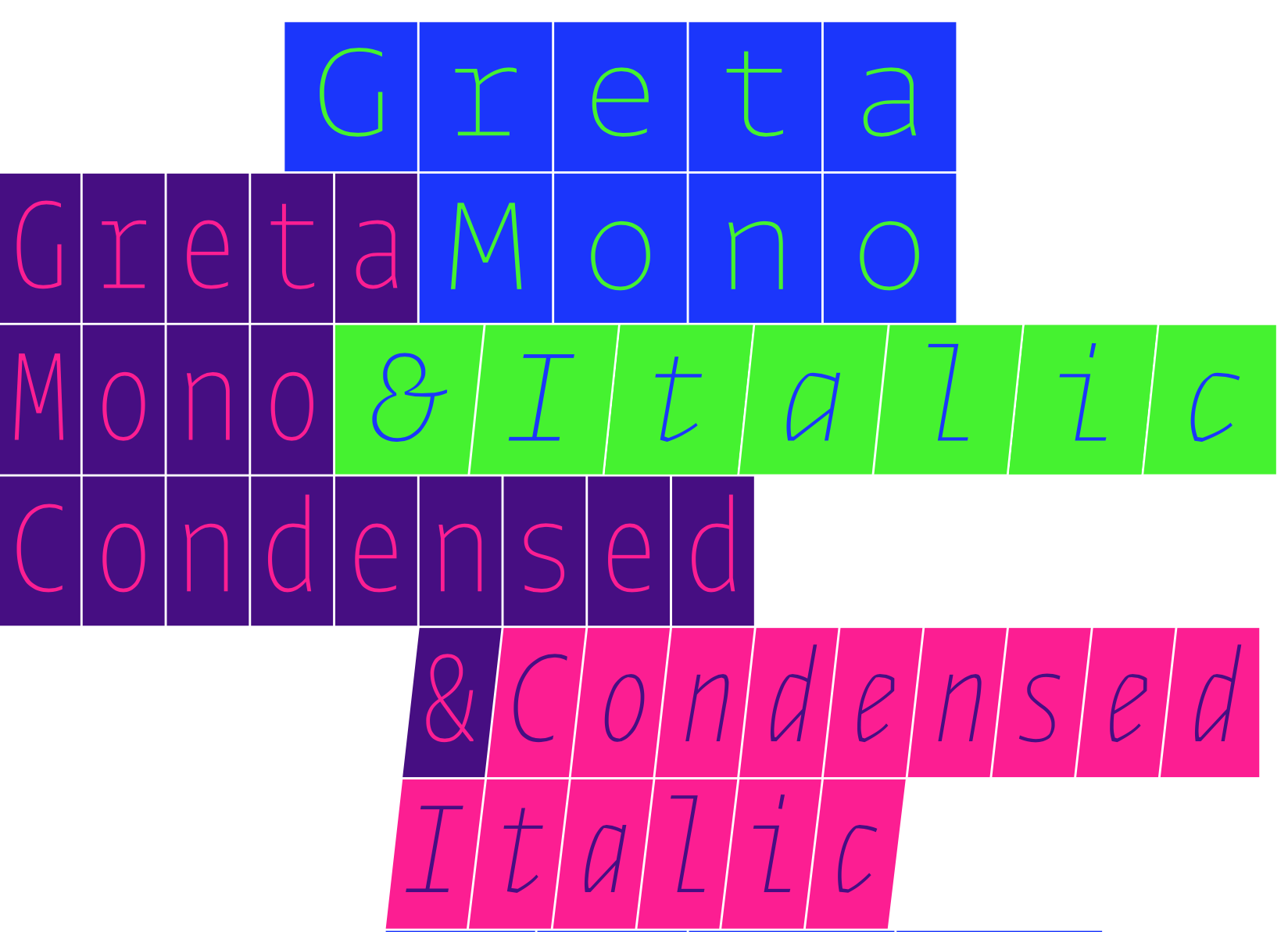
Most digital monospaced fonts come with two weights, regular and bold, because making a monospaced font family gets more complicated as the number of weights grows. Imagine, for example, trying to design a font whose lightest style i in Hairline needs to occupy the same width as the heaviest style m in Black. The newest addition to the Greta family, Greta Mono, has an astonishing ten weights and two widths that offer a broad palette of typographical possibilities. [PDF of Greta Mono.]
Greta fonts are calligraphic in structure, and constraining their letters to a uniform space is challenging. Greta Mono doesn’t use monoline construction, but a higher stroke contrast. To make it appear uniform, most of letter stems are non-uniform, optically adjusted to create an even texture throughout a block of text.
Just like all monospaced fonts, Greta Mono works well in tables, invoices and programming code. I expect, however, that it might find much wider usage, as its 40 versions afford a tremendous range of possibilities for typographic expression. I personally use monospaced fonts when drafting texts, whether an email, essays for Works That Work magazine, or this text explaining a new typeface. It is not to pretend that I am coding, or to make it easier to count characters, it’s because monospaced fonts seem solid, serious, functional and honest. They can be serious fun too. I enjoy using monospaced fonts in large-scale applications, on posters or in architectural settings where one may appreciate seeing how the individual characters create a consistent rhythm of forms.
Please note that Greta Mono breaks the traditional ‘pitch’ system (number of glyphs per inch in a specific point size), because Greta fits 10 extremely different weights into the same fixed space. Therefore, when you change from Courier to Greta Mono, the text will reflow, as Greta Mono has its own defined glyph width.

Specimen illustration by Shiva Nallaperumal.