
Greta Sans Korean, a Hangul humanist Sans typeface system
Greta Sans is one of the largest commercially available type systems. It was originally published in 2012, and quickly gained popularity as a powerful toolbox capable of dealing with the most complex typographical situations. Thus far, Greek, Cyrillic, Arabic, Hebrew, Devanagari, and Thai extensions have been released, opening access to other language communities, and today we are proud to announce the addition of Hangul, the official writing script of Korea.
While the sans serif model is now well accepted in Korean typography, it is the traditional calligraphic form based on brush strokes, myungjo, that has been traditionally used to set long texts. Dutch type foundry Typotheque partnered with Seoul-based Sandoll to create a unique Hangul typeface system that would expand the acceptability of sans serif Hangul letterforms, giving users more choices to work with.

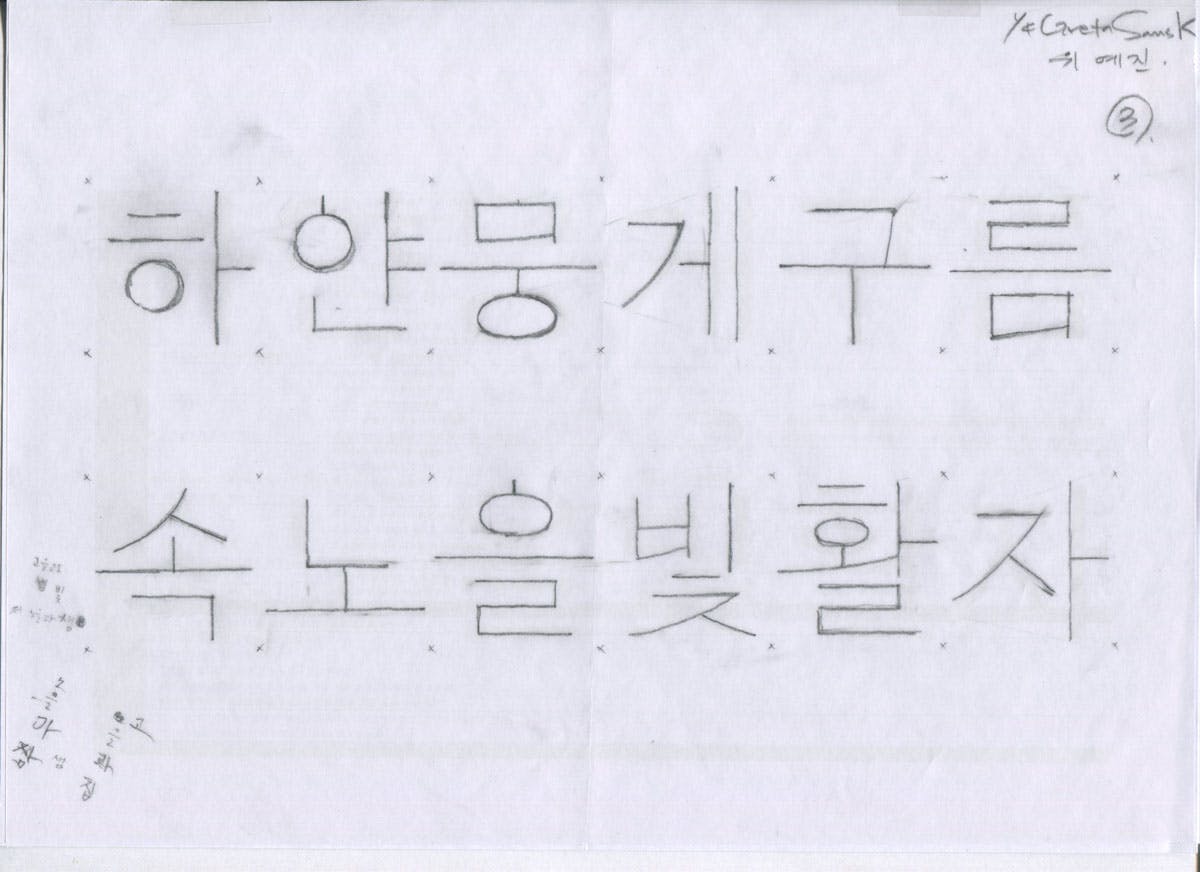
Greta Sans Korean was carefully planned from the outset, designed to be different from the dense, symmetrical, top-aligned typefaces favoured by current trends in Korea. It is more generously proportioned, its shapes less symmetrical. The structure of consonants is rooted in handwriting, creating a fluctuating rhythm within each glyph’s own letter space.
The Hangul script is originally based on a fixed square frame filled with perfect circles and rectangles. Thus, most contemporary Hangul fonts have low contrast between thick and thin strokes, and pair better with Latin geometric sans or grotesque typefaces rather than with humanist sans, whose more natural forms are rooted in handwriting.
Greta Sans is a good example; its shapes bear traces of pen strokes, slightly modulated contrasts between thick and thin, which lend the text a very warm and personal appearance. The Hangul version of Greta Sans attempts to follow the same principles, using natural written forms and generous spacing of characters. This is not the first such humanist model, as there have been several attempts to create less geometric letters, such as the fonts typically used for the covers of mass-produced books, usually essays and novels. Having said that, the model has never been extended to the darkest end of the weight axis, and usually includes only a handful of weights.

Directed by Wujin Sim, Sandoll designer Yejin Wi, Suhyun Lee and Chorong Kim decided to explore whether forms inspired by handwriting using a medium-thick pencil could be extended to extreme dark and light weights. Handwritten Hangul has much more slanted connecting strokes and also a significant difference between the shortest and the longest strokes within one letter. These fluctuating rhythms needed to be emphasised as the weights progressed towards Hairline and relaxed as they progressed towards Black.
Just like the original Greta Sans series, the Korean version has carefully maintained the typeface’s strong personality across all weights. The structures of the Hangul glyphs vary from very simple to rather complex, so from the earliest stages the basic design principles incorporated sufficient flexibility to ensure that the resulting shapes were not just compromises, but a consistent reflection of Greta’s character.

The designers also decided to make Greta Sans Hangul a full-width typeface, using the entire 1,000-unit box space for all weights from lightest to darkest. Side bearings are relatively narrow compared to the fonts favoured in Korea, and they are optically adjusted to keep the flow of the rhythm in text. The typeface is thus very easy to use, since the text doesn’t reflow when the user changes the font weight. On the other hand, the full-width Hangul glyphs are also large in comparison with the proportionally spaced Latin glyphs, and because Typotheque and Sandoll agreed that the needs of local users should be prioritised, the Latin characters were enlarged to 125% of their usual size, and symbols and punctuation marks were adjusted accordingly.

It is important to note that Greta Sans is a continuous design space — while the styles intended for running text (Light, Regular) are designed and spaced for small sizes, the extreme weights (Hairline, Black) are designed to be used as display types, and are therefore tightly spaced and kerned. Whereas typeface families usually include separate optical sizes, all of Greta Sans is constructed using the same design axes. This facilitates more expressive use of elements in the very light and dark styles. Observant Hangul readers will notice that the stem weight grows in the heavier styles, bringing liveliness to the structure of the characters, which emphasises differences between them and draws readers’ eyes through a paragraph. This intentional liveliness of forms is not a common feature of Hangul fonts.

Thanks to Sandoll’s cloud service platform, Greta Sans Hangul has been thoroughly tested before the official release. During the three months of the beta testing, about 5,000 users from Sandoll’s font cloud service have participated in the testing , and more than 500 users responded to the survey with a specific feedback. This pre-release survey was a valuable opportunity to see how Korean users react to this new typeface, how they use and perceived the fonts. Greta Sans Hangul has just ended the final phases of a long process including internal testing and final amendments. After the beta testing, Greta Sans now have bigger punctuation marks, a slightly lowered contrast in thickness, and a bit longer branch strokes from the stem, that still contain the sense of fluctuating rhythm. This new style font is now offered for general licensing on both Typotheque's website and Sandoll's font cloud service.
