
Major update of Lava with variable optical spacing

Our aim at Typotheque is for our type family Lava, along with the November type system, to be able to support all living languages. This is an ambitious aim, and it is a long-term project, in which we hope to translate the concept of a typeface for the long form for various writing scripts. This goal has forced us to rethink the structure of the typeface. For example, the original weight of Lava Regular was selected based on the reading expectations of European readers. However, readers in East Asia and South East Asia have different expectations about the colour of the text. So when we came to plan the Hangul and Thai versions of Lava, we saw immediately that we would not be able to impose the same weight as that which Latin uses; a typeface for long text would require a new, much lighter version of the Latin, which would better match those particular writing scripts.

Therefore, in anticipation of the Korean, Chinese, Japanese and Thai versions of Lava, we are now introducing an update to it, which includes two new additional weights, Thin and Light, and corresponding italics, designed by Anya Danilova and Renan Rosatti.

The updated version of Lava also includes hundreds of new glyphs and international currency symbols, while the spacing and kerning of the fonts have been reviewed and adapted. Because this may cause text reflows, the new version of Lava is called Lava L (the old name was Lava Std); this follows our standards of Language Script Suffixes that identify the language support for particular fonts.
Lava is also a typeface that works remarkably well in small text, from 6 points, yet is sophisticated enough for headline use, as the heavier weight increases the contrast between the thick and thin elements. The same shapes of letters work across a range of sizes, although the space around the letters will need to be adjusted according to the corresponding text size. When the text is used in small sizes, plenty of space is required between the letters to make sure that the shapes do not blend into each other, that they retain their unique silhouettes. An experienced typographer does this by controlling the tracking for each point size.

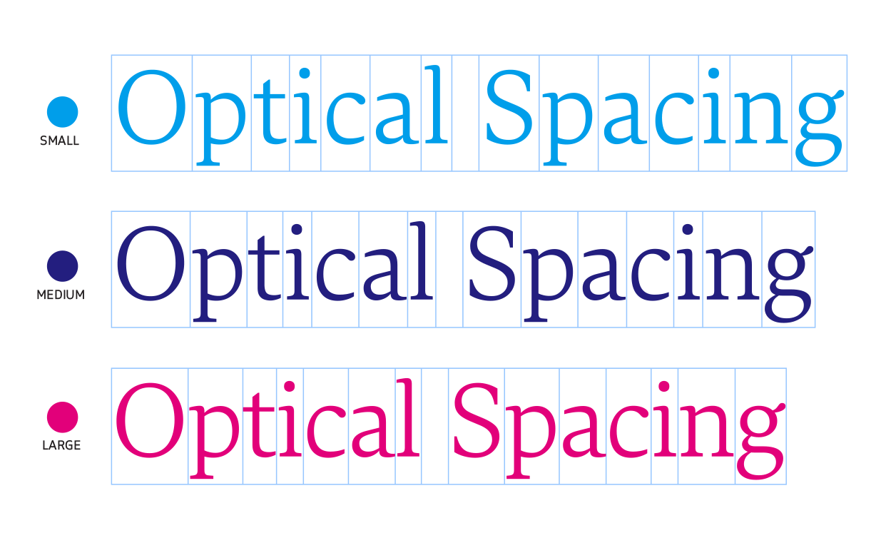
We decided to create a variable version of Lava that does this size-specific tracking optimisation automatically. After a year-long period of research into optimal spacing for various sizes, we can now introduce a variable version of Lava with optical spacing. Essentially, we spaced and kerned every font in the family three times, for a small size of about 6 points, a default size of 10 points, and a large size of 48 points, at the intended viewing distance of 40 cm. It is important that both spacing and kerning are size specific. Kerning pairs can minimise glyph collisions; in tight text settings, glyphs can become too close and need more adjustments, while in a loose text there are naturally fewer glyph collisions. The kerning table for the largest size contains nearly 40% more kerning pairs than the one for the smallest size, and the kerning for black text contains 18% more exceptions, as the text setting is even tighter. We have written an essay about the background to the research we carried out into optical spacing.

For now, only Latin, Greek and Cyrillic are offered with the benefit of variable spacing. However, we will continue exploring the idea and how it could be used in different writing scripts.
We have also updated the Devanagari, Telugu and Kannada versions of Lava, and introduced a number of improvements in terms of more consistent and harmonious shaping of these Indic writing scripts, using our own experiences and our production workflow. The original designers and Parimal Parmar (Devanagari) have taken this opportunity to review and refine the drawings. These fonts have also recently been included in Typographica’s selection of their favourite typefaces of 2019, and we’d like to thank Namrata Goyal for her thoughtful review. Hai Liang has been responsible for linguistic consultations, engineering and mastering of all the language versions in all formats.
Our existing customers who have a licence for the full package of Lava can download the variable version, and the new weights, free of charge. As always, in your Typotheque online account, you will be able to find the latest version of the fonts. It is likely that this is not the final version; we will continue to work towards better support of Sanskrit and Nepali forms, alongside developing other language versions of Lava.
We’d like to thank Stephen Nixon for his help in creating early concept of Lava with variable optical spacing.