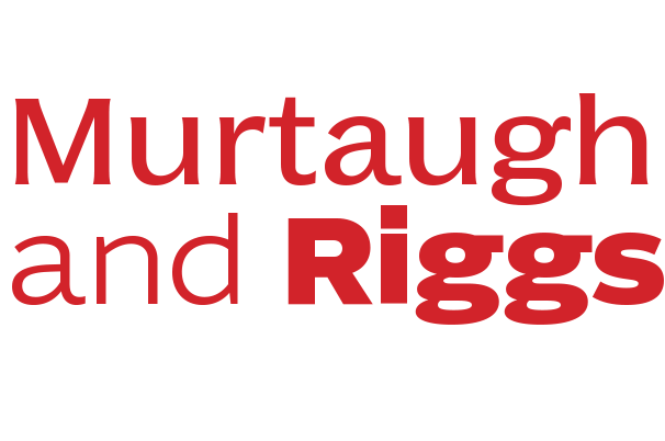
Murtaugh & Riggs, a duo of complementary typeface families

The past three decades have been marked by the growing popularity of extensive typeface families, particularly families of sans and serif fonts developed by modulating the contrast between thick and thin strokes.

With Murtaugh & Riggs, designer Nikola Djurek has taken a new approach to building families, basing this project not on stroke widths, but on the idea of age. His Murtaugh is the senior partner of the team, seasoned and grounded but hardly ready for retirement, thank you very much. Riggs is the young gun, trendy, driven and ready to get at it, and while there is a generational tension between them, there is also a palpable synergy, each drawing from the other as they strike a creative balance. Download the PDF presentation.

Convenient Book of Specimens, Franklin Type Foundry, Cincinnati, 1889
Djurek started by examining the late 19th-century Latins, a genre of wide, medium-weight typeface styles produced by many American foundries under the name Latin Antique. In the Franklin Foundry’s 1889 Convenient Book of Specimens he found the 6-pt version of Latin Antique, a wide design with small, flared serifs and a rather static stroke contrast. Djurek chose to work only with the smallest available size in order to concentrate on the general proportions of the design without getting caught up in the details. In this sense, Murtaugh is not a historical revival, but a looser interpretation of the original, and Djurek considered ways to modernise its design even further. After a number of sketches, however, he decided to keep the first design largely unchanged and to create a second design that would serve as a radical counterpoint, a 21st century partner. Opposites attract, as the saying goes, and the pairing of Murtaugh’s maturity and discipline with Riggs’ insistent drive and flow create unexpected possibilities for setting text.


