
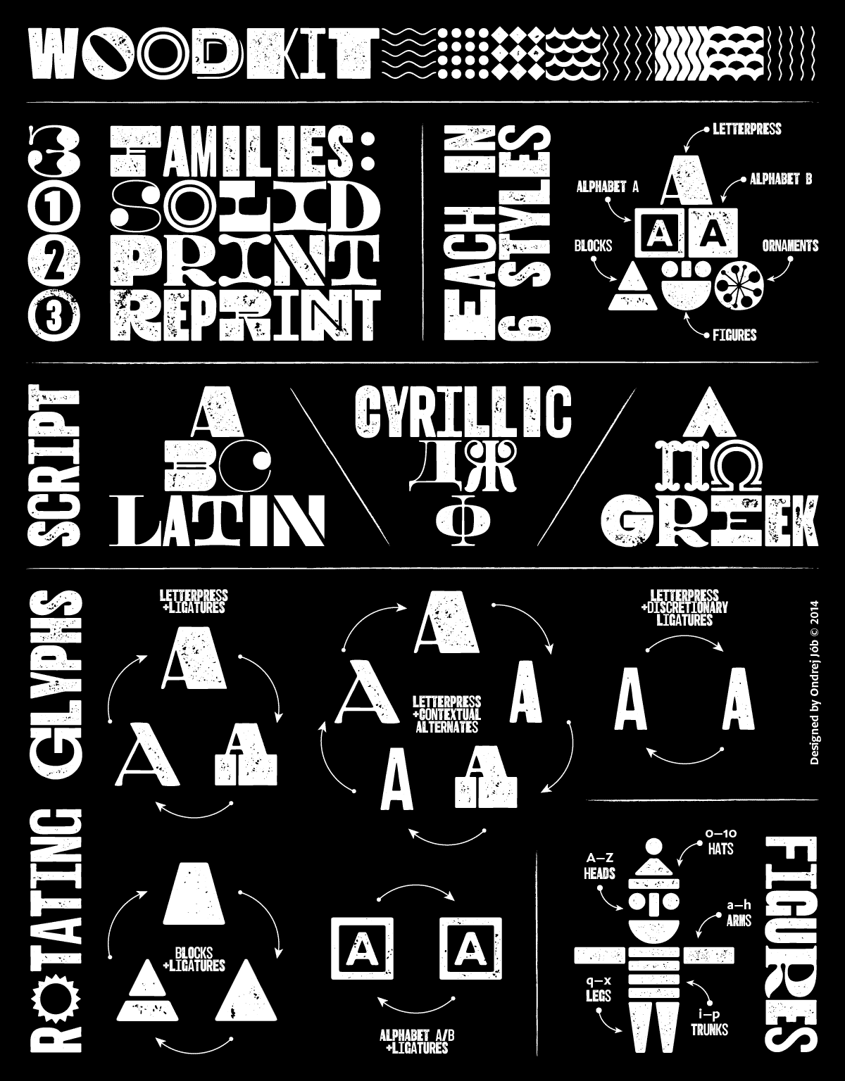
Woodkit, a system of display typefaces

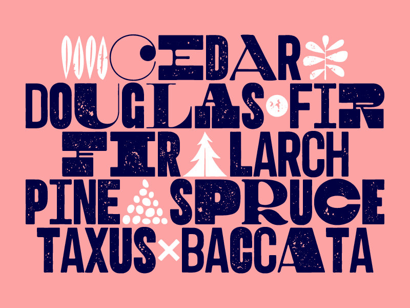
Woodkit comes as three separate families, with different degrees of print degradation: Solid, Print and Reprint, each with six distinct styles and ornaments.

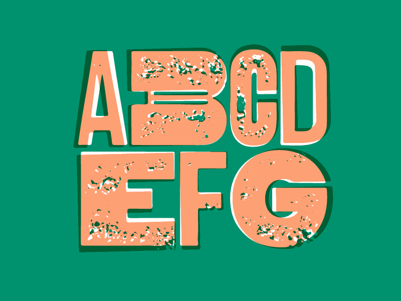
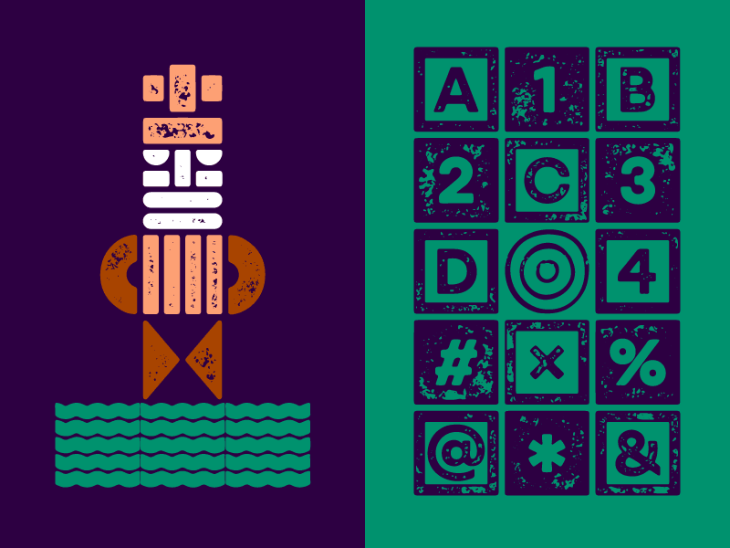
Woodkit supports a wealth of OpenType layout features. When typing with basic ligatures turned on, the font automatically rotates between three different versions for each letter or number. With contextual alternates turned on, five different versions are being rotated, three full square and two half square wide. And finally, when discretionary ligatures are turned on, the font rotates only between the two half square versions. All this combined together allows for a rich setting where no two words look alike.
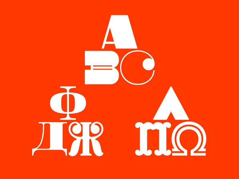
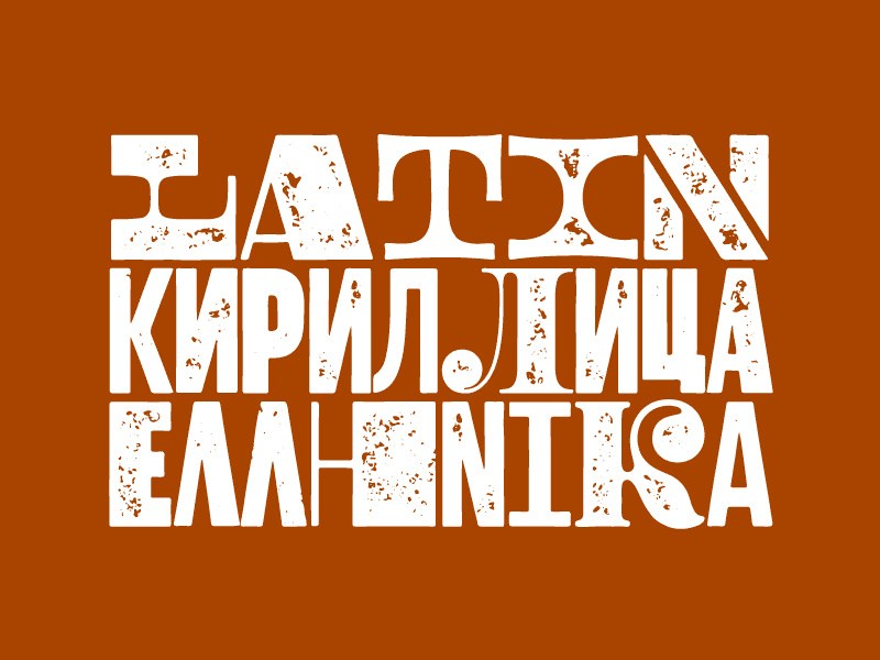
Woodkit supports Latin, Cyrillic and Greek scripts. Read more about the development of Woodkit in this description of the process by the author.
Author’s tips
- Use 100% leading (i.e. 20pt text size/20pt leading) to make the gap between lines and the space between glyphs equal.
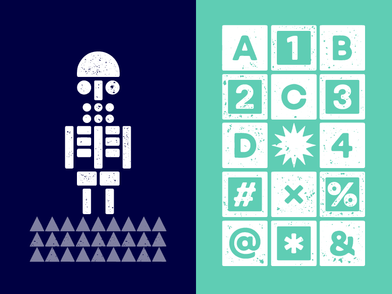
- Woodkit contains over 10,000 glyphs, explore them by using the Glyph palette in Adobe applications (click and hold on a letter with a tiny arrow in the corner).
- The style of each glyph always depends on the previous glyph. That means that changing the first letter in a word will affect all other letters following it. Quick and easy.
- Every glyph is 1000 units wide and the tracking setting in your graphic application uses the very same units. That means that setting the tracking, e.g. to +500, will create gaps between the glyphs that are exactly half-glyph wide.