
Zico Hebrew
Zico Hebrew is a large collection of typefaces in three styles—a clean, versatile Sans, a robust and uncompromising Slab, and dark and expressive Display, a compact headline font.
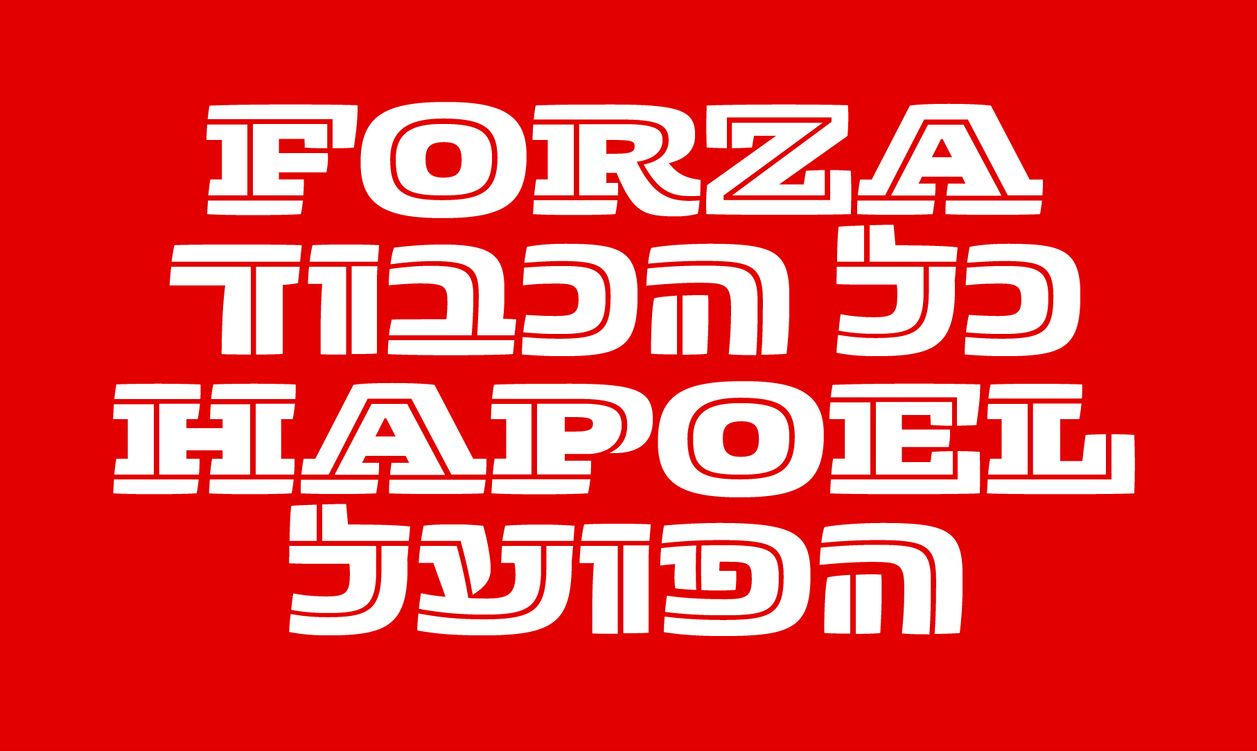
The Slab and Display are inspired by the aesthetics of sports, racing cars, baseball jerseys, and tennis ball packaging. They all share a boldness as well as dynamics of speed and robust action, a confident typeface with the sound of the crowd cheering in the background. The Sans version is intended for more subtle expression and practical typography.
Originally designed by Marko Hrastovec, a Type & Media alumnus as his graduation project in 2015; Zico Hebrew was designed by Daniel Grumer, after graduation from the Type & Media a year later, connected by their former teacher Peter Biľak.

‘After studying in Type and Media for a year, I came back to Tel Aviv with a lot of new questions and motivation to explore. One was ‘how come we don’t have versatile type families with many styles that match all kinds of applications’ — says Grumer. ‘It was as if this chunky inline style was looking at me, quietly begging that I’ll start sketching Hebrew letter shapes that carries the same blend of aesthetic properties’.
There is no tradition of Sans or Serif type categories in Hebrew typography, so working on a Sans and Slab was a challenge. Grumer chose to add generous termination strokes in logical places of in- and out- strokes, in order to express the chunky feeling of a slab-serif typeface.
The result is a Hebrew type family with a unique tone-of-voice that combines humour, seriousness and muscle. ‘Each style has a different feel: The Sans is probably the eldest son, the serious one; then comes the Slab, which has more muscle and speaks very clear; and the Display, which is the funniest member of this family’, concludes Grumer.
Download the PDF specimen of the Zico font family, and see below for more details.


