Bram de Does
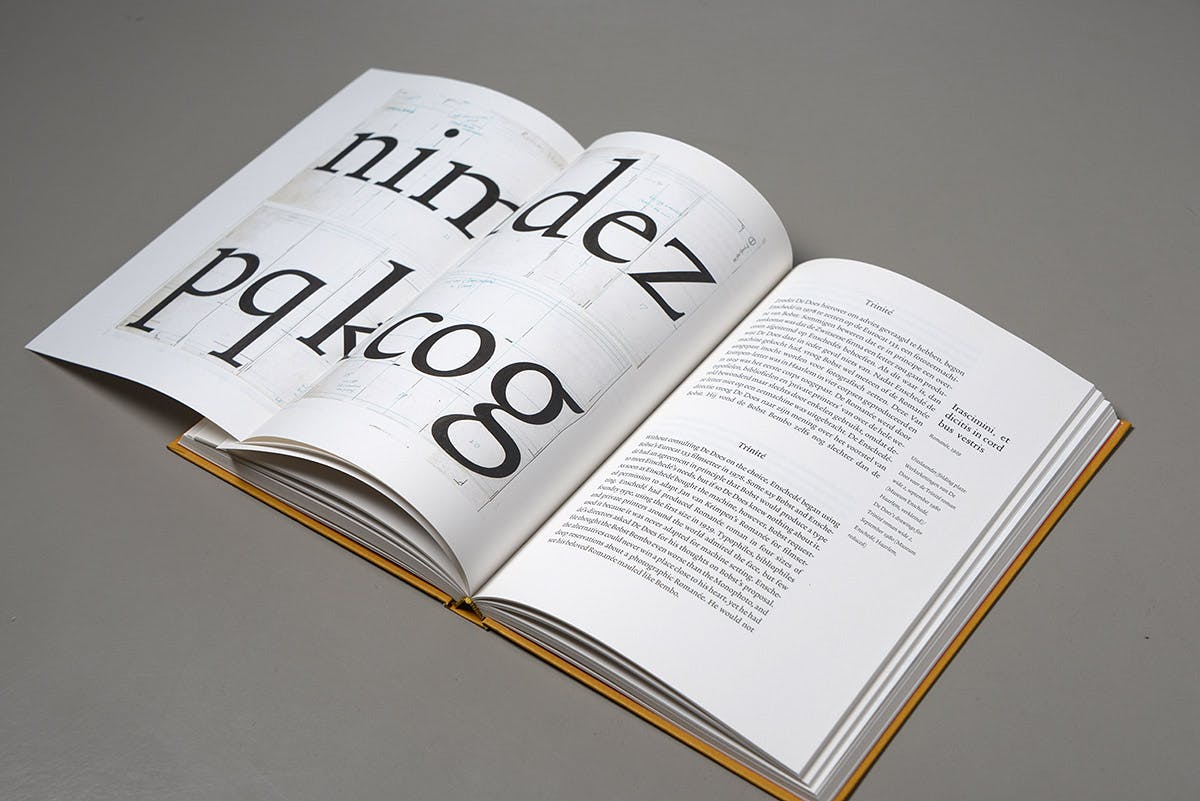
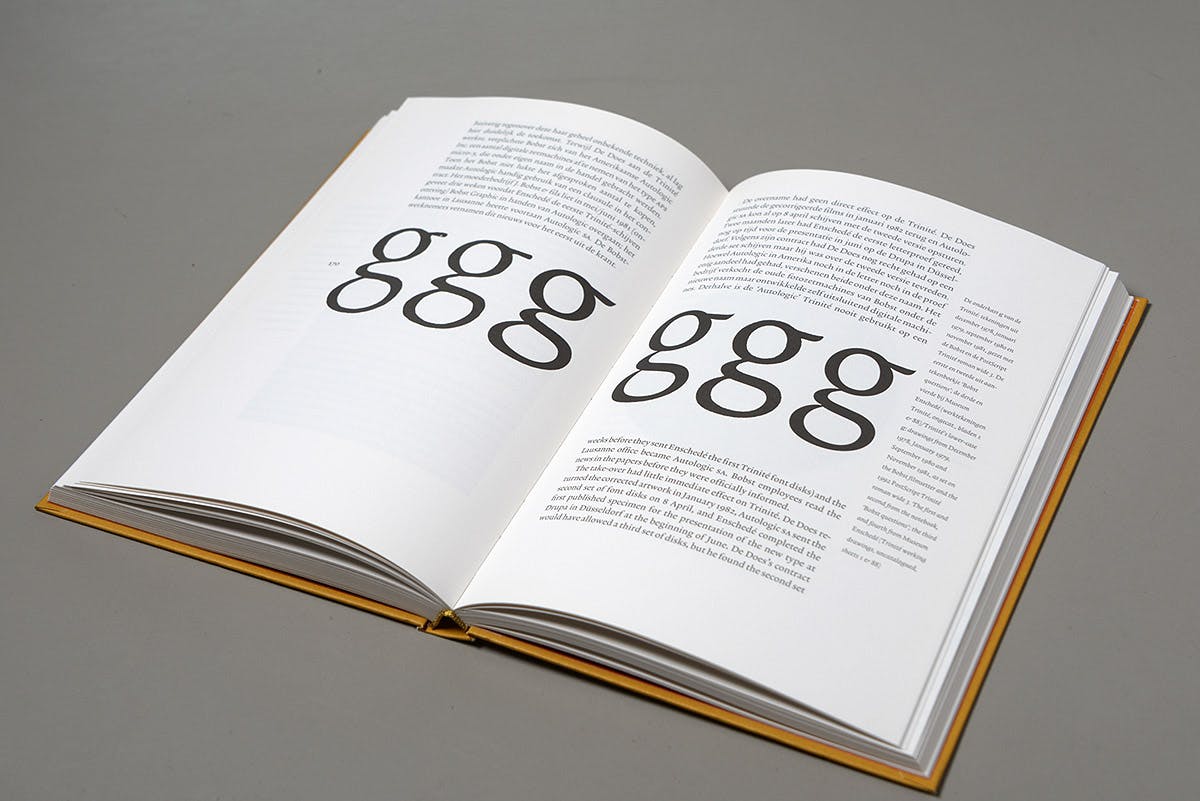
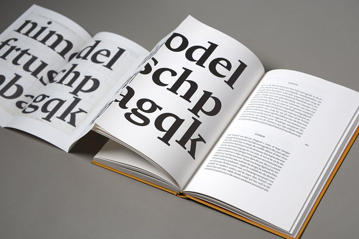
Bram de Does (1934–2015) is best known internationally as a type and book designer, creator of typefaces Trinité and Lexicon. In the Netherlands his Trinité is one of the most popular typefaces in the literary circuit and Lexicon is here particularly known as the body type of the newspaper NRC Handelsblad. Except for a short interruption, De Does worked exclusively for Joh. Enschedé. This famous Haarlem graphics company — which in 2003 celebrated its 300th anniversary — previously employed typographers such as Jan van Krimpen and Sem Hartz. His designs for Enschedé include the jubilee volume Typefoundries in the Netherlands (1978), his typographic magnum opus. He has won many awards not only for his type designs, but also for his book typography, including a ‘Goldene Letter’ in Leipzig, the Premio Felice Feliciano and the prestigious H.N. Werkmanprijs of the city of Amsterdam.
This uniquely designed and executed book is the first substantial publication devoted to De Does’s life and work. His book and type designs are here placed in their contexts. After an introduction by De Does himself and the main texts by Lommen and Lane this monograph includes seven short contributions by internationally prominent book designers on Trinité and Lexicon in their design practice. It also includes an extensive bibliography. De Does emphatically takes tradition as a starting point, but arrives at his own personal solutions. His typography and text types are certainly classical but never ‘traditional’ or dogmatic.