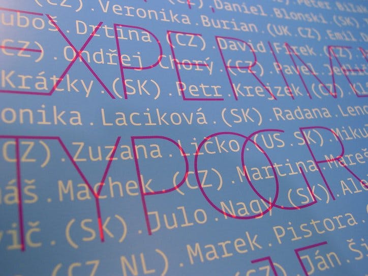
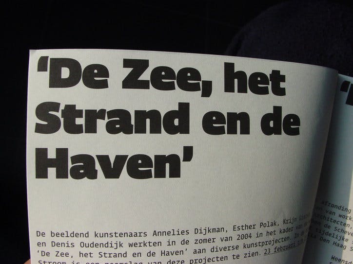
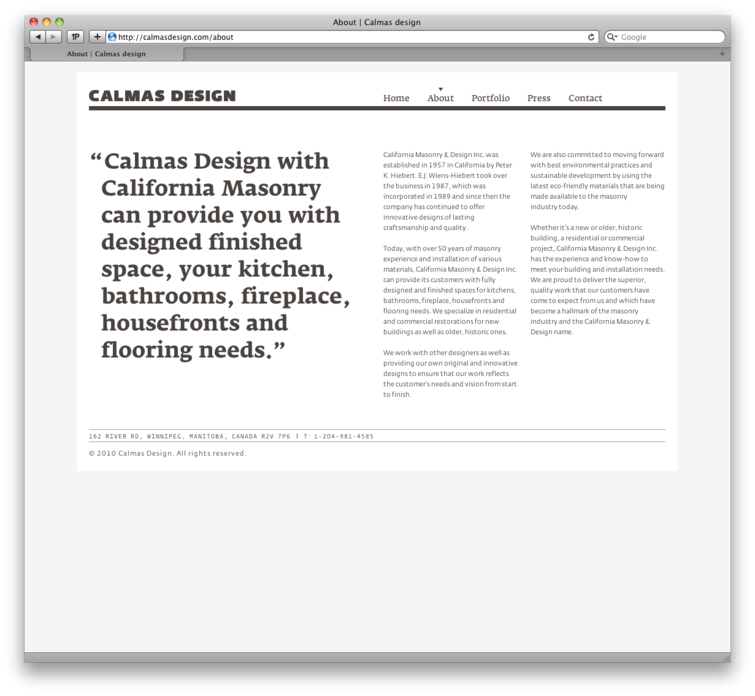
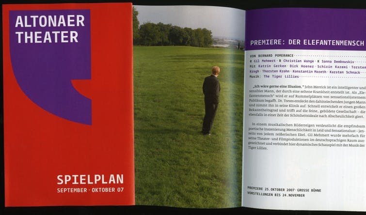
Fedra Mono

Light
Light Italic
Book
Book Italic
Demi
Demi Italic
Medium
Medium Italic
Bold
Bold Italic
NagłówekClick to Edit
Light 100px
HeadlineClick to Edit
Light Italic 100px
TitreClick to Edit
Book 100px
PrüfungsanweisungenClick to Edit
Book Italic 100px
ÚjságcímClick to Edit
Demi 100px
TitoloClick to Edit
Demi Italic 100px
BezeichnungClick to Edit
Medium 100px
HírösszefoglalásClick to Edit
Medium Italic 100px
TitulekClick to Edit
Bold 100px
RubrikClick to Edit
Bold Italic 100px
In spite of all the attention to type and the unprecedented conditions for type designers, the vast majority of new fonts desperately lack originality. Just as in the music industry, where cover versions and remixes are often more popular than new music, font designers seemingly prefer to exploit successful models from the past rather than strive for new solutions. Scant decades ago, new typefaces underwent a rigorous review procedure to ensure that they met the publisher’s artistic and technical criteria. Today, self-publishing has eliminated such processes, and there is little critical review, little effort to add something new to the evolution of the profession. Mediocrity abounds as quality control dwindles. Dozens of blogs (as well as the print media) simply republish press releases without distinguishing between marketing and independent reviews, praising uninspired fonts and institutionalising the average. Many design awards do the same, perpetuating a false idea of what constitutes superior quality. We don’t need new fonts like this.Click to Edit
Book 16px
In spite of all the attention to type and the unprecedented conditions for type designers, the vast majority of new fonts desperately lack originality. Just as in the music industry, where cover versions and remixes are often more popular than new music, font designers seemingly prefer to exploit successful models from the past rather than strive for new solutions. Scant decades ago, new typefaces underwent a rigorous review procedure to ensure that they met the publisher’s artistic and technical criteria. Today, self-publishing has eliminated such processes, and there is little critical review, little effort to add something new to the evolution of the profession. Mediocrity abounds as quality control dwindles. Dozens of blogs (as well as the print media) simply republish press releases without distinguishing between marketing and independent reviews, praising uninspired fonts and institutionalising the average. Many design awards do the same, perpetuating a false idea of what constitutes superior quality. We don’t need new fonts like this.Click to Edit
Book Italic 16px
ÚjságcímClick to Edit
Book 140px
There are still fonts which haven’t been made yet. Our job is to make them. You may consider using them.Click to Edit
Book 0px
In my decade of experience teaching at Type & Media I have seen many students enter the course with no previous experience in type design. Over the eight months of the course they learn the structure of letterforms and the principles of construction that allow them to create well-designed typefaces, (not always terribly original, but convincing executions without obviousClick to Edit
mistakes). Having mastered the formal execution of type, they can then move on to think about how to apply their skills. Obviously, creating type that is too closely related to existing models doesn’t justify the effort involved. Or as my Type & Media colleague Erik van Blokland says: “If an existing typeface does the job, there is no reason to make a new one.”Click to Edit
Book 0px