Design concept
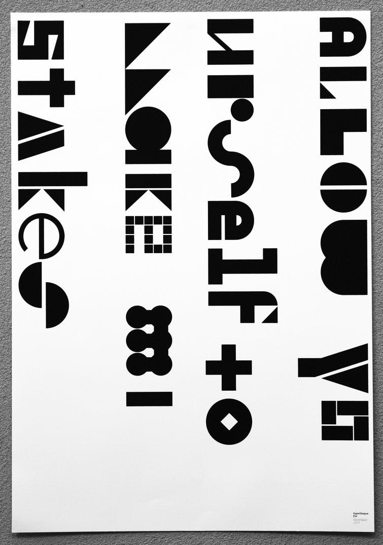
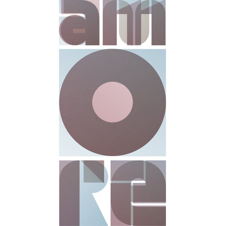
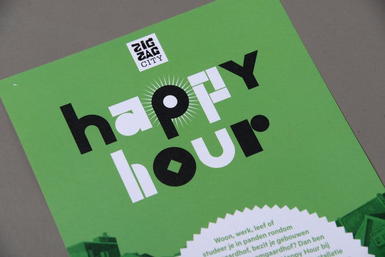
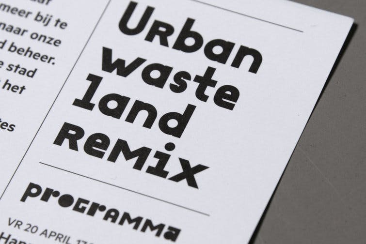
Julien is a playful geometric display typeface loosely inspired by the early 20th century avant-garde. It is based on elementary shapes and includes multiple variants of each letter (over 1000 glyphs per style), as well as intelligent OpenType scripts that select glyphs to create the best word shapes. Julien is a unicase typeface in which upper case and lower case letters are mixed together.
Read more about development of Julien typeface▸

Styles
Julien comes in two weights, one very light and one very dark. Each weight comes with three different styles, round, square and mixed. The style name indicates the predominantly used shapes within the set, so you can choose the visual character of your words accordingly.

OpenType features
Julien was designed for the digital environment and includes numerous variants of letters which can be combined to achieve a better rhythm of shapes when setting words. The pseudo-randomisation script triggered by the Contextual Alternates feature gives the typeface a unique flow. There are specific rules for repeated letters, and it is fun to play with the fonts in applications which understand OpenType substitutions.

Author
Julien was designed in between 2010 to 2011 by Peter Biľak, and Tam Leming wrote the OpenType substitution features.