Maro
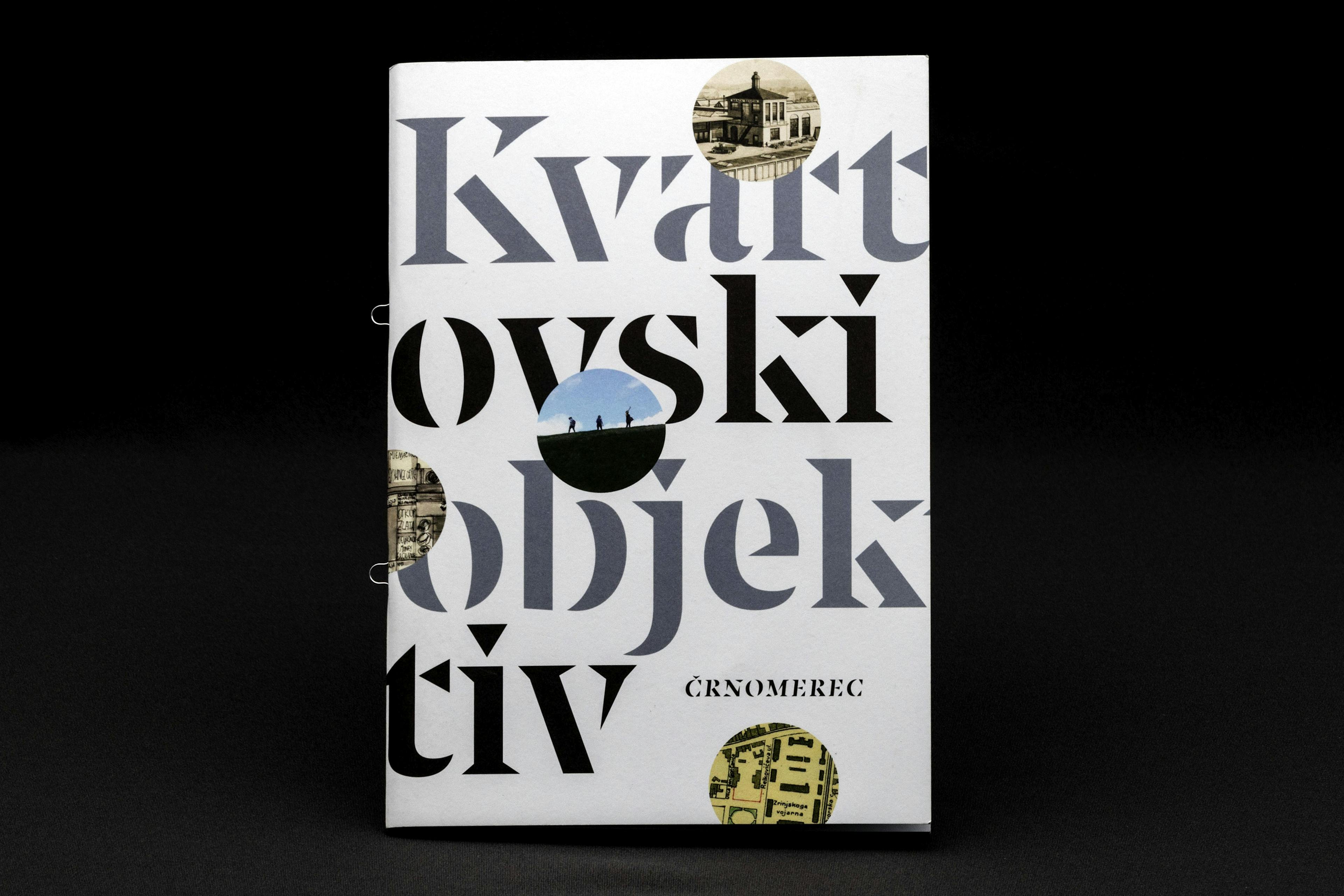
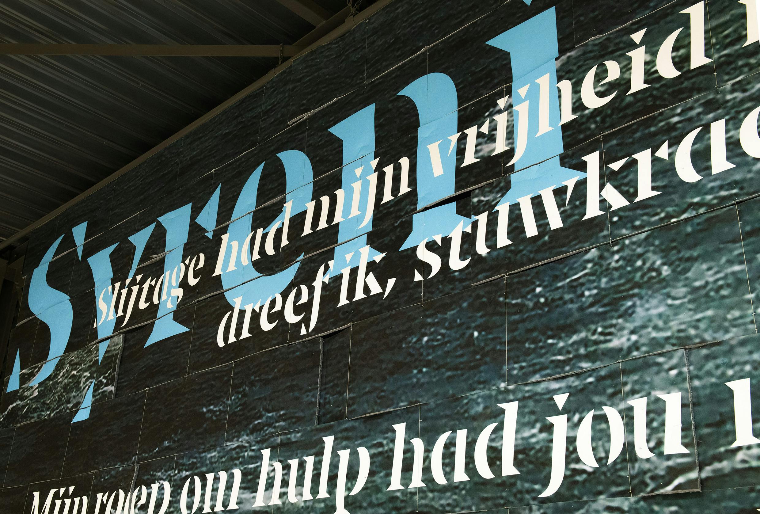
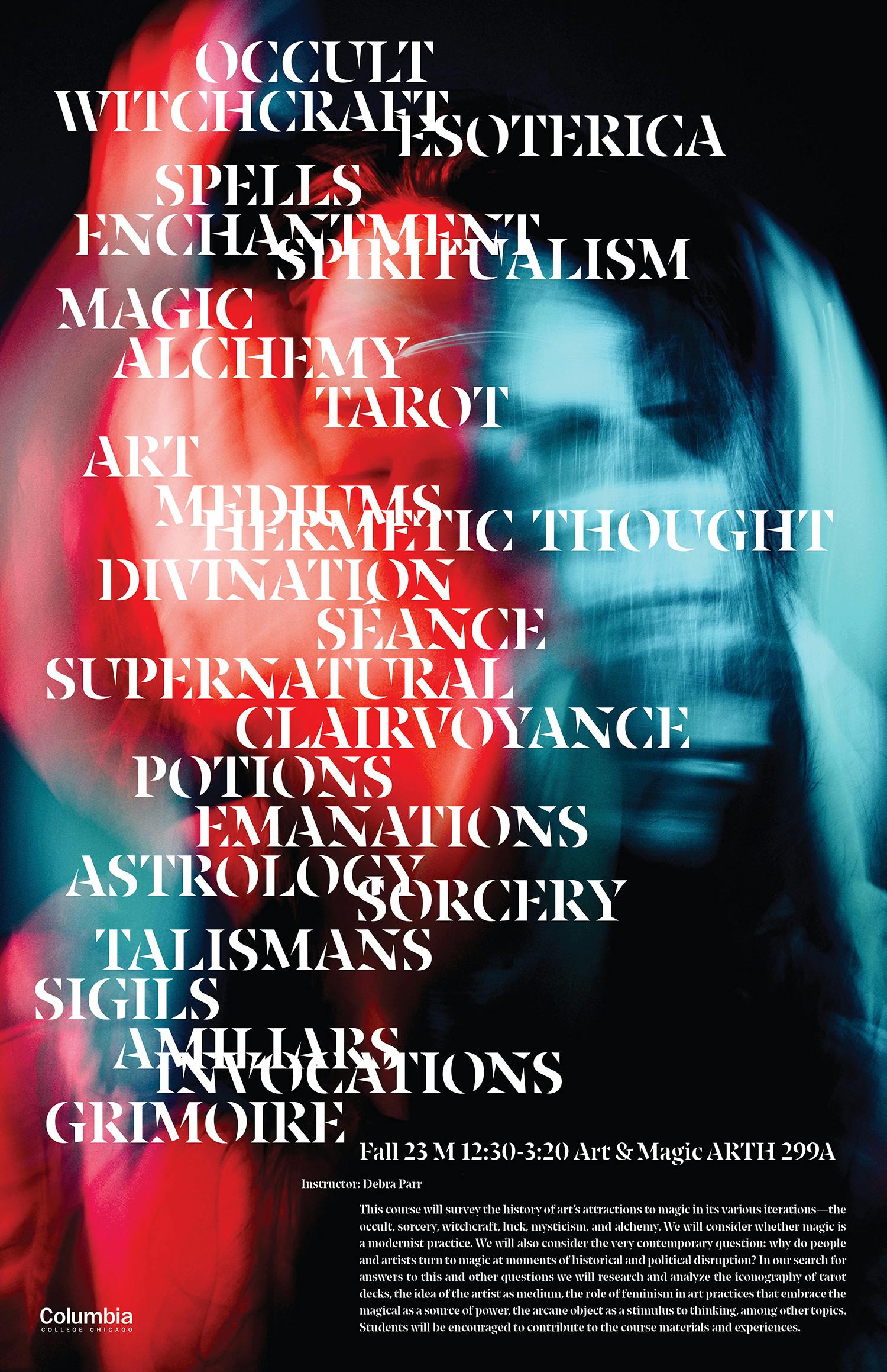
Maro is a razor-sharp stencil typeface for expressive text, with triangular serifs, and an extreme contrast of thick and thin strokes that fracture the letterforms.
PDF Specimen- Latin
- LightLight
- Light ItalicLight Italic
- RegularRegular
- Regular ItalicRegular Italic
- MediumMedium
- Medium ItalicMedium Italic
- BoldBold
- Bold ItalicBold Italic
Design concept
Maro, a razor-sharp stencil typeface that follows the logical contrast principles of letter construction until the shape is fractured at its narrowest point. Maro has very large x-height, flat curves and triangular serifs that give the typeface sharpness and urgency. Maro is designed for large spatial applications, posters or book covers, or any medium whose visual identity would benefit from assertive expression or voice.
Numeral styles
Each weight of Maro includes six different kinds of numerals. Proportional lining figures come as default figures in Maro. It also, however, includes old-style figures, tabular numerals (both lining and old-style) and superior and inferior numerals. For the running text, old-style figures work best; for use in capital setting, use lining figures.
- DesignNikola Djurek (Latin)
- ContributorsIgino Marini (Latin)
- Released2021
Latin
- English
- Comorian
- Luba-Kasai
- Marquesan
- Danish
- Dutch
- Italian
- Haitian
- Estonian
- German
- Friulian
- Galician
- French
- Finnish
- Fijian
- Frisian
- Luxemburgish
- Spanish
- Swahili
- Breton
- Bislama
- Basque
- Afar
- Afrikaans
- Zulu
- Tetum
- Portuguese
- Norwegian
- Swedish
- Catalan
- Polish
- Slovak
- Czech
- Maltese
- Albanian
- Indonesian
- Irish Gaelic
- Latvian
- Lithuanian
- Slovene
- Rhaeto-Romanic
- Hungarian
- Sorbian
- Kurdish
- Hawaiian
- Esperanto
- Welsh
- Sámi (Northern)
- Faroese
- Greenlandic
- Icelandic
- Croatian
- Romanian
- Romani
- Turkish
- Bosnian
- Phonetics
- Sámi (Inari)
- Sámi (Lule)
- Sámi (Southern)
- Vietnamese
- Azeri (Latin)
- Interlingua
- Sanskrit transliteration
- Malay
- Māori
- Turkmen
- Uzbek
- Tagalog (Filipino)
- Malagasy
- Crimean Tatar
- Guaraní
- Kashubian
- Xhosa
- Silesian
- Cornish
- Manx
- Oromo
- Somali (Latin)
- Aymara
- Ganda
- Ido
- Javanese
- Gikuyu
- Kinyarwanda
- Kirundi
- Kongo
- Kwanyama
- Nauruan
- Navajo
- Ndebele (Northern)
- Ndebele (Southern)
- Quechua
- Samoan
- Shona
- Sotho
- Sundanese
- Tahitian
- Tongan
- Tsonga
- Tswana
- Twi
- Wolof
- Yoruba
- Cheyenne
- Chichewa
- Kiribati
- Swati
- Pinyin
- Arabic transliteration
- Ladin
- Igbo
- Karelian
- Veps
- Chamorro
- Marshallese
- Montenegrin
- Náhuatl
- Norfuk
- Occitan
- Papiamento
- Pedi
- Sardinian
- Seychelles Creole
- Tok Pisin
- Tuvalu
- Aromanian
- Ga
- Gagauz
- Ulithian
- Venda
- Chokwe
- Chuukese
- Kituba
- Lingala
- Maninka
- Nyanja
- Otomi
- Palauan
- Rarotongan
- Sango
- Temne
- Umbundu
- Bemba
- Gwich’in
- Scottish Gaelic
- Tokelauan
- Aranese
- Cofán
- Pictograms
- Norn
- Romaji
- Old Norse
- Chiquitano
- Araona
- Cavineña
- Ayoreo
- (H:(H:
Case Sensitive Forms
case
When the ‘change to caps’ function is applied from within an application (not when text is typed in caps) appropriate case-sensitive forms are automatically applied. Regular brackets, parenthesis, dashes and hyphens are replaced with their capital forms. - ->->
Arrow formation
dlig
The discretionary ligature feature creates real arrows when you type the combination -> (right arrow), <- (left arrow), -^ (up arrow) or ^- (down arrow). - fifi
Standard Ligatures
liga
Standard ligatures are those which are designed to improve the readability of certain letter pairs. For example, when this feature is activated, typing ‘f’ and ‘i’ will automatically produce the ‘fi’ ligature. Using ligatures does not affect the spelling and hyphenation of your text in any way. - 1919
Proportional Old-style Figures
onum + pnum
Typotheque fonts contain various styles of numerals within one font. Proportional Lining Figures come standard in all our headline and newspaper fonts. Their proportions are specifically designed to work well with capital letters (for example, in headlines). The proportional Old-style Figures feature changes standard figures to Old-style Figures which work well in running text, as they have the same proportions as lower case letters with their ascenders and descenders. - 1919
Tabular Lining Figures
lnum + tnum
Tabular figures are for use in tables where numerals need to be aligned vertically. Tabular figures are available as a OpenType feature and have a fixed width in all weights. Typotheque fonts include both Lining and Old-style Tabular figures. - 1919
Tabular Old-style Figures
onum + tnum
Tabular figures are for use in tables where numerals need to be aligned vertically. Tabular figures are available as a OpenType feature and have a fixed width in all weights. Typotheque fonts include both Lining and Old-style Tabular figures. - 2/92/9
Arbitrary Fractions
frac
Typotheque OpenType fonts already include a number of pre-designed diagonal fractions. The fraction feature allows you to create other fractions quickly and easily.