
Articles
84 resultsThe Influences of Greta Arabic
Typeface stories by Kristyan SarkisDocumentation and research that lead to design of Arabic newspaper typeface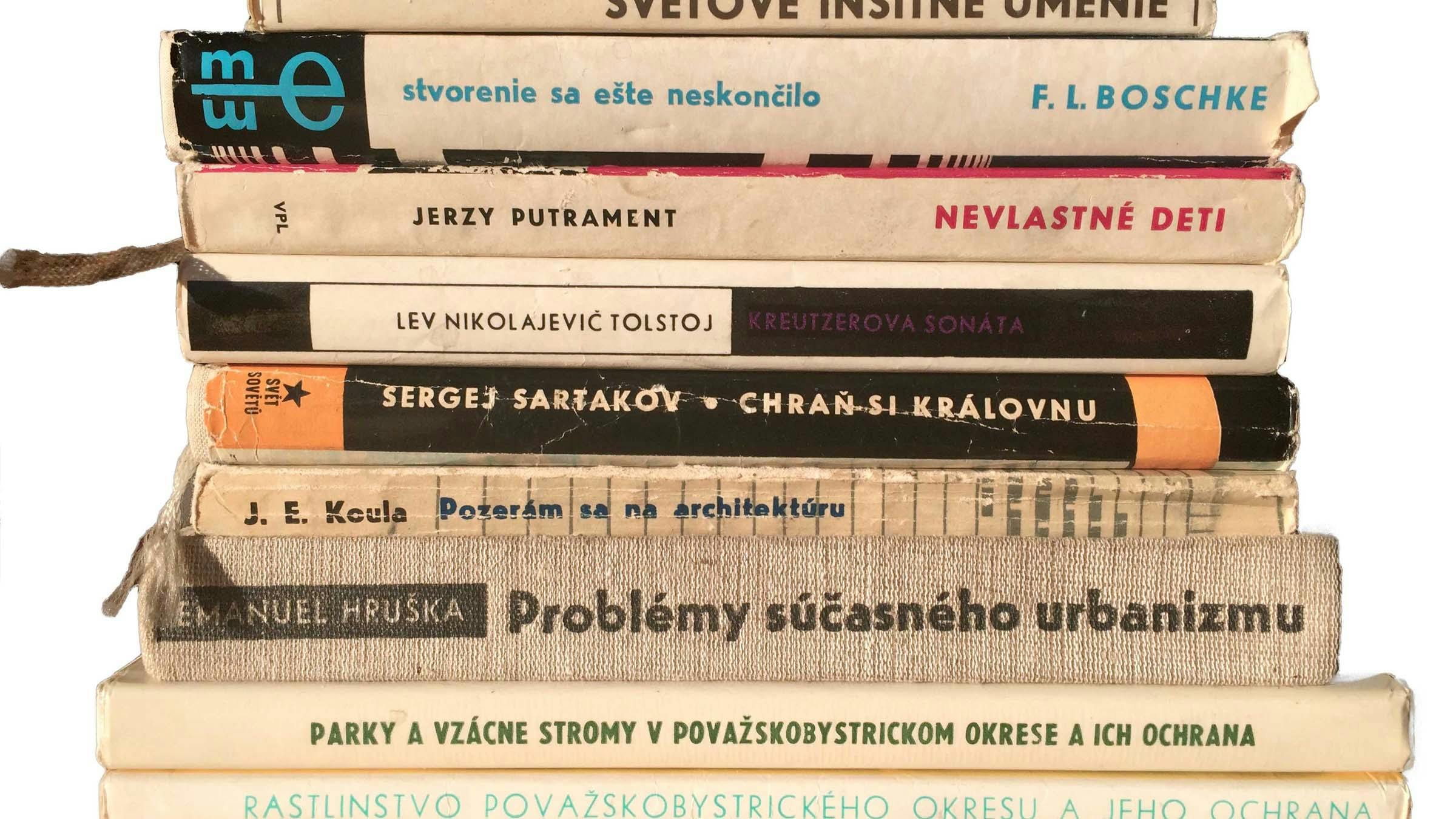
About Uni Grotesk, a Central European geometric Sans
Typeface stories by Peter BiľakUni Grotesk is a modern adaptation of the ubiquitous but awkward Universal Grotesk, a typeface that dominated communist Czechoslovakia.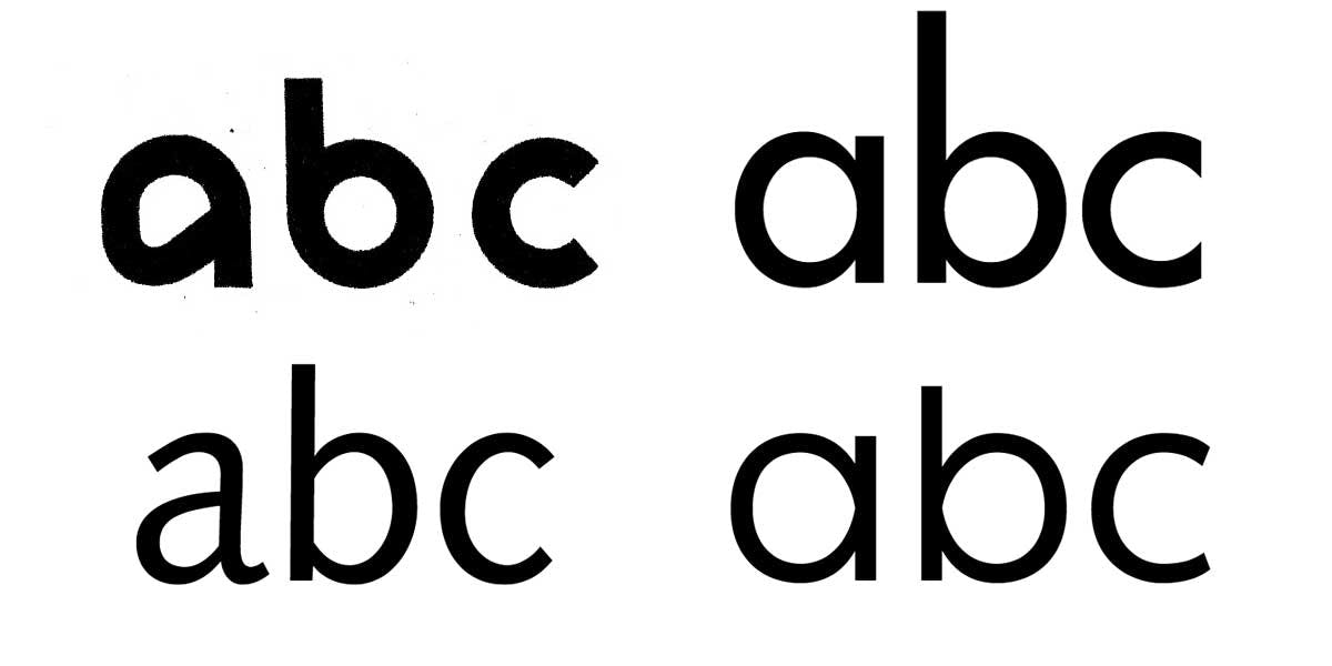
A Brief History of Sans Serif typefaces
Essays by Peter BiľakThe five centuries that followed Gutenberg and his moveable typefaces defined the possibilities of Roman serif type. The current possibilities of sans typefaces were defined over the course of the 20th century. Notes about types that inspired the Ping typeface.Eric Gill got it wrong; a re-evaluation of Gill Sans
Typeface stories by Ben ArcherThis article is intended for an audience of contemporary designers and students who are at least one step removed from mid-century British typographic culture; it is a critique of the Gill Sans typeface and the idiosyncrasies of its creation from a contemporary perspective. The central argument is that an earlier typeface by Eric Gill’s mentor, Edward Johnston, is a superior piece of type design.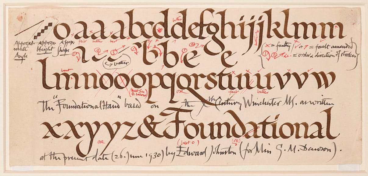 Modern handwriting: IntroductionPart 2
New Approaches in Great Britain
Essays by Sébastien MorlighemThis second part offers an overview of new approaches developed in Great Britain during the 20th century, inspired by writing history or modern pragmatism.Hans Eduard Meier, En toutes lettres
Essays by Roxane JubertHans Eduard Meier a consacré sa vie à la lettre – au dessin de caractères, à la typographie, à la calligraphie et à l’enseignement. La profondeur de sa réflexion s’éclaire à la lumière de l’histoire, classique comme moderne. Féru de calligraphie et habité par l’évolution des écritures depuis leurs formes antiques, il publie à la fin des années cinquante «Le développement des caractèresHans Eduard Meier, une vie dédiée aux caractères
Essays by Roxane JubertL’œuvre typographique de Hans Eduard Meier révèle plus de soixante ans de passion pour la lettre et la traversée de profondes mutations techniques. Si ses recherches des années 1950 restent d’actualité – aussi bien son livre Le Développement des caractères que le Syntax, essentiel dans le répertoire des fontes sans sérifs humanistiques –, il poursuit aujourd’hui avec de nouvelles créations, comme le Schulschrift. Il est tentant de qualifier sa production de « typographie durable ».Hans Eduard Meier, a life dedicated to letter design
Essays by Roxane JubertHans Eduard Meier’s typographic work is the fruit of his passion for letter design which has lasted over 60 years, against a background of profound technological mutations. The research he conducted in the 1950s is still relevant today, notably in his book The Development of Script and Type and his Syntax typeface, a key humanistic sans serif. He is still designing typefaces today, such as Schulschrift. His output in this domain can be seen as a type of “sustainable typography”.Sandberg, Designer and Director of Stedelijk
Reviews by Peter BiľakGraphic designer Willem Sandberg became the director of Amsterdam’s Stedelijk Museum in 1945. From that time until 1962 he designed almost all the printed matter for the Stedelijk and transformed the museum, introducing new ideas into the stuffy world of museums of that time.Hans Eduard Meier, una vida dedicada a los caracteres
Essays by Roxane JubertLa obra tipográfica de Hans Eduard Meier refleja más de sesenta años de pasión por la letra y atraviesa profundas mutaciones técnicas. Si, por un lado, la investigaciones que realizó en la década de 1950 no han perdido vigencia –tanto su libro La evolución de la letra como el Syntax, esencial dentro del repertorio de tipos humanísticos sin remates–, por otro lado, su trabajo continua en la actualidad con nuevas creaciones como el Schulschrift. Por ello es tentador calificar su producción como «tipografía sostenible».
Experimental typography. Whatever that means.
Essays by Peter BiľakAn epistemology of the word ‘experimental’ as it applies to design and type, contrasted with its scientific connotations. Examples of past and current design, type and reading/language, as well as scientific experiment, are taken into account.Rudy VanderLans, editor of Emigre
Interviews by David Casacuberta and Rosa LlopThe globalisation and homogenisation of design, legibility and communication and the history of Emigre magazine are discussed in this interview with its founder, Rudy VanderLans.Writing Lessons: Modern Design Theory
Essays by Ellen LuptonA history of visual design and arts pedagogy, the Bauhaus, semiotics and gestalt theories as they apply to modern graphic design education.De Stijl, New Media, and the Lessons of Geometry
Essays by Jessica HelfandAn exploded view of the digital screen, informed by analyses of architecture, designers’ roles, avant-garde Dutch design from the De Stijl period and geometry.Peter Biľak, founder of Typotheque, Dot Dot Dot
Interviews by Rudy VanderLansRudy VanderLans talks with Peter Biľak about the Typotheque founder’s education, design practice and experience as an ex-pat Slovak living in the Netherlands. Dot Dot Dot is discussed, as well as the typefaces Biľak has produced and his current teaching practice.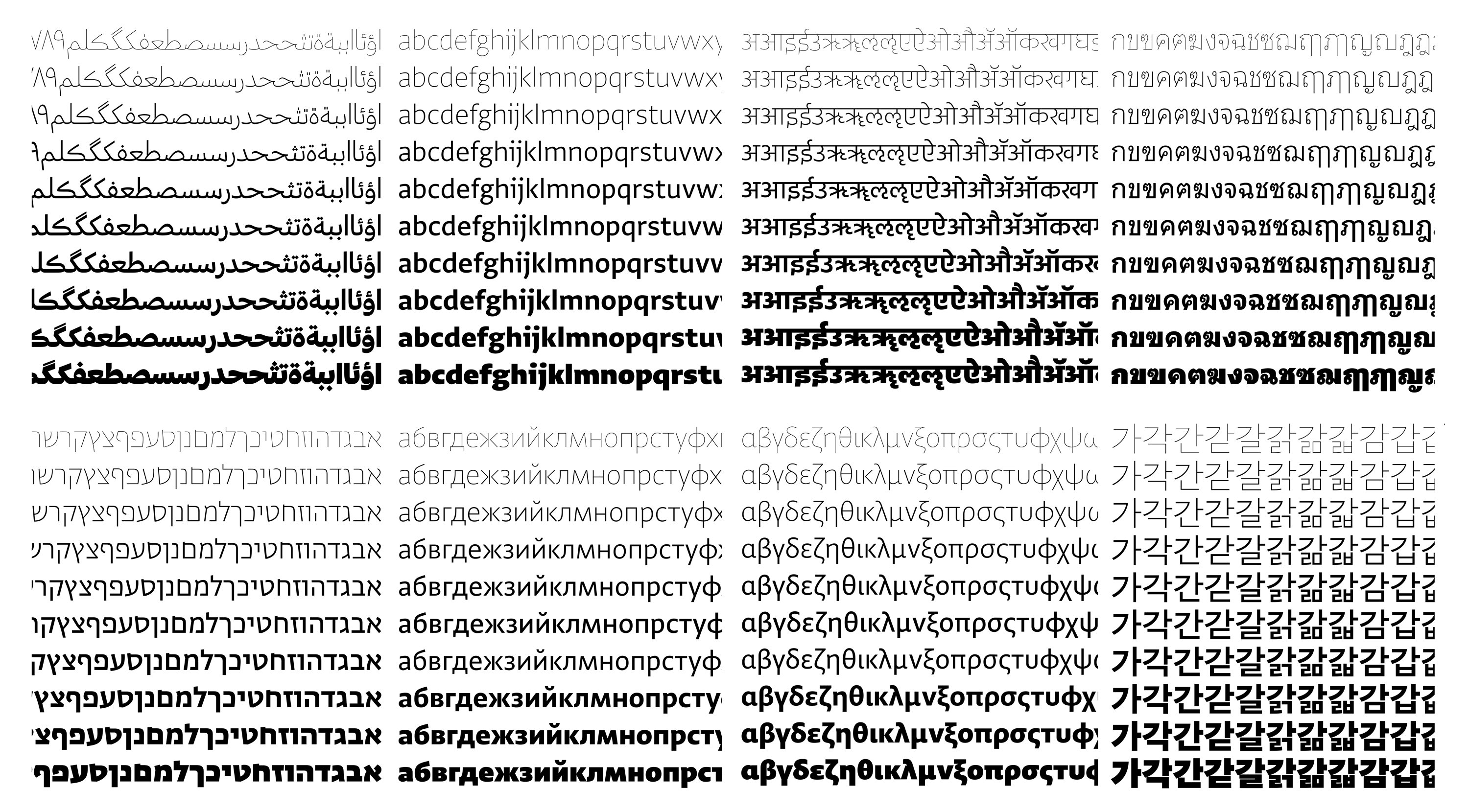
Designing Type Systems
Typeface stories by Peter BiľakGreta Sans was been planned from the outset as a system of interrelated styles. From the very beginning, work proceeded on multiple styles simultaneously. This text is a reflection on the process of designing large typeface systems.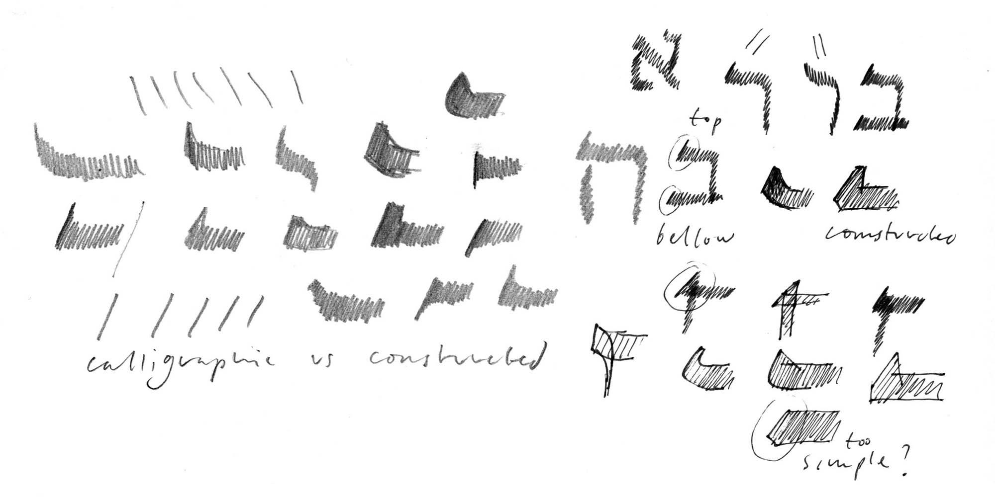
Designing Hebrew Type
Essays by Peter BiľakAn article on the process of designing typefaces for the language other than your own — challenges of looking at unfamiliar patterns, letters, and their cultural significances.OpenType features in web browsers — Tests
Tutorials by Gustavo FerreiraA collection of tests for OpenType feature support in web browsers. Based on the latest draft of the CSS Fonts Module Level 3 specification, and the latest public version of each browser.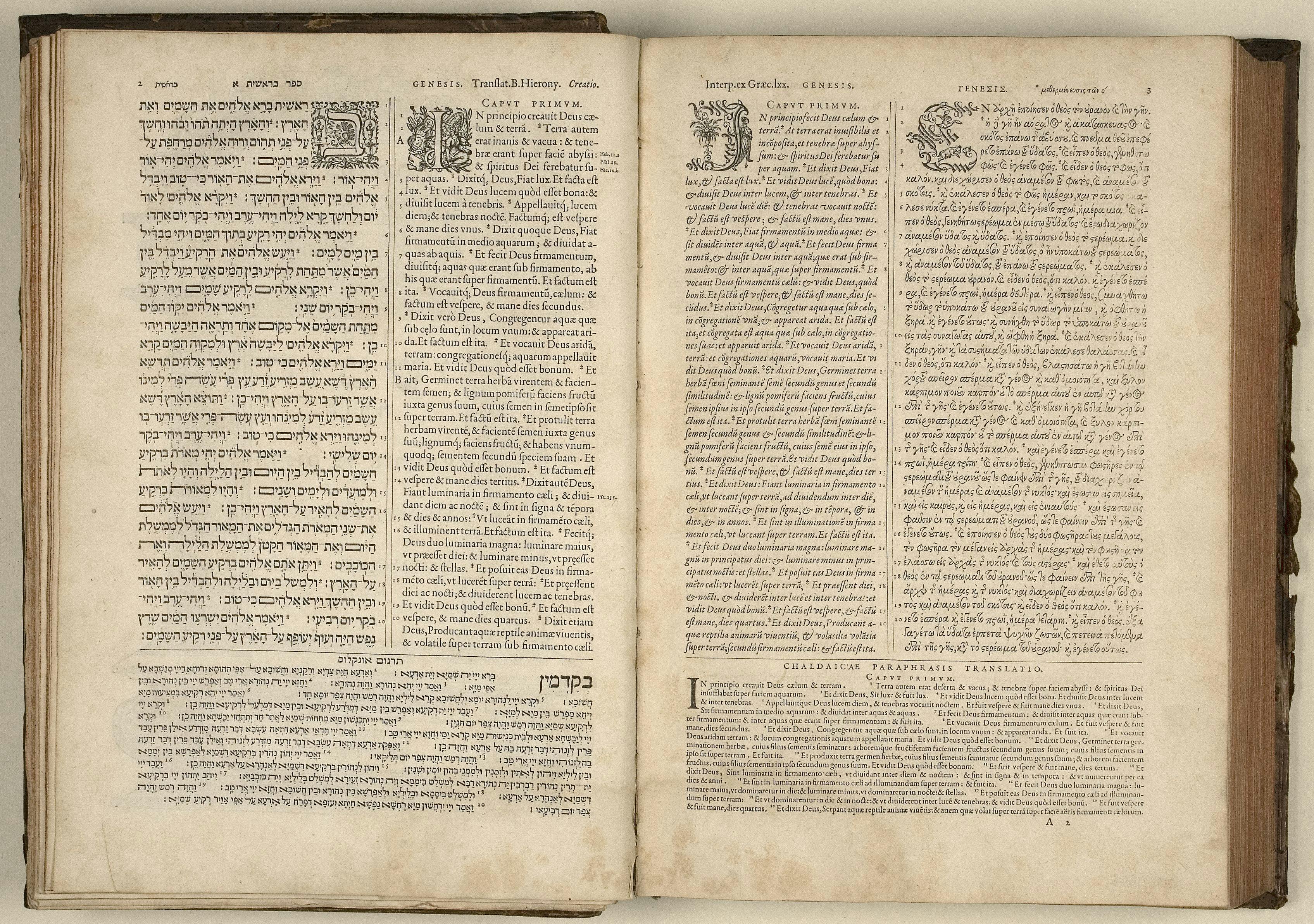
Typeface design beyond a single script
Essays by Peter BiľakCreating a new language version of a typeface is akin to a translation, whereby purpose, intention and respect are as important as proportion and design.OpenType features in CSS
Tutorials by Gustavo FerreiraOverview and sample code for accessing OpenType features in CSS.