
My Type Design Philosophy
About 15 years ago I graduated from the High School of Arts with a seriffed type design. It was never released and I now realize it was a sort of preliminary study for my later typefaces. I subsequently designed three major families, Scala & Scala Sans, Telefont and Seria & Seria Sans. Looking back, I now see that my ideas about type design have not changed fundamentally. Maybe it is time to set down some impressions on my type design philosophy.
The headache of mixing type.
It is my conviction that you cannot be a good type designer if you are not a book typographer. I am not talking here about display types but about text types. A type designer must know how type works in a piece of text, he must know what happens with the type on different sorts of paper, he must know how a typeface behaves with different printing techniques.
As a book designer I made several complex books where more than one typeface had to be used in order to clarify things in the text. It was mostly quite useful to take a sans and a serif typeface, but the problem was always which ones to choose. Mixing Times New Roman and Helvetica in the same piece of text has often been done simply because these fonts were available everywhere. It is not even the worst possible combination one can think of. Using sans serifs like News Gothic, Gill Sans or Futura as text type is very acceptable, but with which seriffed faces should they be mixed? Numerous combinations have been used without any idea of style or knowledge of history. From an aesthetic point of view some combinations produce a severe headache (Garamond with Univers, Bodoni with Gill Sans). It is only in advertising, where a headache can be useful, that these combinations are possible. It became clear to me that the best solution for text was to use a combination of a serif and a sans that derive directly from each other. The only remaining question was which combination of serif and sans could meet this criterium?
The origin of the sans.
Before the mixing of serif and sans in text can be explained, it should first be made clear where sans serif typefaces originate from, as it is only for about the last one hundred years that they have been used substantially. Officially, the very first sans serif typeface to be used for printing was published around 1816 by the William Caslon iv English typefoundry.
![]()
This display face only contained capitals and it is not clear where the rather clumsy forms came from. As a design this sans serif typeface has little value.
Much more interesting is Akzidenz Grotesk, published in 1898 by the German Berthold type foundry in Berlin.
![]()
This sans serif immediately became a great success and was soon imitated by several typefounders. Like all sans serifs of the time, Akzidenz Grotesk was meant to be used as a display face (the German word Akzidenzschrift means display face or jobbing type), however as it also included a lowercase it was suitable for text too.
But what was the basis for Akzidenz Grotesk? The first printing types date from the 15th century, and they were all seriffed typefaces because they were imitations of handwriting. When the sans serif typefaces appeared in the 19th century they could only be based on the seriffed typefaces in use at that time.

Akzidenz Grotesk was probably cut by some experienced but anonymous Berthold punchcutters rather than designed by an individual type designer. This means the punchcutters had to have a general idea for the serifless forms, and they could probably only derive these ideas from the then popular classicistic typefaces such as Walbaum or Didot. This can be seen clearly upon superimposing Walbaum and Akzidenz Grotesk characters. Yet these classicistic typefaces were far from good examples on which to base a sans serif. In Walbaum the thin tail-ends in characters like the c and in numbers such as 2 and 5 were elegant, but when these thin parts were simply made thicker the result was a sans serif typeface with extremely ‘closed’ forms.
In 1928 Paul Renner designed his Futura.
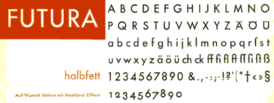
It was the first time a sans serif typeface was not based on the watered down classicistic letterforms on which Akzidenz Grotesk was based; instead he started his drawings from scratch. It would seem that the Futura was influenced by the ideas of the Bauhaus movement and by constructivism. Its letterforms look very much constructed but in fact they were not constructed at all. Renner based his Futura on classic principles, like roman inscriptional capitals, rather than basing it on Bauhaus principles. This was one of the reasons for its success, it is a very well balanced text typeface, yet it has the aura of the then popular Bauhaus movement.
In 1957 Univers, Helvetica and numerous look-alikes were published as a sort of reaction to pre-war geo-metric faces like Futura. These typefaces were all based on the old Akzidenz Grotesk, and they became extremely popular in a short period of time. Basing a sans serif on another sans serif is rather cheap, and it is therefore not strange that these typefaces had hardly any new features compared to Akzidenz Grotesk.
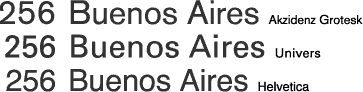
They pretended to be better than Akzidenz Grotesk, but instead they were bereft of every bit of character and the charming clumsiness of Akzidenz Grotesk. However Univers, designed by Adrian Frutiger, had one strong feature that was new in type design: it was made up of an 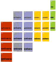
almost scientific system of 21 weights and widths that could be mixed perfectly. It was an answer to the jungle of different sans serif faces that lacked a clear system of weights and widths. Univers was completely redrawn a few years ago and now has more than 60 versions. Unfortunately this has not been an improvement; there are now too many superfluous versions, the justification is too tight and the italic that was already too slanted has been slanted even more. Redesigning an old successful typeface is something a type designer maybe never should consider.
The form of the italic in Akzidenz Grotesk is nothing more than a slanted version of the roman; but why was the italic not based on a real italic? It would not seem too difficult to make an Akzidenz Grotesk italic based on the Walbaum italic.

A real italic has a different form principle than the roman. Probably, with the huge competition amongst typefoundries, the 19th century punchcutters were under great pressure to produce fast, and therefore they had to imitate others. A real italic version was probably too much work or too difficult to make, while a slanted roman was relatively easy to copy from the roman. The strange thing is that, even today, this slanted roman is a sort of standard for sans italics. Typefaces like News Gothic (1908) and Helvetica all have slanted romans. Consequently, even a great type designer like Adrian Frutiger made slanted romans with his sans serif designs, and it was only recently, when his Frutiger typeface (1977) was redrawn in 2000, now with a real italic instead of a slanted roman, that he acknowledged that a real italic makes a better contrast with the roman. Typefaces like Futura have slanted romans too, but in this case it is much more understandable as there was no real old seriffed model on which to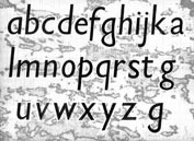
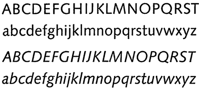
base it. A more interesting italic is that of Gill Sans. It is the first among the sans serifs that has true italic characteristics. His first italic sketches show some very calligraphic features.
Eric Gill was, by all standards, an extraordinary type designer who started his career cutting letters in stone. When he began designing printing type he knew by heart what a seriffed typeface should look like. He designed Gill Sans in 1928, and although this is a sans serif he used his experience as a letter-cutter. While he may not have realized it, he based his Gill Sans on the seriffed typefaces in his head. Mixing Gill Sans with his seriffed Joanna (1930) would provide perfectly harmonious type. You could almost say that Joanna is a sort of Gill Sans Avec!

Had Eric Gill planned Joanna and Gill Sans as one family he would have been the first in history to design a family of serif and sans, but he made them as separate designs with separate names.
Mixing serif and sans.
In my opinion, mixing serif with sans only makes sense when the seriffed typeface and the sans are designed from the same basis, or even from the same skeleton. It sounds simple: take a seriffed design, cut off the serifs, lower the contrast, and there you have a sans serif. But of course there is more to it than just that. I believe the most logical order when making such a family is to start with the seriffed design. From that basis a sans serif can be made. The first attempt to design a sans based on a seriffed typeface was undertaken by the Dutch type designer Jan van Krimpen. In the early 1930s he designed the seriffed Romulus, totally with a sans serif design. Superimposing the serif upon the sans shows how literally Van Krimpen based them upon each other. Romulus Sans was cut in four weights but unfortunately it remained at an experimental stage, as it was never released.

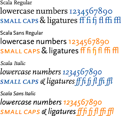
Scala and Scala sans. Two typefaces, one form principle.
I started designing Scala in 1987. At that time I was working as one of the two graphic designers for the Vredenburg Music Centre in Utrecht, a large concert hall that programmed more concerts than any other hall in the Netherlands. We worked on one of the first models of Apple Macintosh, using PageMaker 1.0, and we could choose from 16 typefaces. I was typographically educated with lowercase numbers (also known as old style figures), small caps and ligatures, none of which were available in these 16 Postscript-fonts. The concert programmes, booklets and posters contained very different information, such as composers, titles, conductors, orchestras, soloists, time, date and place. To design this information in a good way I needed these lowercase numbers, small caps and ligatures. And so it happened that I decided to design a typeface especially for Vredenburg to be named after the Teatro alla Scala in Milan.
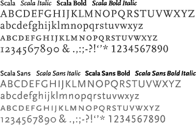
The form principle of Scala was definitely influenced by humanist typefaces like Bembo and by typefaces from the mid-18th century French typographer Pierre Simon Fournier. But I wanted Scala to have low contrast and strong serifs, as I had learned that most Postscript-fonts were too thin. The italic was based more on 16th century Italian writing masters like Arrighi, although to a large extent the details were closely related to the roman.
Scala Sans was literally derived from Scala, so it was also ‘humanistic’ in appearance. 
Until then this had rarely been seen in sans serifs, the only notable exceptions being Gill Sans and Syntax (1968, Hans Eduard Meier). The Syntax roman is truly one of the most beautiful sans serifs ever, but unfortunately the accompanying italic was a slanted roman.
[social]
Probably it was too early for Meier to free himself from some generally accepted ideas about sans serifs.
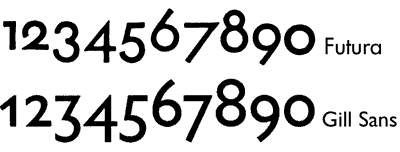
During the design process of Scala one thing was obvious to me: I wanted the lowercase numbers to be included in the normal fonts, and not in the Old Style Figures (osf) fonts. I also designed lowercase numbers for the sans serif, and I discovered that until that time lowercase numbers had not been seen in sans serif typefaces, even Eric Gill never made them for his Gill Sans (although in the 1990s they were superadded by Monotype). Strangely enough, Paul Renner was the only one who designed them for his Futura, though they were seldom used.
The Scala Sans italic follows the forms of its seriffed counterpart quite literally. There are italic small caps, ligatures and lowercase numbers, making Scala the first family with all these features in both a seriffed and a sans design and in both roman and italic.
When I was designing Scala and Scala Sans I had great freedom in executing my ideas on serif and sans. My motto became: ‘two typefaces, one form principle’, which can be demonstrated when the skeletons of the roman and the italic are isolated.

I did not work for a typefoundry, the music centre trusted me completely and there was no time pressure. Under these circumstances I was able to think very freely about the whole concept of serif and sans. Many of the generally accepted ideas did not seem logical to me and luckily I was not obliged to follow them.
Scala was released in 1990 by FontShop International as its first serious text face. It was only when Scala Sans was issued three years later that the family became extremely popular. The use of a seriffed typeface and an accompanying sans proved to be a very happy combination for graphic designers around the world.
Telefont. My in-between Sans
In 1993 I designed Telefont List and Telefont Text for the Dutch national telephone book. The typeface I had in mind was a sans serif. Here I did not use a seriffed typeface as the basis for the sans, although I was able to use the experience I had gained in designing the Scala family. However, compared to my work on Scala Sans, I had to think in a much more restricted way. Telefont List (which I designed first) was going to be used in a small size on cheap paper, it had to save a lot of space and it had to be much more readable than the worn-out Univers that PTT (Post, Telefonie, Telegrafie) had used until then. Simultaneously I thought about the typographic redesign of the phone book itself. This was a great advantage as I could now fine-tune the typeface as a result of the changes I made in the four-column grid and, what is more, I could adjust the page layout after I had made changes in the typeface. One could almost call this interactive design. In any case my experience as a book designer came in handy.
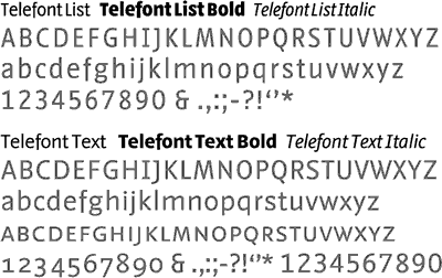
Telefont List is a real workhorse, to be used in the automatically generated phone book listings, while Telefont Text was designed for the custom-made introductory pages using many more typographic refinements such as small caps and lowercase numbers. I want to put it as follows: ‘The most-used type-face has the least possibilities; the least-used typeface has the most possibilities’.
Telefont List and Telefont Text have been used exclusively for the Dutch phone book since 1994, but it is not inconceivable that they will be released in the near future. However I am not planning a Telefont Serif as I do not believe in deriving a seriffed design from a sans.
Seria and Seria Sans. A literary typeface
I made the first sketches for Seria on the train from Berlin to Warsaw in the summer of 1996, using some table napkins from the dining car.
There were two main reasons to start working on a new typeface. The first had to do with my dissatisfaction with the use of Scala in a more literary way. As a book designer I could not use Scala for the more literary books or for poetry, as I found it was too stubborn with too short ascenders and descenders. I had thought of making a version of Scala with longer ascenders and descenders, but then found I wanted to change more than a few details at the same time. I decided that Scala is Scala and if I wanted to make changes I must make a new typeface. This new typeface had to have long ascenders and descenders (I was not planning to make the most economical or space saving typeface).
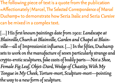
The second reason came as a direct question from a French art critic, Hector Obalk. In 1996 he had invited me to give a lecture on type design in the Pompidou Centre in Paris, and during a chat afterwards he told me of his love for Scala. In fact he liked it so much that he wanted to use it in a book he was writing, containing transcriptions of all Marcel Duchamp’s correspondence, radio talks, interviews, etc. But he needed something special to use in Duchamp’s hugely complicated texts: an extra-slanted italic. He asked me if I could make something like this for Scala and I immediately thought of an upward italic, because an extra-slanted Scala italic is impossible.
I soon found myself working on a completely new typeface. The upward italic has become a major feature of Seria, but a ‘normal’ italic (which I am calling Seria Cursive) has been made for a forthcoming release of Seria versions. Seria was issued in 2000 by FontShop International and it came too late to be used in the book on Duchamp, but thanks to Obalk I designed a typeface with an italic and a cursive.
The individual characters of the Seria family have a lot of subtle details and unconventional curves which can best be seen when used in a large size.
In small sizes while one cannot see these details, one can maybe ‘feel’ them. The rather edgy curves make Seria ‘wittingly irregular’ a principle that was used by W. A. Dwiggins, the American type designer, and also by my Dutch colleague Bram de Does. It comes from the belief that a certain degree of irregularity leads to better legibility.
The need to augment Seria with a sans serif version became immediately obvious to me. Using a black marker and some white paint, I changed the seriffed characters into a sans. Seria Sans has the same long ascenders and descenders as Seria and this is very unusual for a sans. The strength of Seria Sans is that its derivation has been done in a very consequent way, something that is obviously seen most clearly in the italics and bold italics.
The contemporary sans serifs.
Most of the older sans serifs were based on an empty-headed idea of how a sans should look. These designs are more or less imitations of each other, without their designers knowing why their forms are as they are.
It was not until the 1980s that serif/sans families started to appear. The seriffed versions are based on a long tradition, however I would call the sans serifs contemporary sans serifs. To mention a few: Lucida (Kris Holmes and Charles Bigelow, 1984-1985), Stone (Sumner Stone, 1987), Rotis (Otl Aicher, 1989), Charlotte (Michael Gills, 1992), Legacy (Ronald Arnholm, 1993), Quadraat (Fred Smeijers, 1992-1996), Thesis (Lucas de Groot, 1994), Eureka (Peter Bilak, 1995-2000).
The last 15 years have in a way been revolutionary for the sans serifs. More and more type designers have become aware of the basis of sans serifs and for the first time sans serif designs have become full partners of seriffed designs. I can best sum up my type design philosophy by saying: ‘Shake hands and work together in harmony’ .