
Halte, a Display Family with an Extra Dash of Personality
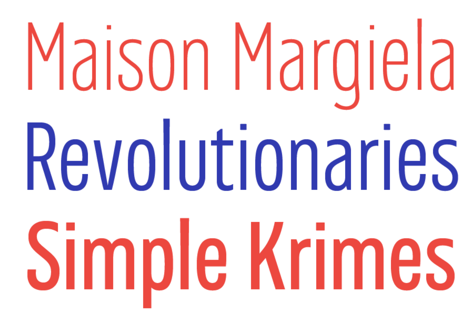
Halte is a display typeface family inspired by the tram and bus stop signage found around Zagreb, the capital of Croatia. The origin of the signs and their unique, idiosyncratic forms remains unclear despite extensive research, but Halte reconciles their quirky vernacular with the practical requirements of strong signage typefaces for medium and large texts. It is condensed and blocky, but also includes delicate curves that make it both charming and commanding.

The old cast-aluminium signs have been in use in Zagreb since the 1960s, and variations including stencil-painted and PVC foil versions have also appeared, but since the early 2000s the city has been in the process of replacing them all, so it seemed like the right time to give new life to this interesting piece of design. The original is bold and daring: while the weight and width are somewhat standard, the letterforms have rather more personality than might be expected for such a utilitarian function.
Halte isn’t really a revival but rather a reinterpretation of this unorthodox typographic cul-de-sac that deserves not to be forgotten. It takes cues from the original and pushes them further to produce interesting word shapes. The flat tops of the lowercase ‘a’ and lower and uppercase ‘s’, and the back-bending curves of the ‘g’ and ‘j’ are defining characteristics of this design.
Halte’s small caps are another key feature, one not common for a typeface in this style. Compared to the uppercase letters, their proportions are exaggerated, which gives the impression of using a different width altogether, helping them stand out from the rest of the text and providing another tool for building hierarchy or creating visual interest.
Although this design originated in street signage, Halte was not designed specifically for this purpose. Signage and wayfinding design have evolved to have rules of their own. Instead, Halte’s proportions and visual voice make it perfectly suited for headlines, leads or display applications like posters, book covers or magazine heads.
Download the PDF specimen of Halte, and see below for more details.


Illustrations by Shiva Nallaperumal
Halte was designed by Hrvoje Živčić. See the interview with the author: