Fedra Serif Display

About

Fedra Serif Display complements text versions of Fedra. It has been specifically made to suit the needs of editorial design – in which strong, compact headlines are important.

PDF Specimen
Available in
More
Rent
Regular CondensedBuy
Amsterdam
RegularBuy
Bengaluru
Medium CondensedBuy
Copenhagen
MediumBuy
Damascus
SemiBold CondensedBuy
Edinburgh
SemiBoldBuy
Fortaleza
Bold CondensedBuy
Guangzhou
BoldBuy
Hong Kong
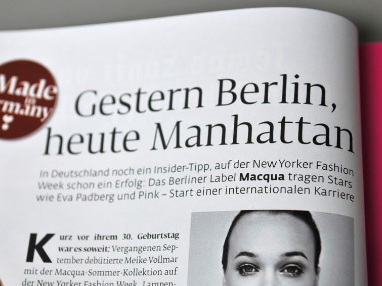
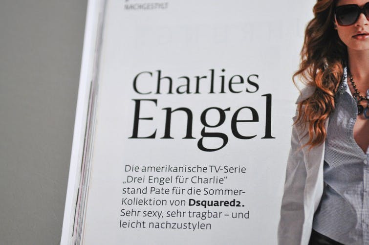
Fedra Serif Display In Use

Design concept

Fedra Serif Display has been designed to complement text versions of Fedra. It has been specifically made to suit the needs of editorial design – the conditions of newspaper print or catalogues in which strong, compact headlines are important. The display series keeps the vertical proportions of the Fedra family, but makes the spacing and kerning tighter, thus more economic. The contrast between thick and thin has been increased. While the text versions of Fedra have modern character proportions with even letter widths, the Display set takes inspiration from Roman inscriptional capitals and increases the width differences between letters. This results in a more classical appearance despite the fact that Fedra Serif Display has a very large x-height.

Fedra Serif Display, Design concept

Unicase

Special small capitals were designed for the family, which match the stem widths and x-height of the lowercase letters, and therefore can be mixed in headlines to achieve the effect of unicase type. They are available only as an OpenType layout feature. Additionally, special superior and inferior capital letters were designed, which can be used next to capitals and lowercase letters.

Fedra Serif Display, Unicase

Compact headlines

Fedra Serif Display also includes plenty of alternative characters that improve flexibility for headline use and increase the expression value of the font. The family also provides smart substitution of letters which allow the choice of appropriate alternative glyphs. For example, if a ‘g’ is followed by a character that has a serif on its left side, an alternative ‘g’ with its ear pointing up is used, allowing tighter spacing and accommodation in headlines.

Fedra Serif Display, Compact headlines

Ornaments

Fedra Serif Display includes dozens of ornaments and border elements which can improve overall look of typesetting.

Fedra Serif Display, Ornaments

Ligatures

Fedra Serif Display includes over 300 ligatures, some of which are employed to eliminate some particular collisions in text setting, for example fi, fl, ffi, fk, fh, etc. Other ligatures, however, simply lend uniqueness to text setting. With the help of the contextual OpenType layout substitution, using these ligatures is easier than ever before.

Fedra Serif Display, Ligatures

  • Released2007

Cyrillic

  • Rusyn
  • Kazakh
  • Russian
  • Abaza
  • Buryat
  • Dargin
  • Kabardian
  • Komi
  • Bulgarian
  • Chechen
  • Kirghyz
  • Macedonian
  • Ossetic
  • Serbian
  • Tajik (Cyrillic)
  • Ukrainian
  • Belarusian
  • Yakut
  • Abkhaz
  • Dolgan
  • Kalmyk
  • Adyghe
  • Avar
  • Dungan
  • Balkar
  • Karakalpak
  • Mordvin (Moksha)
  • Nivkh
  • Enets
  • Ingush
  • Itelmen
  • Kumyk
  • Azeri (Cyrillic)
  • Bashkir
  • Selkup
  • Nanai
  • Nenets
  • Lak
  • Lezgian
  • Mordvin (Erzya)
  • Tabasaran
  • Altai
  • Chukcha
  • Chuvash
  • Yupik
  • Even
  • Khanty
  • Koryak
  • Manci
  • Nogai
  • Tuva
  • Tatar
  • Uighur
  • Rutul
  • Tuvan
  • Moldovan
  • Mari
  • Aghul
  • Evenki
  • Khakas
  • Mansi
  • Nganasan
  • Tsakhur
  • Udmurt
  • Kildin Sami

Greek

  • Greek (modern)
  • Greek (classical)

Latin

  • English
  • Comorian
  • Luba-Kasai
  • Marquesan
  • Danish
  • Dutch
  • Italian
  • Haitian
  • Estonian
  • German
  • Friulian
  • Galician
  • French
  • Finnish
  • Fijian
  • Frisian
  • Luxemburgish
  • Spanish
  • Swahili
  • Breton
  • Bislama
  • Basque
  • Afar
  • Afrikaans
  • Zulu
  • Tetum
  • Portuguese
  • Norwegian
  • Swedish
  • Catalan
  • Polish
  • Slovak
  • Czech
  • Maltese
  • Albanian
  • Indonesian
  • Irish Gaelic
  • Latvian
  • Lithuanian
  • Slovene
  • Rhaeto-Romanic
  • Hungarian
  • Sorbian
  • Kurdish
  • Hawaiian
  • Esperanto
  • Welsh
  • Sámi (Northern)
  • Faroese
  • Greenlandic
  • Icelandic
  • Croatian
  • Romanian
  • Romani
  • Turkish
  • Bosnian
  • Phonetics
  • Sámi (Inari)
  • Sámi (Lule)
  • Sámi (Southern)
  • Vietnamese
  • Azeri (Latin)
  • Interlingua
  • Sanskrit transliteration
  • Malay
  • Māori
  • Turkmen
  • Uzbek
  • Tagalog (Filipino)
  • Malagasy
  • Crimean Tatar
  • Guaraní
  • Kashubian
  • Xhosa
  • Silesian
  • Cornish
  • Manx
  • Oromo
  • Somali (Latin)
  • Aymara
  • Ganda
  • Ido
  • Javanese
  • Gikuyu
  • Kinyarwanda
  • Kirundi
  • Kongo
  • Kwanyama
  • Nauruan
  • Navajo
  • Ndebele (Northern)
  • Ndebele (Southern)
  • Quechua
  • Samoan
  • Shona
  • Sotho
  • Sundanese
  • Tahitian
  • Tongan
  • Tsonga
  • Tswana
  • Twi
  • Wolof
  • Yoruba
  • Cheyenne
  • Chichewa
  • Kiribati
  • Swati
  • Pinyin
  • Arabic transliteration
  • Ladin
  • Igbo
  • Karelian
  • Veps
  • Chamorro
  • Marshallese
  • Montenegrin
  • Náhuatl
  • Norfuk
  • Occitan
  • Papiamento
  • Pedi
  • Sardinian
  • Seychelles Creole
  • Tok Pisin
  • Tuvalu
  • Aromanian
  • Ga
  • Gagauz
  • Ulithian
  • Venda
  • Chokwe
  • Chuukese
  • Kituba
  • Lingala
  • Maninka
  • Nyanja
  • Otomi
  • Palauan
  • Rarotongan
  • Sango
  • Temne
  • Umbundu
  • Bemba
  • Gwich’in
  • Scottish Gaelic
  • Tokelauan
  • Aranese
  • Cofán
  • Pictograms
  • Norn
  • Romaji
  • Old Norse
  • Chiquitano
  • Araona
  • Cavineña
  • Ayoreo

  • HE
    HE

    Discretionary ligatures

    dlig

    Fedra Serif Display includes over 300 titling ligatures as well as real arrows created when you type -> (right arrow), <- (left arrow), -^ (up arrow) or ^- (down arrow). Discretionary ligatures are off by default in Adobe applications.
  • gr
    gr

    Contextual Alternates

    calt

    Fedra Serif Display provides smart substitution of letters for automatic selection of appropriate alternative glyphs. For example, if a ‘g’ is followed by a character which has a serif on its left side, alternative ‘g’ with its ear pointing up is used, allowing tighter spacing and fitting in headlines.
  • Ha
    Ha

    Small Caps

    smcp

    Most Typotheque fonts implement the Small Caps feature. In Adobe applications you can replace lower case letters with small caps using the keyboard shortcut (⌘ + ⇧ + H), or the OpenType menu.
  • Ha
    Ha

    All Small Capitals

    smcp, c2sc

    There are two methods of applying small capitals. The first one replaces only lower case letters with small caps. The second method, All Small Caps, also replaces capital letters with small caps. It also replaces regular quotation marks, exclamation points, question marks, slashes and usually also numerals with small caps variants.
  • (H:
    (H:

    Case Sensitive Forms

    case

    When the ‘change to caps’ function is applied from within an application (not when text is typed in caps) appropriate case-sensitive forms are automatically applied. Regular brackets, parenthesis, dashes and hyphens are replaced with their capital forms.
  • (1)
    (1)

    Circled numerals and arrows

    dlig

    The discretionary ligature feature creates real arrows when you type the combination -> (right arrow), <- (left arrow), -^ (up arrow) or ^- (down arrow). It also creates enclosed numerals when you type numerals inside parenthesis, and inverse enclosed numerals when you type numerals inside brackets. Discretionary ligatures are off by default in Adobe applications.
  • fi
    fi

    Standard Ligatures

    liga

    Standard ligatures are those which are designed to improve the readability of certain letter pairs. For example, when this feature is activated, typing ‘f’ and ‘i’ will automatically produce the ‘fi’ ligature. Using ligatures does not affect the spelling and hyphenation of your text in any way.
  • 2/9
    2/9

    Arbitrary Fractions

    frac

    Typotheque OpenType fonts already include a number of pre-designed diagonal fractions. The fraction feature allows you to create other fractions quickly and easily.
  • H1
    H1

    Superiors

    sups

    Replaces all styles of figures (old style, tabular, lining) and letters with their superior alternates, which can be used for footnotes, formulas, etc. Superior characters are more legible than mathematically scaled characters, have a similar stroke weight, are spaced more generously, and better complement the rest of the text.
  • H1
    H1

    Inferiors

    sinf

    Replaces all styles of figures (old style, tabular, lining) and letters with their inferior alternates, used primarily for mathematical or chemical notation. Inferior characters are more legible than mathematically scaled characters, have a similar stroke weight, are spaced more generously, and better complement the rest of the text
  • ж
    ж

    Bulgarian Cyrillic

    Bulgarian readers prefer to set text in a variation of Cyrillic that differs from the standard Cyrillic by using shapes of letters based on cursive handwriting, where letters are easier to tell apart. Typotheque fonts use standard Cyrillic forms as default, and Bulgarian Cyrillic is applied when the text is tagged as Bulgarian. When the Localised forms feature is not available, you can also apply the same forms by using a Stylistic Set.
  • п
    п

    Serbian & Macedonian Cyrillic

    Serbian and Macedonian Cyrillic has different preferred shapes for some italic letters, which differ from the standard Cyrillic. Typotheque fonts use standard Cyrillic forms as default, and Serbian Cyrillic italic is applied when the text is tagged as Serbian Or Macedonian. When the Localised forms feature is not available, you can also apply the same forms by using a Stylistic Set.