About

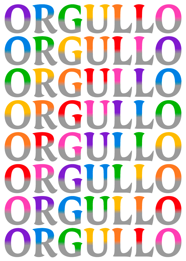
Tremolo Gradient is a radical narrow display font with separate and interlocking top and bottom styles, which allows for the combining of colour gradients. Three different gradient effects are available for different text sizes of the font family.

PDF Specimen
Available in
  • Latin
More
Rent
Active LayersTremolo Gradient A Top + A Bottom
Buy
Amsterdam
Amsterdam
Amsterdam
Active LayersTremolo Gradient B Top + B Bottom
Buy
Bengaluru
Bengaluru
Bengaluru
Active LayersTremolo Gradient C Top + C Bottom
Buy
Copenhagen
Copenhagen
Copenhagen
Tremolo Gradient In Use

Design Concept

Tremolo Gradient is a layering narrow display typeface with two interlocking layers designed for chromatic typography in two colours. It simulates the stroke of a thick, flat brush, and includes three different levels of gradients with upper and lower parts of the letter that can be assembled together in different colours, allowing the designer to control and play with the decorative effect.

Tremolo Gradient, Design Concept

Tremolo collection

Tremolo is a collection of narrow and eclectic typefaces that explore new territories of type design. It is difficult to classify, containing elements of cursive calligraphy, brush lettering, and even condensed blackletter, which can render text austere or friendly, printed or painted – different voices packed into a single design. The Gradient styles with interlocking top and bottom styles, and Shadow styles with separate styles for the top and bottom layer, are designed for chromatic typography, and finally, the Sans is an engaging and warm humanist low-contrast typeface that completes the family.

Tremolo, type collection

  • AwardsTDC Typographic Excellence 2016
  • Released2015

Latin

  • English
  • Comorian
  • Luba-Kasai
  • Marquesan
  • Danish
  • Dutch
  • Italian
  • Haitian
  • Estonian
  • German
  • Friulian
  • Galician
  • French
  • Finnish
  • Fijian
  • Frisian
  • Luxemburgish
  • Spanish
  • Swahili
  • Breton
  • Bislama
  • Basque
  • Afar
  • Afrikaans
  • Zulu
  • Tetum
  • Portuguese
  • Norwegian
  • Swedish
  • Catalan
  • Polish
  • Slovak
  • Czech
  • Maltese
  • Albanian
  • Indonesian
  • Irish Gaelic
  • Latvian
  • Lithuanian
  • Slovene
  • Rhaeto-Romanic
  • Hungarian
  • Sorbian
  • Kurdish
  • Hawaiian
  • Esperanto
  • Welsh
  • Sámi (Northern)
  • Faroese
  • Greenlandic
  • Icelandic
  • Croatian
  • Romanian
  • Romani
  • Turkish
  • Bosnian
  • Phonetics
  • Sámi (Inari)
  • Sámi (Lule)
  • Sámi (Southern)
  • Vietnamese
  • Azeri (Latin)
  • Interlingua
  • Sanskrit transliteration
  • Malay
  • Māori
  • Turkmen
  • Uzbek
  • Tagalog (Filipino)
  • Malagasy
  • Crimean Tatar
  • Guaraní
  • Kashubian
  • Xhosa
  • Silesian
  • Cornish
  • Manx
  • Oromo
  • Somali (Latin)
  • Aymara
  • Ganda
  • Ido
  • Javanese
  • Gikuyu
  • Kinyarwanda
  • Kirundi
  • Kongo
  • Kwanyama
  • Nauruan
  • Navajo
  • Ndebele (Northern)
  • Ndebele (Southern)
  • Quechua
  • Samoan
  • Shona
  • Sotho
  • Sundanese
  • Tahitian
  • Tongan
  • Tsonga
  • Tswana
  • Twi
  • Wolof
  • Yoruba
  • Cheyenne
  • Chichewa
  • Kiribati
  • Swati
  • Pinyin
  • Arabic transliteration
  • Ladin
  • Igbo
  • Karelian
  • Veps
  • Chamorro
  • Marshallese
  • Montenegrin
  • Náhuatl
  • Norfuk
  • Occitan
  • Papiamento
  • Pedi
  • Sardinian
  • Seychelles Creole
  • Tok Pisin
  • Tuvalu
  • Aromanian
  • Ga
  • Gagauz
  • Ulithian
  • Venda
  • Chokwe
  • Chuukese
  • Kituba
  • Lingala
  • Maninka
  • Nyanja
  • Otomi
  • Palauan
  • Rarotongan
  • Sango
  • Temne
  • Umbundu
  • Bemba
  • Gwich’in
  • Scottish Gaelic
  • Tokelauan
  • Aranese
  • Cofán
  • Pictograms
  • Norn
  • Romaji
  • Old Norse
  • Chiquitano
  • Araona
  • Cavineña
  • Ayoreo

  • (H:
    (H:

    Case Sensitive Forms

    case

    When the ‘change to caps’ function is applied from within an application (not when text is typed in caps) appropriate case-sensitive forms are automatically applied. Regular brackets, parenthesis, dashes and hyphens are replaced with their capital forms.
  • fi
    fi

    Standard Ligatures

    liga

    Standard ligatures are those which are designed to improve the readability of certain letter pairs. For example, when this feature is activated, typing ‘f’ and ‘i’ will automatically produce the ‘fi’ ligature. Using ligatures does not affect the spelling and hyphenation of your text in any way.
  • 19
    19

    Proportional Lining Figures

    lnum, pnum

    Typotheque fonts contain various styles of numerals within one font. Old-style Figures, also known as ranging figures, come standard in our text fonts. They are specifically designed to work well in running text, as they have the same proportions as lower case letters with their ascenders and descenders. The proportional Lining Figures feature changes standard figures to Lining figures which work better with all-capital text.
  • 19
    19

    Tabular Lining Figures

    lnum, tnum

    Tabular figures are for use in tables where numerals need to be aligned vertically. Tabular figures are available as a OpenType feature and have a fixed width in all weights. Typotheque fonts include both Lining and Old-style Tabular figures.
  • 19
    19

    Tabular Old-style Figures

    onum, tnum

    Tabular figures are for use in tables where numerals need to be aligned vertically. Tabular figures are available as a OpenType feature and have a fixed width in all weights. Typotheque fonts include both Lining and Old-style Tabular figures.