Zico Display

About

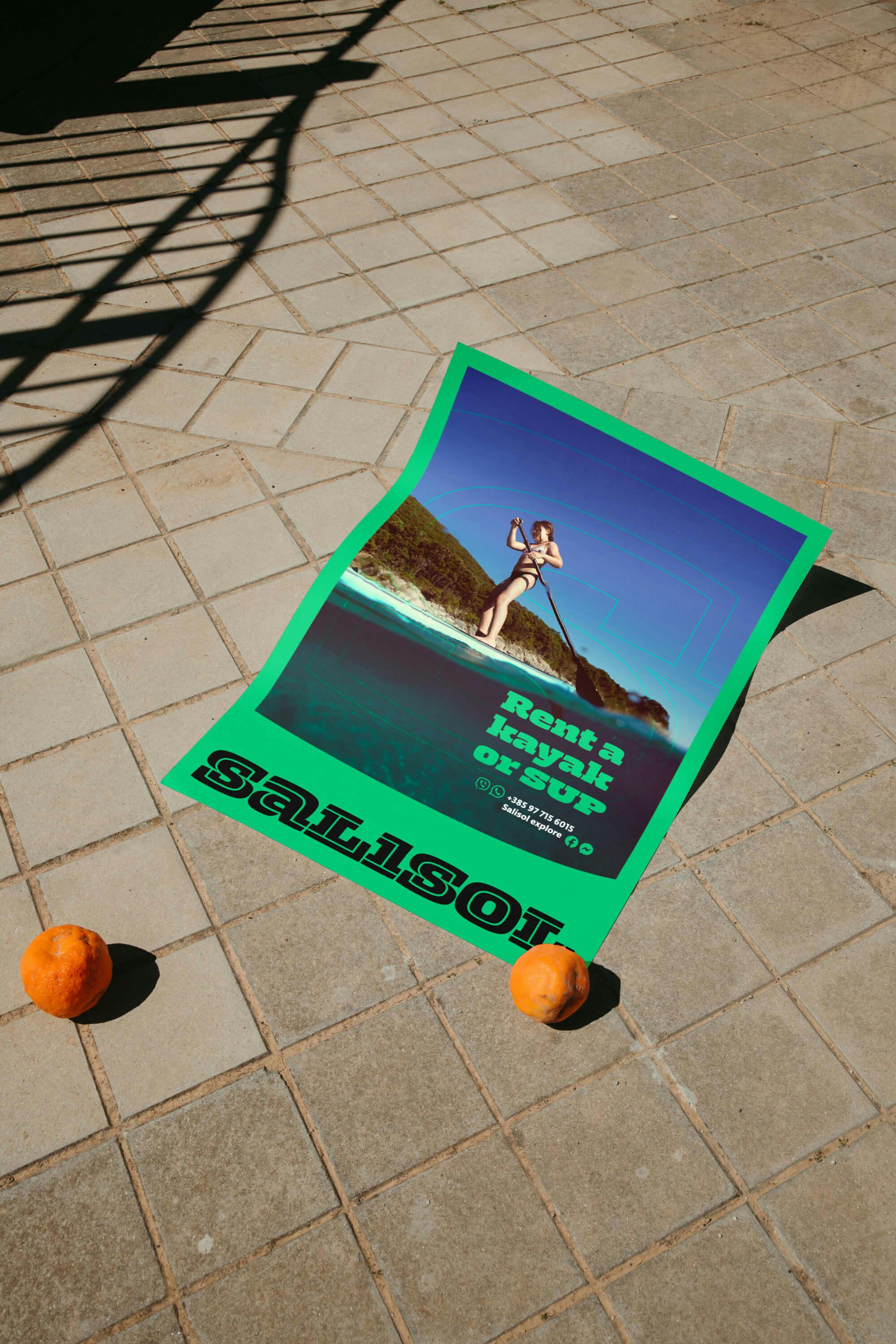
Zico Display is a robust typeface inspired by sport aesthetics, baseball jerseys, racing cars and motor oil cans, bringing elements of type and lettering design into one project. It reduce white space to a minimum, sometimes resulting in unusual reverse-contrast distribution.

Available in
More
Rent
ThinBuy
Amsterdam
OutlineBuy
Bengaluru
BlackBuy
Copenhagen
InlineBuy
Damascus
Zico Display In Use

Design Concept

Zico Display is sturdy and dominant headline typeface, preserving the dynamics of the hand lettering that inspired it. The Display styles reduce white space to a minimum, sometimes resulting in unusual contrast distribution. Read more about the development of Zico in this article.

Zico Display, Design Concept

Zico Type System

Zico is a large typeface family inspired by sports aesthetics, available in a beefy Slab-Serif version and a corresponding Display version, slightly squarish humanist Sans, and a narrower Sans Condensed. Combined, Zico is a powerful toolkit for the most demanding designers, carrying everything you need to create effective text hierarchies, strong headlines and eye-catching titles.

Zico Type System

  • AwardsTDC Typographic Excellence 2016
  • Released2016

Hebrew

  • Hebrew

Latin

  • English
  • Comorian
  • Luba-Kasai
  • Marquesan
  • Danish
  • Dutch
  • Italian
  • Haitian
  • Estonian
  • German
  • Friulian
  • Galician
  • French
  • Finnish
  • Fijian
  • Frisian
  • Luxemburgish
  • Spanish
  • Swahili
  • Breton
  • Bislama
  • Basque
  • Afar
  • Afrikaans
  • Zulu
  • Tetum
  • Portuguese
  • Norwegian
  • Swedish
  • Catalan
  • Polish
  • Slovak
  • Czech
  • Maltese
  • Albanian
  • Indonesian
  • Irish Gaelic
  • Latvian
  • Lithuanian
  • Slovene
  • Rhaeto-Romanic
  • Hungarian
  • Sorbian
  • Kurdish
  • Hawaiian
  • Esperanto
  • Welsh
  • Sámi (Northern)
  • Faroese
  • Greenlandic
  • Icelandic
  • Croatian
  • Romanian
  • Romani
  • Turkish
  • Bosnian
  • Phonetics
  • Sámi (Inari)
  • Sámi (Lule)
  • Sámi (Southern)
  • Vietnamese
  • Azeri (Latin)
  • Interlingua
  • Sanskrit transliteration
  • Malay
  • Māori
  • Turkmen
  • Uzbek
  • Tagalog (Filipino)
  • Malagasy
  • Crimean Tatar
  • Guaraní
  • Kashubian
  • Xhosa
  • Silesian
  • Cornish
  • Manx
  • Oromo
  • Somali (Latin)
  • Aymara
  • Ganda
  • Ido
  • Javanese
  • Gikuyu
  • Kinyarwanda
  • Kirundi
  • Kongo
  • Kwanyama
  • Nauruan
  • Navajo
  • Ndebele (Northern)
  • Ndebele (Southern)
  • Quechua
  • Samoan
  • Shona
  • Sotho
  • Sundanese
  • Tahitian
  • Tongan
  • Tsonga
  • Tswana
  • Twi
  • Wolof
  • Yoruba
  • Cheyenne
  • Chichewa
  • Kiribati
  • Swati
  • Pinyin
  • Arabic transliteration
  • Ladin
  • Igbo
  • Karelian
  • Veps
  • Chamorro
  • Marshallese
  • Montenegrin
  • Náhuatl
  • Norfuk
  • Occitan
  • Papiamento
  • Pedi
  • Sardinian
  • Seychelles Creole
  • Tok Pisin
  • Tuvalu
  • Aromanian
  • Ga
  • Gagauz
  • Ulithian
  • Venda
  • Chokwe
  • Chuukese
  • Kituba
  • Lingala
  • Maninka
  • Nyanja
  • Otomi
  • Palauan
  • Rarotongan
  • Sango
  • Temne
  • Umbundu
  • Bemba
  • Gwich’in
  • Scottish Gaelic
  • Tokelauan
  • Aranese
  • Cofán
  • Pictograms
  • Norn
  • Romaji
  • Old Norse
  • Chiquitano
  • Araona
  • Cavineña
  • Ayoreo

  • Ha
    Ha

    Small Caps

    smcp

    Most Typotheque fonts implement the Small Caps feature. In Adobe applications you can replace lower case letters with small caps using the keyboard shortcut (⌘ + ⇧ + H), or the OpenType menu.
  • Ha
    Ha

    All Small Capitals

    smcp, c2sc

    There are two methods of applying small capitals. The first one replaces only lower case letters with small caps. The second method, All Small Caps, also replaces capital letters with small caps. It also replaces regular quotation marks, exclamation points, question marks, slashes and usually also numerals with small caps variants.
  • (H:
    (H:

    Case Sensitive Forms

    case

    When the ‘change to caps’ function is applied from within an application (not when text is typed in caps) appropriate case-sensitive forms are automatically applied. Regular brackets, parenthesis, dashes and hyphens are replaced with their capital forms.
  • (1)
    (1)

    Circled numerals and arrows

    dlig

    The discretionary ligature feature creates real arrows when you type the combination -> (right arrow), <- (left arrow), -^ (up arrow) or ^- (down arrow). It also creates enclosed numerals when you type numerals inside parenthesis, and inverse enclosed numerals when you type numerals inside brackets. Discretionary ligatures are off by default in Adobe applications.
  • fi
    fi

    Standard Ligatures

    liga

    Standard ligatures are those which are designed to improve the readability of certain letter pairs. For example, when this feature is activated, typing ‘f’ and ‘i’ will automatically produce the ‘fi’ ligature. Using ligatures does not affect the spelling and hyphenation of your text in any way.
  • 19
    19

    Proportional Old-style Figures

    onum, pnum

    Typotheque fonts contain various styles of numerals within one font. Proportional Lining Figures come standard in all our headline and newspaper fonts. Their proportions are specifically designed to work well with capital letters (for example, in headlines). The proportional Old-style Figures feature changes standard figures to Old-style Figures which work well in running text, as they have the same proportions as lower case letters with their ascenders and descenders.
  • 19
    19

    Tabular Lining Figures

    lnum, tnum

    Tabular figures are for use in tables where numerals need to be aligned vertically. Tabular figures are available as a OpenType feature and have a fixed width in all weights. Typotheque fonts include both Lining and Old-style Tabular figures.
  • 19
    19

    Tabular Old-style Figures

    onum, tnum

    Tabular figures are for use in tables where numerals need to be aligned vertically. Tabular figures are available as a OpenType feature and have a fixed width in all weights. Typotheque fonts include both Lining and Old-style Tabular figures.
  • 2/9
    2/9

    Arbitrary Fractions

    frac

    Typotheque OpenType fonts already include a number of pre-designed diagonal fractions. The fraction feature allows you to create other fractions quickly and easily.
  • H1
    H1

    Superiors

    sups

    Replaces all styles of figures (old style, tabular, lining) and letters with their superior alternates, which can be used for footnotes, formulas, etc. Superior characters are more legible than mathematically scaled characters, have a similar stroke weight, are spaced more generously, and better complement the rest of the text.
  • H1
    H1

    Inferiors

    sinf

    Replaces all styles of figures (old style, tabular, lining) and letters with their inferior alternates, used primarily for mathematical or chemical notation. Inferior characters are more legible than mathematically scaled characters, have a similar stroke weight, are spaced more generously, and better complement the rest of the text