An Idea of a typeface
Neutral began as my graduation project for my BA in graphic design from the Royal Academy of Art (The Hague) in 2005. It is the result of an attempt to create a typeface free of all connotations or associations that could distract a reader from the text, a font that delivers the character of the written material untouched by the character of the typeface design. The whole project started with a discussion about why certain typefaces seemed to ‘age better’, or indeed age less than others: there seemed to be something about some of the big milestones of the 20th century like Times or Univers that kept them fresh after more than 50 years.
This got me thinking about Plato’s doctrine of Ideas, ‘original, perfect and unalterable’ mental archetypes representing every class of object that exists in our material world. Plato posits that these idealised, abstracted forms enable us to identify real-world instances of their type by comparison, and I imagined that this had to be true for typefaces as well. Neutral uses design principles to examine timelessness, archetypes and neutrality in graphic design, and specifically in type design.
The project consisted of various parts: a book describing the design process, a website recording email discussions of the project with Daniel van der Velden, Experimental Jetset, Uwe Loesch, Bernd Kuchenbeiser and Helmut Schmid (among others), a series of posters by various international designers using the typeface, and of course the typeface itself.
As the discussion with other designers unfolded, I found neutrality to be an elusive, ambiguous quality, one that I would have to explore in order to define for myself what it would mean for a typeface to be truly neutral.
I touched upon various fields along the way, for example, the Conceptual Art movement of the 1960s, which emphasised the purity of the idea-as-artwork over its materialisation, and whose proponents produced artworks that in many cases only existed in written form.

Joseph Kosuth is one of the main proponents of the Conceptual Art movement, and has been part of it since its beginnings in the 1960s. His famous One and Three Chairs (1965) is also based in the Platonic idea theory and first prompted me to explore it. The above quote is taken from his 1996 article “Intent” (in: The Art Bulletin, Vol. 78 No. 3).
Another source of inspiration were the ideas of 16th-century tea ceremony master Sen no Rikyū, who greatly influenced the wabi-cha style of chanoyu tea ceremony. This style tries to attain perfection in the essential aspects of the ceremony by the removal of anything which could divert the focus from the essential elements: the tea and the interaction of host and guests.

According to historical tradition, these were the words Rikyū used to explain all the secrets of the tea ceremony (from A.L. Sadler, Cha No Yu, Japan, 1933).
Through these explorations of various design disciplines and the exchanges with other designers I arrived at a clearer definition of neutrality that could be applied to a typeface:
[social]Neutrality can be regarded as an auxiliary construction that lets us describe things and events that appear free of connotations to a specific social and cultural group at a specific point in time. Because everybody’s backgrounds and expectations differ, however, the more closely we attempt to answer the question ‘What is a neutral typeface?’, the fewer people agree on various details, and the more the proposal of a neutral typeface becomes a paradox.
If I asked you to draw a water glass
The Platonic Idea or archetype was one of the starting points. We often find it at work in design: if I asked you to draw a water glass, I could be quite certain that you would draw a cylinder (or more precisely, a conical frustum) within a rather narrow range of parameters. These Ideas are not innate, but are acquired from our cultural background, which is why Neutral could be neutral in our culture, but not, for example, in Elizabethan England.

Chope Unie water glass by Duralex, France, courtesy of Duralex.
Measuring old typefaces to construct a new one
In order to discover this Idea of a typeface I sought to distill all typefaces (excluding a few fringe groups) into an average. To keep my own background from interfering with the design process, I devised a system of comparisons of typeface genres and sub-genres to establish what kind of typeface Neutral would have to be to do any justice to its name. This system addressed questions such as: Which shapes are more restrained, closer to a possible archetype? Which of two forms is more commonly used? Which form is less dependent on physical methods or technologies? Which forms are more likely to result in distinguishable (but unobtrusive) letterforms? Which forms are more likely to provide a coherent word-image? Which of two otherwise equally suitable groups of shapes are the plainer, simpler ones?
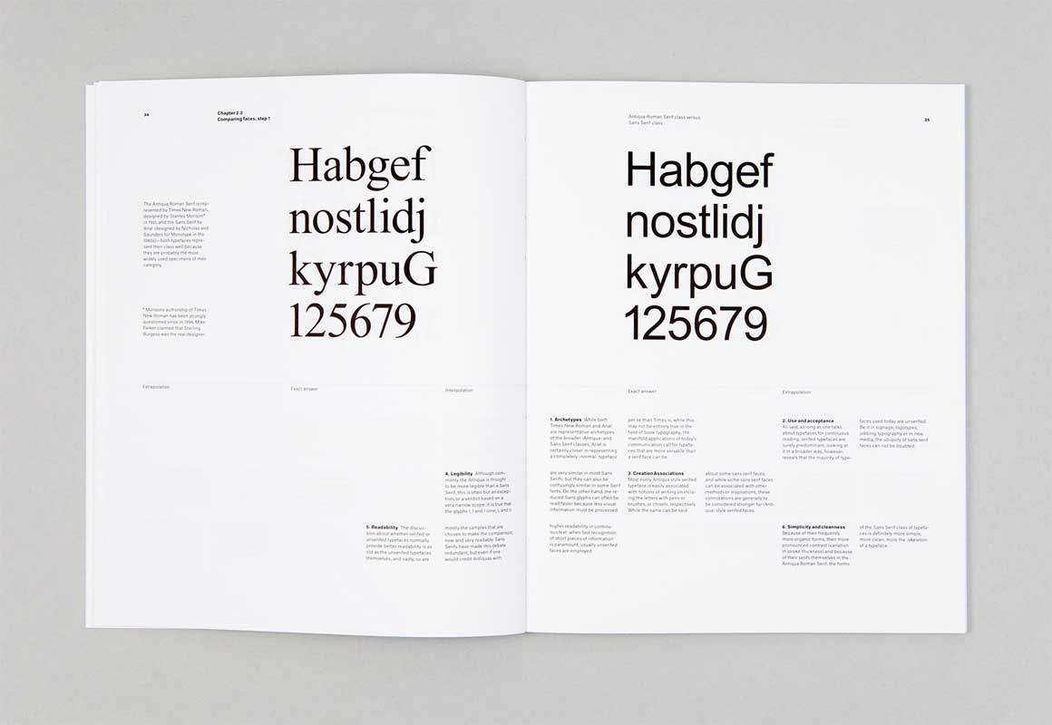
Ideally, I would have measured all Latin-based typefaces, but that was hardly practical. To save time, I first compared first different genres (such as Serif vs Sans Serif) and later sub-genres (Grotesk vs Humanist Sans) with one another; according to the outcome of this, the neutral typeface would be a grotesk with a slight humanist touch.
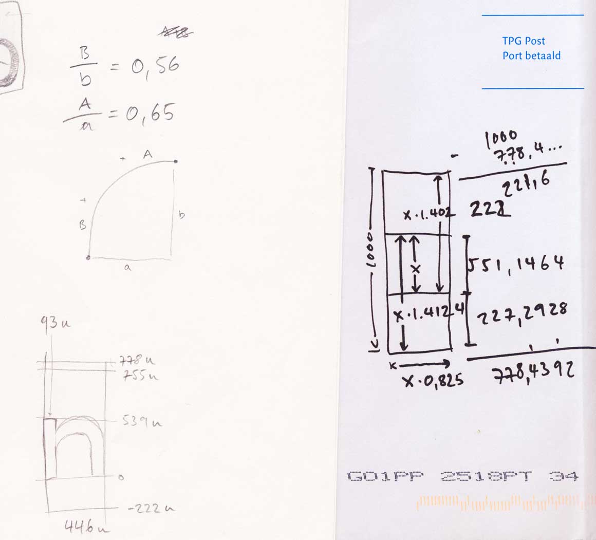
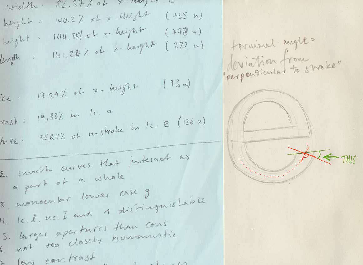
How can the roundness of a curve be measured? How can I define the angle of a stroke termination? New insights and lots of math at every step of the parameter-gathering process.
With these results in hand, I then began to measure key parameters of representatives of these most archetypal genres. The averages of these would then produce the scaffolding onto which Neutral was drawn.


You could easily think that designing Neutral was much like a process of just blending different typefaces with each other. But apart from a list of design principles, all the measurements resulted only in a very loose scaffolding within which I had to draw the typeface. The illustration also shows how important key horizontal and vertical proportions are to the appearance of a typeface. Neutral’s proportions are as average as was possible, to make a typeface as unnoticeable as possible.
See the actual measurement table of selected fonts.
Neutral again
One great advantage of being both a graphic designer and type designer is that your work in one discipline feeds back into your work in the other: you can make the typefaces that you want to use (or imagine that you would want to use), and then you can evaluate your typefaces based on how they perform in application. But over the years I noticed that I wanted to use Neutral less and less frequently, and whenever I did, I wanted to make some small corrections here and there. That’s how I knew I wanted to go back to Neutral, and make it as good a typeface as it was an idea for a typeface.
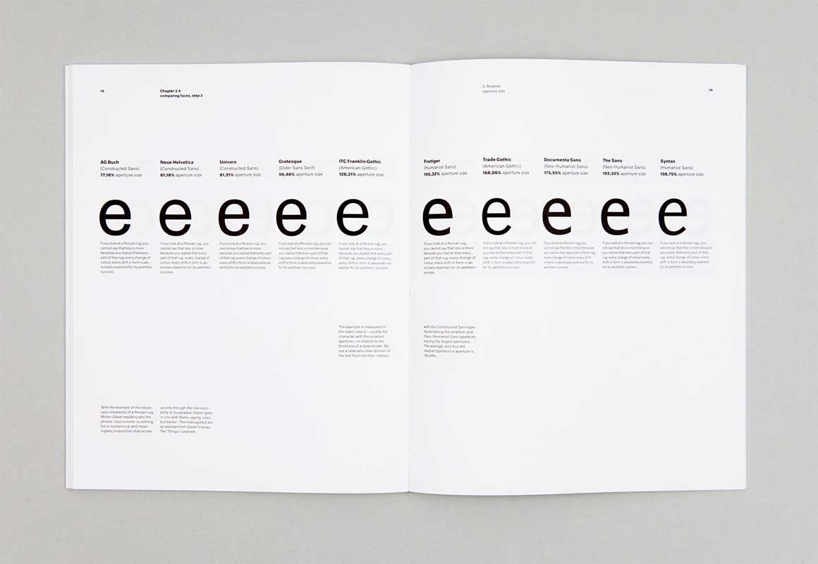
Measurements of the aperture size in the lowercase e, again as a placeholder or indicator for the design of many other apertures in the typeface: This lineup shows a gradation from the most constructed grotesk to the most ‘humanist’ sans.
Keeping it the same, but changing everything about it
Basically I decided to draw it all over again — pretty much from scratch — but was immediately confronted with a fundamental decision: Should I re-evaluate the steps of comparing and measuring typefaces that had initially provided the parameters for Neutral’s construction?
[signup]In the end I decided against it, because the result would not be a new version of Neutral, but a new typeface altogether. I just wanted to design the same typeface, only better. My plan was to eventually upgrade all existing users of the original Neutral to this new version, so I would have to keep everything the same, yet change everything about it.
Very soon, I came to a point where I did want to use it again, indeed very much so. And there was still a steady demand for the typeface from others. These two things were nice accelerators that finally pushed me towards the finish line.
Thousands of invisible changes
What is new about this new Neutral? In a word, everything. Using the original typeface as a guideline to trace over, every glyph was carefully redrawn, every spacing and kerning decision revisited and subtly improved. At the same time, my goal was to keep the original qualities of the typeface the same: the quiet evenness, the unobtrusive character, and the great performance in long text, even in smaller sizes.
There are a few areas where the improvements are quite obvious: the new Neutral’s punctuation is much more refined, many accents that were less familiar to me in 2005 are now drawn in a way that their users actually want them to look, and spacing is much better. The biggest improvement, however, and the one that I am the happiest with, are the figures. Years of practical design experience gave me insight into working with figures that I incorporated into the new design. Also, I decided to make lining figures the default instead of text figures, since many people don’t use all-caps features.

Neutral’s figures have been completely redrawn, and exist in four versions per style. The default figures are proportional lining figures at the height of caps, but they also exist (together with currency, math symbols and selected punctuation) in tabular versions. Instead of old style figures, Neutral additionally features text figures that are smaller than cap height and stand out less in running text. They too come in proportional and tabular versions.
Is the typeface neutral?
Many times during the process I caught myself asking the question that you are also perhaps asking now: Is it still Neutral? And is it still neutral?
A typeface is both a tool for designing, and a tool for reading. The fewer distracting details there are, the more invisible the typeface, and the clearer the text becomes. In the old version of Neutral, there were a couple of things that were not as invisible as I wanted them to be when I started redrawing it. In that way, I guess it’s more neutral now than it ever was.
As stated earlier, however, neutrality is determined by the expectations and norms of a group of people, and the closer we look at the details, the fewer people will agree with any one particular decision. That means that while the parameters were only a loose framework that could be filled in with anyone’s ideas of neutrality, the finished typeface was of course filled in by me and me alone, and so in the final analysis, it is only absolutely neutral for the smallest possible group – just me.
And while the goal of the methodology designed to create this typeface was to abstract the design process away from me, in the end I was still the one who designed this process, who both formulated the questions and answered them. This would have been true regardless of whether ten or a hundred or a thousand comparisons and measurements had been made. A larger data set might have diminished the room for interpretation, but it could never have eliminated it completely.
The plain, reserved nature of the typeface that resulted from filling in this framework of parameters will be quite neutral to a quite large number of people, even though we may argue about the details. In the end we can not create something completely neutral, something to which none of us can attribute any qualities. But we can approximate the formal idea of neutrality to some degree. And even if some would not consider this typeface to be neutral at all — maybe it was only through this project that their own thinking about neutrality was triggered. And in that respect also the project would be a success. It is more important to ask the question than to answer it.