
A sans for small text. And another for large.
Sans-serif vs. serif fonts for legibility: a contentious debate without much evidence. Recent research challenges conventional wisdom.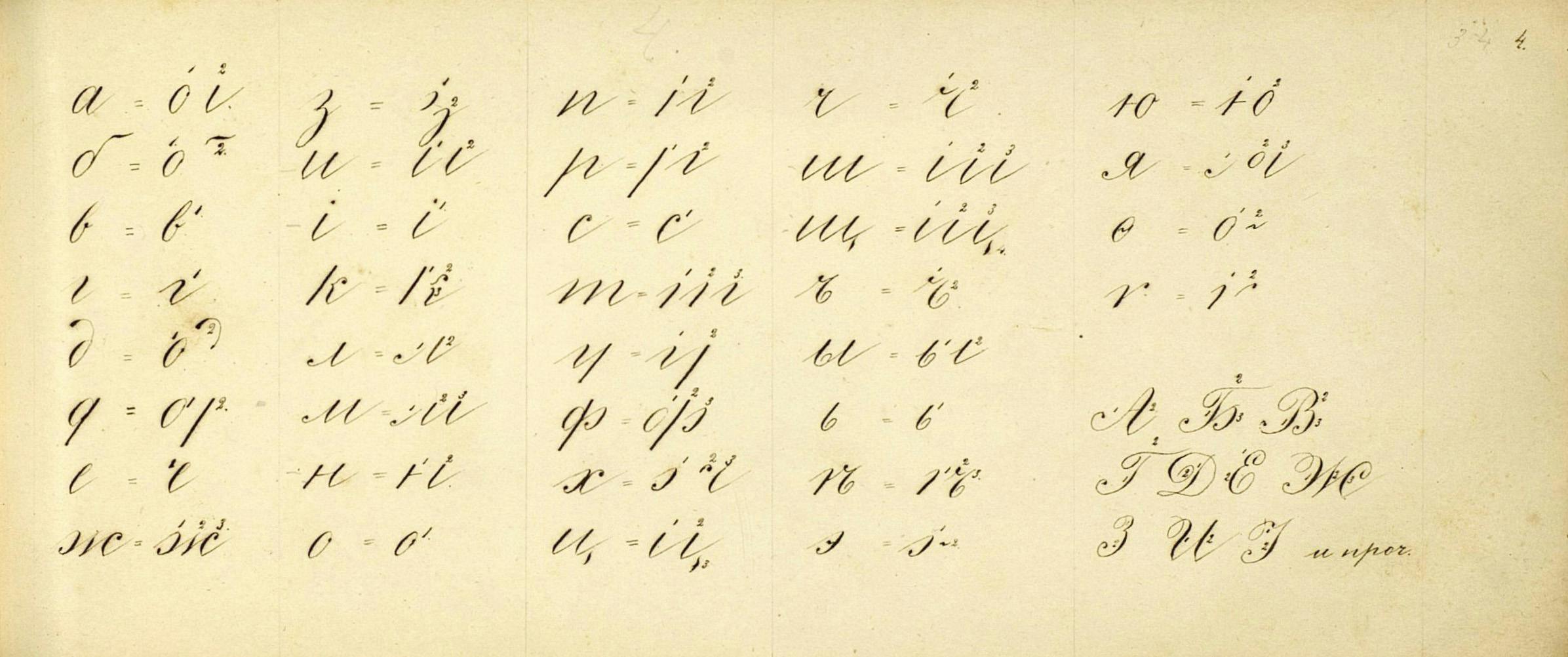 Modern handwriting: IntroductionPart 4
Cyrillic and Greek handwriting
This final part describes the influence of Latin script on other writing systems, namely Cyrillic and Greek, and especially on their cursiveness.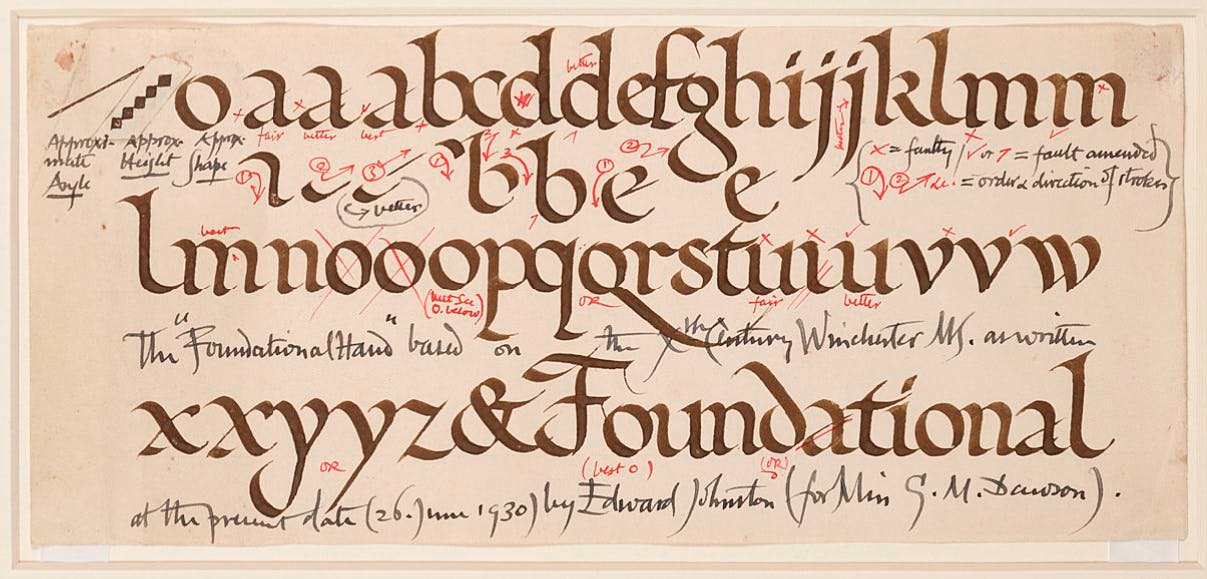 Modern handwriting: IntroductionPart 2
New Approaches in Great Britain
This second part offers an overview of new approaches developed in Great Britain during the 20th century, inspired by writing history or modern pragmatism.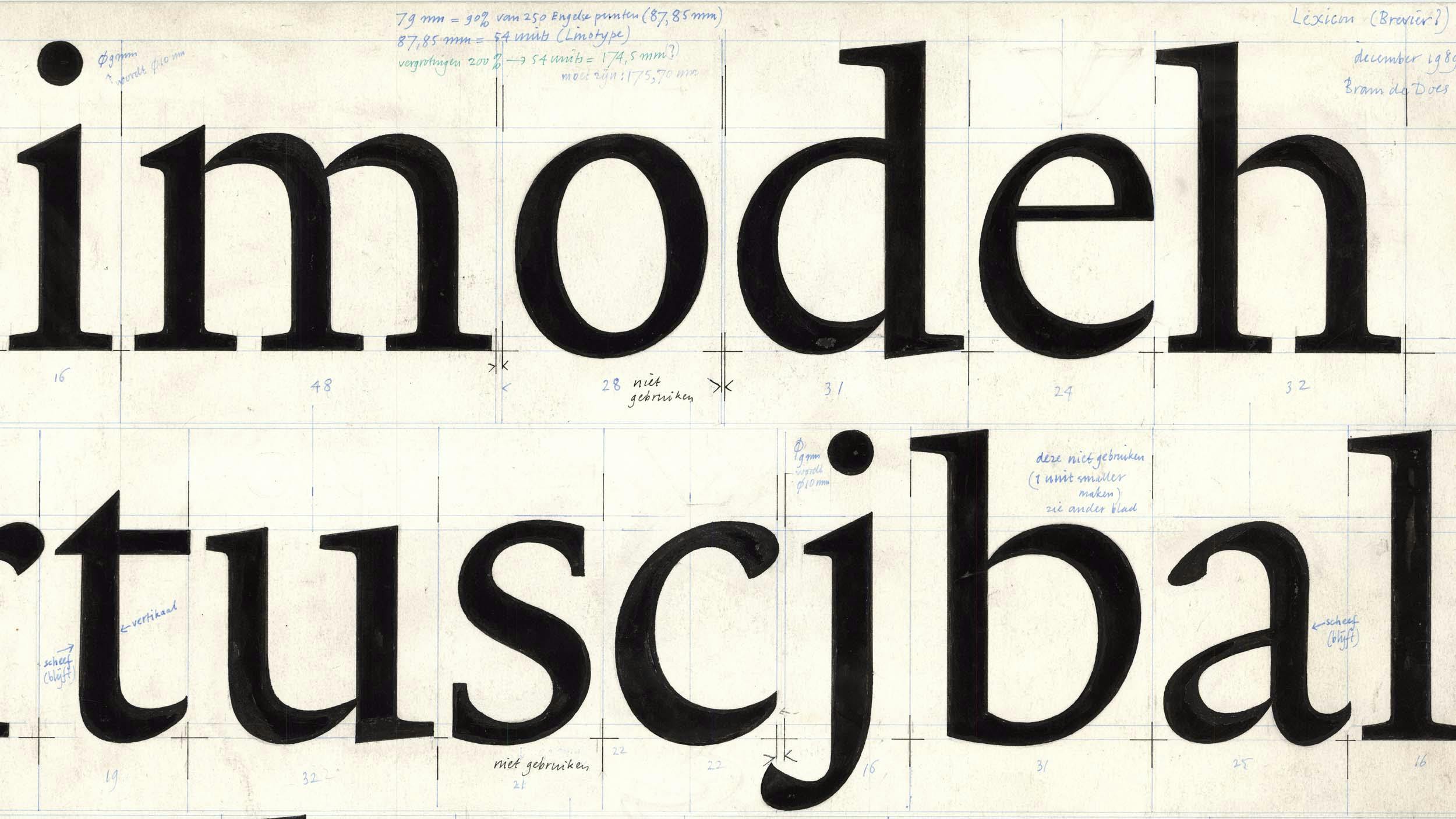
Originality in Type Design
The article was triggered by the discussions with the late Gerard Unger about the nature of originality in the type design industry, highlighting the importance of historical continuity in creating new works while examining the notions of originality and the boundaries between interpretation and plagiarism.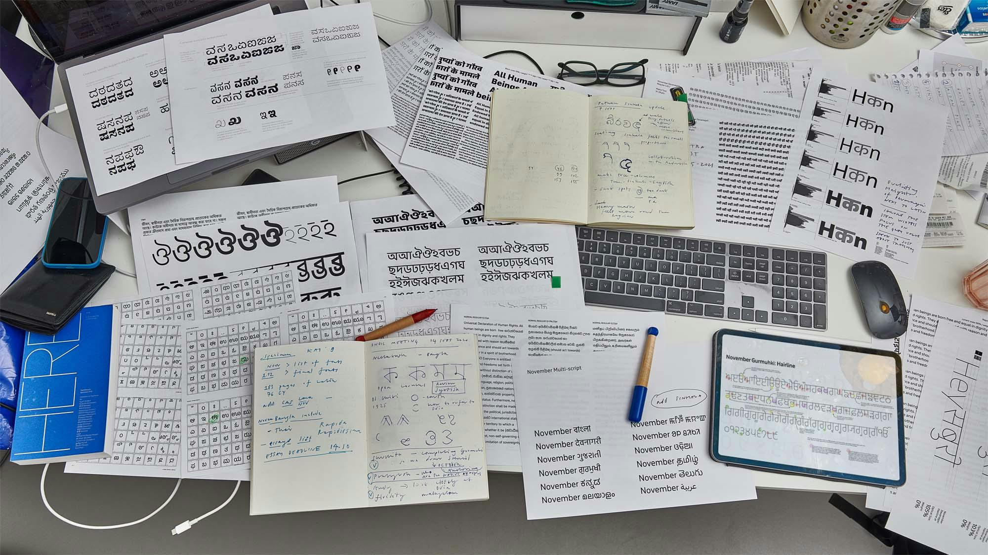
Designing Fonts for Two Billion people
Typotheque tackled the unprecedented task of designing a comprehensive set of fonts for South Asia.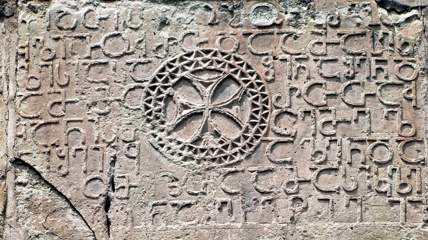
Georgian alphabet, writing and typography
An article on the origins of the Georgian writing script, is historical development, printing traditions, and Georgian typography today.
Typeface design beyond a single script
Creating a new language version of a typeface is akin to a translation, whereby purpose, intention and respect are as important as proportion and design.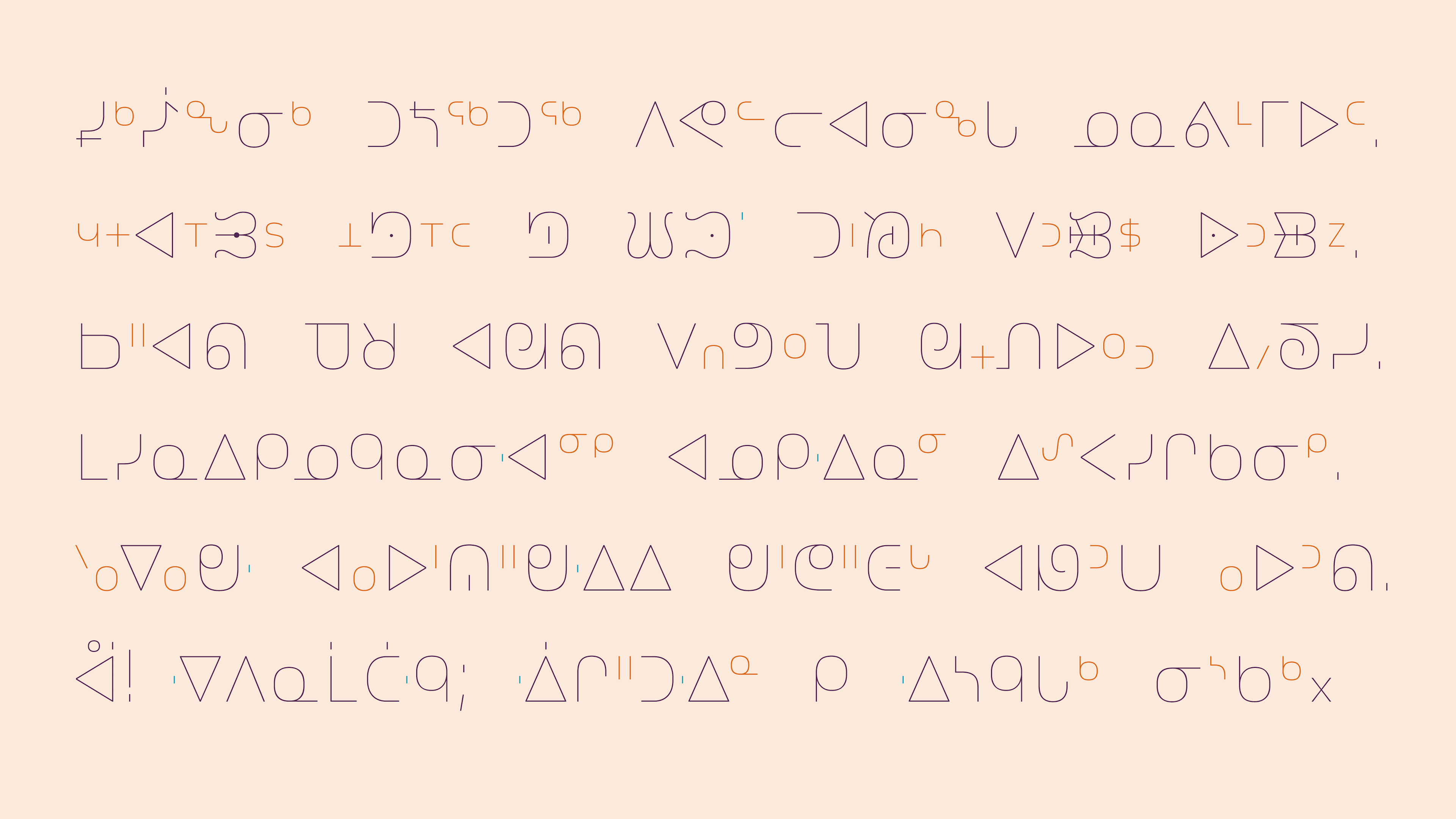
Syllabics typographic guidelines and local typographic preferences
This essay provides guidelines to fine Syllabics typography through identifying its general and inherent concepts, as well as detailing the nuances found in local preferences within individual communities.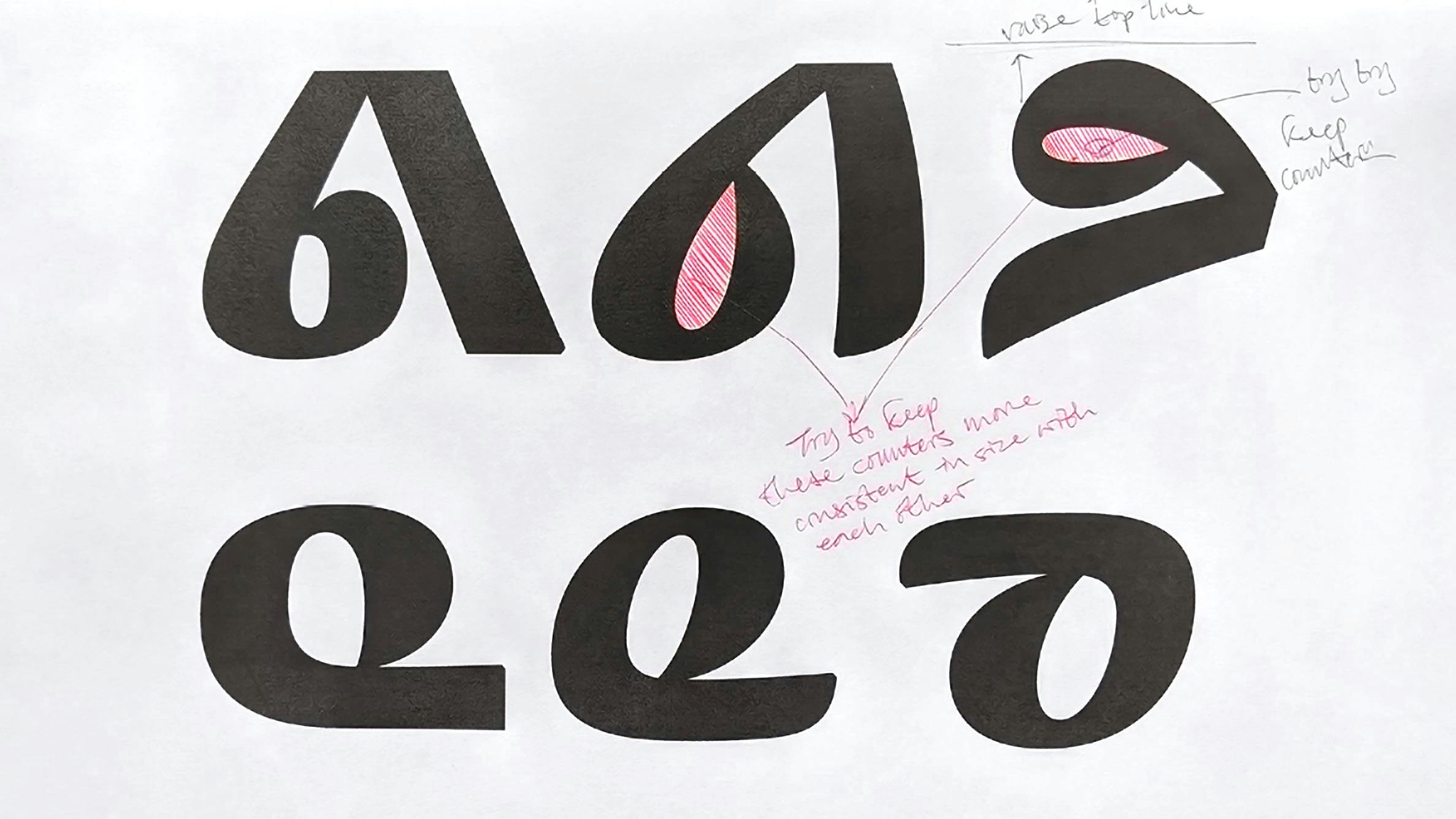
On developing a secondary style for the Canadian Syllabics
This essay explores the journey to developing a suitable secondary style for such a script, the Canadian Syllabics, in a way that expands its typographic palette and offers more tools for expressing the language in its visual form.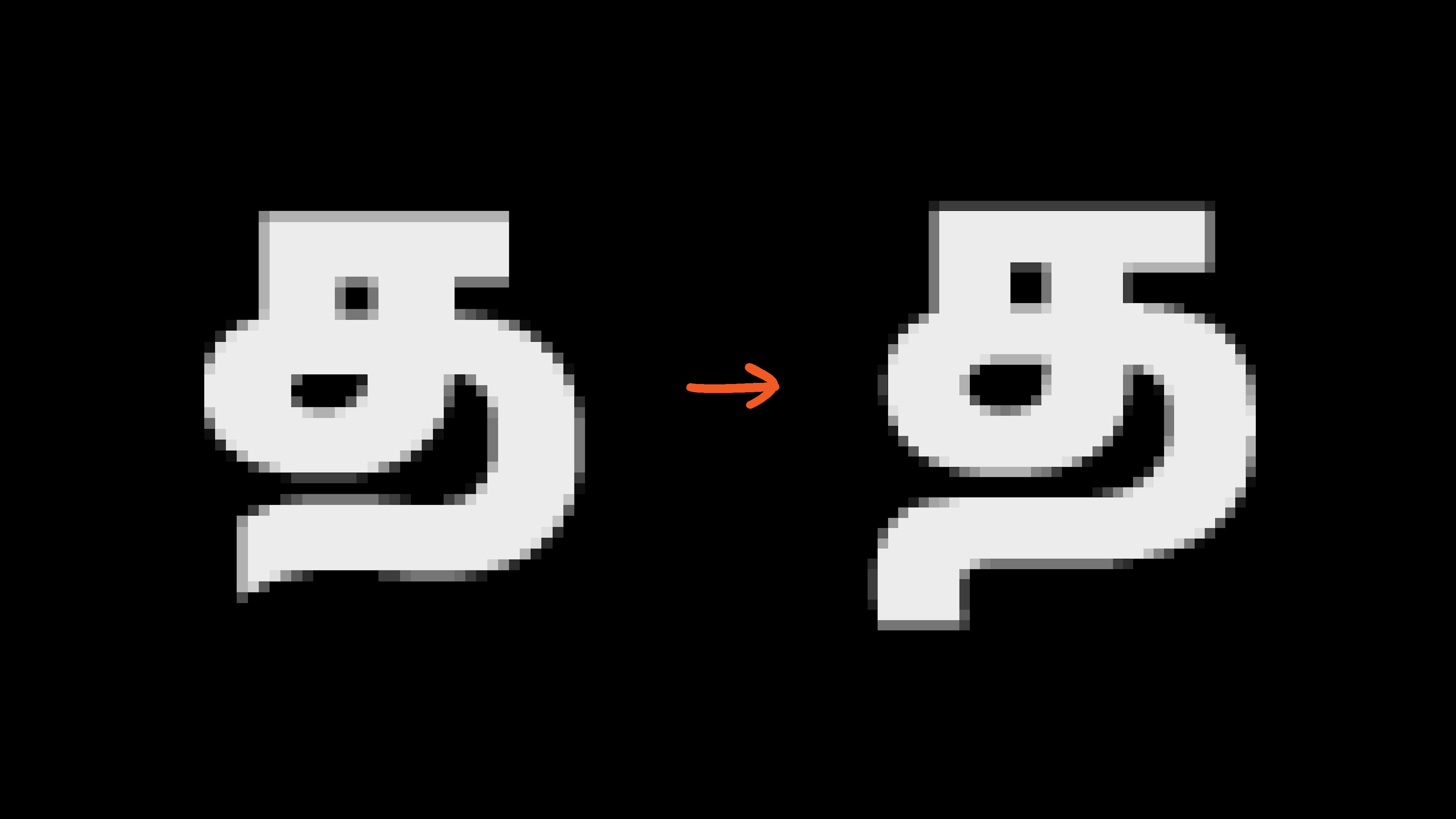
November Tamil: Designing with purpose
November, October and November Stencil Tamil are a family of low-contrast, monolinear Tamil typefaces. Following a rigorous overhaul of the original, they have now been redesigned for better reading and unambiguous communication in text and display sizes.
Theory of Type Design, a book review
A book review of Theory of Type Design by internationally renowned type designer Gerard Unger, where he is delving into cultural, historical and social roots of type design and typography.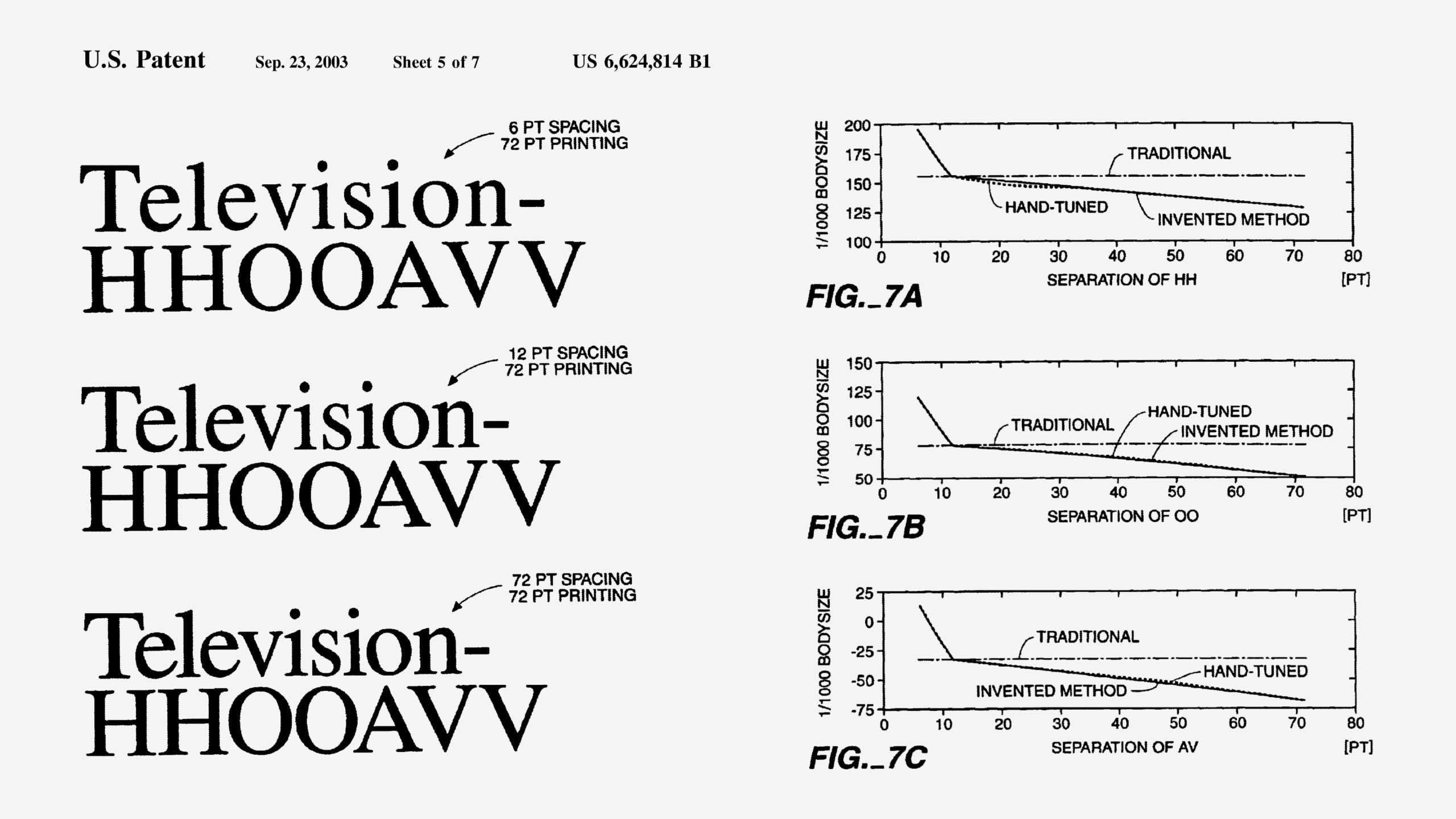
Size-Specific Spacing of Fonts
Type design must consider not only the shape of the letters, but also the white space around them, which is essential for the ease of reading.