Calcula
Calcula began as the final assignment in my graduate typeface design class in the GD MFA program at the Maryland Institute College of Art (MICA). It was in my first semester and my first week in the United States that I met professor Tal Leming. Being a type nerd, I knew of Leming who had just launched his massive Balto typeface and a new website for his foundry a few days prior, but I had never designed a typeface of my own, and this class was life-changing, to put it mildly.
After basic tutorials and weeks of drawing all kinds of things, we came to the final assignment which had a simple brief: Find a typographic area of interest and explore it to create a new typeface. At the time I was very interested in ancient Arabic calligraphic traditions, particularly in the geometric Kufic style, which I chose as my area of exploration.
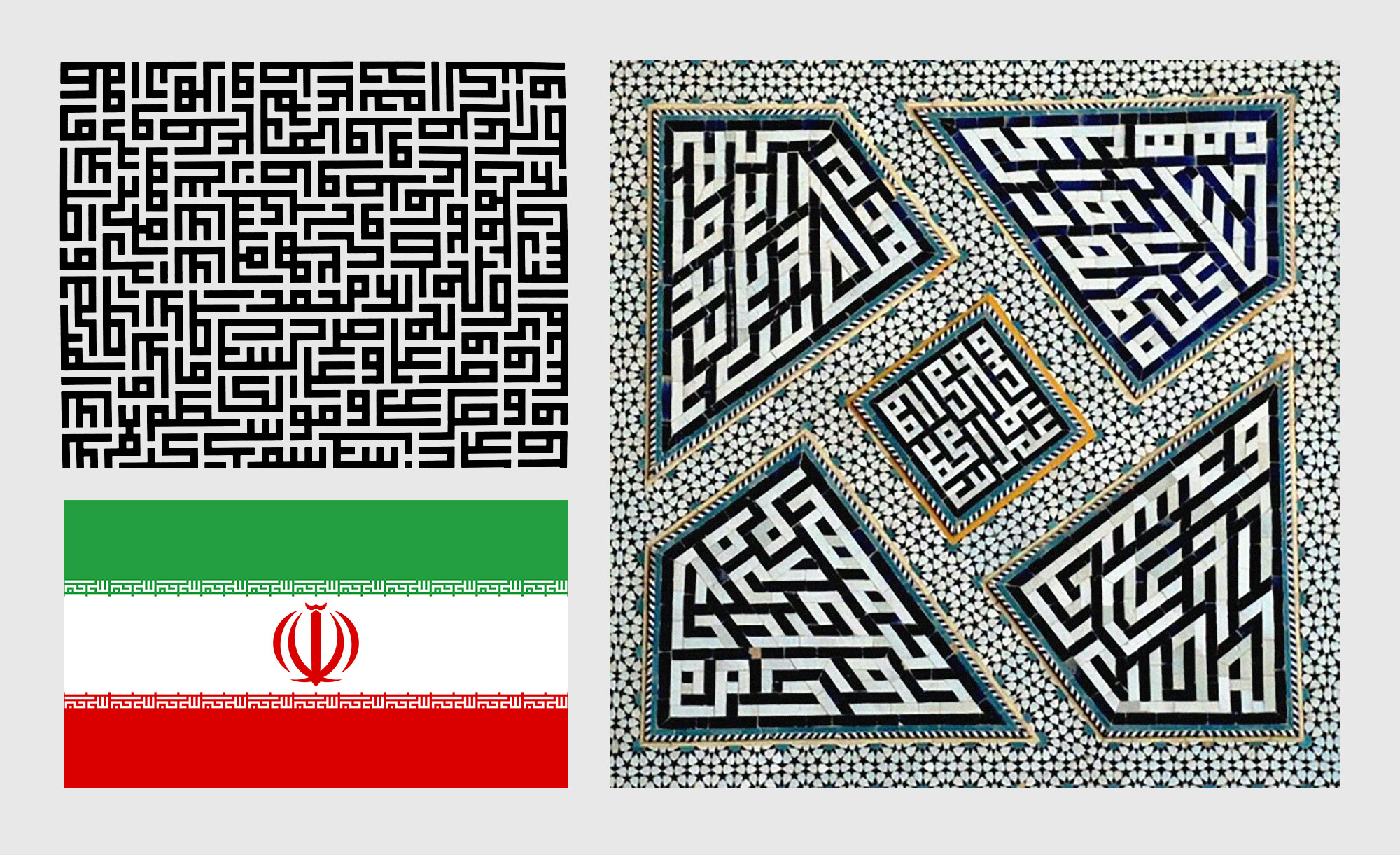
Clockwise from top: A Kufic Composition from Calligraphie Arabe Vivante by Hassan Massoudy (1981); Glazed-tile Decoration of the Jameh Mosque, Isfahan; Flag of the Islamic Republic of Iran featuring the Takbir written in geometric Kufic.
Islamic art is primarily non-representational and calligraphic. Kufic is the oldest calligraphic form of the various Arabic scripts, dating back to around the 7th century, and is named after its origin, the Kufa region in present day Iraq. Its geometric variant developed later and has been used in architectural tiling, also called Banna’i, (Persian for ‘builder’s technique’). The strict relationship between negative and positive space gives the style a maze-like complexity that pushes the boundaries of legibility.
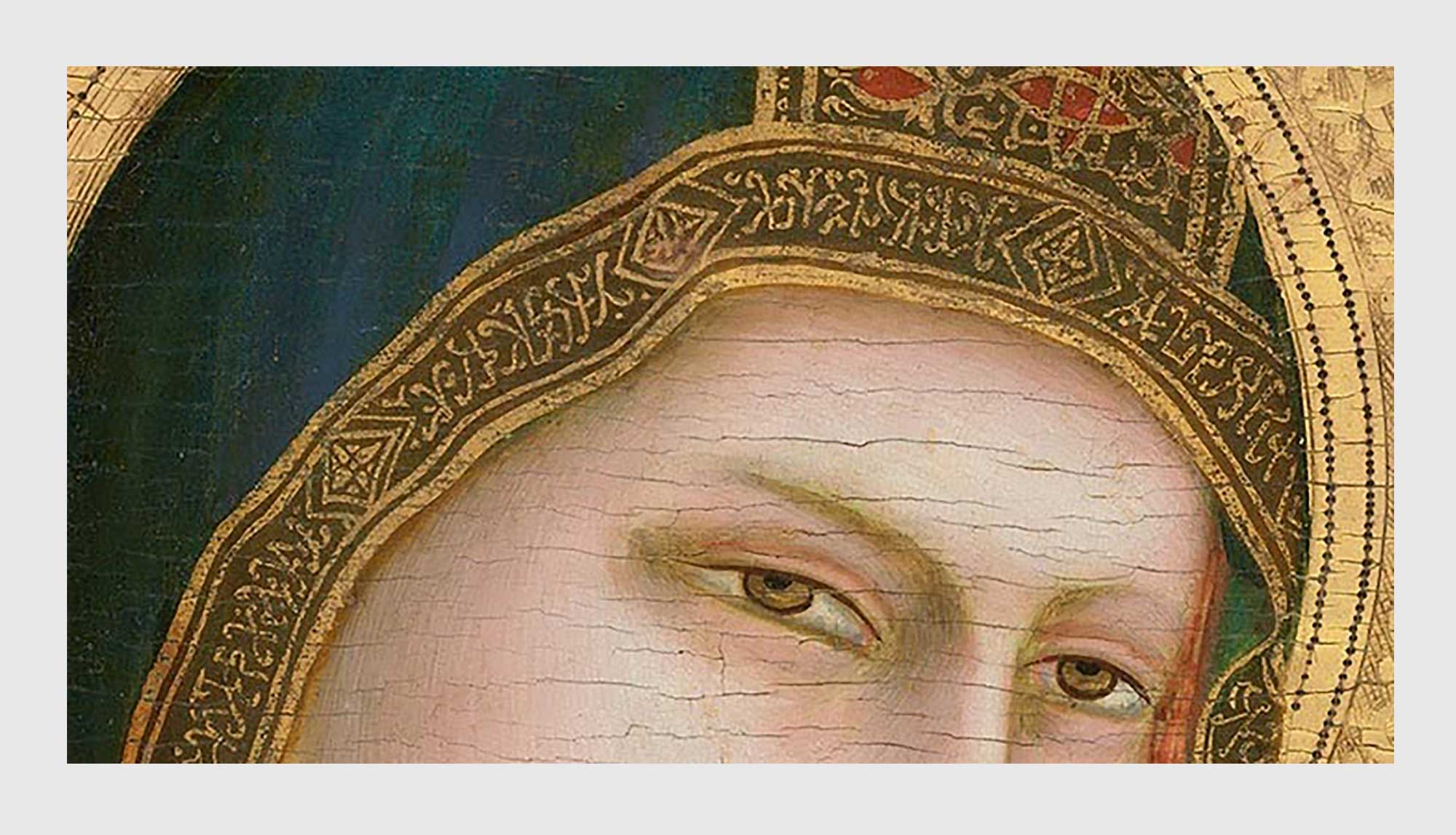
Pseudo kufic used in the veil of the virgin, Giotto, Madonna and Child (1320).
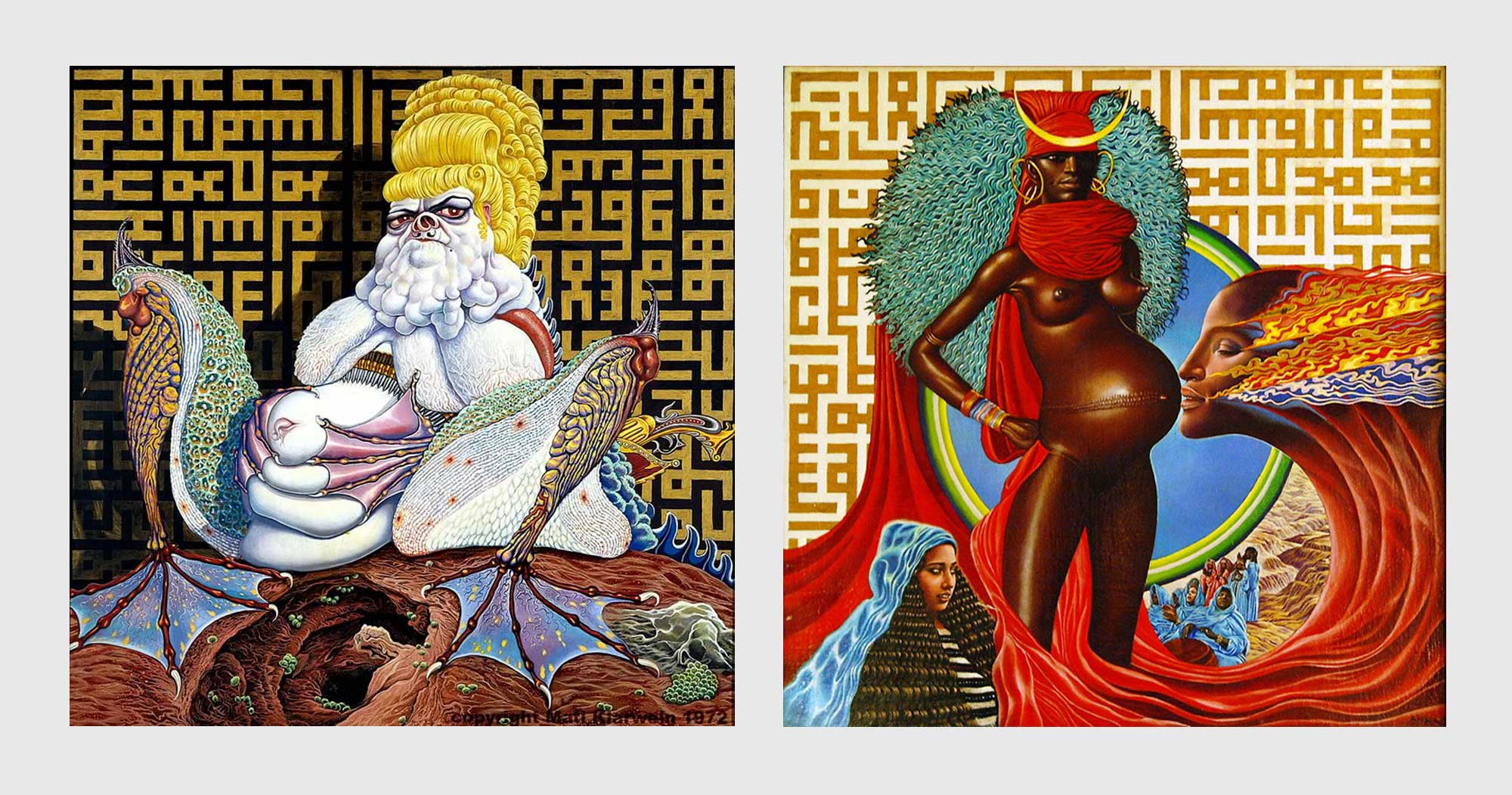
Kufic’s arresting visual quality was imitated by the Western world in what became known as ‘Pseudo-Kufic’. It became popular in medieval and Renaissance Europe, especially in depictions of people from the Holy Land. A more contemporary example of this is surrealist painter Mati Klarwein’s album cover for Miles Davis’ LIVE-EVIL.
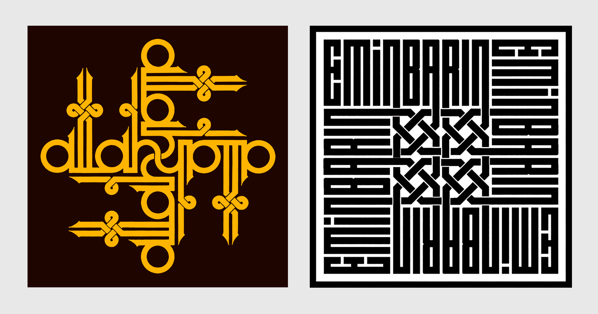
Works by Emin Barin.
I became familiar with Kufic through the work of prolific Turkish calligrapher and book designer Emin Barin, a traditional calligrapher who explored the Kufic style with Latin script, creating visually arresting monograms and pieces that make the style instantly accessible to a non-native like myself. He maintained the maze-like quality of Kufic, abstracting the inherent shapes of Latin letters to achieve the same visual balance between negative and positive space. This was very interesting to me, and I wondered if this could be achieved in a typeface. According to Erik van Blokland, the difference between lettering and typeface design is that lettering is designing letters to fit a specific composition, whereas typeface design is designing a system where any combination of letters should work together. I felt that the systematic approach to using repeating shapes in the Kufic style placed it closer to typeface design, but its freedom to twist a letter to fit between preceding and succeeding letters was, of course, a lettering technique.
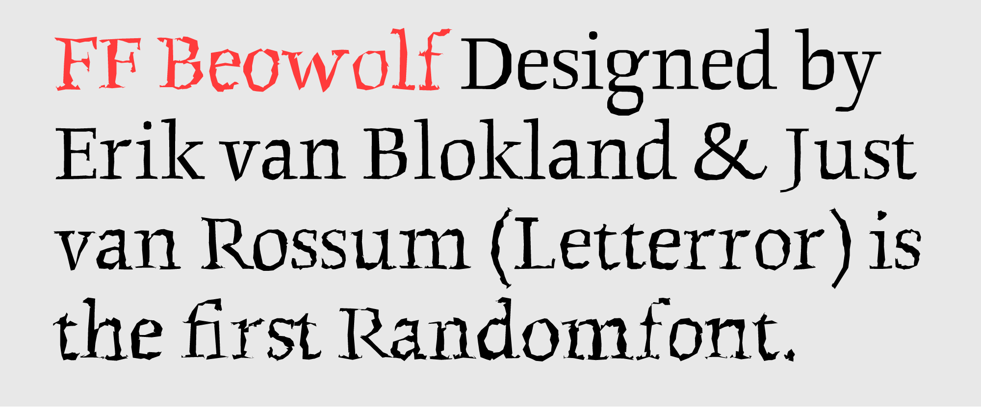
When Tal showed us FF Beowolf, the chaotically distorted font which van Blokland had designed in the late 1980s with Just van Rossum, it was an epiphany for me. I’d never dreamed that such possibilities existed, nor that there could be such a close relationship between type design and Python programming. The original PostScript FF Beowolf was a truly random font whose outlines changed on the fly, meaning that no two versions of the letter would ever be the same. This broke my fundamental understanding of type design as work with repeating shapes. Reading more about this typeface, I was inspired to explore the possibility of a typeface that seemed as free as lettering, a typeface inspired by and adhering to the rules of geometric Kufic.

I quickly lettered the word ‘PLATELET’ within a 5x5 grid and showed it to Tal as a concept for the final assignment, explaining my ideas for the typeface. Tal then began to show me how OpenType features could be more than just fancy ligatures and fractions, opening up a whole arena for experimentation. He showed me typefaces like Swiss Interlock (Christian Schwartz for Photolettering), Studio Lettering and Ed Interlock (Ken Barber and Tal Leming for House Industries), Liza Pro (Bas Jacobs, Akiem Helmling and Sami Kortemäki for Underware), Irma, Julien and Delvard Gradient (Peter Biľak, Biľak and Leming, and Nikola Djurek and Karsten Luecke respectively, for Typotheque). Having created the open type features for some of these typefaces, Tal made a proposition: if I were to devise a proper system for how this Kufic-inspired typeface could work, then he would program it for me. This was a dream come true.
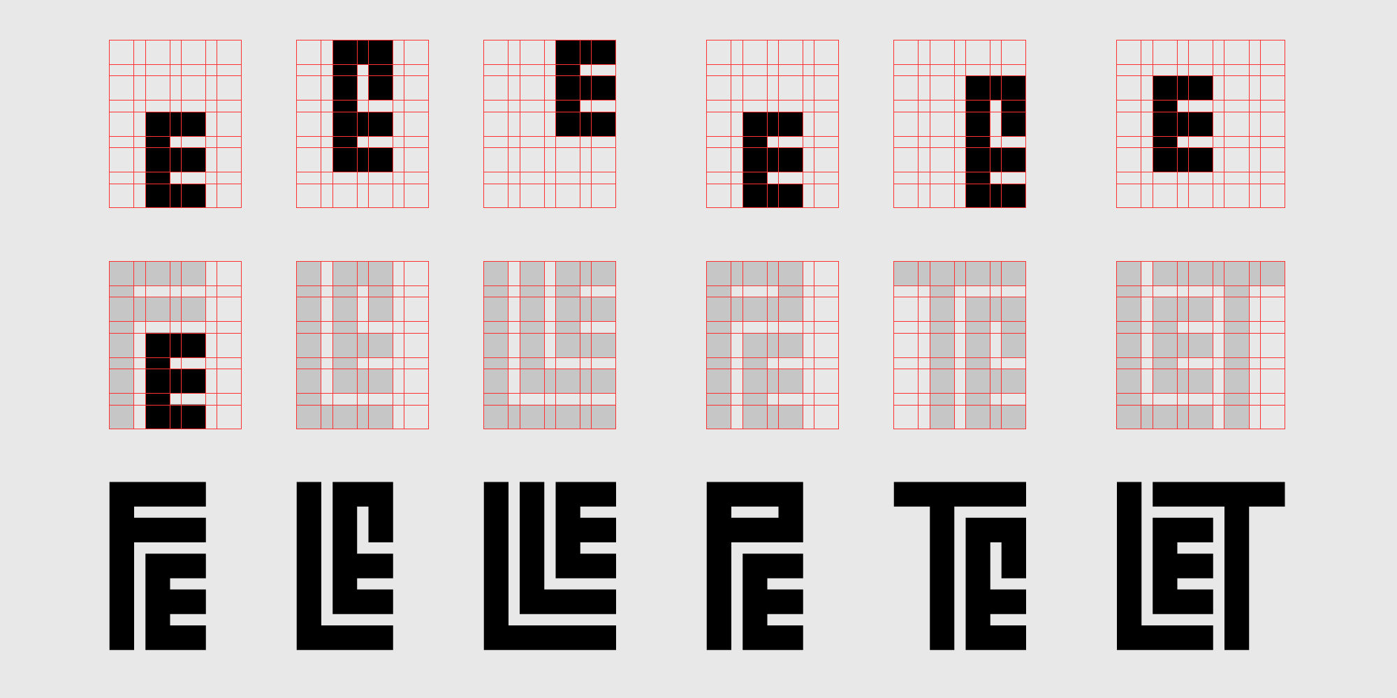
Multiple alternates for each glyph based on the intruder glyph they are interacting with.
The System
The remarkable typefaces Tal showed me are demanding to execute because the normal drawing, spacing, kerning et al. are only part of the process. Although they aren’t the most text-friendly or ‘functional’, they challenge their users and invite further enquiry. We studied them to find a way to achieve what we wanted to do with Calcula, i.e. to create a consistent, fixed-width space between letterforms. Each letter would need to adapt to the preceding and following letters in order to fit them over or under itself.
[signup]Observing typefaces like Ed Interlock, Julien and Liza Pro, I noticed that the beauty of these fonts lay partly in the unpredictability of which letter would interlock with which other letter. But with Calcula, the interlocking was only a way to achieve the strict relationship between negative and positive space. So I first made two rules for the design of this typeface: interlocking would happen only when absolutely necessary (would be predictable), and all letters would adhere to a 5×5 grid.
Since the grid was the guideline for all the letters, I made all the symbols and punctuations fit within the grid as well. They have extremely reduced visual character and fit within one of three widths present in the typeface, making Calcula an almost fixed-width typeface.
I identified the five ‘intruder’ letters (F, L, P, T, r) that other letters would need to adapt themselves to. I devised a simple system in which each letter had five versions, each designed to adapt to one of the intruders. This involved changing either the designs of the letters or their placements on the grid. Then I identified ‘multiple intrusions’ in which letters had to adapt to two intruders (LL, TT, LT, etc.). In this way, these smaller parts would come together when an interlocking was required. Once all the alternates were drawn, Tal created Ligature Builder, a Python program that would take these parts and create new glyphs, assembling them in various combinations.
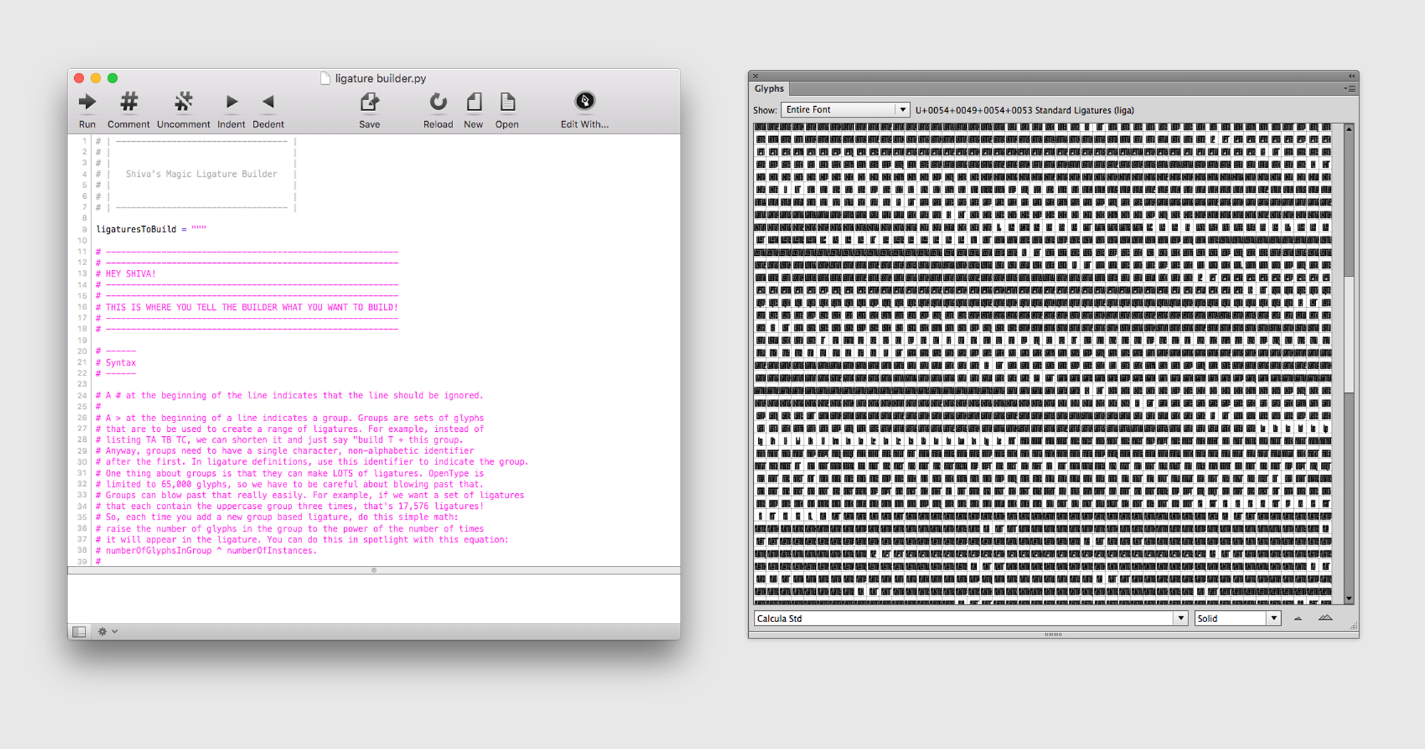
Tal Leming’s Ligature Builder for Calcula (Left), Glyph panel of Calcula featuring the generated ligatures (Right).
The Ligature Builder script references key points in base glyphs to locate possible combination structures. These structures are then compared to each other to automatically build N number of ligatures. The OpenType features are pretty straightforward. Based on our definitions of what we wanted the end result to look like, they insert ligatures as needed and try to resolve any remaining glitches afterwards.
Process
When I look back at all the times we thought this project was coming to a close, I laugh to myself. After Ligature Builder built the required number of ligatures, I began testing the typeface in various situations and combination of words. All the basic combinations seemed to work, but scores of less common combinations failed. This led me to research the frequency of letter usages in Latin-based languages. I began learning to play Scrabble and using the various online Scrabble word-finder programs to help identify new words with complex letter combinations. I repeated this process with other Latin-based languages and compiled lists of thousands of words containing any of the intruder letters. The process for this typeface was the exact opposite of the process I love—drawing, adjusting, tweaking letterforms and spacing, typesetting text—so for the sake of my sanity, I designed other typefaces on the side. We accepted that the work on Calcula would extend far beyond the length of the course and even my stay at MICA.
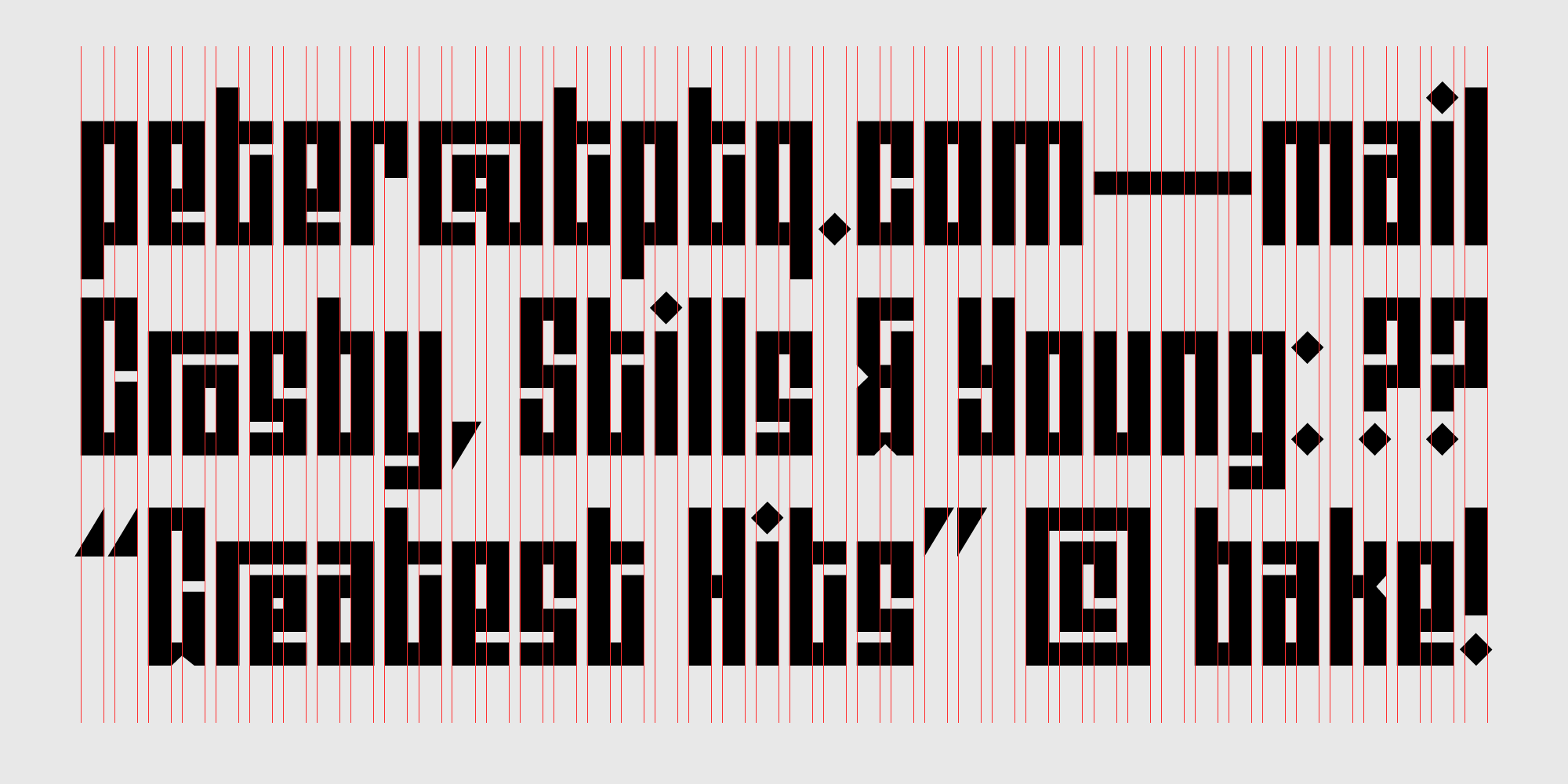
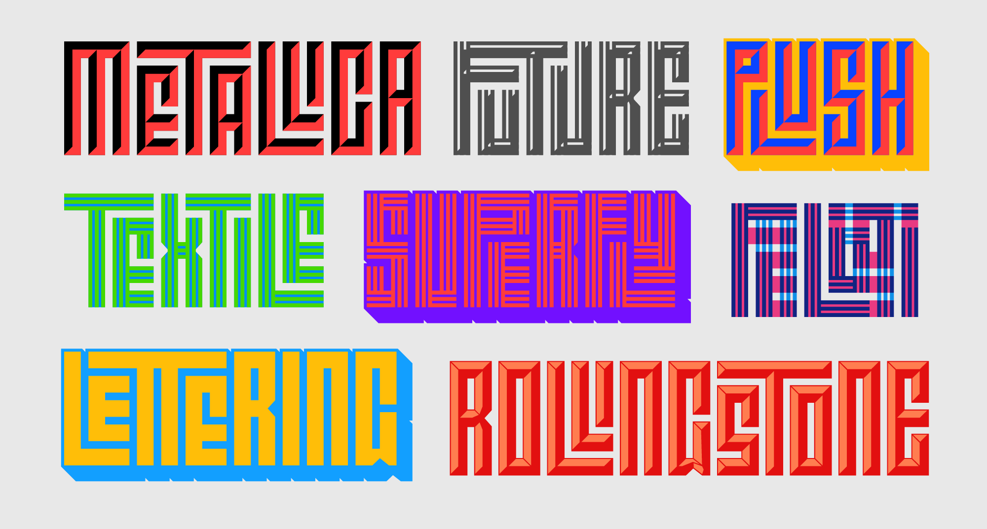
The various combinations of the Calcula styles used as layers.
From the inception of the project I knew I wanted to pitch this project to Typotheque. Typotheque’s articles and essay section were an early inspiration in my journey towards type design and I desperately wanted to work with this company. Around November 2014 we had a working first draft that performed the basic interlocking well enough to show to Peter. To my happiness, he accepted the project but suggested that I should take Calcula as far as it could go: Why stop with one font? Up to that point I hadn’t thought of making it a family, but his suggestion stoked my interest. Making new fonts from scratch and repeating the entire process would have been impractical, so we toyed with the idea of creating scripts to automate the process of creating new styles.
Tal suggested that I speak to designer and programming wizard Frederik Berlaen, who had created Robofont, the program I used to design Calcula. I drew a proposal of various visual effects that would fit the character of Calcula and pitched it to Frederik. Coincidentally, he had already created scripts that could enable two of the proposed styles (Stripes and Shadow) and accepted the challenge of designing the Stone script that would let me set the position of the sun and angle of the shadows. I was excited to be working with these experienced designers that I looked up to.

At this point another major challenge emerged: any changes to the letterforms, whether to accommodate the new styles or to correct terrible design choices (remember that this was the first typeface I’d ever drawn) necessitated revision of the Ligature Builder system as well. Tal re-wrote the program multiple times as we refined the system again and again, and although the last complete redesign of the letterforms took place sometime in 2015, it wasn’t until the end of 2016 that I felt the end was in sight.
We had managed to tweak Ligature Builder and the glyphs to solve most of the problems, and had manually created hundreds of ligatures that fell outside the program’s parameters. The new styles were mostly done, even Stripes, which required yet another redrawing of the entire base set and subsequent revision of Ligature Builder. As a bonus, since neither the widths or base design were modified in the new styles, we found that Calcula also works perfectly as a layering typeface, its fonts combining to create yet more styles.
In early 2017 I was invited to speak at the annual Typographics Conference in New York City. We felt that this would be a perfect platform to launch Calcula, and with deadlines set, the final changes were made.
Conclusion
We had to make certain compromises in the design of Calcula. For instance, after much labor-intensive trial and error, we decided to drop the idea of accented letters. We explored MARK positioning, ideas for on-the-fly diacritics but in the end, with the way that Ligature Builder works, accented ligatures would outnumber the number of glyphs allowed by OpenType. We eventually decided we could probably approach it again in the future. Since it was a display typeface for large sizes and experimental uses, the accents could be manually positioned.
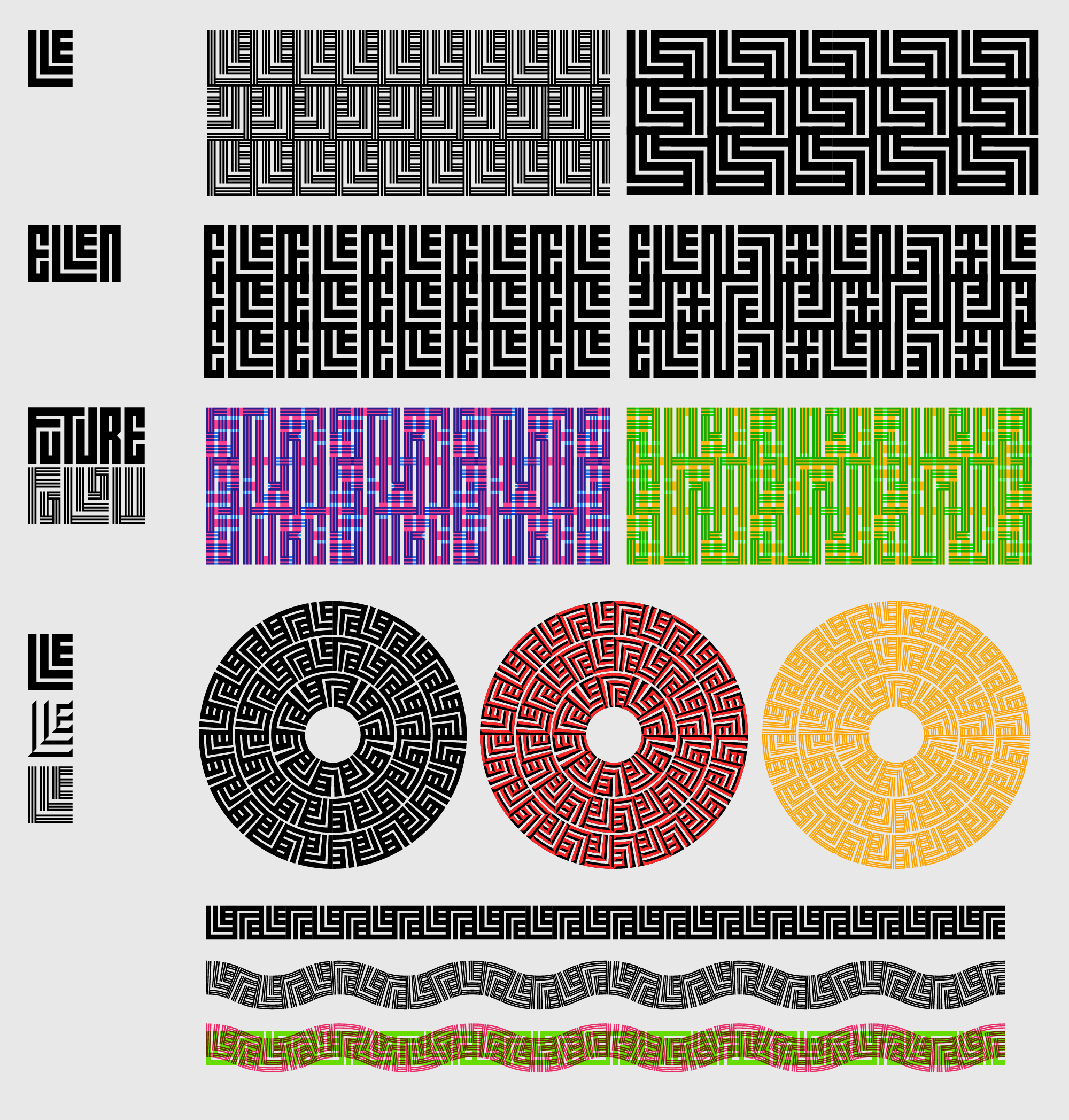
Usually typefaces are designed with a specific use in mind. With Calcula, the end result was unknown to me. Because of how closely it follows the rules of Geometric Kufic, an interesting side effect of this typeface is that it lends itself very naturally to creating geometric patterns. Patterns can be derived from single ligatures or entire words. Using Adobe Illustrator’s Pattern Brush tool, even crazier visual possibilities open up. It is interesting to complete something and not know how designers will end up using it.
I would like to extend my heartfelt thanks to Tal Leming for patiently guiding me throughout this four-year process and for undertaking the mammoth task of programming Calcula. Thanks to Peter Biľak for his patience and support and crucial advice. Thanks to Frederik Berlaen for creating the custom scripts that made the new styles possible. And finally, thanks to Ellen Lupton, Jennifer Cole Phillips and Abbott Miller, for their support and guidance for this typeface when it began at MICA.