Eric Gill got it wrong; a re-evaluation of Gill Sans
Gill Sans: Pride of England?
Gill Sans is the Helvetica of England; ubiquitous, utilitarian and yet also quite specific in its ability to point to our notions of time and place. As a graphic designer’s in-joke once put it ‘Q. How do you do British post-war design? A. Set it in Gill Sans and print it in British Racing Green’. As the preferred typeface of British establishments (the Railways, the Church, the BBC and Penguin Books), Gill Sans is part of the British visual heritage just like the Union Jack and the safety pin.
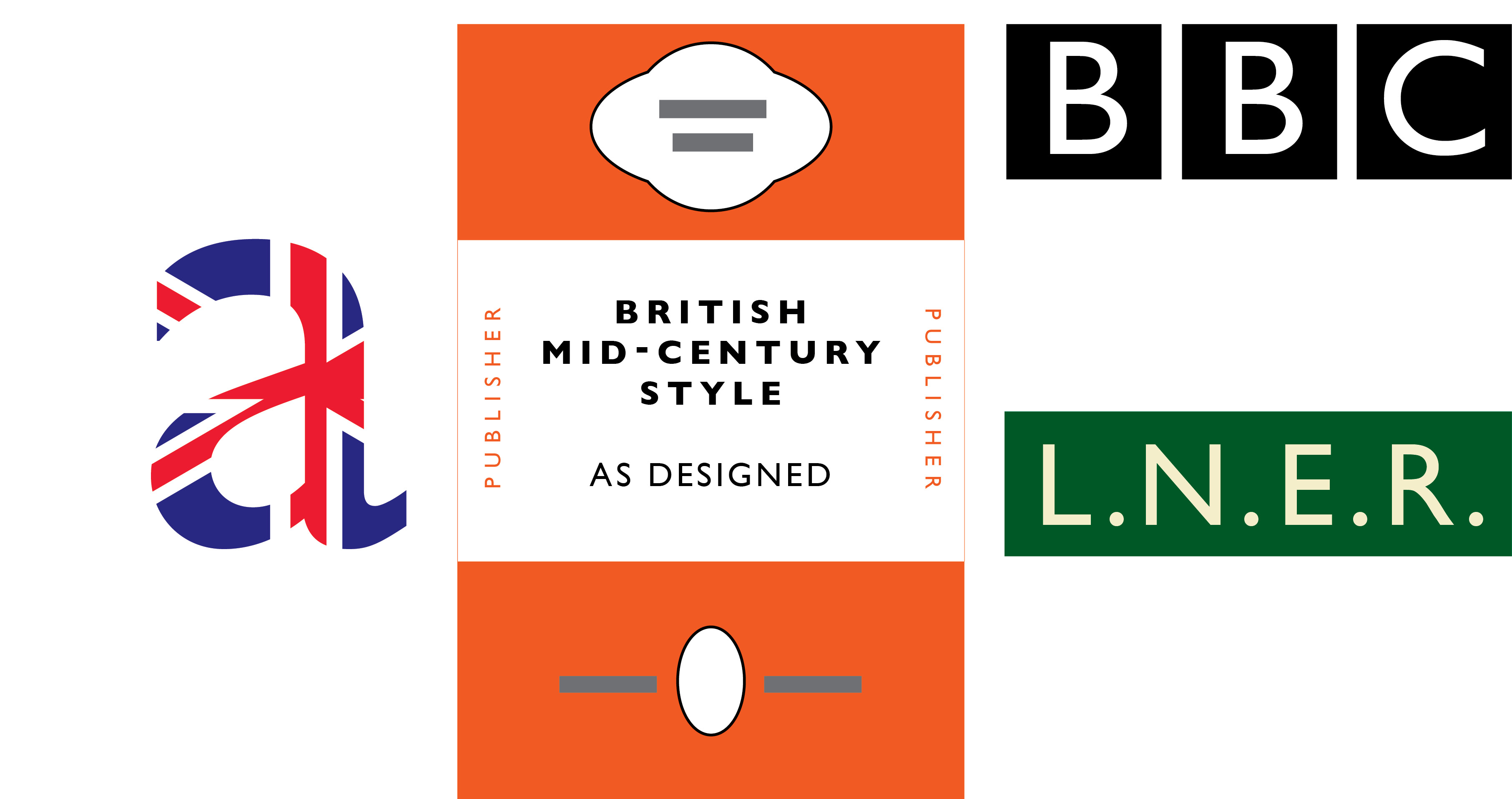
Icons of the British mid-20th century.
So to pick an argument with something that is akin to a typographic national monument might appear unwise; it is so very much ‘ours’. But it is a flawed masterpiece. How flawed? Well, monumentally flawed, in fact. In 2006, now that Gill Sans is distributed freely with Apple’s OS X and Adobe’s Creative Suite products, it is time to re-examine those flaws. Ever since Gill Sans was incorporated into the Adobe/Linotype library in the early 1990s what used to be Monotype Gill Sans became GillSans. The new compound name and the missing foundry attribution serves to distance today’s users of this type from any awareness that Monotype used to issue Gill Sans in a range of different series with alternate cuts. Readers with experience of metal and phototypesetting may recall this system, but for now, the majority of us only have this ‘bundled’ version of GillSans to go by.
The older Gill Sans MT appellation and Monotype icon set.
Since the inspirations of Optima (1958, by Hermann Zapf) and Syntax (1969, by Hans Eduard Meier), there has been a steady rise in the number of sans serif faces that have a humanistic structure and are good for a variety of tasks. FB Agenda (1993 by Greg Thompson), Bliss (1996 by Jeremy Tankard) and Fedra Sans (2001 by Peter Bilak), are some of the recently-produced typographical riches that all owe some part of their provenance to Edward Johnston’s sans serif lettering for the London Underground in 1916 – a project that the younger Eric Gill briefly assisted on and freely acknowledged as being the original model for Gill Sans.
[signup]However, writing his Essay on Typography in 1931, Gill claimed that Johnston’s letters were not entirely satisfactory or ‘fool-proof’, and that his new Monotype Sans Serif, the prototype of Gill Sans, was superior. Although other writers have celebrated the individual qualities of Gill Sans Q, R, a, g and t, as designs in their own right, I contend that the majority of character shapes in Gill Sans are actually worse than in Johnston’s design of fifteen years previous. Gill Sans achieved its pre-eminence because of the mighty marketing clout of the Monotype Corporation and the self-serving iconoclasm of its author. Thus, rather than Johnston’s lettering, it was Gill Sans that became the English national style of the mid-century. There were other, arguably better, typefaces derived from the ideal of making a monoline sans serif based on humanist structures. That this project has returned to inform some of the really great type design of the last fifteen years is a testament to how the problem was not solved in 1928.
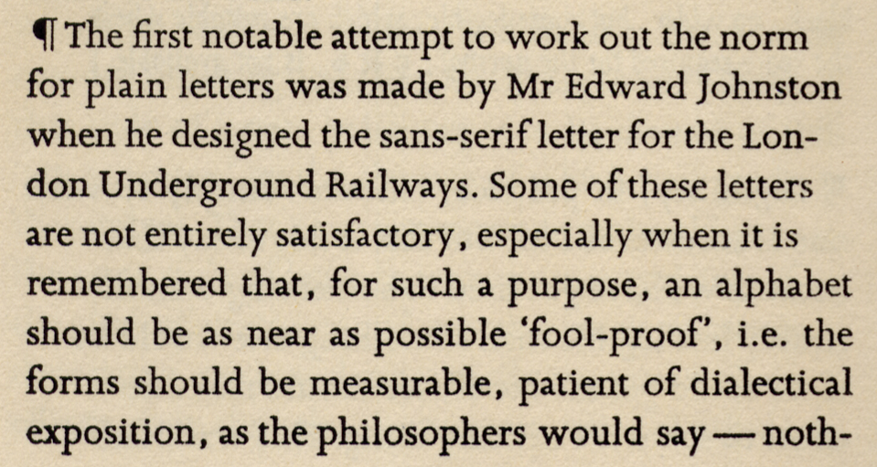
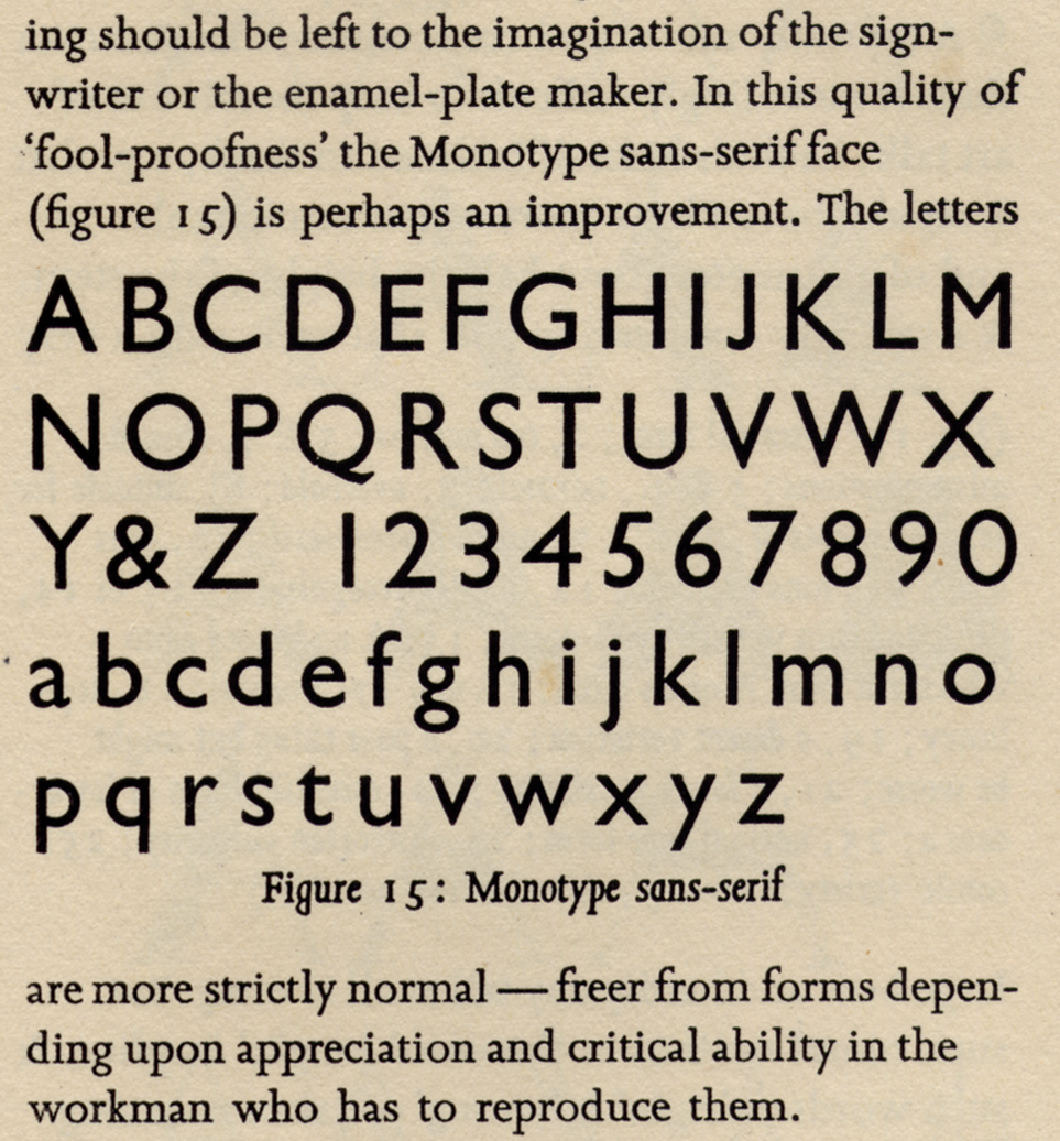
The claim made against Johnston’s earlier design; pages 48-49 of Eric Gill’s Essay on Typography.
Origins of Gill Sans in Johnston.
Like Johnston’s Underground lettering, Gill Sans began life as a piece of signage, a fascia board for the shop of Douglas Cleverdon. To complement the exterior signage, Gill produced a smaller alphabet in a blank book intended as a guide for Cleverdon to make future notices and announcements. To be fair to Gill, the initial intention was perhaps quite casual – but the result was seized upon in such a way that it forced Gill to step into Johnston’s shadow, on a commission that was to have far wider implications. Gill’s patron, Stanley Morison, as advisor to the Monotype Corporation, was probably the single most powerful individual in British typefounding in the 1920s. Gill knew that despite an existing commission for the serif face Perpetua, his working relationship with Morison, and his wider reputation with Monotype, the trade, and ultimately the reading public, would come to rest on this design. In the face of this, Gill may have deemed his relationship with both Edward Johnston and his style of lettering expendable, but the evidence suggests that Eric Gill was ‘learning on the job’ with this assignment.

Three variants of lowercase ‘a’; the more rational forms are the ones that didn’t make the final cut.
There are three developmental forms of the Gill Sans lowercase ‘a’ on record; revisions were made at the Monotype drawing office and passed back to Gill for approval. The original design for ‘a’ is strikingly similar to Johnston’s (as might be expected), followed by a second attempt which was put into production and can be seen on early specimen sheets. The third and least satisfactory character is seen in all versions of Gill Sans since the early 1930s. Stylistically it calls into question Gill’s deletion of the foot serif for the lowercase ‘l’ in Johnston’s model – a feature which had an essential function within that alphabet, as it allowed distinction between the numeral 1, uppercase ‘I’ and lowercase ‘l’. In Gill Sans (appointed typeface to a nation of shopkeepers), this feature is absent and Monotype were obliged to produce a complete alternate cut for Gill Sans, designated ‘F’ that included a ‘proper’ numeral 1 that could be used for numerical setting, such as shop window prices and timetables. This tradition, upheld by Monotype until the early 1990s, was not carried forward to Adobe GillSans.

Comparison of lowercase l, i and numeral 1 in Gill Sans and Johnston.
Gill obliterated the terminus endings of the vertical stroke in ‘b’, ‘d’, ‘p’ and ‘q’; the Monotype drawing office again came to his assistance and revised the forms so that they were preserved in the medium weight (this can be seen on early samples of the series 262). Today however, this feature only persists in the lightest weight of the digital GillSans.
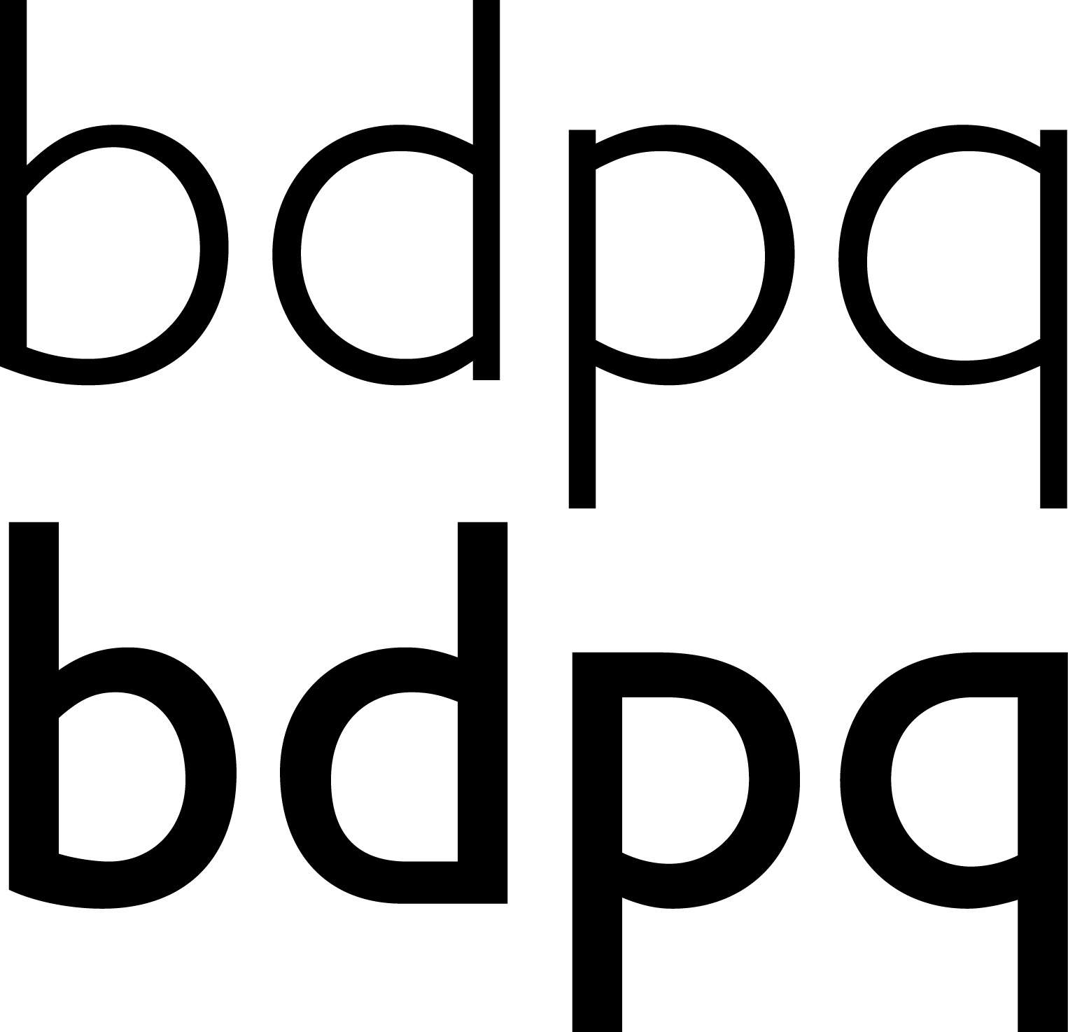
Gill Sans Light (above) and Gill Sans Regular (below); flattening of the bowls and subsequent loss of terminal stroke details in lowercase ‘d’, ‘p’ and ‘q’.
The Gill Sans ‘g’ is another instance of ‘do as I say not as I do’; elsewhere in Gill’s Essay on Typography is a diagram of the forms of lowercase ‘g’ accompanied by the sneer “…comic modern varieties – as though the designer had said: A pair of spectacles is rather like a g; I will make a g rather like a pair of spectacles.” Sebastian Carter, writing in ‘Twentieth Century Type Designers’, called this the ‘eyeglass g’, claiming that it had been kept and improved from the Johnston alphabet. Looking at the original trial drawings for this ‘g’ in which the link is weaker, longer and the bowl correspondingly lower, it is easy to rebut this argument. The directional stress of the lower bowl is not consistent from weight to weight in Gill Sans, and it changes form entirely (to a continental or italic g) in the Ultra Bold weight; the fatness of the letter does not allow four strokes and two counters to fit within the allotted vertical space.

Variation of the directional stress from weight to weight of Gill Sans in the lower bowl of the ‘eyeglass g’ – no longer ‘eyeglass’ or double storey by the time it becomes Ultra Bold.
The lowercase ‘y’ was designed with a straight descending tail which makes the character appear rigid and unbalanced. This feature, like the overdrawn arms of ‘a’ and ‘r’ with their conflicting terminations, puts paid to any notion of rhyme or reason in the ‘improvement’ of the ‘unsatisfactory’ Johnston letterforms. The question to ask is this; if Gill found it necessary to introduce his (strictly unnecessary but aesthetically defensible) curves into the tail of ‘Q’ and the leg of ‘R’ in the uppercase, where none had been drawn in the existing model, why did he find it expedient to remove the existing curve (which was both necessary and defensible) in the tail of the lowercase ‘y’?
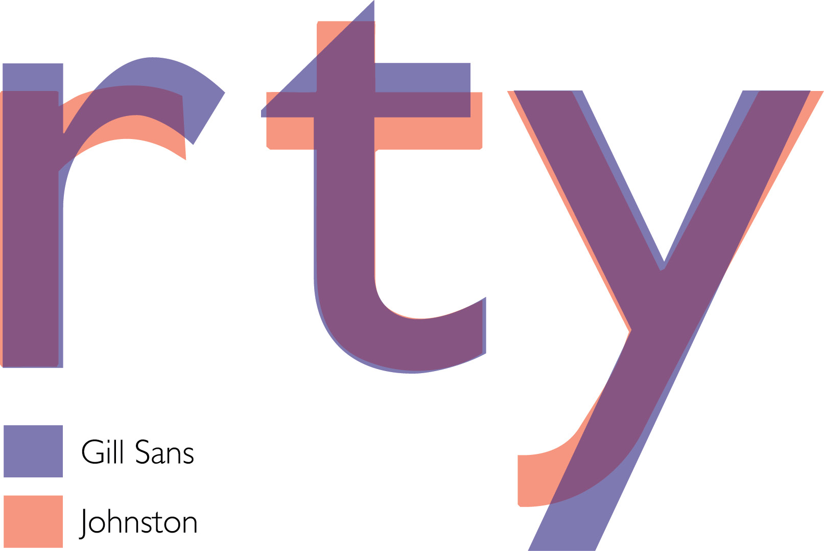
Examples of conflicts in stroke terminations; lowercase r, t and y compared.
Gill Sans is the ‘New Black’: Revival or Reaction?
One of the abiding eccentricities of Gill Sans is that its range of weights appears darker and less evenly distributed than any comparable face (even Futura is better moderated in this respect). Gill Sans Light (series 362) may equate to the book, normal or even the regular weight in other typefaces, just as Gill Sans Medium (series 262) looks like boldface in comparison, and Gill Sans Bold (series 275) is already well on the way to what Gill himself called Gill Sans Double Elefans. A likely reason for this is that Gill, as a stonecarver and sculptor, had his ideas about the apparent desirability of darker types formed by the ideals of the Arts and Crafts movement of William Morris nearly 50 years earlier. However it is perfectly clear from reading Gill’s own Essay on Typography what he thought about the advisability of making extra bold weights of display typefaces: “…as many different varieties of letters as there are different kinds of fools. I myself am responsible for designing five different sorts of sans-serif letters – each one thicker and fatter than the last because every advertisement has to try and shout down its neighbours.”
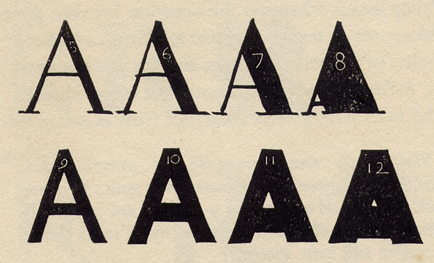
Diagrams of how not to make letters – 7, 8 and 11 are ‘overbold’, 12 is ‘hardly recognisable’; page 51 of Eric Gill’s Essay on Typography.
[social]This is why series 442, the Ultra Bold weight, is otherwise called Kayo for ‘knockout’ – it was envisaged as an (English) heavyweight champion capable of slugging it out with (German) Futura Extra Bold. Elsewhere Gill labels his diagrams with terms ‘sans overbold’, ‘hardly recognisable’ and ‘fatuous’, to drive home his point about the distortion of letterforms in the heaviest weights. Yet this is exactly what happened to Gill Sans – rather than refuse commissions for Extra Bold and Ultra Bold (well beyond the weight of what was considered normal), he continued to draw up and deliver designs that he knew to be aesthetically unjustifiable.
Aside from inconsistencies of the weights in Gill Sans, Gill changed proportions between capital height, stroke width and character width. This leads me to disagree with the many descriptions of the design of Gill Sans that still contend that the typeface is “based on Roman character shapes and proportions” or “does not reject traditional forms and proportions”.

Comparison of uppercase E and F in Gill Sans and Johnston. Shorter middle arms help balance and legibility in Johnston’s case.
This is debatable – only with ‘J’ and ‘Q’ is there a potential argument about their improvement. While most of the uppercase appear compromised against their Johnston counterparts, the significant demonstrations concern the simplest shapes. With uppercase E and F, Gill standardised the length of the lower and middle arms to match the width of the topmost arm, narrowing the overall widths of both letters to compensate. This alters the letterforms’ balance in direct contradiction to the idea that he was somehow preserving classical proportions. While Gill narrowed the proportions of the M, his version of L, N and T are all much wider than in Johnston’s alphabet. Crucially this also makes extra white space around the letterforms – therefore N and T dominate the appearance of Gill Sans with their broad diagonal and open white space, requiring extra care with kerning and letterspacing.

Comparison of uppercase ‘K’ and ‘T’ in Gill Sans and Johnston.
Was Gill Sans ever designed as a jobbing typeface – suitable for a variety of purposes? While Monotype’s older publicity material never claimed Gill as being suitable for extended text setting, tastes and applications have changed; a recent assignment at my University showed nearly a third of second year degree students choosing Gill Sans as a headline and text face for a publication assignment. That the face is now as convenient to use as a Palatino or Helvetica may have something to do with this continued popularity. Identifont.com currently lists Gill Sans at six out of ten most requested fonts. In 2006, with Apple/Adobe GillSans about to amass the ubiquity of a lesser-known Arial, it would be all too easy to forget what came before GillSans. Now that the new OpenType format allows for extensive support including alternate sorts and contextual spacing, the typographic community should look forward to a better version of Gill Sans OpenType Pro; perhaps a complete overhaul in the style of Frutiger, Sabon, Optima and Syntax?
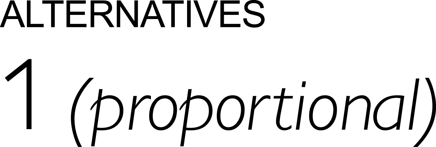
From the Monotype .pdf catalog at myfonts.com; apparently the only alternative glyph in the entire Gill Sans Opentype Pro font is the proportional numeral one.
Meanwhile, students should be urged to approach Gill Sans with caution; it is a hard typeface to use well without making considerable effort. When one’s view of a historic facade includes a very large and well-known monument, it can be hard to see which background details are obscured by the foreground presence, and this is where English sans serif type design has been for the last sixty years.
Light at the end of the tunnel for Johnston?
In addition to sanctioned and licensed revivals such as P22’s London Underground (1997 by Richard Kegler) and ITC Johnston (1999 by Dave Farey and Richard Dawson), a number of recent type designs now remind us of the original beauty of Edward Johnston’s vision rather than Eric Gill’s.

Fedra Sans by Peter Biľak, 2001; diamond-shaped dots show historic character at larger sizes.
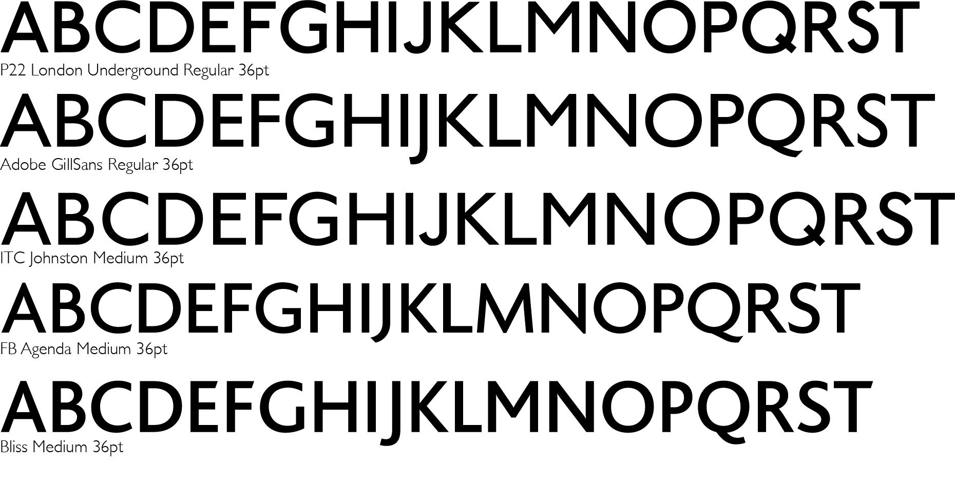
Contemporary sans serifs Bliss and FB Agenda join forces with revivals from ITC and P22.
As reported in issue 58 (winter 2005) of Eye magazine, Jeremy Tankard was commissioned by Sheffield City Council to create Sheffield Sans. Now publicly released as Wayfarer, this type was partially inspired by the spirit of Granby, which had originally been released by the Sheffield foundry Stephenson, Blake in 1930. Created at a time when Gill Sans was the new sensation, Granby was formulated to be the local competition. It’s easy to see from today’s perspective, that to beat the competition, Gill employed a certain amount of bombast and hyperbole to secure critical success, while the Monotype sales force were able to supply volume discounts to institutional customers. In terms of design, however, Stephenson, Blake’s secret advantage may have lain in the fact that they had cut the wooden masters for Johnston’s original London Underground lettering.

42pt Granby in metal from the Stephenson Blake Foundry.
The old metal version of Granby has a faithfulness to Johnston’s proportions and characteristics that Eric Gill missed in such a way as to suggest he did it deliberately. Nearly a century later, Edward Johnston’s pioneering work is still the big noise in contemporary sans serif typeface design. So much for ‘fool-proof’!
Update, 16 March, 2016:
Monotype released the Eric Gill Series including Gill Sans Nova (a long-awaited update by George Ryan) in November 2015 with an exhibition in London’s Brick Lane at the Truman Brewery.
This new release now addresses several of the criticisms made in the original article (2007), including a recognisable numeral 1 and a semi-bold weight – which is very useful when using Gill Sans Light for text setting. This ‘new’ Gill Sans also includes Greek, Cyrillic and many accented characters in the Opentype format, as well as extra sorts and roman numerals, (but no alternative ‘a’ or ‘crotched’ versions of b, d, p or q). This aside, there cannot be any real improvement in the character shapes themselves, precisely for the reasons given in the original article.
References: An Essay on Typography by Eric Gill, J. M. Dent & Sons, London, UK 1931. Reproduced by kind permission of The Orion Publishing Group Limited.
Creative Type by Cees W. de Jong, Alston W. Purvis and Friedrich Friedl. Copyright ©2005 Thames & Hudson Ltd, London, UK 2005.
Device Fonts: 10 Year Itch 1995-2005 by Rian Hughes, Device Ltd, London, UK 2006.
Johnston’s Underground Type by Justin Howes. Capital Transport Publishing, London, UK 2000.
Lettering Alphabets (Third Edition) by Alfred Bastien. Bastien Brothers, West Drayton, Middlesex, UK 1948.
Specimens of Type from the Stephenson Blake Foundry St. Bride Printing Library, Corporation of London, UK retrieved October 9 2000.
Specimens of Type from the Monotype Foundry St. Bride Printing Library, Corporation of London, UK retrieved October 19 2006.
The Encyclopedia of Typefaces (Second Edition) by W. Turner Berry, A. F. Johnson, W. P. Jaspert. Blandford Press, London, UK 1958.
The Letterforms and Type Designs of Eric Gill by Robert Harling, David R. Godine, Boston, USA 1977.
Three new typefaces for local institutions draw on Sheffield’s cultural and typographic history by Catherine Dixon and Phil Baines, Eye Magazine issue 58, Haymarket Publishing, London, UK. Winter 2005.
Twentieth Century Type Designers (Second Edition) by Sebastian Carter, Lund Humphries Publishing, London, UK 1995.