Letter Fountain, book review
Letter Fountain [on Printing Types]
by Joep Pohlen
Taschen, £44.99, €49.99, US$69.99
Who is the audience for today’s typography textbooks? Are they aimed at tomorrow’s practitioners, the students — or their educators? For anyone unable to travel to the Netherlands to see the Tholenaar type specimen archives, the Tetterode collection at the University of Amsterdam, or the work of Gerard Unger and others, the armchair tourism of Letter Fountain represents a particular kind of bargain.
My first reaction to seeing the fourth Dutch edition in the bookshop of the Graphic Design Museum in Breda on a study trip in February was to wonder when it might become available in English. Occasionally, an inability to read a text advantages a purely visual reckoning of the design, and Letter Fountain certainly passes this test. Thanks to Taschen’s new foreign-language editions, not just English typophiles, but Spanish, French and German ones too, will be able to study Letter Fountain this year.
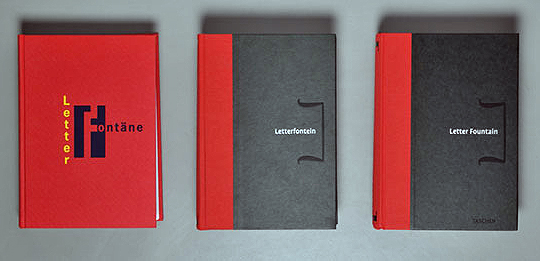
1996 Fontana Publishers edition (left), 2009 Fontana Publishers fourth Dutch edition (center), 2011 Taschen foreign language edition (right)..
This book offers a view of Dutch pedagogic concerns with undergraduate typography present since Letter Fountain’s inception date in 1994. This began with a conversation between Joep Pohlen and Geert Setola, who was teaching typography at the Academy St Joost in Breda at the time. Together forming Fontana Publishers, these two designer-educators managed to author, produce and sell over 15,000 Dutch, German and French copies within six years. When Pohlen subsequently explained that he still wanted to expand and revise the book, Setola left him to it and the book increased to its current extent. Despite winning both a coveted German Red-Dot Communication Design Award and a TDC Certificate for Typographic Excellence in 2010, Fontana ultimately couldn't afford to translate, publish and distribute it in any other language markets. Taschen, however, as a truly international publisher, has both the ability and desire to do this, and should be congratulated for producing a book so different from their usual style. The result could be termed a win-win situation.
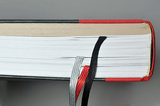
One of the drawbacks of bigger and cheaper print-runs; the binding of the current English edition (printed and bound in China) is inferior to the Dutch edition from 2009 (printed and bound in the Netherlands).
So Letter Fountain’s aims are broadly threefold. Firstly, to put printed type specimens in front of students despite the growing scarcity of printed specimen books freely available from the larger suppliers. Secondly, to contextualise contemporary European type design by telling the story of the institutional mergers and acquisitions that have shaped the historical corpus of type designs that has come down to us today. Thirdly, to provide a comprehensive general primer itemising type anatomy, historical development, classification, measurement, selection and usage, along with a survey of near-contemporary font formats, type designs, foundries and designers.
[signup]This ambitious scope presents as a kind of compendium; the book, which could have been designed casebound as three separate volumes, runs to 640 pages and is 5cm thick. Three ribbon markers are provided for part one, the main text (220 pages), part two, the type specimens (276 pages) and part three, the indices (144 pages). Despite this offering several ways into the book, its sheer extent may prove such a daunting prospect for today’s undergraduates that perhaps its true market is the faculty and postgraduate student alumni. Academic interest is running high, as the reality of global English and economies of publishing mean that very few Dutch books on typography escape their native market, however much their reputation precedes them.
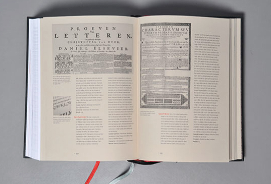
The comprehensive Index of Type Companies in the third section of the book is illustrated by historical type specimens. Many of these photos of the type specimens are also available online.
Whether or not Letter Fountain is ‘the ultimate typeface reference guide’ is open to interpretation, however. It is not an exhaustive survey of a single supplier’s inventory like FontShop’s massive FontBook, nor is it the painstaking analysis of a single designer’s output like Adrian Frutiger: The Complete Works by Philipp Stamm and Heidl Osterer. Instead, Letter Fountain has stayed true to its original purpose as a reference work, and employs a multi-purpose approach to the subject. Therefore it has commonalities of argument and method with other type reference books such as Karen Cheng’s Designing Type, Phil Baines and Andrew Haslam’s Type & Typography and Lewis Blackwell’s 20th Century Type: Remix. Chief among these are the oft-repeated arguments about the need to extend the Vox classification system into something called Vox+, Hans Peter Willberg’s suggestion for an alternative classification schema, followed by fifty pages of letterform comparison and analysis.
Letter Fountain’s strength is that as a survey it stands independently of any one supplier — and does a credible job of providing an overview of European typographic development since Gutenberg. Its textbook function is evident in the contextual diagrams and illustrations — including a visual timeline that correlates historical type designs with landmarks in fine art and design movements. This is reinforced by the fascinating and well-illustrated Index of Type Publishers (with an accompanying timeline) in the back section of the book, which, for this reader, represents the clinching argument for buying this book.
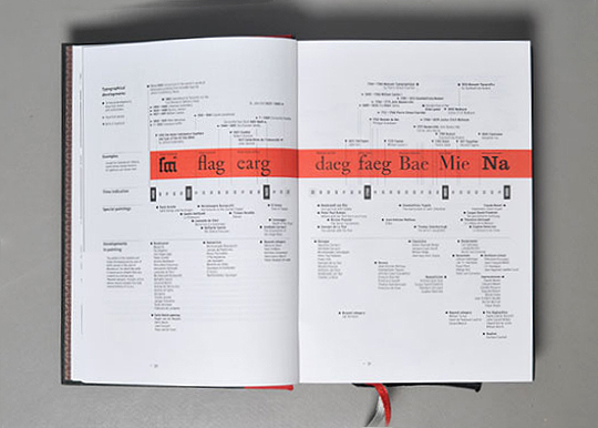
Timeline diagramming the evolution of European typography from 1450 to 2006 and showing landmark moments in fine art history.
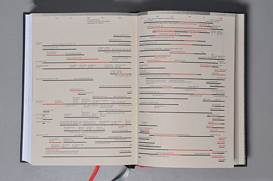
Timeline of Type Publishers — a visualisation of the Index of Type Companies.
[social]Letter Fountain uses the same format and paper stocks as last year’s award-winning Dutch fourth edition. The main text is set in Martin Wenzel’s FF Profile, with captions and indices throughout in Tobias Frere-Jones’ Interstate Light Condensed. Pohlen clearly has skill as a book designer, supplying intricate examples and both typographic and photographic illustrations in red and black throughout, without losing pace or cohesion, although the proximity of captions is not always what it might be. His rigour certainly comes into play with the design of the type specimen pages in part two, where comprehensive showings of thirty five classic typefaces (thirteen serif, nine sans ‘classics’ and twenty two scripts, monospaced fonts and dingbats) are displayed in a variety of sizes and styles, supported by keyboard charts for the non-alphabetic samples and no less than six alternatives suggested and shown for each of the text faces.
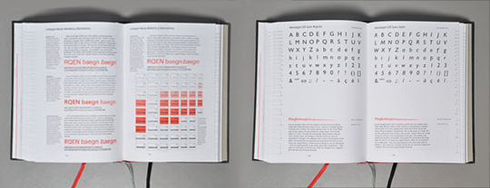
The type specimens featuring 35 classic typefaces in the second section of the book.
Letter Fountain’s weakness is (perhaps unsurprisingly) in its scope and size. Without adequate editorship and translation, this already sizable project suffers from repetitions, omissions and mistranslations in the text. Some, such as the charming use of the definite article for many typeface names, is understandable. For a subject with such a diverse and arcane terminology this was always bound to be a problem, particularly in translation. It must be acknowledged that just as English and American typographic practice and terminology differ, there will never be a ‘one size fits all’ solution to this problem; any typographic primer intended for both audiences must acknowledge the differences and state them accurately.
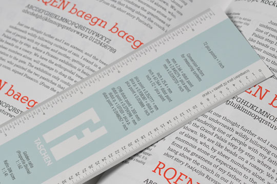
Typographic ruler with different units of type measurements.
As a bonus, the book includes an inserted typographic ruler calibrated in four different units of measure (inch, Anglo-American Postscript point, Didot point and mm) that supports Pohlen’s arguments for using both mm and points in designing typographic layouts. Unfortunately, this will be the first item likely to go missing from the college library copy.