Microtypography, Designing the new Collins dictionaries
Then and now
One of the surprising things about researching a new dictionary design was to discover just how little it had changed – on a macro level – over the last 250 years. There is quite a difference in feeling between Samuel Johnson’s Dictionary of 1755 and today’s Collins English Dictionary, but the structure of information and the way in which it is made visible are identical. The two- or three-column grid with its three-letter column headers, the outdented headwords, the cascade of entries and quotes; all these are familiar elements of contemporary dictionaries.
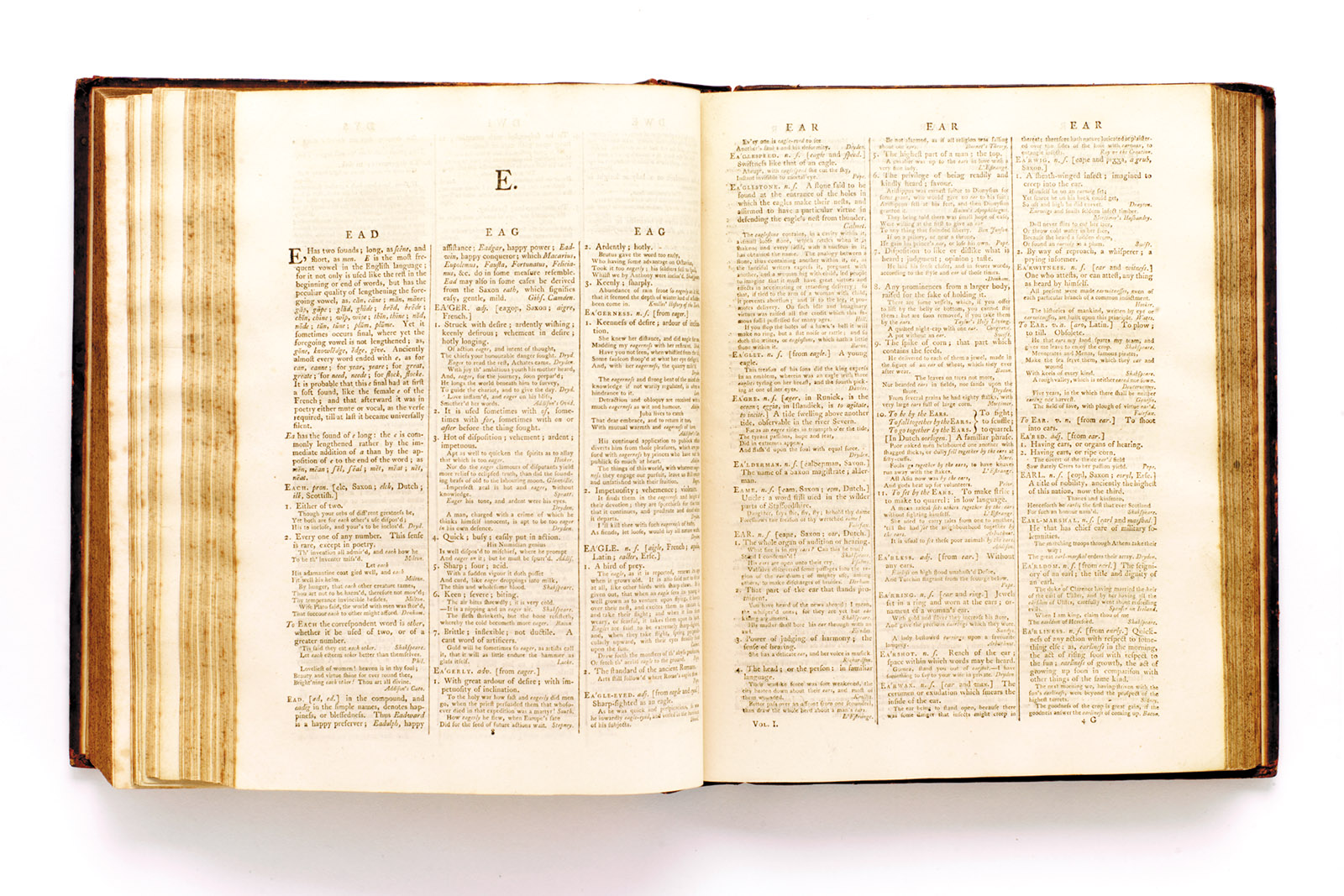
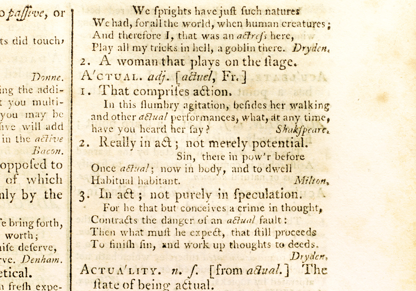
Samuel Johnson A Dictionary of the English Language. Headwords and entries 10pt; quotations 7 pt.
On a microtypographic level however, there are some differences. Dr Johnson’s compositor didn’t have a bold weight to separate headwords from entries, or a sans serif for related words; instead the hierarchies were expressed through capitals, small capitals, changing sizes and italics. Although the word count is about the same, the new dictionary reflects a general tendency towards use of lower- or upper and lower-case forms for headwords, in a bolder and often sans serif type, slightly larger than the entries, instead of varying between capital, roman and italic forms at the same size and the same weight, with detail expressed by a reduction in size.
Minimum type size is also a very interesting question. It might be assumed that better glasses and contact lenses would lead to a greater capacity to read small type, yet some of the historical dictionaries and bibles I’ve seen contain type that is extremely small by any standards. A dictionary like the Collins Household Dictionary of 1859 is quite difficult to navigate and read, with its 6pt type, lack of differentiation in weight, and column rules.
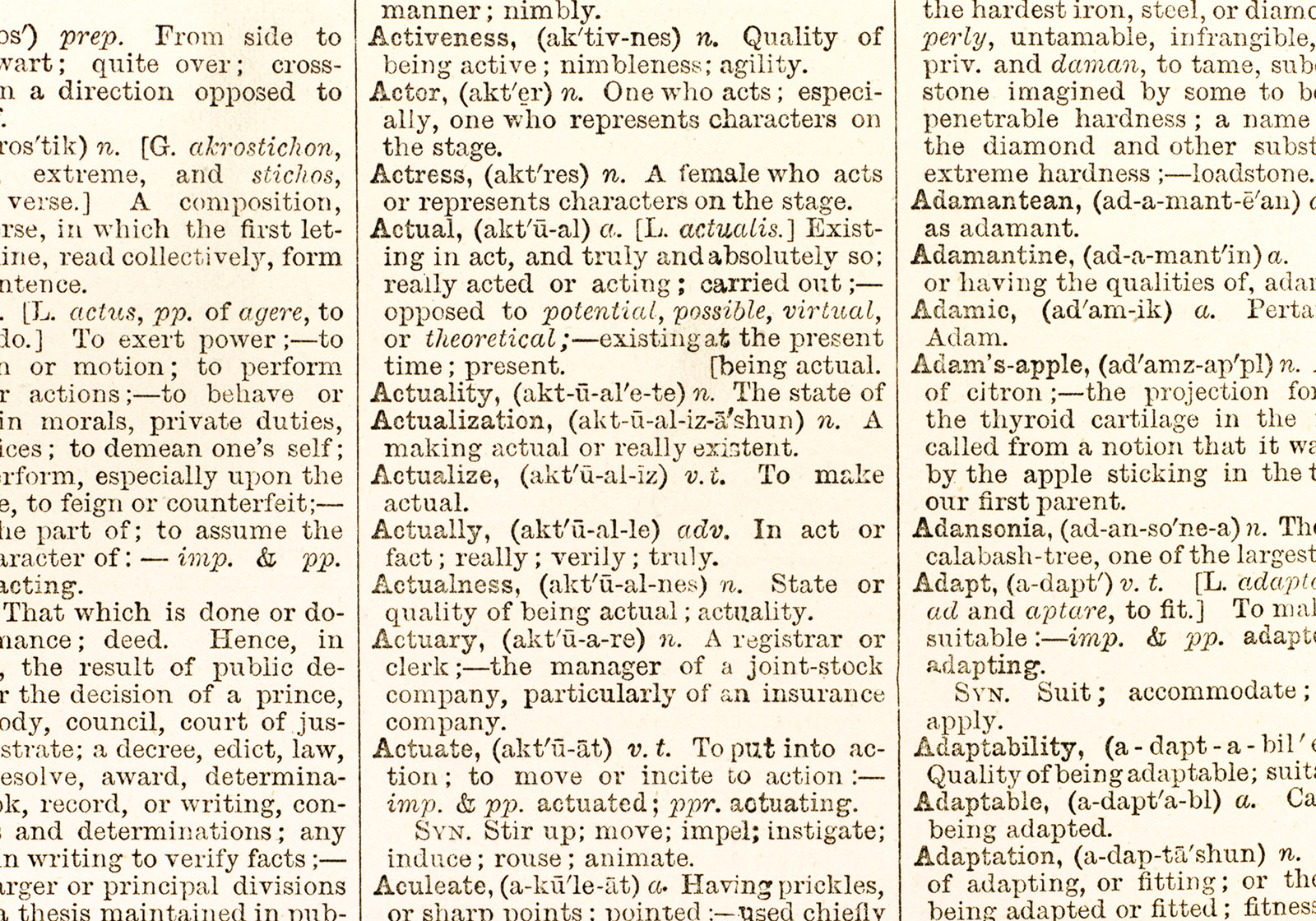
Collins Household Dictionary, 1859, detail. Type about 6pt; no differentiation in size between headwords and entries.
Collins went the other way with the Graphical Dictionary of the later nineteenth century. The relatively huge headwords must have been very popular, because this basic design lasted about 40 years. At about this time Collins styled itself as the Clear-Type Press, a claim it could make with its strong type and solid black printing. The Collins Gem dictionaries were pocket-sized and cheap; this one uses a 6pt type, set solid. But although the Collins Modern University Dictionary of 1939 used the same type, its design used indented and capitalised headwords – a backward step after the earlier supersize all lower case headwords and then the outdented and bold headwords of the Gem.
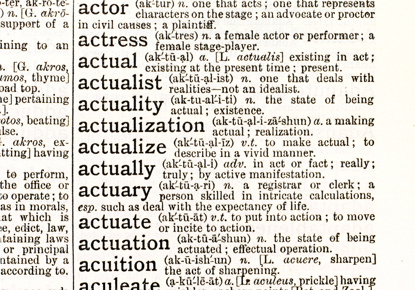
Collins Graphical Dictionary, 1890s, detail. Headwords about 13pt; entries about 7pt.
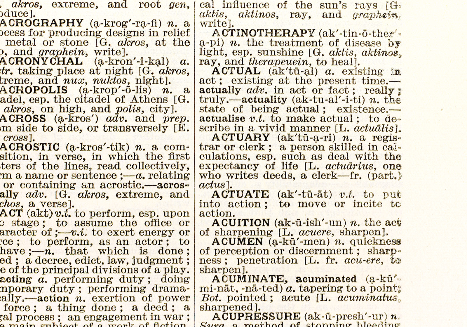
Collins Modern University Dictionary, 1939, detail. Headwords and entries about 7pt.
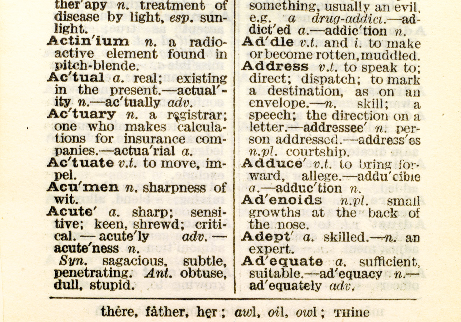
Collins Gem English Dictionary, 1936, detail. Headwords and entries 7pt.
The 1950s-70s saw a kind of new sobriety amongst dictionary publishers, although the typographic means didn’t always appear to be adequate for the issues of clarity and navigation that the dictionary presented. Entries like that for ‘call’ in the Collins Paperback English Dictionary of 1986 clearly show the struggle for legibility and the limitations imposed by justified typesetting and lack of distinction in the italic.
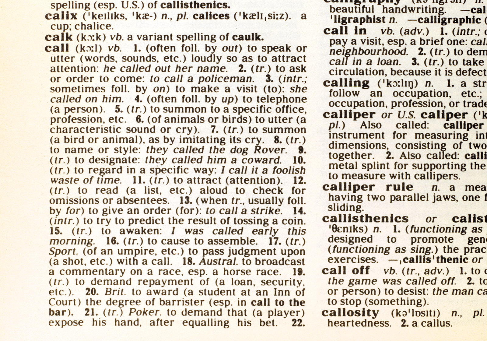
Collins Paperback English Dictionary, 1986, detail.
Then suddenly around the mid-1980s it all seemed to take off in the opposite direction. Instead of calmly stating itself, the dictionary became a kind of supermarket of features. Seemingly this was a sales-driven development. What had happened was that there was a lot of convergence in the different products on the market – they were all basically the same. Publishers were looking for something with which to distinguish themselves from one another, so they began to add ‘features’ such as usage notes and info panels, each was which was very clearly flagged. Eventually things that were not really ‘features’ at all started to become more visible – things like the number of different senses of one word, or a list of related words, which are really just part of the dictionary. The purpose of all of this was to gain some competitive advantage as well as improving the dictionary’s usefulness… but the result was that the dictionary publishers ended up looking at each other as much as at the reader. If one introduced a second colour for headwords, which is quite expensive in a 2000-page book, next year the others would too. In a market which is by nature convergent, the various players had struck out individually, but ended up on the same track, looking the same and saying the same thing.
The result of this convergence was that the pages of dictionaries were decorated with handfuls of icons and symbols, each advertising itself louder than the next. Some of these pages look like summer rain on a hot pavement; others like a kind of camouflage. The whole thing was getting more and more decorative, and finding your word on the page was getting harder.
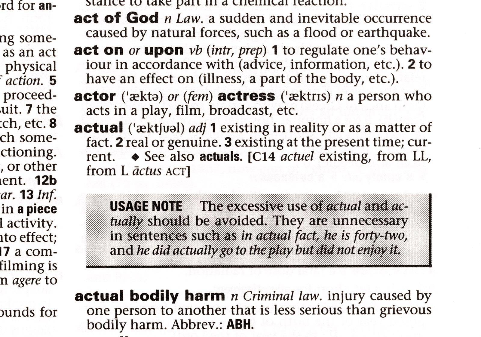
Collins Concise English Dictionary, 1998, detail.
This was the situation in 2004, when Collins decided to review the design of its dictionaries as part of a complete redesign of its presence in publishing.
Design
The first title in the redesigned series is the concise format, with around 2000 pages at 234×153mm. To reflect the format and its content, which includes internet addresses as well as an internet-linked cd-rom, this had been renamed as the Desktop edition. The rest of the Collins dictionary series includes one larger and many smaller editions, right down to the Gem format; there are also different levels at many of the formats, for example school and student levels. Then there is a very wide range of bilingual dictionaries, again at various formats and levels, and a number of specialist dictionaries for Scrabble, crosswords and so on. Altogether there are around 150 Collins dictionaries published each year.
One of the guiding principles of the new design is economic: the new dictionary must run to the same number of pages as the old, even though there’s more content. So for every square millimetre of white space I wanted to add, the text design had to be that much more efficient. In fact the white space was already there in the previous edition, but it was trapped in places like excessive word spaces in lines of justified text, or extra space between definitions to allow for enlarged headwords.
The new design is ranged left, and therefore has consistent word spacing. This makes sense in a dictionary: with a fairly narrow measure and most entries being just a few lines, justified setting is prone to very large and irregular word spaces. Ranged-left type is more even and controllable in colour; equal word spacing in itself makes texts easier to read, and the voicing is more consistent.
In almost all contemporary dictionaries the headwords are significantly larger than the entry type, as well as being much bolder. These headwords demand extra leading above to avoid crashing into the descenders of the preceding entry. Since the number of entries varies from one column to the next, existing dictionaries have vertically justified the columns by adjusting the space between entries. The new design’s headwords are slightly larger than the entry type, but not so much that they need extra leading. The fixed baseline grid and consistent leading mean that the lines of type back up properly recto to verso, with the effect that the interlinear space is whiter and has more contrast with the type, preserving the even colour of the text and helping the eye to distinguish between lines.
I repurposed the white space gained through consistent word spacing and leading to restore some proper margins to the page. Past attempts to squeeze in as many words as possible had led to the page margins being more or less determined by the printable area and trim tolerance. This created particular difficulties in the inner margin, which in many cases was much too narrow for a book with 2000 pages and correspondingly deep curvature into the gutter. As well as climbing out of the gutter, I wanted margins with some sense of proportion to each other, that would give a feeling of positioning on the page – the classical idea that there should be a progression to these proportions, and that they depend on how the book is to be read. And in any case I wanted to use them for navigation.
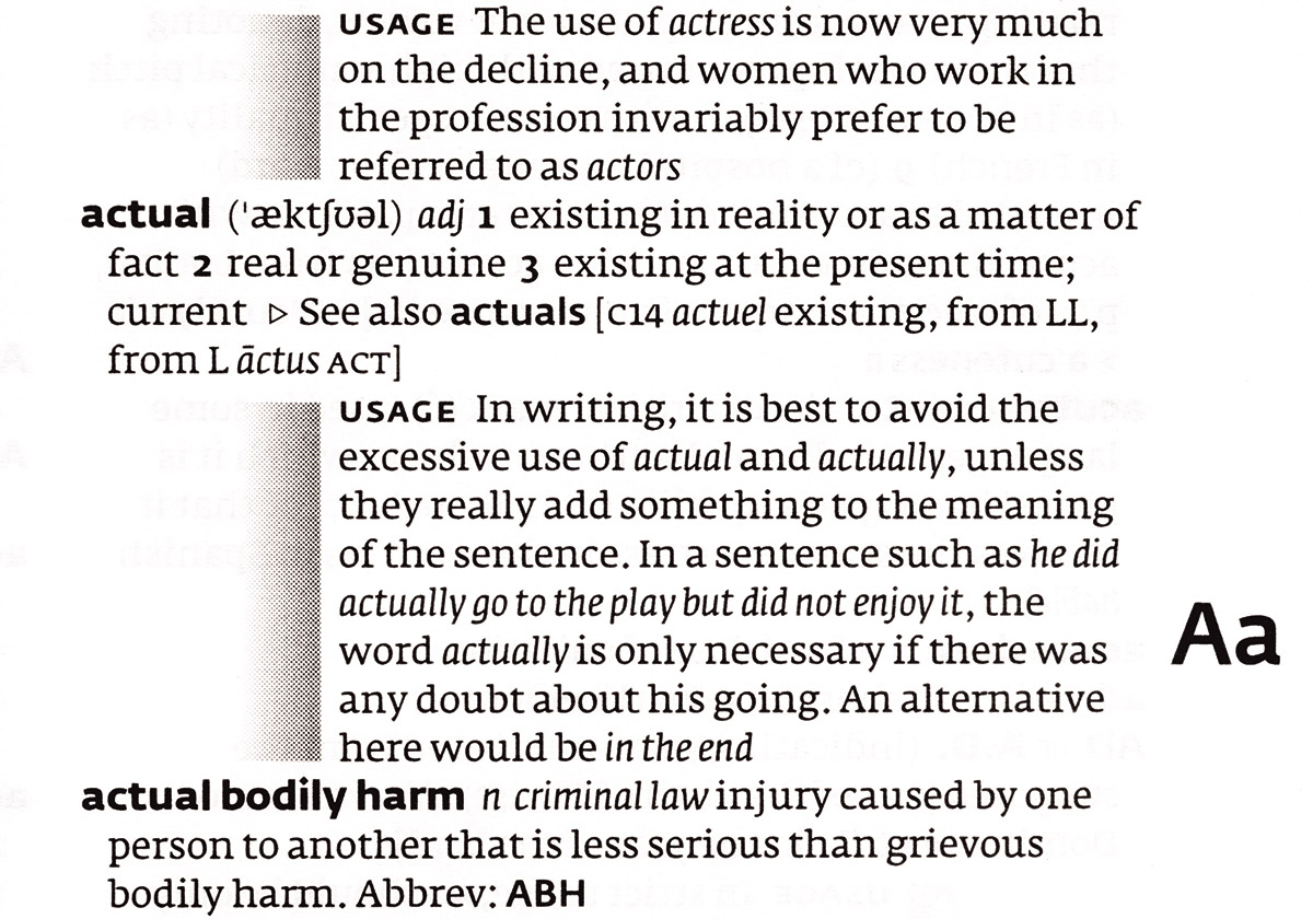
Collins English Dictionary, Desktop Edition, 2004. Treatment of info panels and usage notes.
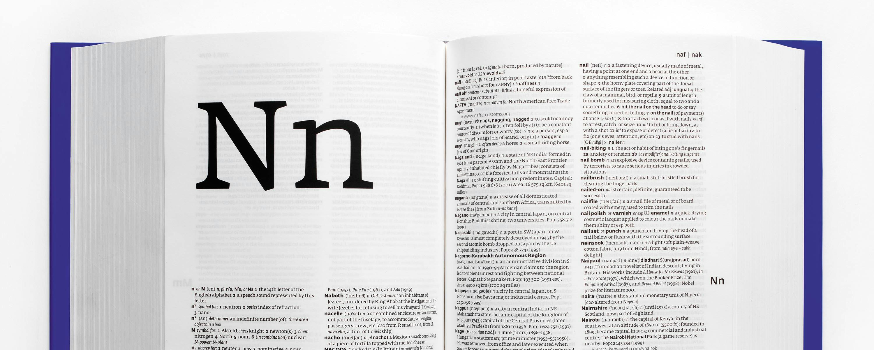
[signup]I wanted to make the process of using the dictionary more intuitive, in terms both of reading and navigation. The heading letters in the new design are shown in upper- and lower-case forms, in half a page of white space. I added running letters, again in both upper- and lower-case forms, in a fixed position in the outer right margin; these allow the user to mine down through the pages while the eyes remain still, like a flick-book. At the outer top of each page is the range indicator, which follows a convention that goes back to Dr Johnson’s dictionary and further, in taking the first three letters of the first and last headwords on the page.
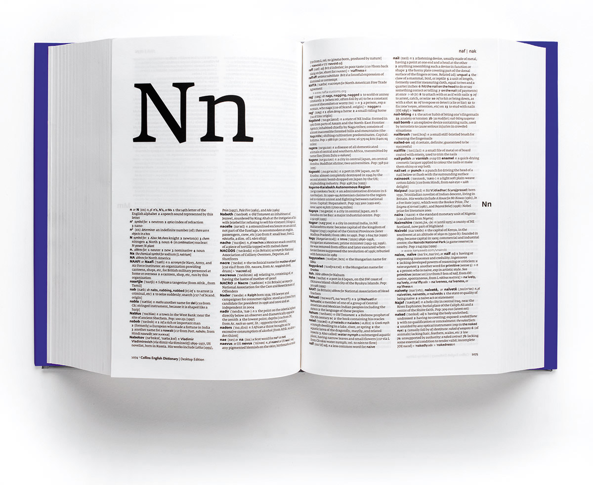
Collins English Dictionary, Desktop Edition, 2004. Each letter is introduced with the capital and lower-case letterforms in half a page of space.
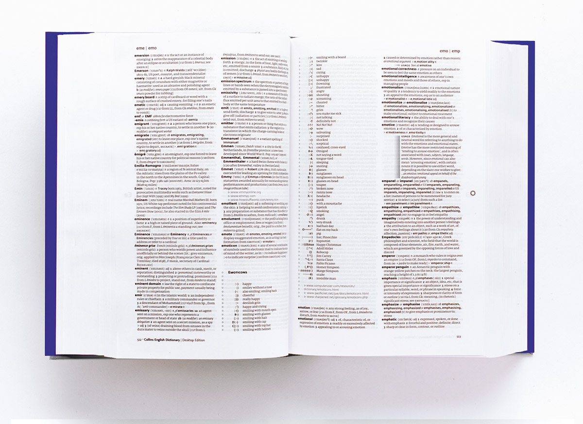
The text design itself breaks the information visually into overlapping planes. The deepest level is the plane of the entries, which is intended to be as even in colour as possible at first sight. Hovering above this grey plane, and slightly offset to the left, is the plane of headwords: much bolder, sans serif and in this case about 8 per cent bigger than the entries. A slight outdent, the width of a lower case n, helps to locate the changing second letters of the headwords. Once the eye is at the destination word, the lower, grey plane is revealed as containing further, more subtle variations. There is a phonetic rendition, equivalent in weight to the entry text. The parts of speech are abbreviated and expressed in italic type. If a headword has multiple meanings or senses, the sense numbers appear in the bold weight of the entry type, both accented and neutralized by extra white space around them. Plurals or related words appear in the medium weight of the sans serif headword type; etymologies in combinations of small and regular capitals, italic and roman. Simple icons indicate new parts of speech or sense, and related words.
Collins English Dictionary, Desktop Edition, 2004. Guide to using the dictionary.
Within lexicography there is a detail area somewhere between orthography and typography, which is concerned with how certain common elements are expressed typographically. What do small capitals mean, or italics? What is the relationship between the information and the typographic language in which it is expressed? Is it a necessary relationship textually, or is it just a change of attitude? These are questions of voicing, and certainly some different voices are needed. In the end I simplified as far as possible by separating the applied and structural information from definition, which has a more narrative expression. So quotations and samples from everyday speech are expressed in italic, as is structural emphasis (parts of speech; subject areas; translations or source words in another language); small capitals are used only to indicate the century of a word’s origin, and related words. Hopefully this has clarified the primary voice of the entries themselves, by stripping away some of the chorus.
However, all this does not mean so much if the text is still choked by punctuation and icons. Because the dictionary is trying to express so many different kinds of information within a standardized form, existing texts had accumulated punctuation as part of their classification systems – very good for keeping each element in its box across the whole dictionary, but quite an obstruction if you are just browsing one word, as well as scattering the page not just with tiny signs but also with the space above and below them. The editors and I decided to strip the text of all punctuation and reinstate only what was absolutely necessary. After that process we dropped, for example, the full point after part of speech abbreviations: its identity already having been underlined by the use of italic, by its abbreviation and by recurrence, there’s no need for a full point after n or vb. Likewise full points after abbreviations in definitions and etymologies. Even full points at the end of entries are not really necessary – the only potential confusion is when there is a closed sentence within the entry, demanding a full point, but even then we found that the point at the end of the final sentence could be omitted without losing sense. Abbreviated informative elements such as ‘Pop’ for ‘population’ do not need a full point followed by a colon – the colon is enough in itself. Indicators like the word ‘history’ at the beginning of etymologies are superfluous if the fact that we have arrived at the etymology is indicated in some other more economical way, in this case brackets.
Removing some of the punctuation and clarifying the voicing typographically helped to give a more narrative, approachable tone to the entries. But there was still a thicket of icons to get through.
By ‘icon’ I mean a graphic element belonging to the language of this particular dictionary or publisher. There are good reasons for the visual interference some of these icons offer – to indicate a sense change for one word with multiple definitions, for example. But it’s not necessary to see this from outside the entry, more that it becomes visible once the eyes are within the entry: a sense change belongs to the word and not to the page. Many of these icons have in the past been standard lozenges, stars or squares. Going back further, a very elegant French dictionary from around 1750 made liberal use of printer’s fists to indicate examples of words in use; use of conventional ornamental sorts was quite common – daggers, asterisks and so on. But more illustrative contemporary icons like a classical portico indicating history, or a keyboard/monitor combination to indicate a url, are at best unnecessary. I have done without, and reduced the others to very simple indicators – a right-pointing triangle in outline and an open arrow, which is the same triangle with one edge removed. The Desktop edition’s internet features are expressed as cascading menus, using the same hollow triangle in an indented context. The advantage of these icons is that they melt into the grey of the text until the reader is actively within it: they reveal themselves when they have something to say.
Probably the most useful of the icons is the one that signifies a note on usage. The existing standard form for these usage notes is a grey box with various permutations of keyline and heading, and text on top. These boxes draw attention to themselves in such a way that things around them tend to suffer. Things on the verso suffer too, because the boxes are often visible through the paper.
In a sense it’s right for these usage notes to have some prominence, because they are dealing specifically with words whose meaning is in flux. Usage notes give a picture of how language is changing, and where it is at the moment. So they need to be set apart, somehow, from the rest of the text, yet without overwhelming surrounding innocent words. I looked at the amount of space taken up by the indents within the conventional grey boxes, and the boxes themselves within columns, and repurposed it into a single vertical statement of almost nothing: just a large indent and a fade into the note, which is simply set in the same type and on the same grid as the entry itself. The effect is that the voicing of the usage note is the same as the entry, but it is still clearly visible. There’s minimal impact on the verso, and the fade enlivens the page and implies movement and change, a theme which echoes the front cover design of these dictionaries.
Looking at the page design through half-closed eyes, the effect of the changes becomes evident. Comparing the design to the previous Collins title, the new design shows an increase in evenness of tone in the entries, and relatively less tonal interference. The usage note has become both integrated and separate at the same time. Against the existing Oxford title the same lack of interference and the absence of such extreme ‘icicles’ of white space (caused by a combination of justification and short lines), give the page a smoother and calmer image.
Microtypography
In the area of the typography, or to be more precise the microtypography – the details of how the signs and spaces relate – there was a chance to create something new. Collins didn’t have a preset look or type; dictionaries were approached more on a case by case basis, although there was some focusing around Stone as a type family. So to be able to create a typographic environment specifically for this situation full of minute details, which is all about legibility and function and giving something to the reader, was a big opportunity.
Like bible and newspaper typography, type for dictionaries is a very specific area with its own formal and detail requirements. It has to be exceptionally clear at small sizes with minimal leading. It must be efficient in terms of characters per line without sacrificing word distinction or appearing too condensed. There must be enough distinction between weights to bring headwords clear of their entries. The colour should not be too black because of show-through. The letterforms must survive web printing on very light paper. The type family must have many members to support various levels of information.
To these general needs I added some further specific requirements: the family would ideally have Cyrillic and Greek variants and a full set of accented characters. There should be sans and serif variants on the same skeleton. There must be full sets of small capitals, and tabular and non-lining figures in all weights. The italic must be complementary to the roman, but distinct and readable in continuous text. A related version that is comfortable for reading in longer passages of text, such as intros and supplements, would be good. An OpenType version will be needed very soon. And on an aesthetic level I was looking for a type that has a sense of openness and clarity, while using familiar letterforms and word images.
Looking back into Collins history, Monotype cut a bible type for Collins in 1929, which was also used successfully in dictionaries. That was a good time for Collins typographically and in design – in 1936 Giovanni Mardersteig cut his Fontana specifically for Collins, the same year as Eric Gill created his Fountain logo for the company.
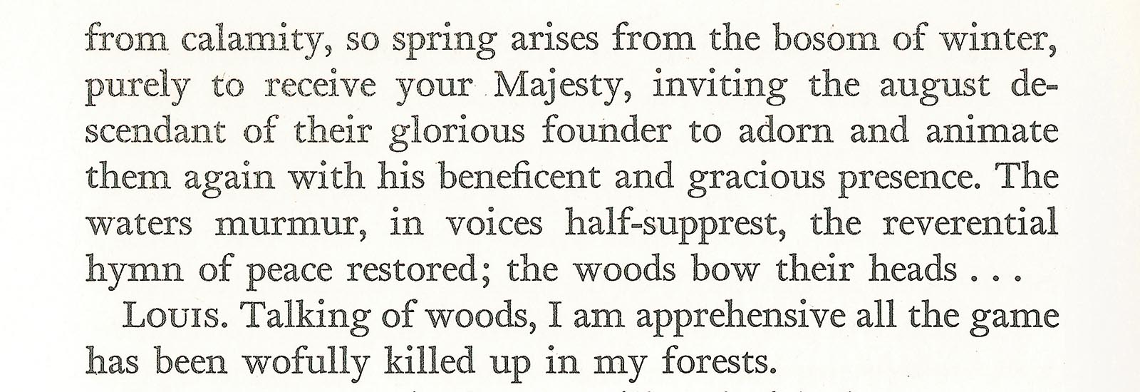
Giovanni Mardersteig's Fontana type designed for Collins, 1936. This extract from W. Landor: Imaginary Conversations, printed 1936 at Officina Bodoni, Verona, by Mardersteig.
[social]The shining example of dictionary type today is Lexicon. I like it very much and it is very flexible, with all its weights and varying stem lengths. But I wanted to work with something new as part of a new art direction at Collins, which was launched at the beginning of September 2004. One of the key elements in the new art direction is a unified approach to typography across the entire company: the principal type is the Nexus family designed by Martin Majoor, along with Fresco and Sansa by Fred Smeijers.
Without the time to commission something new for the dictionaries, I made some samples with Peter Bilak’s Fedra and realised immediately that this family had the qualities I was looking for. Plus I had worked happily with Fedra in other contexts, and also knew from Peter’s engagement with reading and detail that it would be possible to achieve the customisations that we needed. We worked together quite closely on those details, and in a very short time Peter had created Collins Fedra.
Collins Fedra is a big family with serif and sans serif variants built on the same basic form. It’s based on the Fedra family, which includes Greek and Cyrillic alphabets. The basic form has a relatively large x-height and short ascenders and descenders, with a large, open eye. Peter has said that it is ‘a synthetic typeface in which aesthetic and technological decisions are linked. The typeface combines seemingly contradictory ways of constructing letters to produce one harmonious result … (its) humanistic roots are balanced with the method of drawing imposed by a coarse computer-screen grid’. The relationship of the sans to the serif is compared to that between Gill Sans and Joanna – a similar overall formal language adjusted to the specific parameters of sans and serif type.
The original Fedra Serif has two versions: version A has the proportions of Fedra Sans, while version B has longer stems and more stroke contrast. The original version of Fedra Sans has a number of distinctive characters which were then ‘normalized’ in a later Alt version. Collins Fedra uses version A of the serif, along with a hybrid of the two sans serif versions in which only the more extremely distinctive characters such as the lower case f have been replaced by the Alt versions.
We needed to make many other customisations for the dictionary situation. Perhaps most important was to close the word spacing significantly, to 72 per cent of its original value (a little less so for the italic). This helped to maintain economy and compensate for the fact that the letterforms are not in any way condensed – if anything, the word images have a slightly horizontal emphasis, which helps the flow of the text as well as maintaining a calm, measured voice. Kerning before and after punctuation was similarly tightened. In longer passages of continuous text such as the introduction, the word spacing has been opened out again slightly, but in the context of a dictionary entry which is on average only a few lines long, the tight spacing does not have a negative effect, and it helps to preserve the uniformity of text colour demanded by the design.

Fedra Serif and Sans.
Many individual characters needed attention too. Ligatures are practically impossible in dictionaries owing to the form in which the data is held (although this will change with the contextual possibilities of OpenType), so the kerning of the lower case f in both forms was adjusted to accommodate the usual ligature situations. Certain symbols such as multiplication and division signs were enlarged from the original Fedra character sets. Superscript figures were redrawn larger and more open. Stress marks were designed to hint at inflection. And some new symbols were created: the open and solid triangles were redesigned to fit the x-height, and the triangular arrow was added. On top of which, special Xtra fonts were created for each weight, containing diacritics and accented characters for a wide range of languages.

Modified version of Collins Fedra.
An OpenType version of Collins Fedra is in preparation, and as far as design and typesetting is concerned, the sooner there is a single consistent path from lexicographical data management to typeset output, the better. At the moment, dictionaries are typeset on different platforms by a variety of companies, all of which handle data in slightly different ways. Some of the companies use their own proprietary software, others use Ventura or Framemaker – it’s a long way from a smooth workflow.
The end result of the work on Collins Fedra is a strong-looking type which is legible and concise, and can be set with tight interlinear spacing without losing its horizontal sense. It is friendly and a little bit vibrant – it still has a lot of character even at very small sizes, yet also seems somehow familiar.
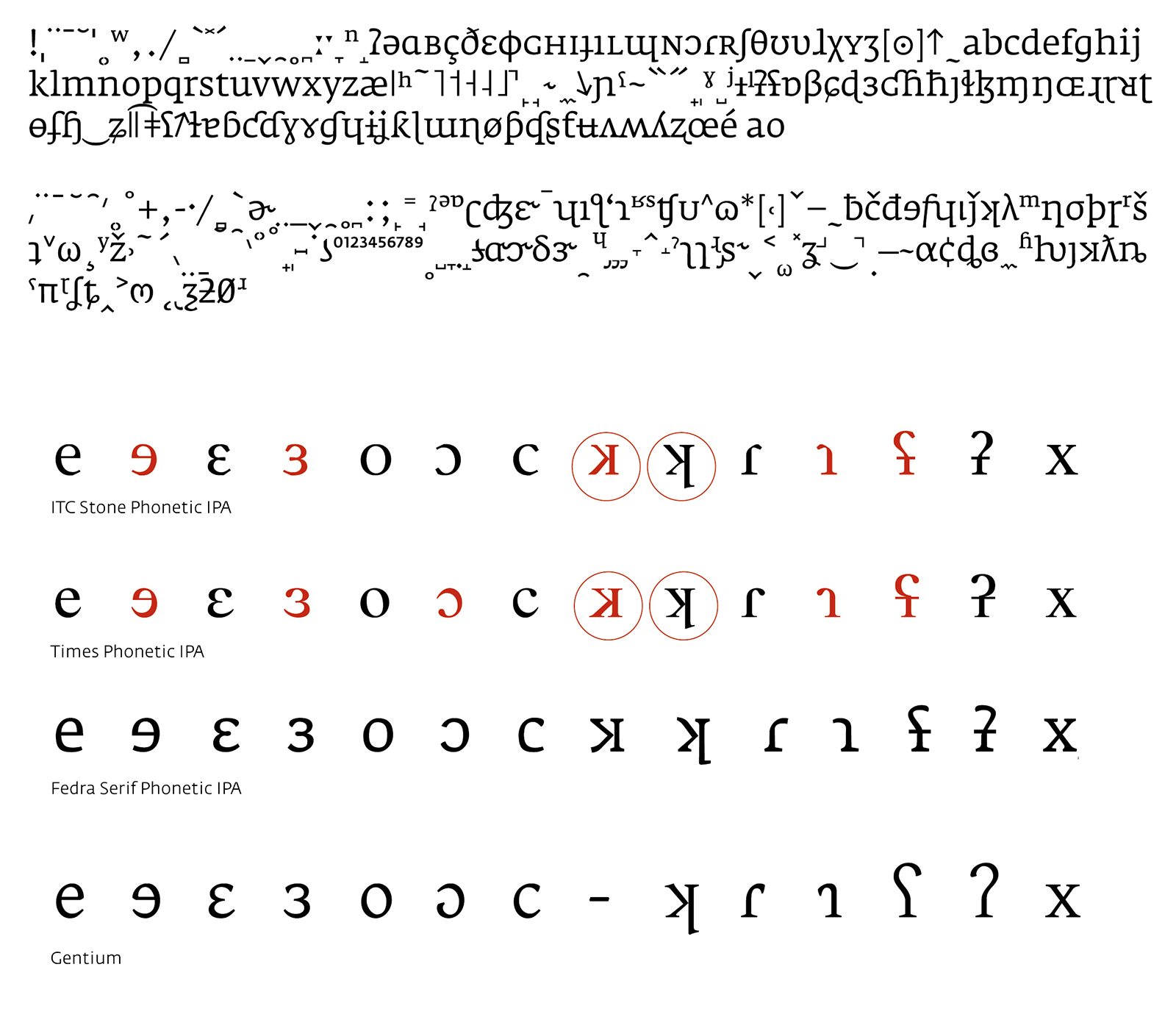
I also asked Peter to create a phonetic version of Fedra, which has brought some very interesting results. It turned out that existing typographic realisations of the International Phonetic Alphabet were composed of combinations of borrowed, rotated and reflected characters as well as regular glyphs from the character set. The result of this is that the stroke direction and weight distribution of some of the characters is not consistent with the rest of the character set, which in turn leads to a loss of legibility. It was only when I saw the first samples of Fedra Serif Phonetic that I realised how much difference this makes in practice. Where previously I had struggled to decipher phonetic characters one by one, the new type offered a consistent word image, even if the alphabet itself is unfamiliar. Because the characters in Fedra Serif A Phonetic have consistency of stroke and are properly kerned, it’s possible to create more comprehensible images of sounds. Asking around, it seems that others share this view.
Peter’s research indicates that the mirroring and rotating of characters was more or less concurrent with the development of photocomposition or early digital technology. Certainly Fedra Serif A Phonetic is a step forward in terms of readability; it also had an extra, hidden, benefit in terms of the dictionary design, in that its colour is equal to the overall colour of the entries themselves, helping to preserve one of the key elements of the design.
Summary
One of the key principles of Collins dictionaries is that they reflect the language we are speaking now. The meanings and usage of words are cross-referenced through a 2.5 billion-word corpus which is fed 35 million words a month by publications, broadcasts and websites from around the world.
I tried to reflect that popular heritage in the external design of the new dictionaries. Where previous dictionaries have been solemn, self-possessed, almost authoritarian (on the outside at least), I have tried to make something light, approachable and compelling. Instead of the flat dark blue or black of most English dictionaries, redolent of royalty and institutions of learning, the new Collins dictionaries’ silver covers always reflect modulated light and, for what is basically a brick, appear slightly dematerialised. They don’t look as heavy as they are. Where there was something masculine about existing covers – a kind of dark suit and tie image – the new Collins covers are more gender-neutral, if not more feminine. Instead of centred capitals and other instruments of static inscription, the new dictionaries’ covers range left, from the top left. They are not so much concerned with the appearance of authority; they are more concerned with communication and the ideas of pleasure and desire. Although at the end of the process the result is basically the same – x thousand pages, each with two or three columns of closely-set type – I hope that the microtypographic and general design decisions have contributed to making this dictionary a lot more accessible, intuitive and rewarding to use.