On developing a secondary style for the Canadian Syllabics
For many scripts, a secondary style that can be used within certain typeface families is taken for granted. However, for some scripts, their unique typographic culture and history means that a secondary style has never evolved. In such cases, it has often been possible to develop suitable secondary styles that draw on the script’s manuscript and writing culture, with the results being accepted and embraced by its readership. But what if the script in question does not have a manuscript culture to draw upon in terms of stylistic reference points?
I’m keenly aware that introducing a new style to a script and its readers can be a risky proposition, especially if one does not fully engage with the rigorous process of careful investigation that must lead such an effort. One may be tempted to create an imitation of a well-established stylistic convention from one script (often italic, from the Latin source) – and to place this onto the skeleton of another may seem like an easy solution. However, the results of such an approach will often be a design that lacks any connection with the local readership, in terms of both form and the meaning behind its function.
Still, the creation of a new style is not an impossible task, and it is possible to deliver value-adding results by starting with an appropriate methodology that involves: opening up conversations with local community members; investigating hand-written material that offers a more comprehensive view of the stylistic scope within the script culture; and providing a set of parameters for the new style that both meet the typographic needs of the writing system and will serve a useful purpose for the language community.
While such an undertaking can be a significant challenge for scripts with a well-established writing culture, the bar is raised even higher within a writing system that historically has no manuscript or writing culture. The Syllabics is such a system; it has no history of manuscript production prior to its printed form, appearing from its beginnings in the typographic model we commonly see today. However, it must be noted that some communities that use the Syllabics do themselves have a history of producing manuscripts, just not in this writing system. In fact, these communities have been writing and producing manuscripts for thousands of years, most commonly in the form of birch bark scrolls, known as wiigwaasabakoon (ᐐᒃᐙᓴᐸᑯᓐ) in Anishinaabemowin (ᐊᓂᔑᓇᐯᒧᐎᓐ), which were used for a variety of purposes, including the Midewiwin ceremony in Anishinaabe culture. These scrolls consisted of written, non-phonetic pictographic marks made by a stylus which incised the forms into the birch bark.
Additionally, Anishinaabe and other Indigenous peoples across North America created inscriptions using these pictographic characters carved into rock faces and other surfaces. Yet, despite this long tradition of manuscript production within several Indigenous communities, the Syllabics system played no part in it, instead spreading to the many communities across the continent via printing, without a formal body of written documents.

The above image, as shown in Inscribed birch bark scrolls and other objects of the Midewiwin, 1983, shows an example of a birch bark scroll, a document used in the Midewiwin ceremony. Manuscripts such as these were and are common in Anishinaabe culture, as a means of recording traditional stories, with the purpose of facilitating their future transmission. The Midewiwin scrolls were made by using an incising stylus to cut into the surface of the inner bark, leaving behind incised, petroglyphic marks. While the Syllabics script does not possess a manuscript culture in its history, there is a long tradition of manuscript making within Indigenous communities in North America.
It is against this background that I began thinking about how to design a secondary style for the Canadian Syllabics, which, rather than having developed via a manuscript culture, in fact began in a typographic manifestation, on the printing press. Therefore, seeking stylistic variation that departs from the main, upright style is a challenge, as there is a lack of material available to provide examples of such text. A further obstacle is that the user community is simply not accustomed, in the conventional typography, to having the option of an additional style variant within typeface families. This absence of stylistic variation tells us something, however: that an opportunity does exist to enrich the typographic palette of Syllabics for its user communities, and to give them more diverse options within their typography. In attempting to create a design solution, certain questions inevitably arise, such as what role this secondary style should play within the typography of the Syllabics, and after the defining of such a role, what is the appropriate form for the design to take given these constraints?
This effort to create a secondary style for the Syllabics is not in fact my first attempt. As part of my MATD project Mazina, I developed a prototype for a cursive companion that was largely based on the italic concept of the Latin family member. This work was important in that it gave me the opportunity to apply more movement to the Syllabics forms, and to see how they would best respond to such patterns. However, the sample was of limited size, as I only sketched a few characters, and none across a full series of syllabic orientations. When I more recently approached the design work for Lava Syllabics’ secondary style, I realised that my work on Mazina had failed to reveal to me the fundamental structural element of rotation, and that this element must be heavily respected in any Syllabics type design.
When I began working on the task of designing a secondary style for the Syllabics, I found myself reflecting on the purpose of such styles in general in typographic systems. What is a secondary style used for – and what could it be used for? A secondary style can have quite different functions, depending on the script and its users. From a Western perspective, a roman has its italic companion, primarily implemented for use as emphasis within text. While italic is not bound by its predominant use as an emphasis tool, the readers and users of the Latin script have this purpose ingrained in their psyche as a result of the pattern of use of italic over hundreds of years. Despite this, italic is also useful for its expressive qualities which evoke handwriting, and a faster speed of movement, providing a tool for expressing personal, and more intimate text elements and giving greater meaning to them. To summarise, italic has many uses within the Latin typographic palette that are in addition to its common purpose, all of which are acceptable to readers. Reflections such as these – and discussions with Peter Biľak – helped me realise that a secondary style could be useful for reasons outside of my own local paradigm, and might also bring new value to the Syllabics.
To return to Latin typography, the italic style has not always been used for the purposes of emphasis mentioned above, and nor is it consistently so today. In the first few decades of Latin script typography, italic was used as a primary style in its own right, being employed to set the main text of works, as was roman. While there were many use cases where italic and roman were paired together in these early works, they embodied two distinct styles that were not designed as part of a harmonious system, intended for use together. These early works that used both styles may not have employed italic for emphasis, but rather used roman and italic together to expand the typographic palette and provide hierarchical differentiation within complex layouts. Many early typographers such as Christophe Plantin utilised italic in this way, for setting captions, giving them an identifiable presence on the page, distinct from the roman main body text. Italic is able to facilitate this shift from the roman through a change in form and movement, with characters clearly differentiating in shape, as well as slant and proportion. All of these ingredients distinguish the italic type sufficiently from the roman to make it a clearly independent style, while retaining enough of the graphic pattern in the type system that it remains harmonious with the roman.
However, Syllabics typography does in fact already have established conventions for providing emphasis in text. The most common means of delivering emphasis has been the use of a bold weight within a type family, a device we can see as early as James Evans’ work, and which gained momentum throughout many of the other Syllabics-using communities. Often, the role of emphasis in many texts was to mark the beginning of specific sentences, as is the case in much of the work John Horden printed in various Cree (ᓀᐦᐃᔭᐏ) and Northern Ojibwe (ᐊᓂᔑᓈᐯᒧᐎᓐ) dialects at Moose Factory.

Above, page 2 from John Horden’s ᑌᕕᑦ ᐅ ᓂᑲᒧᐎᓇ᙮ / Psalter, or Psalms of David in the language of the Cree Indians of North-West America, 1875. The above document shows the formatting convention in Syllabics typography of using a bold face syllabic character to note emphasis within the text. This method was originally employed by James Evans, and was subsequently borrowed as a convention by later printers producing Syllabics texts in the 19th century, such as Horden at Moose Factory.
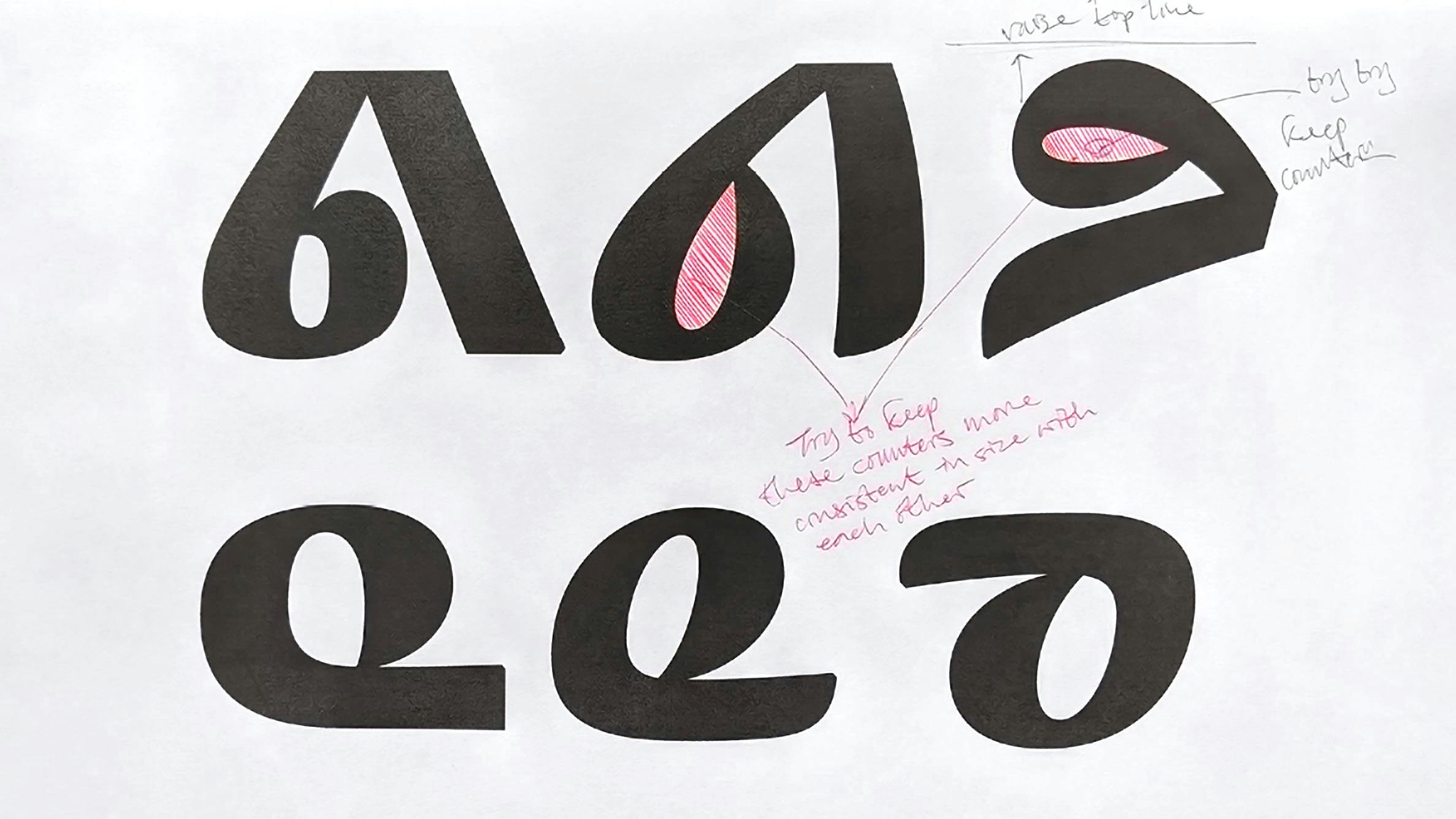
As this technique of providing emphasis became commonplace in many communities, it persisted within the typographic practice of the local users, and hence is still used today. Therefore, any attempt to develop a secondary style with the express goal of it being used for emphasis alone is likely to fail, given that a well-established practice is already ingrained in the communities. A better approach, then, is to consider how a secondary style could provide a new way of expressing the language graphically, and how this may prove useful in terms of expanding the typographic palette of the Syllabics.
I commenced a thorough examination of Syllabics typographic conventions, in an attempt to understand the core construction patterns and anatomy of Syllabics character forms. This was essential in both developing the November and Lava Syllabics typeface families and finding an appropriate starting point for the conceptualisation of a secondary Syllabics style. As mentioned earlier, one of the challenges of developing a secondary style for the Syllabics – compared to other scripts – was the lack of a formal manuscript culture. There was one area of source material, however, that proved to be very helpful for developing a secondary style: samples of Syllabics handwriting from local Indigenous users.
Syllabics handwriting is of course common across Indigenous communities that use the script, and samples were gathered from published sources, as well as handwritten documents by some of the Indigenous languages keepers I worked with during the project. These samples were largely from Inuktut community members, with one sample coming from Northwestern Ojibwe (ᓂᐊᑲᐤᐁᒧᐎᓐ), and another from Dakelh (Carrier / ᑕᗸᒡ). A notable feature of the Syllabics handwriting samples that I studied was that, structurally, they do not stray very far from the typographic model, with forms remaining disconnected, rather than joining as in a cursive model. Many of the samples also showed a tendency for the characters to remain upright, with a slower speed to the curve transitions, and only some slanting towards the direction of writing – essentially faithful renderings of the typographic geometric and monolinear forms. However, where shaping and stylistic ingredients for a secondary style could be found was in the movement of the writing forms and the flexibility with which the forms fitted together on given lines of text.
A sample that that stood out in particular was the first page of Paul Apak Angilirq’s screenplay for the 2002 film Atanarjuat: The fast runner (ᐊᑕᓈᕐᔪᐊᑦ). Angilirq’s writing represented a dynamic handwritten Syllabics, with a quick speed to its curves, and a freer and looser form than one is accustomed to seeing in Syllabics typography. Angilirq’s forms are almost exclusively made with the fewest pen lifts possible, which forces a looping structure onto many of the characters, further distinguishing these Syllabics forms from the typographic sources. In fact, there is a tension in Angilirq’s writing – presenting forms that almost want to be cursive, but that still respect the typographic model at the root of the Syllabics. This can been seen in broken, single-stroke pathways for series such as ᓂᓄᓇ, ᑭᑯᑲ, and ᕕᕗᕙ, in which looping, unconnected forms result from the speed of writing.

An example of Paul Apak Angilirq’s Syllabics handwriting, as seen in the screenplay book produced to accompany the film Atanarjuat: The fast runner (ᐊᑕᓈᕐᔪᐊᑦ), 2002. Angilirq’s Syllabics writing provided an important reference in the development of the Lava Syllabics secondary style design.
With Angiliriq’s writing as a model for the movement and behaviour of the character forms, I could begin to develop a system. However, its ingredients would have to adhere to the foundational parameter inherent to all Syllabics typography: rotation. The construct of rotation within the structure of Syllabics typography is non-negotiable, and it was not until working on a secondary style that this became so clear. Of course, the concept of rotating forms to mark vowel inflections is at the core of how the Syllabics writing system functions.

An example of the concept of rotation, which sits at the core functionality of Syllabics typography, for any language that uses the writing system. Note that not all orthographies use all four orientation positions, for example, the Nunavut dialects of Inuktut, which only use three positions, as a result of those dialects only having three vowels (ᐃ=i, ᐅ=o, ᐊ=a).
This cannot, therefore, be ignored when developing a Syllabics typeface; it is the key structural attribute that defines the form and behaviour of the characters across a given orthographic repertoire. Retaining and working with this element is even more critical when developing a modulated, contrast design such as Lava Syllabics – in terms of both the upright and secondary, cursive styles.
I began sketching the modulation structure for Lava in the way I approach most projects, by first writing freely with a stylus, and in this case, broad-edged pen.

An early sketch made by the author during the initial research phase of the project, exploring potential modulation structures that could be applied to the Lava Syllabics design. The above studies explored the impact of a writing tool (broad edged nib) as it moved through the various forms in the Syllabics characters.
This was a good foundation for mapping contrast onto the Syllabics, and did provide a basis for the eventual modulation that would ultimately follow Lava’s design patterns. A problem arose, however: if one follows a stroke pathway and fixed pen angle, as would be used conventionally in the Latin script paradigm, an awkward result ensues across the four rotation positions, whereby the Syllabics characters appear disunified.

An image showing a comparison of a fixed-modulation pattern (broad-edged pen; 45° angle), line one, and a modulation model which subscribes to rotation, line two, the key defining criteria of Syllabics typography and it’s form structures. While in some script traditions such as the Latin, modulation can be conventionally defined by a fixed pen angle and the direction of writing, the Syllabics cannot subscribe to this model, as particularly evidenced by the characters marked orange. Note in both na (ᓇ) and ni (ᓂ) and so (ᓱ) and sa (ᓴ) in the showing on line one, how the fixed pen modulation model results in awkward stroke transitions and entry/exits. By remaining faithful to the rotation model, these awkward stroke sequences are avoided, and the ideal character images and their identities are retained.

The above figure shows a comparison between an early modulation experiment for Lava Syllabics (line one), and the final modulation structure implemented for the design (line two). The structure attempted in line one follows a fixed pen angle methodology, in which the modulation pattern roughly adheres to a 45° broad nib pen angle. This works for some Syllabics shapes, such as the na (ᓇ), ni (ᓂ), and the base form ki (ᑭ) as it is applied to the Inuktut syllable qi (ᕿ), however, there are many shapes that cannot faithfully follow this structure and harmonize with the system. Marked in orange, r (ᕐ) and la (ᓚ) show this, with resulting terminations that are foreign shapes within the Syllabics system that obscure the identity of these characters to readers. The example on line two for r (ᕐ) and la (ᓚ) show the required implementation within a contrast Syllabics design that retain the character’s identities.

The effect of the concept of rotation, as seen in the contrast model applied to the Lava Syllabics typeface. Note that as the orientation of the characters changes, the modulation pattern does not, and is simply rotated, with modifications to suit vertical and horizontal orientations as needed.
So, rather than try to force a modulation pattern onto the Syllabics, I adapted to this core behaviour by drawing one character position (often the a-vowel position, i.e. ᓇ, ᑲ, ᒐ) which defined the modulation, with the subsequent three rotation positions being pure reflections of the initial character, constructed as composite glyphs. This allowed the modulation to reflect the spirit of the writing system, and produced a faithful text that looked acceptable to local users, while also fitting the Lava Latin modulation pattern.
This design process also resulted in a more efficient way of managing the design and production of such a large glyph set: when drawing, I would edit one source glyph’s curves and shapes, but I would also simultaneously watch the effect of this shaping across the other three composites. This meant that any curve or shape I drew in the source glyph would also have to work across the other three reflected forms, in order for them to look congruent within the type system when composed as text. With this methodology in place for working on a Syllabics type design with a contrast stroke modulation model, I could begin adapting the secondary style to harmonise with the rest of the system.

The n-series, as rendered in the upright version of Lava Syllabics Regular. The above figure depicts the workflow methodology employed to design Lava Syllabics. As all four glyphs in the n-series are rotations of one another, the designer can draw and fit one active base glyph in the sequence (above, na (ᓇ) marked orange), with the other three glyphs being composites of the base (above, marked grey). The challenge of designing within this framework is that any modulation decision made in the base glyph must work equally well for the other three series members.
While I wanted this secondary style to suit the system, it still had to meet the criteria required to provide an alternative means of expression in the many Indigenous languages that use Syllabics, and therefore had to capture some of the liveliness seen in Angilirq’s sample. In order to achieve a greater movement in the Syllabics characters, I developed a shaping structure where stroke terminations flared and tapered at their extremities, in contrast to the square, hard endings of the upright model. Further, I imposed a shaping model on the cursive where there was rarely – if at all – a straight line in any character stroke. This gave a dynamic quality to the characters which echoed movements in Angilirq’s writing, while retaining enough graphic information from the Lava family to fit the pattern of the type system.

A proof showing a comparison of the Lava Syllabics upright and cursive forms, in the Heavy master. In order to achieve enough separation from the upright form, and provide a truly distinct additional style, the terminations used in the Syllabics cursive were curved to contrast the blunted terminals in the upright style. To further distinguish the cursive style, no straight lines were used, which sharply contrasts the movements in the upright design.

Above, proofs during the design development phase which show the movement of the cursive forms. The upright Syllabics shapes are inherently very strong, static forms, which owe to their origins as monolinear structures. To push the cursive as far away from the upright as possible, a much quicker speed of movement is used, in conjunction with an angle of inclination.
I stated earlier that when beginning to design the upright Lava Syllabics, I needed to develop a design methodology whereby one source Syllabics modulation pattern was defined, with the subsequent three characters in the series following this graphic lead purely via rotation. However, the cursive model resisted this; it proved impossible to perform a straightforward rotation to the forms. The script had to maintain a quality of the behaviour of handwritten forms, and take into account the shaping of these cursive Syllabics forms, which was influenced by the path of the stroke. In conversations with Peter where we discussed the cursive design, he noted that in many contexts, handwriting takes the shortest and easiest path to complete a character. This observation liberated me from trying to work within the construct of rotation alone. This new perspective allowed me to adapt the pathway of each character to suit the clearest route it wished to take, while enabling the character to be accommodated within the rotation space. In many cases, this meant that both the a and e vowels were reflections of each other, as were the o and i vowels, with the quadrangle being unified through the suggested shape, as well as by familiarity within the readership.

The difference between designing the cursive glyphs within the context of the rotation scheme (purple), as opposed to the upright Syllabics (orange). As seen in the earlier figure in this essay depicting the design methodology for the upright design across the four orientation axes, the upright design requires one base Syllabic to be drawn, with the other three being composites. This is quite different in the cursive, as the angle of inclination slightly throws off this approach. In the above cursive n-series (purple, centre), only ne (ᓀ) can be a reflection of the na (ᓇ) base, with no (ᓄ) and ni (ᓂ) requiring to be a separate sequence of base + composite.

The k-series as seen in Lava Syllabics cursive, purple, with the upright versions included above, orange, for reference. An important criteria of the cursive design was that it followed a stroke pathway that was true to that of Syllabics handwriting. In order to achieve this, the shortest and easiest path was followed for each character.
The final design resulted in a secondary style that is sufficiently distinct from the upright, typographic model of the Syllabics while not diverging completely. It has also been well received by Syllabics experts and Indigenous language keepers who have participated in the beta testing of the fonts, with the overall impression from the users being that this offers more variety to Syllabics typography and its users. Furthermore, with this design solution, Lava Syllabics demonstrates a methodology by which the convention of a secondary style can be added to a script in a way that has meaning, and which provides the user community with both a wider diversity of options within their typographic palette and greater means of expressing their visual language.


Two showings of the Lava Syllabics type system, showing the upright and cursive working together in both display implementations, as well as working in conjunction with Lava Latin, in embedded settings with the Latin italic. The Lava Syllabics cursive not only expands the typographic palette of the Syllabics, but it also adds additional means of expression for users of the writing system in their typography.
Text sources:
Paul Apak Angilirq, ᐊᑕᓇᕐᔪᐊᑦ / Atanarjuat, the fast runner. 1st Edition, Coach House Press, 20 December 2002
John Horden, ᑌᕕᑦ ᐅ ᓂᑲᒧᐎᓇ᙮ / Psalter, or Psalms of David in the language of the Cree Indians of North-West America, Society for Promoting Christian Knowledge, London, 1875
Richard E. Nelson, ‘Inscribed birch bark scrolls and other objects of the Midewiwin’, in Actes du quatorzième congrès des Algonquinistes (Acts of the fourth congregation of the Algonquinists), Carleton University, Volume 14, Ottawa, 1983