Tobias Frere-Jones, type designer
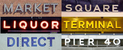
A native New Yorker, Frere-Jones’s work is as connected to his hometown as the name of his latest design. In fact, he has undertaken the task of ‘documenting anything extant and noteworthy’ in Manhattan. Gotham was inspired by a variety of unassuming, often derelict signs originally carved, painted, rendered in neon, and cast in steel or bronze on the facades of buildings throughout New York. It took an intimate knowledge of the city to see the formal and historical connections between these varied letterforms, but also a humble respect for metropolitan history to focus on such an unglamorous aspect of New York. By focusing on the mundane – even decrepit – corners of his environment with Gotham, Frere-Jones has created a typeface that carries with it the disorienting bustle of a walk in the city – the sense of being engulfed by a history that remains just out of reach.
At what point in the process did the inspiration for Gotham assert itself? Do you study the source material only initially or is it a constant resource?
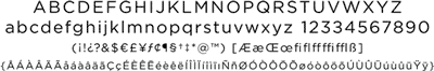
It was always close by, and required a lot of (literal) legwork as we moved through the character set. We were pretty well informed about the caps, needed to search around to understand the figures, and went searching (in vain, ultimately) for lowercase sources. This was the start of the photo excursions that I make almost every weekend now.
Why did you choose to focus on such a blue-collar form of New York lettering?
I suppose there’s a hidden personal agenda in the design, to preserve those pieces of New York that could be wiped out before they’re appreciated. Having grown up here, I was always fond of the ‘old’ (or just older) New York and its lettering. After watching one of the most distinctive features of the city being destroyed last fall, it seemed more urgent to protect the original ‘character’ of the city, both in the sense of letters and personality. After collecting material for Gotham, I set myself the task of walking every last block of Manhattan with a camera, and recording anything extant and noteworthy.
[signup]
How did the process of designing Gotham relate to some of the other projects HTF has done related to New York City?
The projects for Grand Central and Lever House had what we sometimes call a ‘forensic’ aspect, in that they called for the reconstruction of something lost, or the completion of something partial. In these cases, we used historical photos and records to suss out the original motives we’d need to follow. (Not unlike those serial killer profilers, but without all the, you know, killing and stuff.)
Jonathan’s work for the Guggenheim and for Radio City certainly started with existing forms, but weren’t quite as obligated to them, as their new application had to go well past the original. The typefaces for The Wall Street Journal and The Whitney Museum were outright new constructions, but both meant to acknowledge what had existed before them.
Were you interested in designing Gotham for use in building signage?
Though it wasn’t part of any brief from the client or ourselves, I always figured that the finished typeface could come back full circle to signage. While it’s not as blatant as Bell Gothic and other designs, Gotham builds its esthetic directly out of the pressures of its environment. (Incidentally, designer William Addison Dwiggins was a master at turning the necessary into the desirable, though his circumstances were quite different – faces like Caledonia become only more impressive when you know what he was up against.)
What piece of music most closely resembles the process of type design?
Yow. Hm. While I’m not sure I could pick out a single piece, I think most anything by Autechre would come pretty close, as those guys seem to work on very large and very small scales simultaneously. And even their most startling and disorienting pieces sound deliberate and carefully planned. I could also have an unfair bias, as I listen to them quite often while drawing.
How does designing a typeface that is self-initiated differ from designing one that is commissioned?
Two of the designs that I’m most pleased with – Whitney and Gotham – wouldn’t have happened if somebody hadn’t asked for them. Those parts of the spectrum – the humanist and the geometric – had already been thoroughly staked out and developed by past designers. I didn’t think that anything new could have been found there, but luckily for me (and the client), I was mistaken. The best custom jobs will push me to take on a problem that I hadn’t considered before, or to reexamine what I had regarded as the final word for a given motif.
[social]
How would you approach creating a typeface based on typography and graphic design of the recent past – say the mid-1990’s?
Given how quickly Interstate gained currency with designers, I’m really not sure how I’d handle that. My first thought is that it would be like trying to call myself on the telephone: ‘What? How come I always get a busy signal? Who could I possibly be talking to?’
What sort of creative or research projects do you work on outside of type design?
Music (or sound, generally) is definitely the largest activity aside from design. It gets sidelined by work now and then, but I like to stay close to that way of thinking.
What is the absolute worst use you could think of for Gotham, and what kind of sick pleasure would you take in seeing it used just that way?
With Gotham’s origin – and my own stubborn opinions – I think that anywhere in the suburban sprawl would be the worst place for it: advertising for featureless subdivisions, the specials board at the Exit 23 Dairy Queen, bumper stickers that say ‘I [heart] my SUV’ and so on.
Images © Hoefler & Frere-Jones