Tribunal — Shaped by Two Worlds
Headfirst Into a Challenge
I can still recall the smell of the freshly painted newsroom on the fourth floor of number 6 Kersnikova Street on that late summer day in 2009. There wasn’t any furniture yet, so we had to sit on the floor, six editors discussing how best to approach the revival of the historic Slovene student magazine Tribuna. Founded in 1951, it had been a journalism and design institution of Ljubljana and a shaping force in the social movements of the 1960s and 1980s.
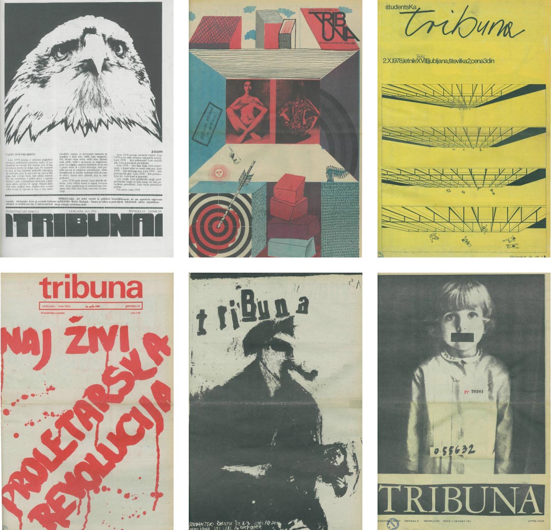
Six examples of former Tribuna.
Eleven years had passed since the last issue. Nothing remained of it but a 700-issue archive, the record of a constantly shifting magazine that defied all standardisation, a periodical whose style and publishing methods had adapted fluidly to its financial and political circumstances at any given time.
Restarting Tribuna from scratch with a monthly budget of perhaps €10,000 made experimenting with production processes a necessity. In any case, seeing how traditional periodicals were struggling to stay alive, clinging to traditional approaches seemed a sure recipe for failure. We scrutinised every aspect of production to see how we could deal with our constantly changing situation through innovative use of available technologies including compact manual printing presses, photocopiers and the open-source tools of the World Wide Web. Finding a typeface that would suit Tribuna’s character, respond to sudden changes in reproduction techniques and fit into the tight budget was a challenge, especially with the ambitious December 15th launch date only a few months away. When it came time to discuss the typeface, momentarily ignoring the scope of the challenges ahead, I suggested ‘Why not make our own?’
[signup]
We formulated the following criteria as a framework for development:
• It would initially be used on web offset or sheet-fed offset on newsprint, but would also be exported to PDF for onscreen reading and laser or inkjet printing, and would later be used on the webpage and in other electronic content.
• It had to fit at least 20,000 characters in four columns of 8pt raw text per Berliner page, (set with 4mm leading).
• It had to support the entire Latin alphabet, taking into account the specifics of the Slavic languages.
• It would have fewer cuts to simplify choices and prevent chaos in setting text, but those cuts would be designed for maximum functionality.
• It would function well even without OpenType features, although those features would eventually be developed.
• The first upright cuts would be ready to use in two months although new versions could be tested with each new issue as needed.
• Only one test print run would be possible before the first issue came out.
The resulting typeface would be shaped by these functional requirements, rather than by the aesthetic preferences of the editorial board.
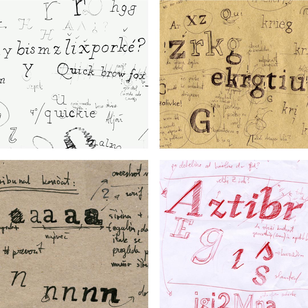
The many jumbled hand-drawn and digital sketches of the initial version tell the story of the frantic race against time, settling on just the skeleton drawings and a few initial design principles, most of which were later abandoned anyway. (Autumn 2009)
Character as Distillation, Rather Than Deliberation
There was no way to get it right for the first issue. (Or the second, or third, or fourth for that matter.) The main priority was just to have a basic glyph set so we could set the magazine and send it to print on time, and the first issues of the new Tribuna bear witness to lousy letter forms lacking clear construction concepts and coherent features. But the constant stream of feedback from everybody from the editors to the printers to the readers helped us to refine Tribunal with every iteration.
Tribunal in different stages of development (2009-2013)
This method had its disadvantages. Font metrics, for example, had to be adjusted every month. The time constraints made kerning unfeasible, so I had to make sure the metrics would perform as well as possible on their own. Also, with so many versions, there was always the possibility of introducing errors that could escape detection over several iterations, so tracking development was sometimes very complicated. Furthermore, every flaw in the typeface was extremely public, as demonstrated by Radio Študent, which ran monthly advertisements for Tribuna: their commercial for the second issue ended with, ‘Psst, we heard they made the letters bigger!’
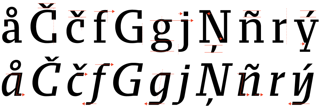
There were, however, great advantages in being the designer of the typeface and its principal user at once: it allowed me to experiment with the idea of typeface as a tool and respond to even the most minuscule problems that we encountered during production. For example, I tried redrawing letters that would otherwise require ligatures so that they would connect gracefully even when OpenType features were turned off. It worked better than expected and is one of Tribunal’s distinctive characteristics.
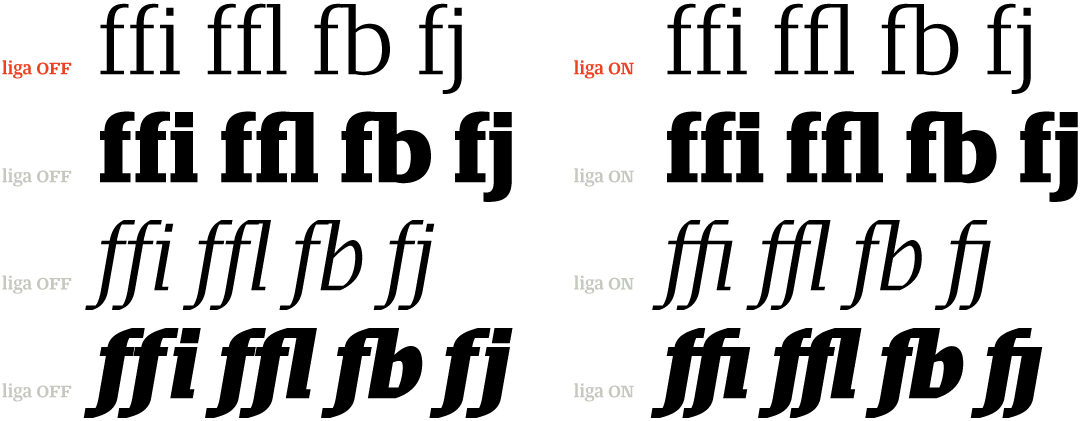
Example of ligatures in Tribunal
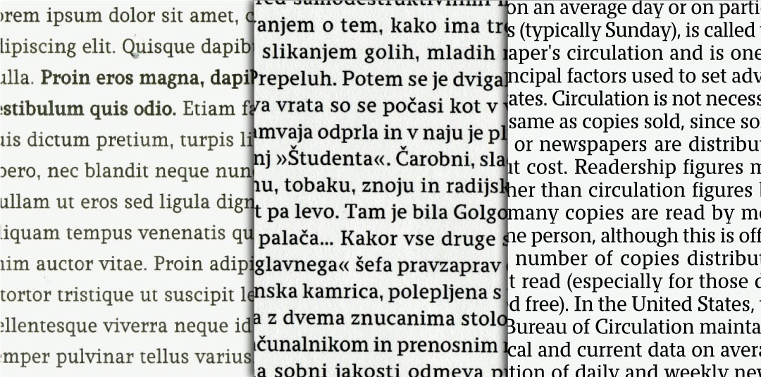
I also experimented with equalising the metrics of different weights (as in monospaced fonts) so that the text would not reflow during the second proofreading, which took place just before galley proofs were sent to print.
Example of equalised metrics in Tribunal (summer 2010)
During the second year of this development process the general character of the typeface slowly emerged. When I added the first version of the italic to the upright in the autumn of 2010, however, the two were far from a perfect couple. Furthermore, the italic cut did not fit into the scheme of multiple weights with equal metrics, so I abandoned that idea and gave the glyphs of each cut their optimal proportions, whitespace and metrics, letting them breathe. In the following months, the multitude of formal explorations condensed into a highly constructed slab serif with a contrasting italic. Distinctions between the cuts were somewhat exaggerated to create added contrast in the text block and give stronger presence to the prominent elements of the page.
[social]Reaching a Multiple-Platform Audience
With print runs of only 5,000–10,000 copies, Tribuna had to reach additional readers through electronic media, so Tribunal had to work just as well on the screen as it did on paper. Hinting the new iterations of the fonts each month was out of the question, so the forms would have to take the nature of the screen matrix into account. This was a breakthrough idea: perhaps part of the underlying aesthetic could be to apply the constraints of the screen to the print version rather than trying to make the display behave like paper. It gave me a firm concept to work from during Tribunal’s two years of extended development following my departure from Tribuna.
When considering legibility and readability of the typeface, screen rendering was given the upper hand in determining the construction of each glyph. That construction would then translate to the ‘higher resolution’ print, as a stylistic feature. All the resulting quirks were considered enhancements of the character, rather than annoying mistakes.
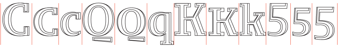
In its final form, Tribunal consists of ten cuts, five upright and five italic. Although it is designed for setting periodicals, the number of cuts is deliberately limited in keeping with one of Tribunal’s design principles: what can go wrong will go wrong, so avoid unnecessary complexity in order to limit the damage.
Central to the overall design was a conscious decision to not expand the number of cuts. Granted the wide selection of cuts may be of interest to highly skilled designers, it can cause confusion among less astute users. Tribunal’s design space does however offer opportunity for extrapolated weight and width extremes, left open to future investigation.
Time to settle down
For its Typotheque release, Tribunal’s character set was expanded, details were refined, kerning was finally added and hinting was applied to facilitate even crisper screen reproduction. With this, after four years of drawing and redrawing, 15 major versions of the upright and 11 major versions of the italic (with countless minor versions in between), Tribunal has finally settled into its last iteration.
Awards
Tribunal received the Brumen Award for typeface design at the 5th Slovene Biennale of Visual Communication in 2011.