Zico — how lettering became type design
Zico began in 2015 as my final project for the Type & Media course at the Royal Academy of Art (KABK) at The Hague. I had already worked intensively with hand-lettering, quite a different discipline from type design. A lettering artist renders specific words in a specific size, in a specific colour, in a specific location, for a specific purpose: to tell a story that needs to be told. A font designer, on the other hand, seldom knows how his work will be used. Projected at large sizes on building façades by a professional? Printed at tiny sizes on a shoddy laser printer by an amateur? Rendered on thousands of smartphone displays of unknown resolutions? Anything is possible.
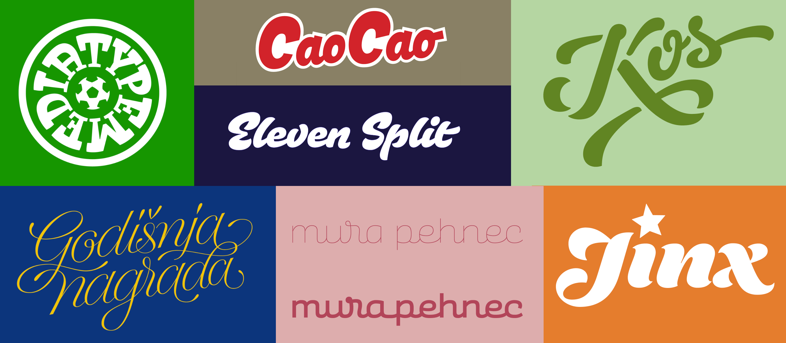
Lettering work of Marko Hrastovec
From the start then, Zico presented a dilemma: I wanted to create a project that captured lettering’s strengths and immediacy, but I also wanted to produce a versatile tool that went beyond lettering’s limitations. To reconcile these two contrasting goals my teachers at T&M suggested narrowing the context in which the font would be used, giving it some of the specificity of lettering without losing the flexibility of type. The only question was which environment to choose.

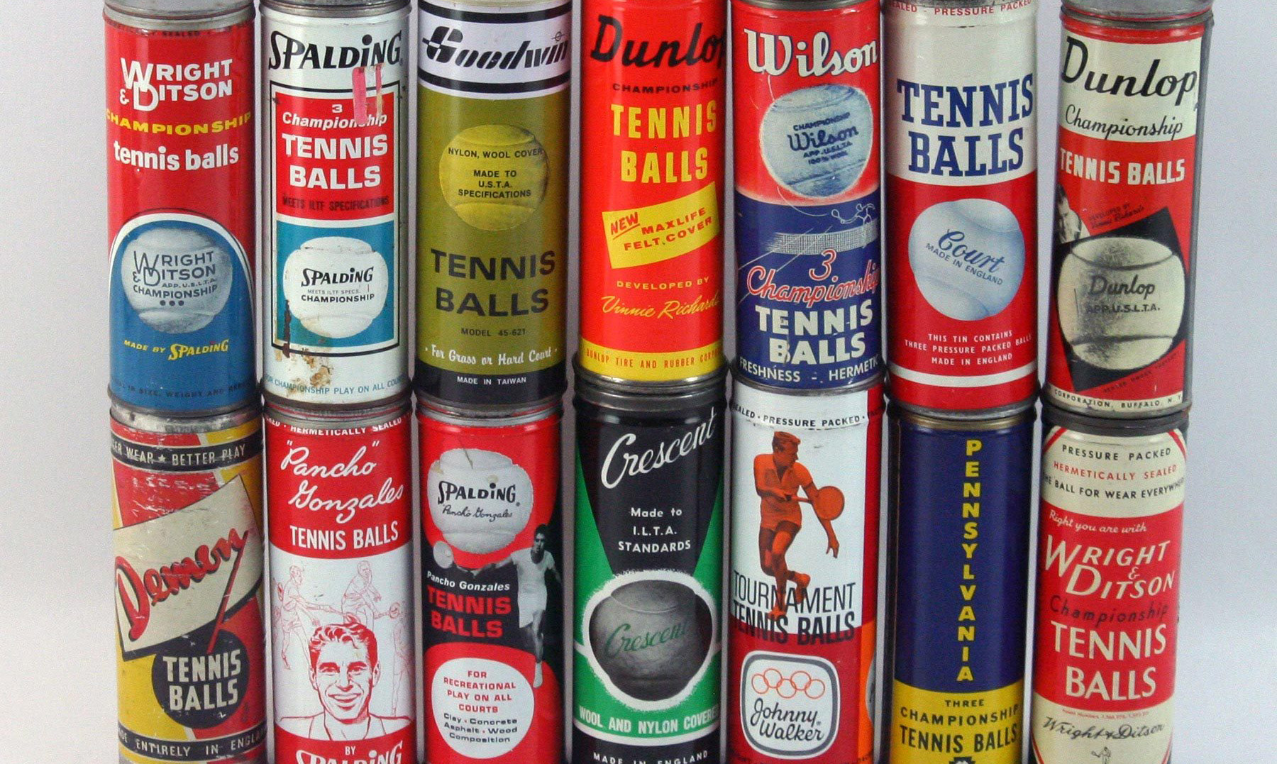
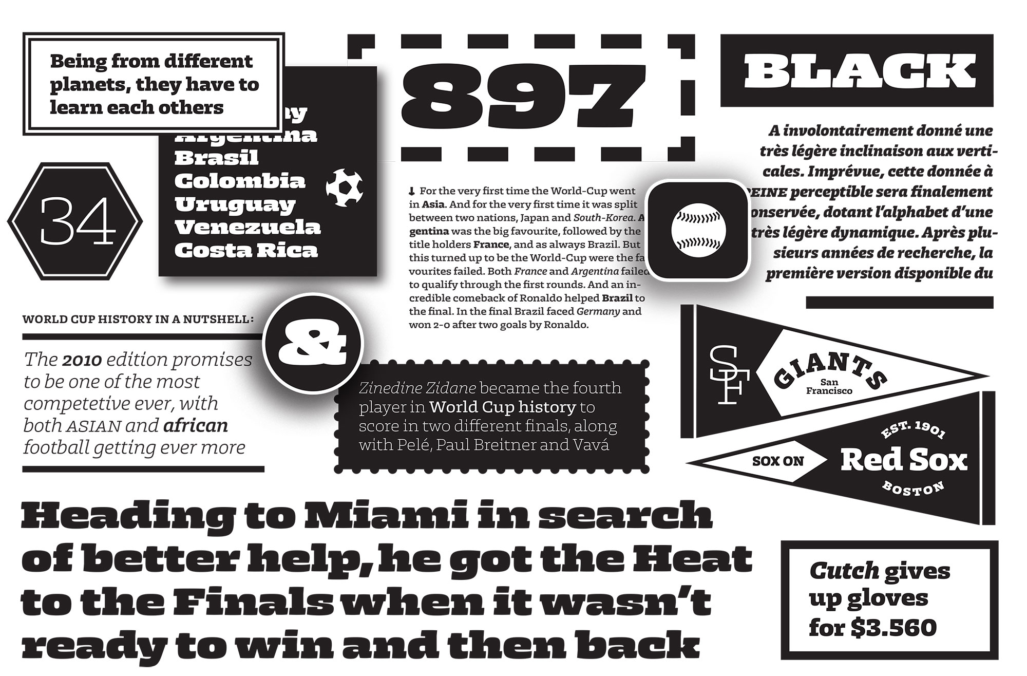
I decided to take the opportunity to explore the aesthetics of sports. Ever since I got seriously interested in graphic and type design I’ve dreamt about designing jerseys, with their robust numerals and bright colours. Of course the sports world offers a wide variety of design projects: tennis ball packaging, gym signage, racing cars, motor oil cans, etc. They all share a boldness that is somehow still warm and playful, a specific atmosphere that I tried to capture and use as the feel of my typeface.
Translating the visual language of sports into a fully functional type family was not a very straightforward process. What makes sports jerseys so attractive is their broad, bold, ruthless character. They aren’t designed to work at small sizes on an archaic printer; they only care how they look on a HD plasma TV, with the sound of the crowd cheering in the background. The challenge was to capture as much of this milieu as possible while still constructing a versatile family of fonts.
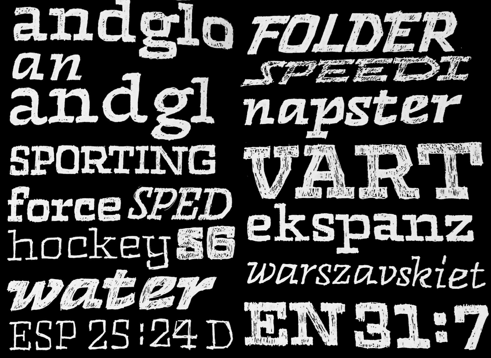
In this sense, the very heavy styles of Zico were the most straightforward to design. They are the sports celebrities of the family: beefy, self-confident and attention-grabbing. These extreme cuts became the foundation of the project, helping to define the design approach.
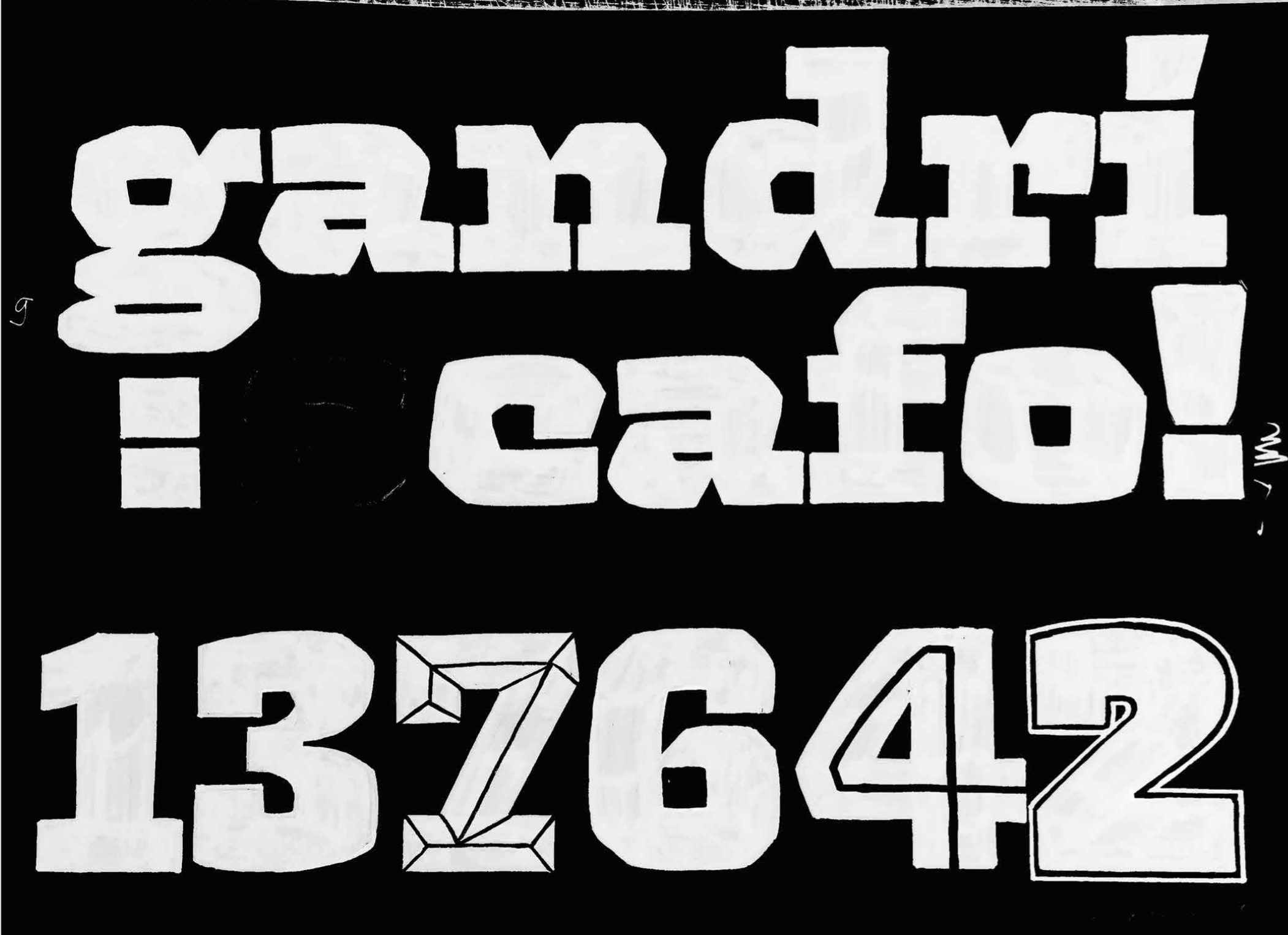
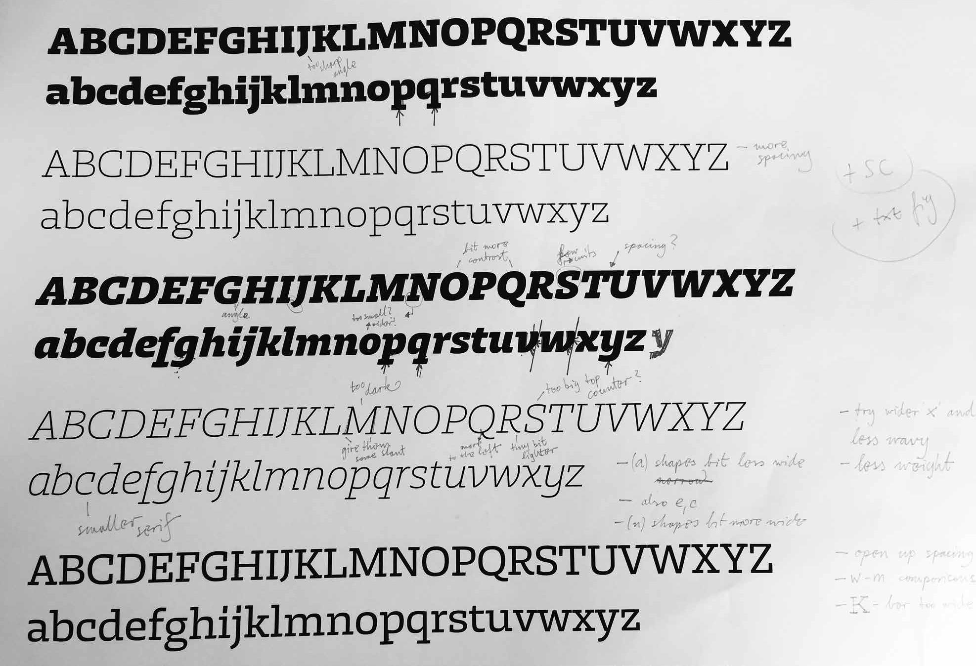
In order to translate these monsters into useful text styles, something less vain and more rational, I focused on the abstract parameters that define Zico’s character, the squarish curves, geometric proportions, heavy slab serifs, wider proportions, and variable contrast of thick and thin strokes. My intention was to develop a slab serif type family with a broad range of flavours that could handle not only bold titles and headlines, but also continuous text settings for editorial design. Could a single family combine subtle text and extreme display styles and still work as a team? How extreme could those contrasts be?

To create a sufficiently versatile set of text fonts, the Thin styles needed to be as lithe and open airy as possible, in contrast with the compact, saturated Blacks. And because the Thin and Black characters have nearly the same widths, Zico manipulates the contrasts between their thick and thin strokes just enough to keep the counters open. In particular, the inner horizontals and stroke connections are much thinner than might be expected in heavy styles.
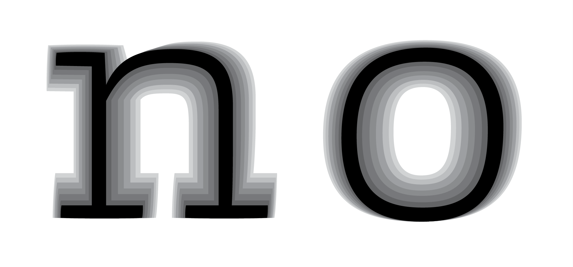
Weight intervals were carefully chosen to produce complementary pairs: Light pairs with Medium, Regular pairs with Bold, and Medium pairs with Heavy, leaving the Thin and Black styles more independent. This makes a total of 7 weights of Romans and matching italics, 14 styles in all.
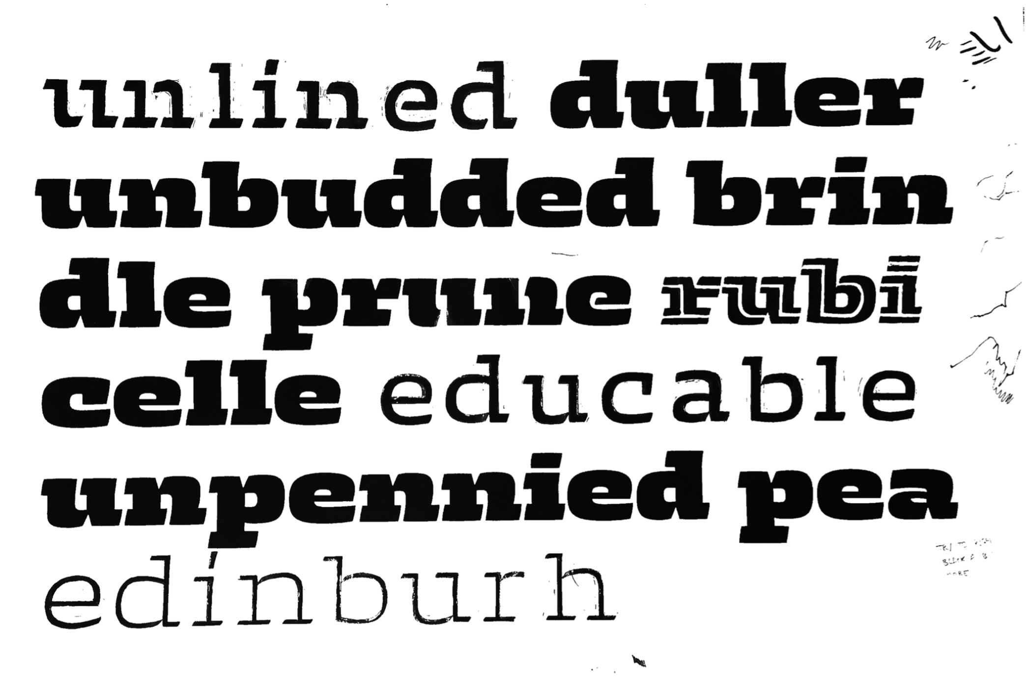
The Display set (Black, Thin, Inline and Outline) that had guided the initial development of the text fonts were now ready to be fine-tuned. The thin inner horizontals and stroke connections used in the heavier text styles became a design feature of these cuts, and throwing out conventional wisdom about contrast, proportions and construction, each letter was treated individually to reduce the white space around and inside it, resulting in a mix of high-, low- and even reverse-contrast forms. In addition, special care was taken to achieve horizontality, keeping the ascenders and descenders as short as the slabs would allow. Special mention should be made of Arthur Schraml’s lettering work, which influenced the Inline style.
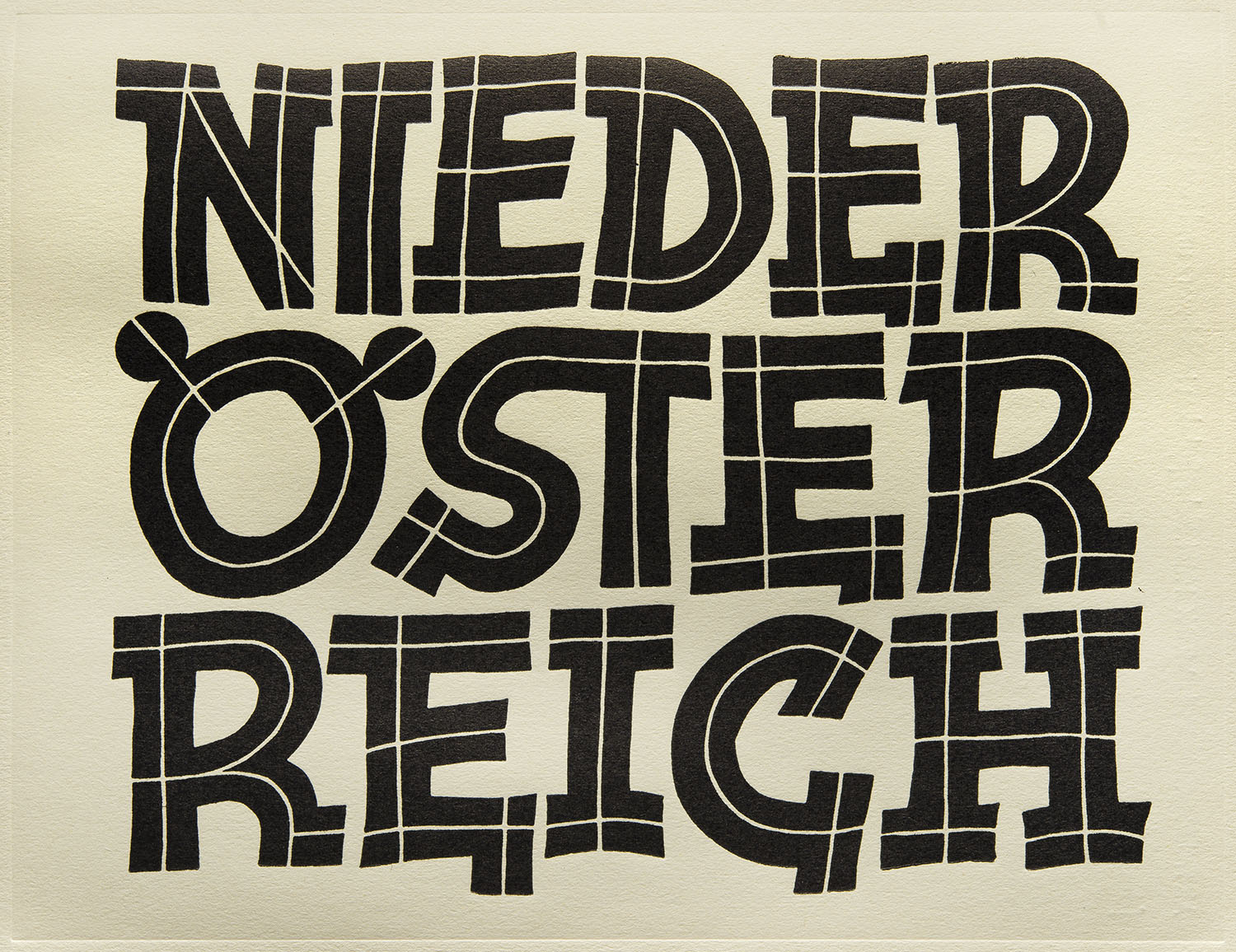
Arthur Schraml’s lettering work
Powerful as well as graceful, Zico is a family of fonts ready to tackle the most challenging projects.
I'd like to acknowledge and thank my teachers at the Type & Media at the Royal Academy of Art (KABK) at The Hague: Françoise Berserik, Peter Bilak, Erik van Blokland, Petr van Blokland, Paul van der Laan, Just van Rossum, Jan Willem Stas, and Peter Verheul; as well as my classmates (Elliott Amblard, Benedikt Bramböck, Bahman Eslami, Minjoo Ham, Tilmann Hielscher, Katerina Kochkina, Philipp Neumeyer, Loris Olivier, Heidi Rand Sørensen, Tetsuo Suzuki, Jasper Terra, Cristian Vargas) and visiting teachers (Paul Barnes, Frederik Berlaen, Frank Blokland, Nikola Djurek, Tobias Frere-Jones, Frank Grießhammer, Lucas de Groot, Tal Leming, Mathieu Lommen, Christian Schwartz, Fred Smeijers, Bram Stein, Rickey Tax, Hrvoje Živčić) who helped to shape Zico to what it is.