Client Spotlight: Communication Arts magazine

Communication Arts is the world’s largest magazine for designers, and over its more than 50 years of existence it has kept up closely with the rapidly evolving media of visual communication. It was the first US magazine to be printed using offset lithography, as well as the first major design magazine to have an online presence, and today it is also reaching out through applications and social media. Surprisingly, in its long history CA has only gone through four major redesigns, the most recent of which involved Typotheque’s Greta Sans.
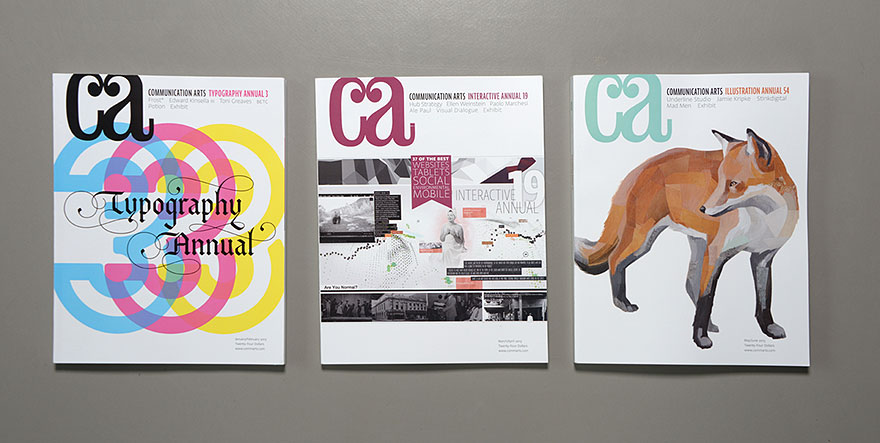
Publisher Patrick Coyne and art director Tricia Seibold needed a typeface that would give them the typographical tools necessary to support an international publication in both print and onscreen applications, but they were also looking for a certain personality. ‘When Patrick first came to me with Greta, I felt like a kid in a candy store,’ says Seibold. ‘It seemed like there were so many possibilities. The font feels modern, sleek and unobtrusive. Our goal at Communication Arts is to make sure the artists we feature take centre stage, so any font we chose had to have just enough style to be distinctive and capture the spirit of our brand without competing with the work we show.’
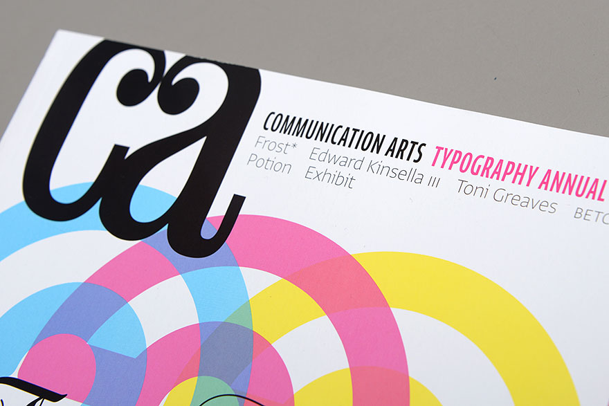
Patrick and I have always loved the original logo. As Patrick mentioned, one of the problems with our Univers Thin Ultra Condensed logo is that is wasn't particularly scalable. Shown at a small size, it fell apart, and visually became a series of vertical lines. —Tricia Seibold
A major objective for the redesign was to unify the magazine’s design across all platforms. This had been a problem because when CA launched its website, the typefaces it was using for its print version were not available for use on the web, which forced the magazine to fragment its visual identity. And even when webfont systems made it possible to use the print fonts online, Coyne says, their readability on digital displays was a concern. ‘This issue was further complicated as we increased our social media presence and began to explore publishing a tablet version. We have used a modified version of Univers Thin Ultra Condensed as our logotype since 1995, but it becomes illegible when viewed as an icon in Apple’s App Store or on Twitter.’ In addition, Coyne and Seibold needed a font system versatile enough to handle a wide variety of typesetting situations. ‘I was looking,’ says Coyne, ‘for a typeface family with enough text weights between light and bold to adapt to numerous screen and print resolutions while still remaining highly legible, distinctive and not obtrusive. When searching for a complete family range with even greater flexibility than Univers, I found Greta Sans to be the perfect solution.’ Seibold agrees. ‘[Linotype’s Univers] has served us well and did offer some great weight choices, but the weights and widths (not to mention all the glyphs) we have with Greta give us a lot more to play with.’
Seibold calls the redesign ‘a bit of an ongoing undertaking’, and CA’s websites are currently in the process of being converted to Greta Sans, but you can follow their progress at commarts.com.
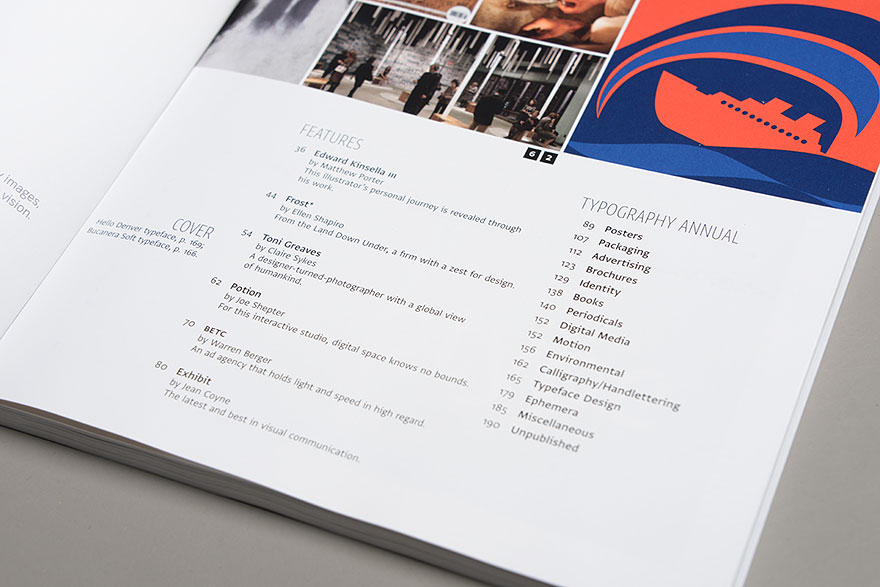
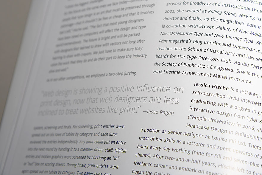
The lighter and heavier weights of Greta Sans works well in headlines, while the Regular weight is well suited for body text.
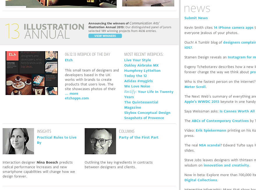
Like any brand steward, I’ve never been happy that our printed publication and our website used different typefaces. The use of Web fonts could have finally solved this. —Patrick Coyne