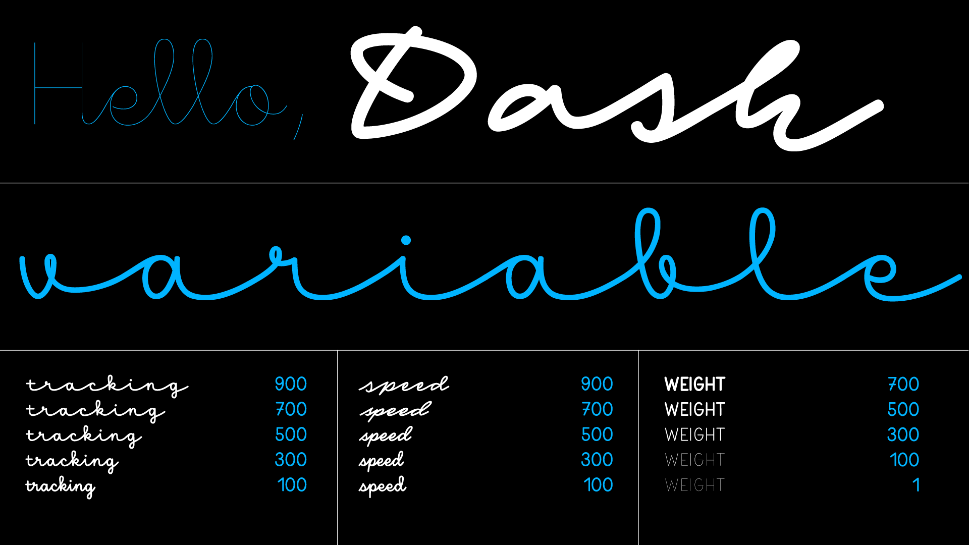
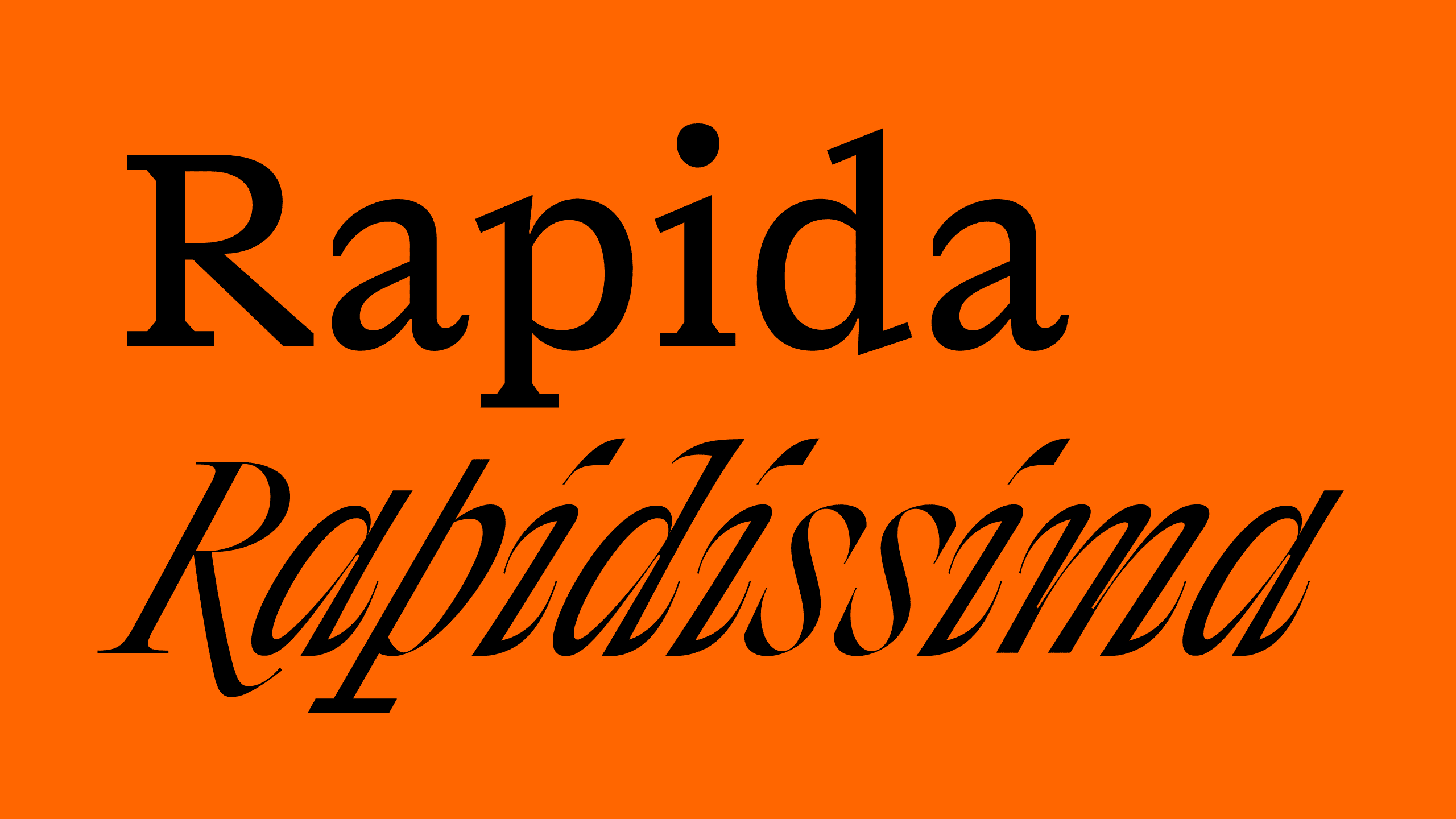
Three years after graduating from Type & Media, Michelangelo Nigra completed his thesis project, which is full of surprising type details that give text a unique character and liveliness.
New fonts · 3 October 2022
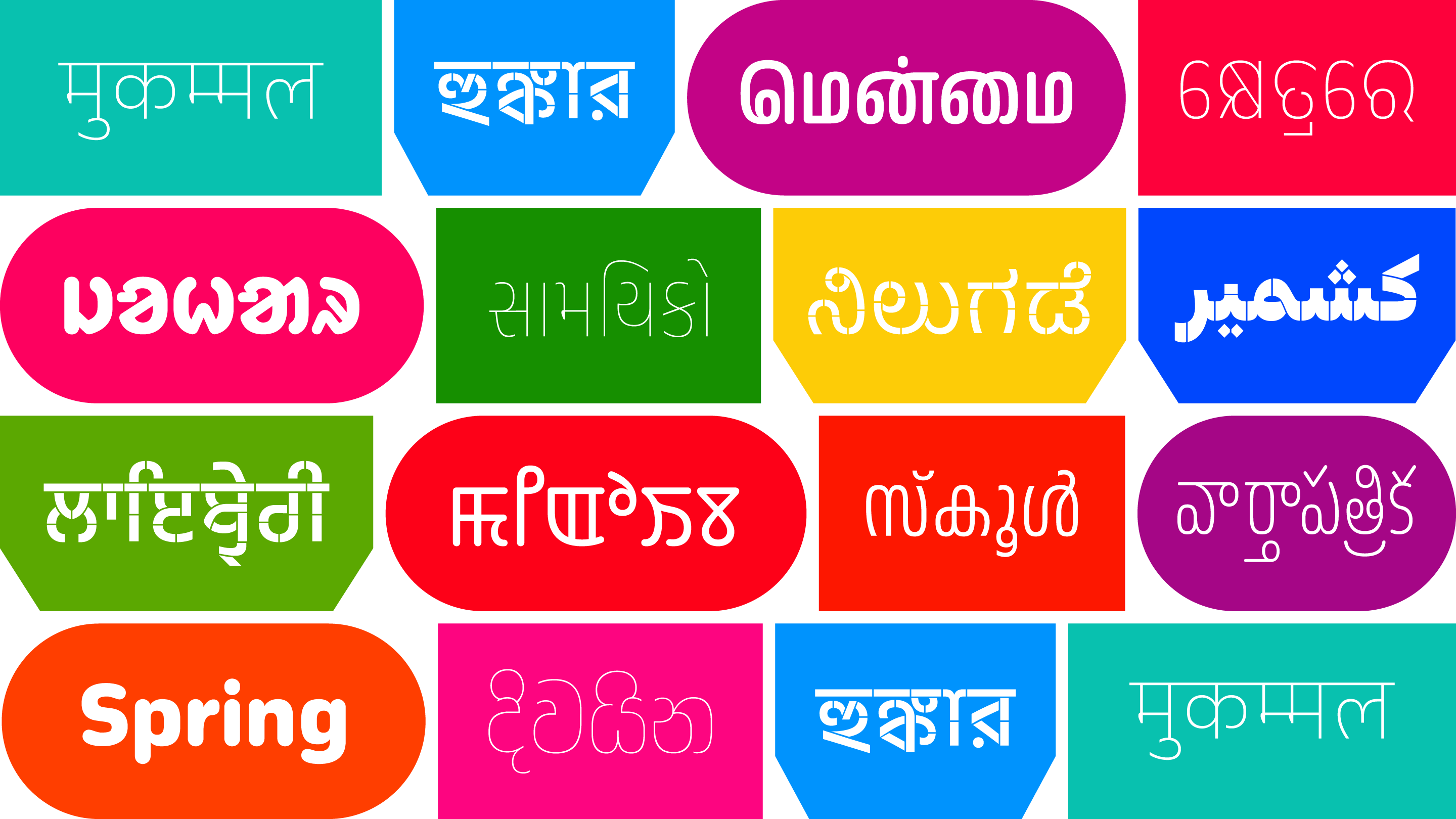
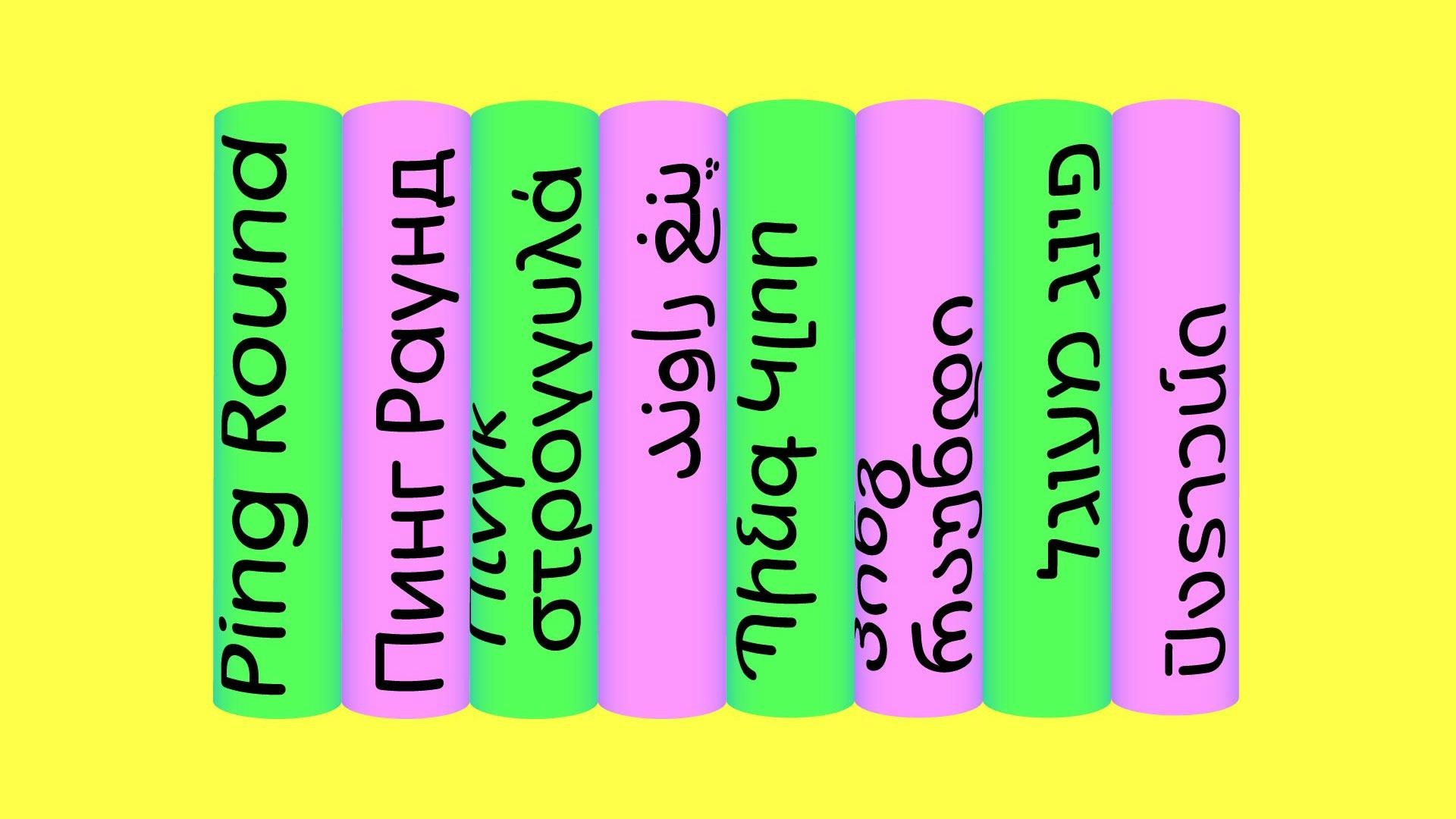
An affable font family with fluid stroke structure that communicates in Latin, Greek, Cyrillic, Arabic, Hebrew, Thai, Georgian, Armenian and Devanagari.
New fonts · 16 May 2022
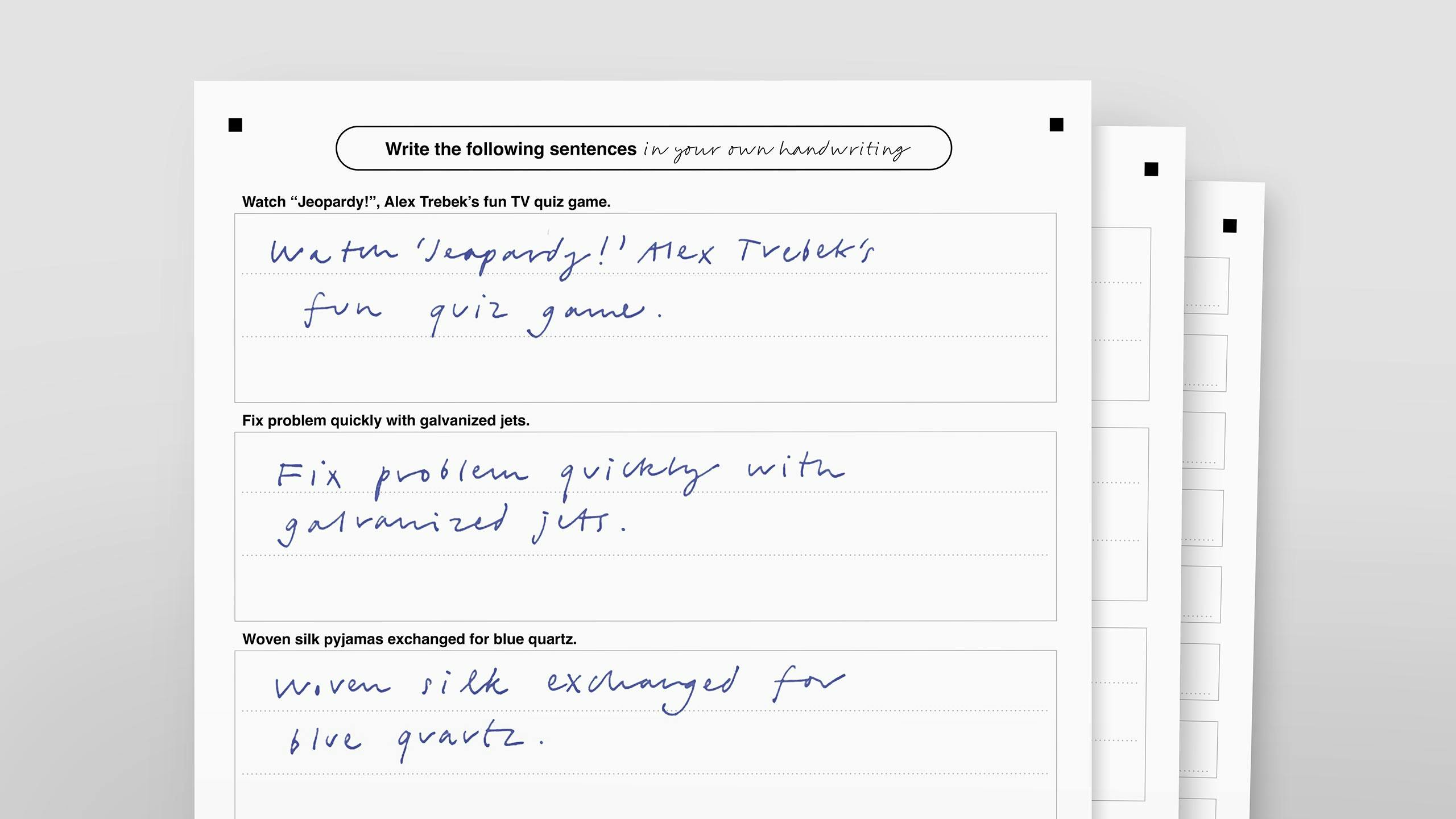
As a company that develops fonts, we’re interested in learning how people write. In particular, we want to know more about how people around the world write by hand and how they perceive handwriting by others, a topic on which we have found no current literature.
Research, Announcements · 2 May 2022
Typotheque has designed a set of new fonts for the largest public broadcaster in Norway, as part of its brand refresh. The fonts respond to the client’s needs, creating a tool to strengthen its identity.
Client Spotlight, Announcements · 21 March 2022
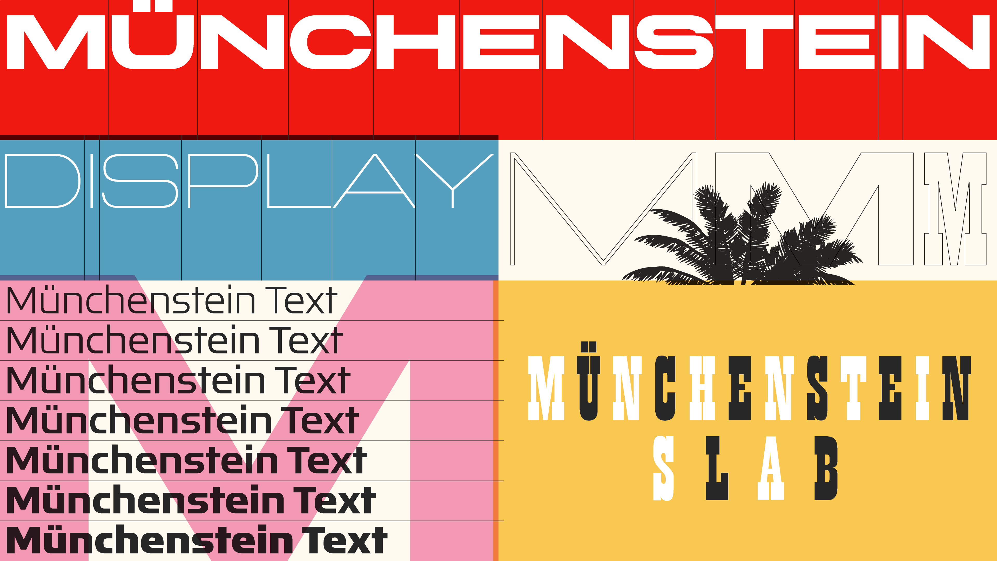
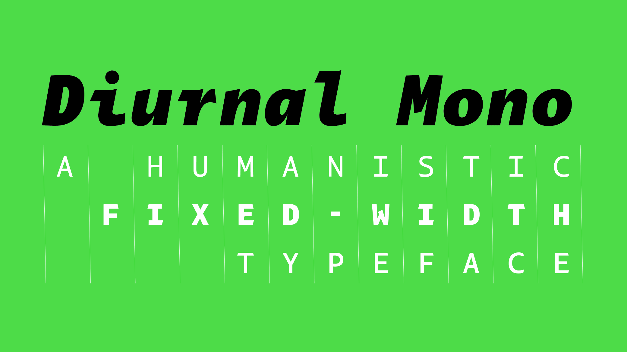
A humanist monospaced typeface with calligraphic traits, that bringing regularity and warmth into a block of text that aligns vertically.
New fonts · 21 March 2022
Typotheque has been working on an extensive historical research project, based on the development in Devanagari printing, combined with a survey of the contemporary regional preferences of Devanagari readers.
Research, Updates, New articles · 21 March 2022
A decade after Nikola Djurek drew Delvard, a collection of sans and display fonts, comes Delvard Serif, an eye-catching serif typeface in three optical sizes.
New fonts · 24 January 2022
Typotheque is launching a series of Unified Canadian Syllabics fonts that support Indigenous language revitalisation and preservation efforts in North America, changing the standards of future Syllabics fonts.
New fonts, New articles, Research · 24 January 2022
November has been completely revised, redesigned and reengineered and are now available in both static and variable font formats.
New fonts, Updates · 18 November 2021
In order that we can make more informed, research-based decisions when designing Devanagari fonts, we are inviting people who regularly use the Devanagari script to take part in our survey to help us understand regional preferences for character variants.
Research · 1 September 2021
After more than a year of work, the 560-page book, printed in 11 different inks, that presents the complete Typotheque collection has been published. It is a true community project that took the involvement of hundreds of people to bring it to fruition, and it includes a poem by Indian poet Tishani Doshi, written to correspond to the specific word count of the book.
New products, Announcements · 14 June 2021
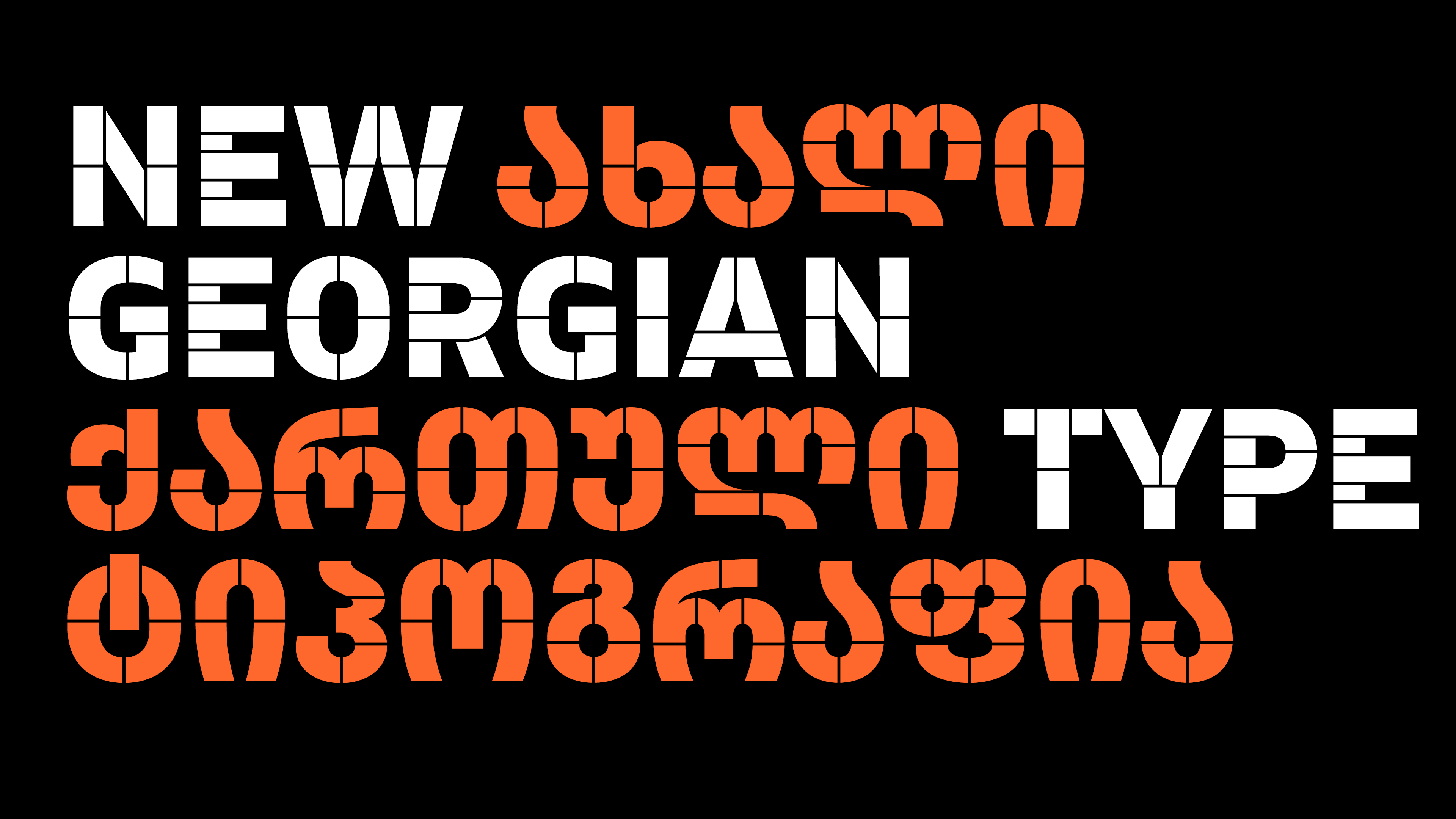
An organically created stencil typeface that follows the logical contrast principles of letter construction until the shape is fractured at its narrowest point.
New fonts · 14 June 2021

Tags

Ellen Lupton Erik Spiekermann 16th century @font-face Abbott Miller abugida activism advertising AGI Al Gore alternate glyphs Amsterdam Andrej Krátky animation Arabic architectural architecture Armenian art Art Nouveau augmented reality Australia authorship awards bandwidth Bangla Ben Bos bible bitmap Bodoni book binding book design books branding browser calligraphic calligraphy Canada capitals Catherine Zask Central European chess symbols choreography CJK CNC router collection of work comic strip condensed conferences corporate identity cover Croatia CSS cultural studies custom fonts Cyrillic Czech and Slovak Republics dance Dance Writer decorative design criticism design heroes Devanagari diary Didone digital publishing distribution Diwani Donald E. Knuth Dutch design eBooks eclectic editorial design Elisa Biľak Emily King End User English Erik van Blokland exhibitions experimental extended extra bold Eye magazine fashion Fedra feminine film titles film/video Firefox font formats France František Štorm Fred Smeijers geometric Georgian Gerard Unger Germany Gert Dumbar graphic design Greek grotesque Gustavo Ferreira hairline hand lettering Handwriting Hangul Hans Eduard Meier Hansje van Halem Hanzi headline Hebrew high x-height high-contrast Hindi hinting Hiragana history HTTPS/SSL humanist humour icon font illustration India individual typeface industrial informal Inscriptional capitals interdisciplinary Inuit Inuktitut iPad iPhone Irma Boom ISO Italy Ivo Biľak Jan Middendorp Jan van Toorn Johanna Biľak Jürg Lehni Just van Rossum KABK Kai Bernau Kana Kanji Kannada Karel Martens Katakana Kevin Finn Kristyan Sarkis Kufic language Latin layers lecture legibility Letterror licensing lining figures low-contrast lowres Ľubomír Longauer Lukáš Timulak MacOS magazines Maria Doreuli Martin Majoor masculine Matthew Carter Max Kisman METAFONT Mevis & Van Deursen Michal Sahar microtypography modernism modular monospaced multi-purpose multilingual multiple widths multiscript music Naskhi neo-grotesk Netherlands neutral New Zealand newspaper Nikola Djurek non-Latin Nunavik offset printing old-style figures on-screen reading Ondrej Jób OpenType ordering ornaments Otabind packaging parametric pattern PDF Pentagram performance Persian Peter Biľak Photofont photography pictograms pixels politics post stamp posters pricing Print & Web licence Pro fonts programming publishing René Knip research revivals Rick Poynor Robert Estienne Robin Kinross Ross Milne round Roxane Jubert sans-serif sculpture semantic serif signage silkscreen Simplified Chinese sketchbook slab serif small caps SN Rajpurohit society software stage design Std fonts stencil Studio Dumbar superfamily SVG Sweden Switzerland Syllabics symbols tabular figures Tamil TDC Winner technology Telugu testing fonts Thai The Hague theory transliteration TrueType type as object type design type modifications type specimens type systems typeface package typography unicase Unicode upgrading USA vinyl wayfinding webfonts websites William Caslon Windows WOFF wood type Works That Work magazine Yanek Iontef zodiac symbols