
Delvard Serif, an eccentric, yet very functional old-style typeface
Just like the sans version, Delvard Serif is not modelled on a single historical source, but takes loose inspiration from the late nineteenth-century art nouveau posters and its adventurous lettering.

Delvard Serif has an high x-height, and distinctive design features such as flat curves with abrupt terminals and deep cuts of the ‘g’ and the ‘f’ that give the text spark.
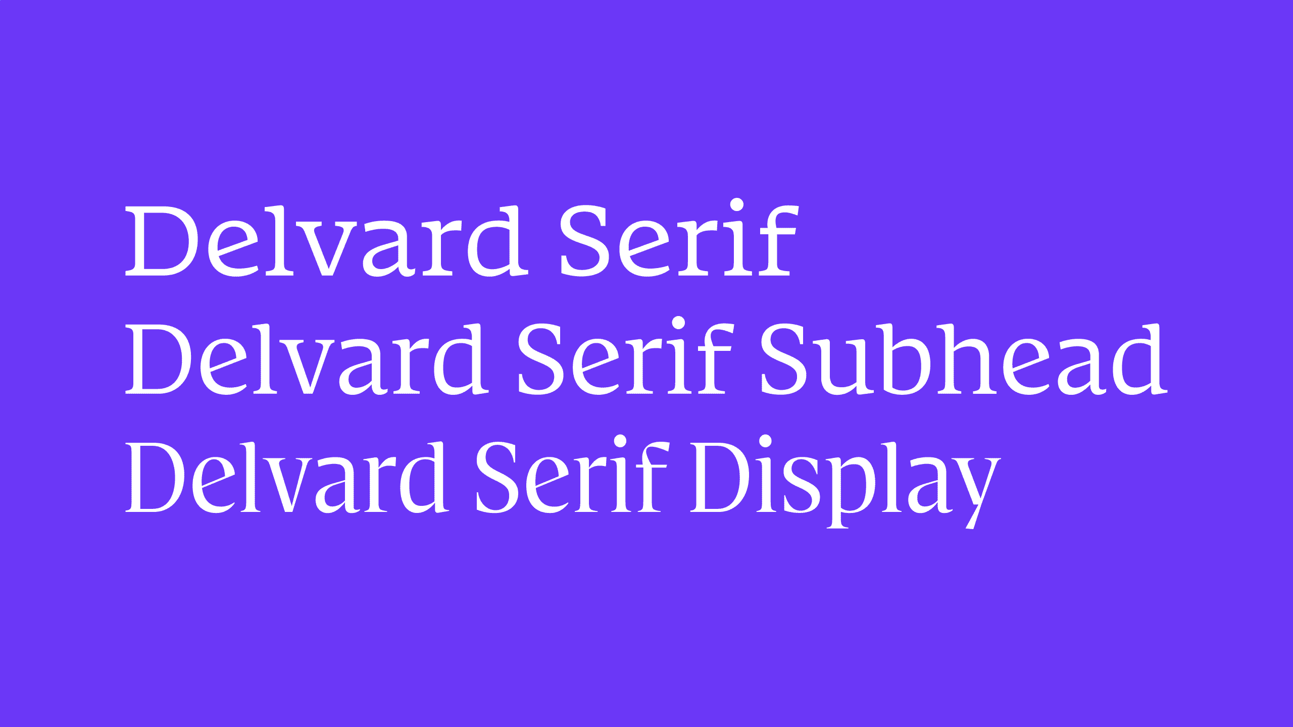
The Text version is generous in width, with vertical and horizontal proportions of the types made for the micro sizes (4–6pt), and thanks to its robustness and spaciousness, it is highly legible in small text. The Subhead styles have regular proportions for small to medium text sizes, and increase the contrast slightly. And finally, there is the crisp and eye-catching Display styles, with narrow widths and pronounced, eccentric detailing for high-impact headlines.
Together, Delvard Serif is a comprehensive type family of 24 styles, with great adaptability of use, that can be used in an extreme range of sizes, starting from 4 points, to anything that fits your format. Explore the full character set for delightful surprises and stylistic sets, as seen in, for example, the double crossbars of the capitals ‘H’ and ‘A’.

