Lava — a Multilingual Typeface for Running Text
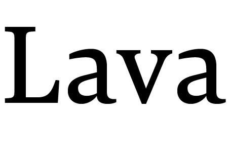
Lava was originally designed for Works That Work magazine, but far transcends its original application. It’s a no-nonsense workhorse typeface that can handle large quantities of text with ease. It’s legible and harmonious at small sizes, sophisticated and elegant at large sizes.
Since the magazine exists both in print and on screen, Lava was designed to perform optimally in both high- and low- resolution environments. Lava looks closely at system fonts such as Times and Georgia and aspires to work on screen as well as they do. In print, Lava delivers something that user interface fonts usually lack: refined details, finely tuned proportions and meticulous spacing that let the reader forget about the typeface and pay attention to the text.
Lava supports hundreds of languages and three writing scripts: Latin, Cyrillic and Greek. Furthermore, a special version of Lava has been developed for Latin/Arabic typesetting. It is being released as the Latin component of Harir, and has been adjusted to match Harir’s weight, rhythm and contrast, as well as its three optical sizes.
Read more about the development of Lava in this article.

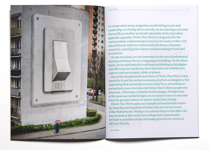
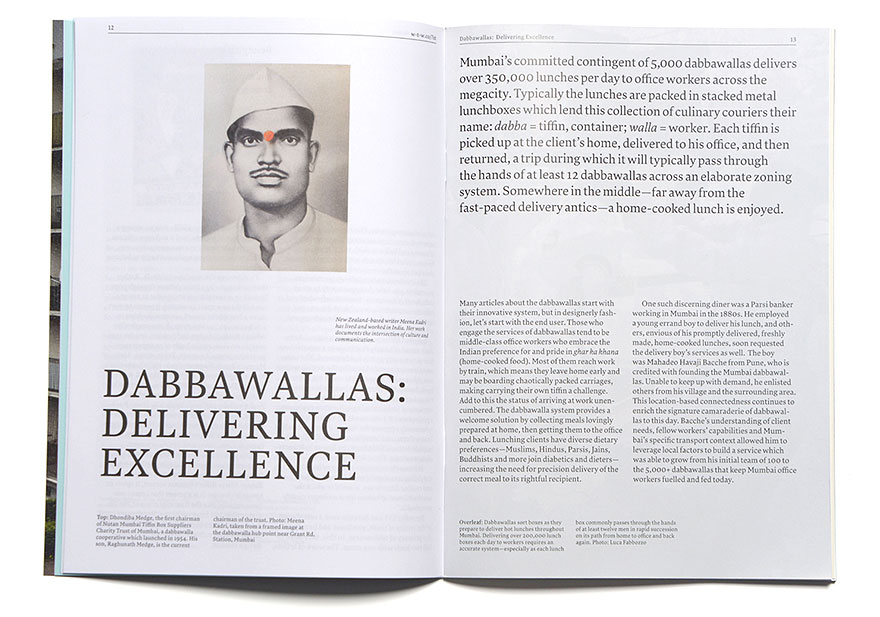
Lava was designed for Works That Work magazine. The magazine is designed by Atelier Carvalho Bernau.
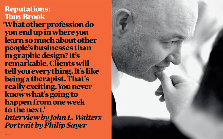
Issue 86 of Eye magazine will use Lava for both the headlines and the body text. Designed by Esterson Associates