
Manu, a smart handwriting font

A sophisticated handwriting font written with two pens, in two speeds, supporting Latin, Greek, and Cyrillic scripts.

Handwriting fonts are a curious breed. Handwriting by definition is not typographic. Even the most trained hand produces a unique specimen every time, influenced by the size and quality of the paper, the type of pen and ink, the writer’s mood, even how fast he or she writes. Digital fonts, on the other hand, assemble preformed shapes, making them available at the touch of a key, over and over again. If the basic principle of typography is that it is a repeatable act, ‘handwriting font’ is very nearly a contradiction in terms.
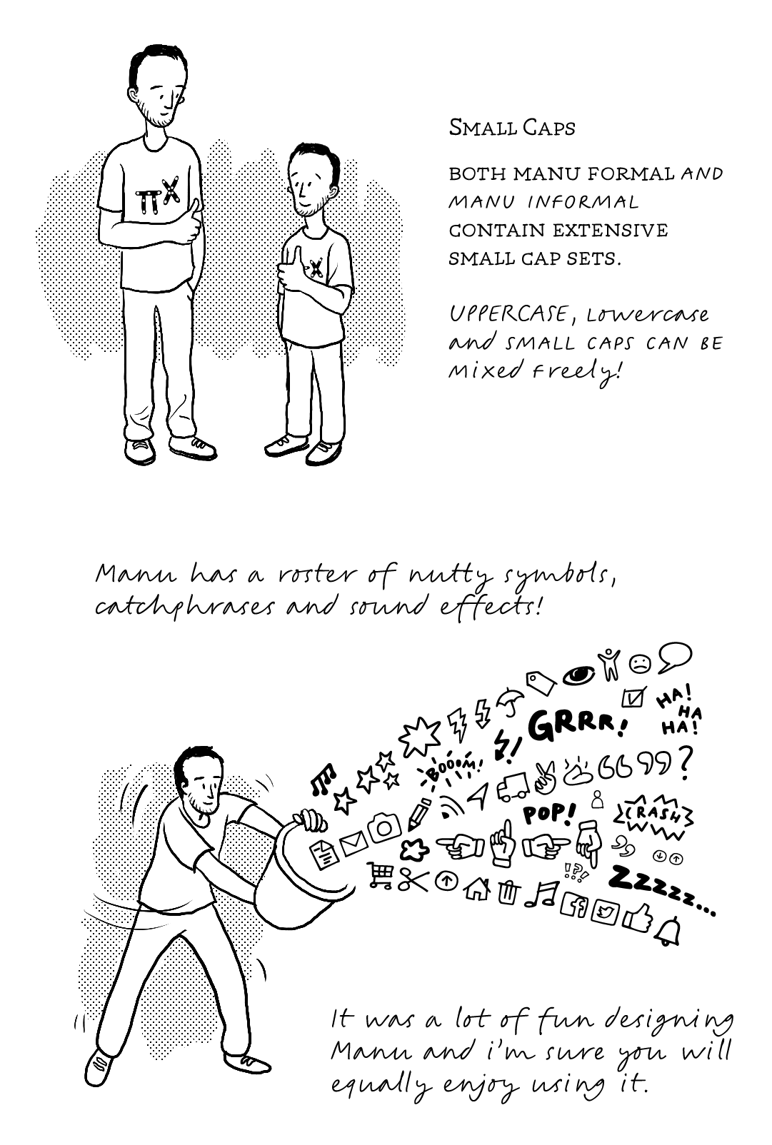
Manu is a sophisticated, modern handwriting font based on the fluid, casual writing of its author. It comes with the OpenType features that the most demanding users are accustomed to finding in serious text typefaces. Manu comes in three styles, Formal, Informal and Emphasis.
Manu Formal is based on slow careful writing that humanises printed type. Manu Informal is fast, cursive, uninterrupted writing with the rhythm of handwriting. Both Formal and Informal styles are written with the same pen (Muji Pen 0.7mm) at small (18pt) text sizes. Emphasis is a semi-fast all-caps typeface written with a heavier felt-tipped pen. All three styles can be combined and recombined, and give plenty of space for expression, personality and typographic hierarchy. Each style comes with a handy set of symbols, icons and emoticons, plus advanced typographic Opentype features.
For some reason, handwriting fonts are usually produced by amateurs, while professional designers focus on serious text typefaces. There are some exceptions — most notably, Erik van Blokland and Just van Rossum’s FF Hands — and wonderful examples of informal handwritten fonts. While they are very expressive, they also have all the hallmarks of early 1990s fonts: quickly digitised, with limited character sets and features. Manu is designed as carefully as any of our text fonts, with the same attention to detail, and with the same (or perhaps even more complex) OpenType substitution features. As it is standard for Typotheque fonts, Manu supports over 150 languages, offering nuanced voices for various situations.
Illustrations by Shiva Nallaperumal.